ART TESTS 🧵(1/10). I rediscovered some old e-mails of art tests I have done over the years & wanted to share some things I wish I knew at the time & what to watch out for as a 3D artist who is on the job hunt. This will contain both good & bad practices. #gamedev #gameart 

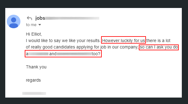
(1/10) I hadn’t noticed at the time due to inexperience, but looking back, this art test situation was by far one of the worst ones with multiple warning signs. After applying & completing an art test (80/100 hours) for an AAA studio, I was sent the following e-mail. 

(2/10) Take note of the areas in red. At this point, I should have exited the process, but alas, I completed the additional 2 tests equalling about 60 more hours of work. A total estimate of about 1 month of working hours in 3 weeks. There was no response, so I inquired. 
(3/10) After 3 weeks of no response, I followed up & inquired about the test & requested feedback on how to improve. After spending around 160 hours across 3 art tests, I received a response regarding my application. No acknowledgment of feedback, just a wave goodbye. 

(4/10) On the other side, I have completed tests that have been purposefully scoped to be around 16 to 32 hours of work, resulting in a few days to complete. These are the best types of tests as they take into consideration that you’re a human being and not a blank face.
(5/10) It's healthy to turn down art tests. You may be in a circuit wanting to please every studio, but look out for yourself. If multiple tests are affecting your quality of life, drop them. Send an e-mail that you’ll be dropping out of the test & thank them for the opportunity.
(6/10) On the studio side, art teams need to manage expectations by providing art tests that are scoped well, with feedback being either embedded or the final closing action. These tests should go to the very best of applicants, & not be blanket sent to mass pools of applicants.
(7/10) By scoping art tests & sending them to select applicants, you can bake feedback into the process, which will help artists grow as they continue to develop in the industry & job search. Mass sending out art tests leads to the very issues I've outlined so far.
(8/10) All in all, we need to make sure junior artists are given correct & thoughtful information to progress their skill set & career. We should not demotivate them & throw them away after attempting to prove themselves by completing an art test.
(9/10) Quick anecdote: I was once sent an art test on a Friday afternoon & was required to complete it by end of Monday. The test would have taken roughly around 50 hours to complete. I politely declined & enjoyed my weekend. Don't feel pressured to do tests, look after yourself.
(10/10) Looking forward, I am seeing some great developments in the art test process for the games industry. Studios are picking smaller tests, starting to pay, & a lot of studios are providing feedback not only at the end of the art test, but during it. The future looks bright!
• • •
Missing some Tweet in this thread? You can try to
force a refresh


