I have 10+ years of university-level education.
But no lecture taught me how to create good visualizations.
These things are crucial for communication but are often not part of the training.
So, let's have a crash course on visualization guidelines anyone can implement. 🧵
But no lecture taught me how to create good visualizations.
These things are crucial for communication but are often not part of the training.
So, let's have a crash course on visualization guidelines anyone can implement. 🧵
1. Know your audience
You can't use the same visualization for every audience.
A plot that works in a scientific journal may bore (or confuse) non-scientists.
You can't use the same visualization for every audience.
A plot that works in a scientific journal may bore (or confuse) non-scientists.
2. Know your takeaways
Forget the dream of putting ALL of your great insights into one powerful plot.
This. does. not. work.
If anything, this dream is a gateway to using too many chart types all at once.
Visualize only your most important insights (maybe in separate plots).
Forget the dream of putting ALL of your great insights into one powerful plot.
This. does. not. work.
If anything, this dream is a gateway to using too many chart types all at once.
Visualize only your most important insights (maybe in separate plots).
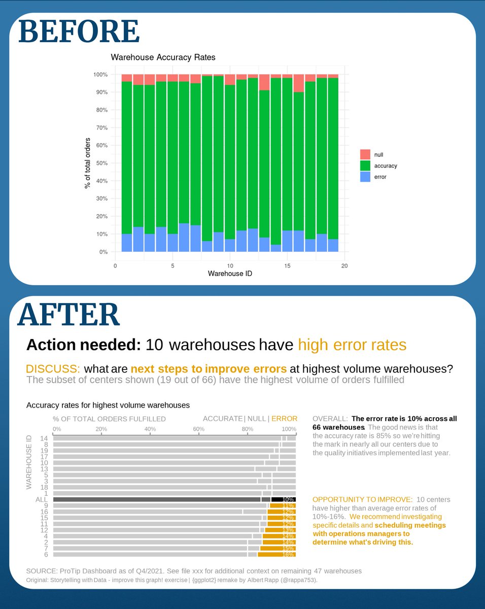
3. Use only a few chart types in one plot
A bar chart here. Add a line there. Include some points and text labels over there. And all of a sudden you've got a mess.
Here's a SWD makeover reducing the number of chart types. Looks cleaner, right?
Source: storytellingwithdata.com/blog/bar-chart…
A bar chart here. Add a line there. Include some points and text labels over there. And all of a sudden you've got a mess.
Here's a SWD makeover reducing the number of chart types. Looks cleaner, right?
Source: storytellingwithdata.com/blog/bar-chart…


4. Be mindful of your color use
Colors are great. But they can easily overwhelm your reader.
There are two similar rules of thumb that can help to avoid that:
- Start with grey
- Emphasize just one or a few categories
Colors are great. But they can easily overwhelm your reader.
There are two similar rules of thumb that can help to avoid that:
- Start with grey
- Emphasize just one or a few categories


5. Avoid rainbow colors
They can turn into a colorful rainbow mess pretty quickly.
Here are my go-to alternatives palettes:
Coloors generator: coolors.co/d9f4c7-f8fa90-…
Viridis: sjmgarnier.github.io/viridis/index.…
Okabe-Ito: mikemol.github.io/technique/colo…
They can turn into a colorful rainbow mess pretty quickly.
Here are my go-to alternatives palettes:
Coloors generator: coolors.co/d9f4c7-f8fa90-…
Viridis: sjmgarnier.github.io/viridis/index.…
Okabe-Ito: mikemol.github.io/technique/colo…

6. Improve accessibility
The Viridis and Okabe-Ito colors are colorblind-friendly. But you can do more to make your plots accessible, e.g.
- Double-coding (like using color AND shape for categories)
- Adding alt-texts supercooldesign.co.uk/blog/how-to-wr…
The Viridis and Okabe-Ito colors are colorblind-friendly. But you can do more to make your plots accessible, e.g.
- Double-coding (like using color AND shape for categories)
- Adding alt-texts supercooldesign.co.uk/blog/how-to-wr…
6. Reduce clutter
Do you really need all labels? Or all grid lines or axes? Especially with labeled bar charts there is really no need to keep it all.
Do you really need all labels? Or all grid lines or axes? Especially with labeled bar charts there is really no need to keep it all.

7. Align labels
Your plot feels more harmonious if labels are aligned and not spread out all over the place.
For example, what feels "smoother" in this image?
Remember that next time you create a table with centered columns.
Your plot feels more harmonious if labels are aligned and not spread out all over the place.
For example, what feels "smoother" in this image?
Remember that next time you create a table with centered columns.

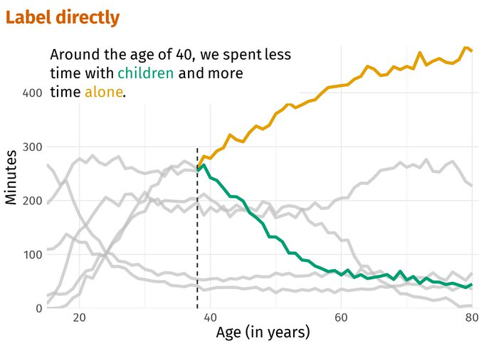
8. Remove the legend and label directly
Do you really need a legend? It can take up sooo much valuable space of your plot.
Besides, switching back and forth from the legend to the plot can be quite challenging for your reader.
Instead, you can label directly.
Do you really need a legend? It can take up sooo much valuable space of your plot.
Besides, switching back and forth from the legend to the plot can be quite challenging for your reader.
Instead, you can label directly.
These were just a few of my most favorite dataviz "rules".
Of course, there's lots more to learn.
So let's talk resources.
Of course, there's lots more to learn.
So let's talk resources.
Fundamentals of Data Visualization by @ClausWilke is a great resource to learn more about dataviz.
Best part? It's totally free and open-source.
clauswilke.com/dataviz/
Best part? It's totally free and open-source.
clauswilke.com/dataviz/
Another great and totally free resource is
Data Visualization: A practical introduction by @kjhealy
socviz.co/index.html#pre…
Data Visualization: A practical introduction by @kjhealy
socviz.co/index.html#pre…
I've also enjoyed the Storytelling with Data book.
It's pretty short but filled with insights. Unfortunately, it's not free.
amzn.to/3U0x0rM
It's pretty short but filled with insights. Unfortunately, it's not free.
amzn.to/3U0x0rM
Now, it's one thing to know the rules but it's another thing to apply them.
My recommendation? Practice with the weekly #tidyTuesday challenge.
Each week, a new data set for practicing your data skills is published.
A great competition for all levels. github.com/rfordatascienc…
My recommendation? Practice with the weekly #tidyTuesday challenge.
Each week, a new data set for practicing your data skills is published.
A great competition for all levels. github.com/rfordatascienc…
If you're getting started with visualizations, you'll likely need help.
But don't worry, there are resources for templates/inspiration. Here are my 4 favorite helpers:
1️⃣ cookbook-r.com/Graphs/
2️⃣ r-graph-gallery.com
3️⃣ python-graph-gallery.com
4️⃣ data-to-viz.com
But don't worry, there are resources for templates/inspiration. Here are my 4 favorite helpers:
1️⃣ cookbook-r.com/Graphs/
2️⃣ r-graph-gallery.com
3️⃣ python-graph-gallery.com
4️⃣ data-to-viz.com
That's a wrap for today.
I hope that you enjoyed this little intro to data visualization 😊
Tomorrow, we'll explore common chart types and better alternatives.
If you want to be there or see more posts like that, you can follow @rappa753.
I hope that you enjoyed this little intro to data visualization 😊
Tomorrow, we'll explore common chart types and better alternatives.
If you want to be there or see more posts like that, you can follow @rappa753.
• • •
Missing some Tweet in this thread? You can try to
force a refresh