This is a great thread from @TimHarford but it made me question:
❓what are the creative tensions/levers chart producers can use to enlighten, not bamboozle ❓
Here's a 🧵...
❓what are the creative tensions/levers chart producers can use to enlighten, not bamboozle ❓
Here's a 🧵...
https://twitter.com/TimHarford/status/1491079708380909573
Lever 1: “Speed to Primary Insight.”
Let's take Napoleon’s 1812 Russian disastrous military campaign.
You could do a slow graph, like Minard did in 1869, or aim for fast insight using bubbles.
Let's take Napoleon’s 1812 Russian disastrous military campaign.
You could do a slow graph, like Minard did in 1869, or aim for fast insight using bubbles.

(note: @GiorgiaLiupi’s great Data Humanism manifesto talks at length about the benefits of slow data: medium.com/@giorgialupi/d…)
Lever 2: "Granular or Sparse"?
Take these examples showing the impact of vaccines on polio in the US from @randal_olson (left) and Wall Street Journal (right). Both work, but contain different levels of detail. Why would you use one approach over the other?
Take these examples showing the impact of vaccines on polio in the US from @randal_olson (left) and Wall Street Journal (right). Both work, but contain different levels of detail. Why would you use one approach over the other?

Those vaccine charts are what inspired me to coin Cotgreave’s Law, BTW!)
infoworld.com/article/304831…
infoworld.com/article/304831…

Also, @randal_olson did a great write up about the strengths and weaknesses of the two vaccine chart approaches: randalolson.com/2016/03/04/rev…
Lever 3: "Explore or Explain".
Perhaps as much in the delivery as the chart design itself, chart makers need to optimise charts depending on whether they are there to describe them or not. Compare, for example, a self-explored business dashboard to Hans Rosling on a stage.
Perhaps as much in the delivery as the chart design itself, chart makers need to optimise charts depending on whether they are there to describe them or not. Compare, for example, a self-explored business dashboard to Hans Rosling on a stage.

If you haven't seen the late Hans Rosling (of @Gapminder ) do his thing, go check out his amazing data communication skills: ted.com/talks/hans_ros…
Lever 4: Dry or Emotional?**
Both examples below show air quality in Sheffield, by @IQAir (bar chart) and @miriamquick & @stefpos (necklace). Which one would you use to engage non-data people, for example?
Both examples below show air quality in Sheffield, by @IQAir (bar chart) and @miriamquick & @stefpos (necklace). Which one would you use to engage non-data people, for example?

Lever 5: Accuracy and Ambiguity.
On the right is @SimonScarr’s Iraq Bloody Toll, a visceral masterpiece telling a human tragedy story. On the left is a @Reuters chart about gun deaths in Florida that aimed to emulate Scarr’s but actually created more confusion.
On the right is @SimonScarr’s Iraq Bloody Toll, a visceral masterpiece telling a human tragedy story. On the left is a @Reuters chart about gun deaths in Florida that aimed to emulate Scarr’s but actually created more confusion.

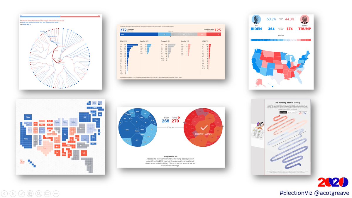
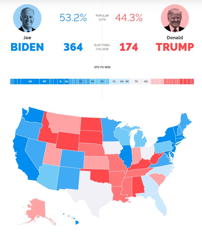
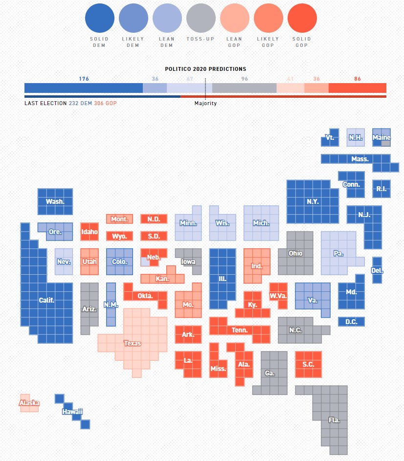
All of the levers can be used when creating #dataviz and considering your goal. It’s fine to be on either end of any of the levers, but your choices must be deliberate and tied to your intent.

I’d love to know your thoughts. Are they the right levers? Are there others? Is the word choice correct?
Finally, if this kind of thing fascinates you, then join me on my Communicating and Persuading With Data course with @getsphere, where we’ll apply these principles to charts for all areas of your work. Details here: getsphere.com/cohorts/commun…
• • •
Missing some Tweet in this thread? You can try to
force a refresh