Andy Cotgreave Profile picture
Tableau evangelist, data communicator. My newsletter: https://t.co/5VwS0920NT | My book: https://t.co/8Trvuzl1uA
Nov 3, 2022 13 tweets 7 min read
This is a great thread from @TimHarford but it made me question:
❓what are the creative tensions/levers chart producers can use to enlighten, not bamboozle ❓
Here's a 🧵... Lever 1: “Speed to Primary Insight.”
Let's take Napoleon’s 1812 Russian disastrous military campaign.
You could do a slow graph, like Minard did in 1869, or aim for fast insight using bubbles. Lever 1: Should a chart be fast or slow?
Apr 9, 2021 10 tweets 7 min read
What #boardgames contain mechanics/principles that appeal to #dataviz enthusiasts. A list of ideas in this thread... can you think of others? Image Illusion by @WolfgangWarsch exploits how bad we are at accurately understanding area. It's about shape and colour encoding boardgamegeek.com/boardgame/2449…
Nov 2, 2020 11 tweets 8 min read
Thread: How would YOU visualize poll tracker data? You have 50 US states and a race to 270 Electoral College votes. Here's a thread of several approaches from the media, with one pro/con for each. #ElectionViz (1/11) #
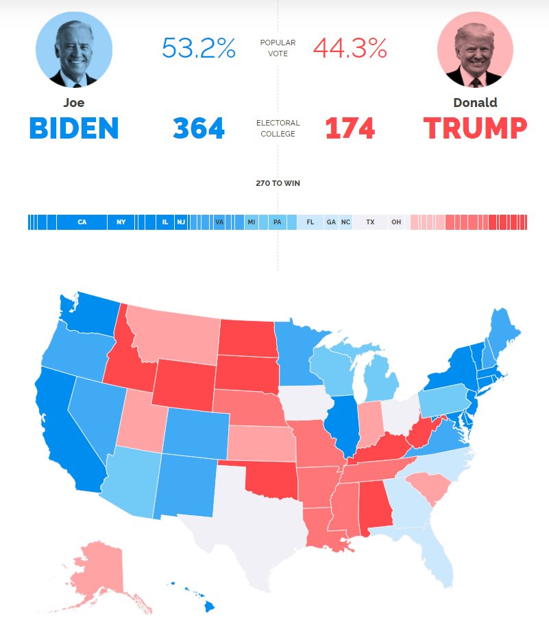
YouGov goes for a traditional approach: stacked horizontal bar chart and standard US map.

Pro: Easy to find any particular state.
Con: Size is based on physical area, not number of electoral college votes

today.yougov.com/2020-president… (2/11)