The Nov 18 @COVID_19_Canada Canadian COVID Index and associated data are now live.
SEVERE: PEI
VERY HIGH: CAN, AB, BC, MB, NS, ON
HIGH: NB, NL, North, QC, SK
All regions improving or stable.
Link: covid19resources.ca/covid-hazard-i…
SEVERE: PEI
VERY HIGH: CAN, AB, BC, MB, NS, ON
HIGH: NB, NL, North, QC, SK
All regions improving or stable.
Link: covid19resources.ca/covid-hazard-i…

@COVID_19_Canada The index scores correspond to the percent excess all-cause mortality due to COVID we expect.
For example, we expect ~6% excess mortality for the week ending Nov 18 in Canada.
For example, we expect ~6% excess mortality for the week ending Nov 18 in Canada.
@COVID_19_Canada The annual average % excess all-cause mortality for the epidemic to date in Canada is 7% (after adjusting for any excess deaths attributable to accidents, suicie, toxic drugs and heat dome).
That's about 21K untimely (extra) deaths/year. From QC data it looks like most is COVID.
That's about 21K untimely (extra) deaths/year. From QC data it looks like most is COVID.
@COVID_19_Canada We don't have all-cause mortality reporting for 2022 for most of Canada, but we do have it to Sep 3/22 for 4 fast-reporting provinces: AB, BC, QC and NL.
So far, during Omicron avg % excess mortality in these provinces is 12%. Their average for the epidemic to date is 9%.
So far, during Omicron avg % excess mortality in these provinces is 12%. Their average for the epidemic to date is 9%.
@COVID_19_Canada A MAJOR concern is that excess mortality (black line in graph) has been increasing quickly in these provinces over 2022, and is currently at the highest point of the epidemic so far.
This is without all reporting in yet, especially the most recent deaths.
We should be concerned
This is without all reporting in yet, especially the most recent deaths.
We should be concerned

@COVID_19_Canada If we are seeing 12% excess mortality across Canada during Omicron, this means 36,000 excess (untimely) deaths by December of this year.
By our estimates, as of Nov 18 there have been over 37,000 Omicron deaths in Canada, with 52% of these deaths undetected/unreported.
By our estimates, as of Nov 18 there have been over 37,000 Omicron deaths in Canada, with 52% of these deaths undetected/unreported.
@COVID_19_Canada I focus a lot on deaths because they're the easiest indicator to assess using data sources independent of provincial data reporting differences.
They're the tip of the iceberg indicator--they give a sense of the scale of the underlying problem.
They're the tip of the iceberg indicator--they give a sense of the scale of the underlying problem.
@COVID_19_Canada You can find a lot of the details in the weekly report linked at the top of this thread, and in our Excess Mortality Tracker at the link here:
covid19resources.ca/public/excess-…
covid19resources.ca/public/excess-…
@COVID_19_Canada Our estimates of total COVID mortality during Omicron are similar to the % excess mortality we expect for Canada, based on fast-reporting provinces (12-15%).
They're also similar to COVID mortality estimates from models such as IHME.
Anyway, for all the difference it makes.
They're also similar to COVID mortality estimates from models such as IHME.
Anyway, for all the difference it makes.
@COVID_19_Canada OK, following are the weekly COVID "weather reports" for individual provinces.
Yes, we will have less number-y, easier/faster to read versions soon. These are a placeholder!
Yes, we will have less number-y, easier/faster to read versions soon. These are a placeholder!
@COVID_19_Canada I suspect that "HIGH" may be the baseline. Estimated total infections have been declining from a high peak in late October, but that decline looks like it may be slowing.
Several provinces that have been stably high (NL, QC, SK) have increasing waste water signal.
Several provinces that have been stably high (NL, QC, SK) have increasing waste water signal.

@COVID_19_Canada These provinces don't appear to have gone through surges as intense as other regions over the last few weeks (see coloured grid below), so I'm not sure if this means they're about to go through the same as others.

Here are the weekly weather reports.
CANADA
VERY HIGH COVID hazard, but improving slowly
1 in 39 people infected
0.8-1.1 million infections per week
If this keeps going, Canada may fall to HIGH hazard in next week or two.
#WearAMask
#StayHomeWhenSick
A good one--N95-type.
VERY HIGH COVID hazard, but improving slowly
1 in 39 people infected
0.8-1.1 million infections per week
If this keeps going, Canada may fall to HIGH hazard in next week or two.
#WearAMask
#StayHomeWhenSick
A good one--N95-type.

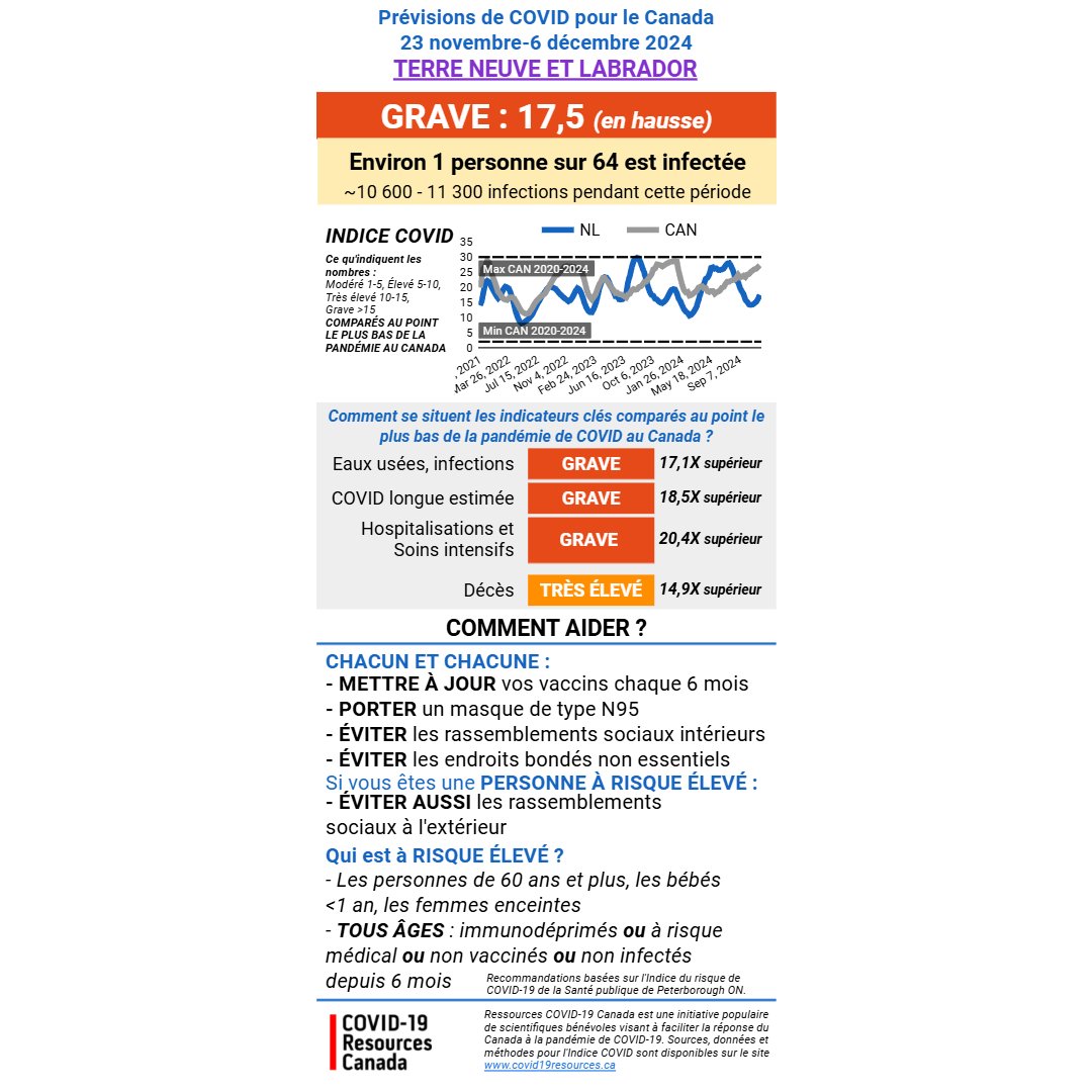
NEWFOUNDLAND & LABRADOR
HIGH COVID hazard.
1 in 66 people infected
11,000-15,000 infections per week
NL is stable, but may start increasing again. And stably high isn't great.
#WearAMask
#StayHomeWhenSick
A good one--N95-type.
HIGH COVID hazard.
1 in 66 people infected
11,000-15,000 infections per week
NL is stable, but may start increasing again. And stably high isn't great.
#WearAMask
#StayHomeWhenSick
A good one--N95-type.

PRINCE EDWARD ISLAND
SEVERE COVID hazard, but improving slowly
1 in 19 people infected
7,000-10,000 infections per week
If this keeps going, PEI may fall to VERY HIGH hazard in next week or two.
#WearAMask
#StayHomeWhenSick
A good one--N95-type.
SEVERE COVID hazard, but improving slowly
1 in 19 people infected
7,000-10,000 infections per week
If this keeps going, PEI may fall to VERY HIGH hazard in next week or two.
#WearAMask
#StayHomeWhenSick
A good one--N95-type.

NOVA SCOTIA
VERY HIGH COVID hazard. Improving steadily now (finally).
1 in 51 people infected
10,000-14,000 infections per week
If this keeps going, NS may fall to HIGH hazard in next week or two.
#WearAMask
#StayHomeWhenSick
A good one--N95-type.
VERY HIGH COVID hazard. Improving steadily now (finally).
1 in 51 people infected
10,000-14,000 infections per week
If this keeps going, NS may fall to HIGH hazard in next week or two.
#WearAMask
#StayHomeWhenSick
A good one--N95-type.

NEW BRUNSWICK
HIGH COVID hazard. Not much change recently.
1 in 65 people infected
6,500-9,000 infections per week
It should be possible to drive this down to ELEVATED hazard in the next week or two, with consistent effort.
#WearAMask
#StayHomeWhenSick
A good one--N95-type.
HIGH COVID hazard. Not much change recently.
1 in 65 people infected
6,500-9,000 infections per week
It should be possible to drive this down to ELEVATED hazard in the next week or two, with consistent effort.
#WearAMask
#StayHomeWhenSick
A good one--N95-type.

QUEBEC
HIGH COVID hazard.
Stable but waste water signal increasing.
1 in 53 people infected
121,000-167,000 infections per week
If people start taking more care, it might be possible to get down to ELEVATED hazard.
#WearAMask
#StayHomeWhenSick
A good one--N95-type.
HIGH COVID hazard.
Stable but waste water signal increasing.
1 in 53 people infected
121,000-167,000 infections per week
If people start taking more care, it might be possible to get down to ELEVATED hazard.
#WearAMask
#StayHomeWhenSick
A good one--N95-type.

ONTARIO
VERY HIGH COVID hazard. Improving slowly, but Ontario is like a ship--hard to slow down.
1 in 31 people infected
300K-415K infections per week
Hopefully Ontario falls to HIGH hazard in next week or two.
#WearAMask
#StayHomeWhenSick
A good one--N95-type.
VERY HIGH COVID hazard. Improving slowly, but Ontario is like a ship--hard to slow down.
1 in 31 people infected
300K-415K infections per week
Hopefully Ontario falls to HIGH hazard in next week or two.
#WearAMask
#StayHomeWhenSick
A good one--N95-type.

MANITOBA
VERY HIGH COVID hazard. Improving slowly. Hope it continues.
1 in 25 people infected
41K-56K infections per week
Hopefully Manitoba falls to HIGH hazard in the next week or two. You can help it get there!
#WearAMask
#StayHomeWhenSick
A good one--N95-type.
VERY HIGH COVID hazard. Improving slowly. Hope it continues.
1 in 25 people infected
41K-56K infections per week
Hopefully Manitoba falls to HIGH hazard in the next week or two. You can help it get there!
#WearAMask
#StayHomeWhenSick
A good one--N95-type.

SASKATCHEWAN
Still HIGH COVID hazard and remaining stable, although waste water increasing.
1 in 80 people infected
9K-12K infections per week
Time to take care to prevent surging higher.
#WearAMask
#StayHomeWhenSick
A good one--N95-type.
Still HIGH COVID hazard and remaining stable, although waste water increasing.
1 in 80 people infected
9K-12K infections per week
Time to take care to prevent surging higher.
#WearAMask
#StayHomeWhenSick
A good one--N95-type.

ALBERTA
VERY HIGH COVID hazard.
Stable...hope it can go lower in next week or two.
1 in 56 people infected
52K-72K infections per week
Please help the healthcare system!
#WearAMask
#StayHomeWhenSick
A good one--N95-type.
VERY HIGH COVID hazard.
Stable...hope it can go lower in next week or two.
1 in 56 people infected
52K-72K infections per week
Please help the healthcare system!
#WearAMask
#StayHomeWhenSick
A good one--N95-type.

BRITISH COLUMBIA
VERY HIGH COVID hazard.
Stable...hope it can go lower in next week or two.
1 in 38 people infected
97K-133K infections per week
Please help the healthcare system!
#WearAMask
#StayHomeWhenSick
A good one--N95-type.
VERY HIGH COVID hazard.
Stable...hope it can go lower in next week or two.
1 in 38 people infected
97K-133K infections per week
Please help the healthcare system!
#WearAMask
#StayHomeWhenSick
A good one--N95-type.

Unfortunately, no data were posted by PHAC for any Northern Territory this week, although we finally have waste water tracking for Haines Junction at the entrance to the beautiful Kluane National Park, Yukon!!!
Usually, as long as we have test positivity data for the 3 territories and data for at least the Yukon, we can try to estimate the situation compared to neighbouring provinces. However, this week we only have waste water from Haines Junction (signal is declining there BTW).
So, unfortunately this week I won't share the COVID weather report for the North (although based on trends in last week's data and waste water I think the hazard is likely currently HIGH but declining).
Sorry about that, Northern friends. We try really hard to do a report for you, but we need a bit more data. I'm hoping that we haven't lost all national reporting for the region. I may have to start digging around to see how we can standardize territorial government sources.
Finally, need incentive to start wearing your (high quality) mask again?
Here's the current @IHME_UW projection for how many lives could be saved if 80% of Canadians started masking again today.
Here's the current @IHME_UW projection for how many lives could be saved if 80% of Canadians started masking again today.

@IHME_UW By Christmas Day, we could cut daily COVID deaths in half if 80% of Canadians start masking again today. We were doing that until Feb or March of this year. We can do it again.
What better present could we give than saving a life and preventing the grief of so many families.
What better present could we give than saving a life and preventing the grief of so many families.
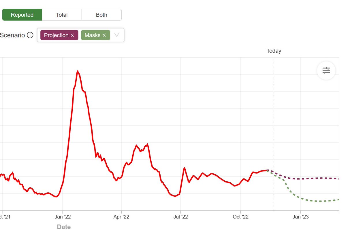
@IHME_UW Without 80% of us wearing masks again, the IHME projection predicts that we'll continue to grind along for months much as we are now, with a steady 5-6% excess mortality and hospitals at 5-10% over-capacity from COVID alone, not to mention flu and RSV.

@IHME_UW Reducing excess mortality from 5% to 2.5% by masking in high risk periods might prevent 7,500 untimely deaths/year. That's double the average annual mortality of flu in Canada.
#StayHomeWhenSick
#WearAMask
Take care of the people you love and your community.
#StayHomeWhenSick
#WearAMask
Take care of the people you love and your community.
@IHME_UW That's it for the thread for tonight. It was a teaching day, and I'm wiped.
Don't forget, you can always join our Wed, Thurs or Sat evening free, anonymous COVID kitchen table-style discussions.
Here's the link to sign up.
Love to all. You matter.
covid19resources.ca/discussions/
Don't forget, you can always join our Wed, Thurs or Sat evening free, anonymous COVID kitchen table-style discussions.
Here's the link to sign up.
Love to all. You matter.
covid19resources.ca/discussions/
• • •
Missing some Tweet in this thread? You can try to
force a refresh