Businesses with photos on their GBP get 42% more requests for directions than those without. Photos = conversions.
Additionally, Google’s AI can analyze photos and use this information to influence rankings.
Here are 7 essential photos every profile needs 🧵
#seo #localseo
Additionally, Google’s AI can analyze photos and use this information to influence rankings.
Here are 7 essential photos every profile needs 🧵
#seo #localseo

1. Brand identity images
People like familiar brands. Even if your brand is not yet recognizable, your GBP is the perfect place to start building that brand identity.
Make your business stand out by using a strong logo badge and cover image (don't you DARE use stock photos).
People like familiar brands. Even if your brand is not yet recognizable, your GBP is the perfect place to start building that brand identity.
Make your business stand out by using a strong logo badge and cover image (don't you DARE use stock photos).

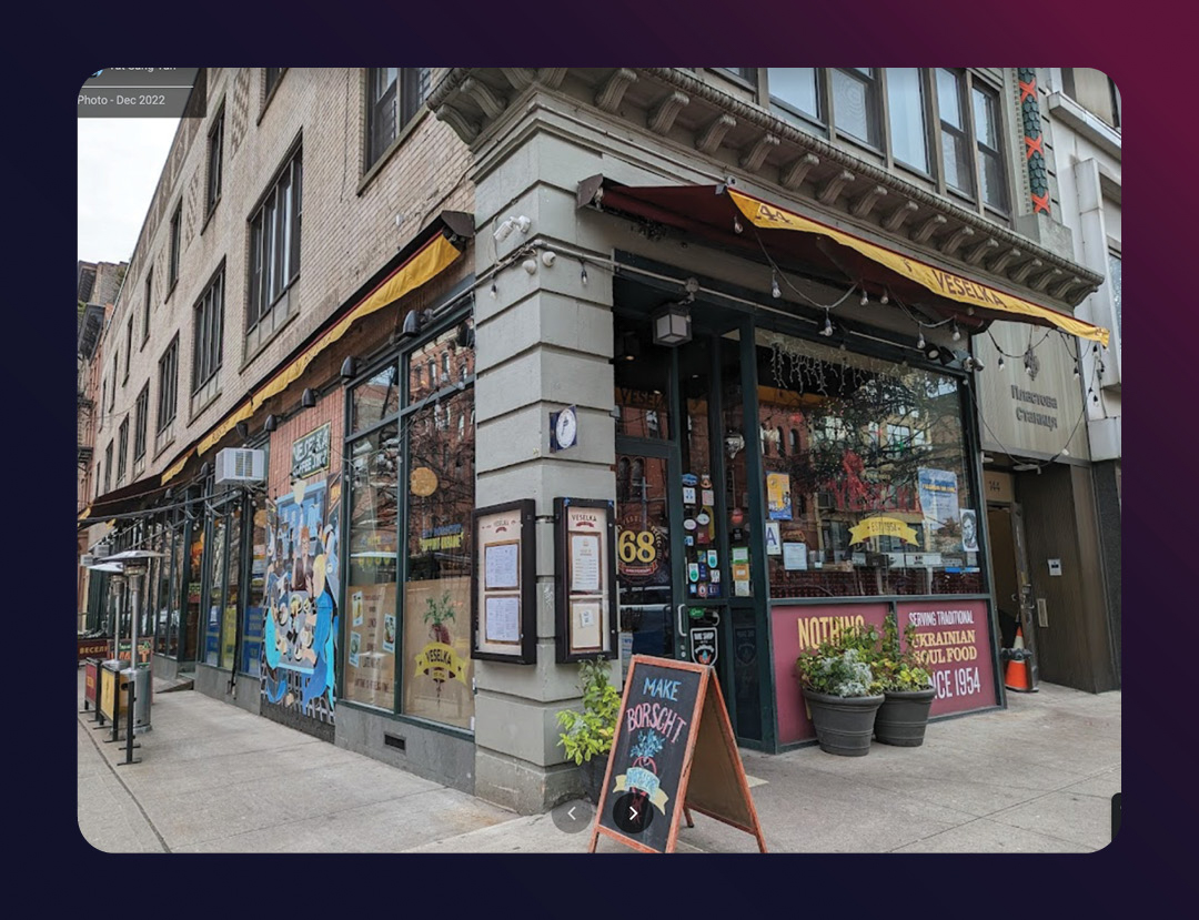
2. Exterior shots
Include some pictures of your storefront, signage, parking and any important views or angles that might be useful to your potential customers.
Include some pictures of your storefront, signage, parking and any important views or angles that might be useful to your potential customers.

3. Interior shots
Include pics of the reception/waiting areas and any key spots inside the business. Make sure these photos look professional and inviting.
You can also add a virtual 360 tour of your entire space, which can help drive engagement and conversions.
Include pics of the reception/waiting areas and any key spots inside the business. Make sure these photos look professional and inviting.
You can also add a virtual 360 tour of your entire space, which can help drive engagement and conversions.

4. Team photos
They say that people don’t buy from companies, they buy from people. Searchers want to see the faces behind the company.
A group photo of the team or some action shots of them working is a great way to show your customers what kind of company you are.
They say that people don’t buy from companies, they buy from people. Searchers want to see the faces behind the company.
A group photo of the team or some action shots of them working is a great way to show your customers what kind of company you are.

5. Services/Products
Demonstrate your service expertise through your photos, and showcase the products that you offer. Make it look good.
Pro tip: Upload your pics to Google’s AI to see if it comes up with any keywords that you are trying to rank for.
Demonstrate your service expertise through your photos, and showcase the products that you offer. Make it look good.
Pro tip: Upload your pics to Google’s AI to see if it comes up with any keywords that you are trying to rank for.

6. Updates by customers
Ask your customers to include a pic in their review. This will:
1. Feed your photo section, driving more engagement
2. Help your good reviews stay on top (according to research by @SterlingSkyInc, reviews with photos tend to stay on top for much longer)
Ask your customers to include a pic in their review. This will:
1. Feed your photo section, driving more engagement
2. Help your good reviews stay on top (according to research by @SterlingSkyInc, reviews with photos tend to stay on top for much longer)

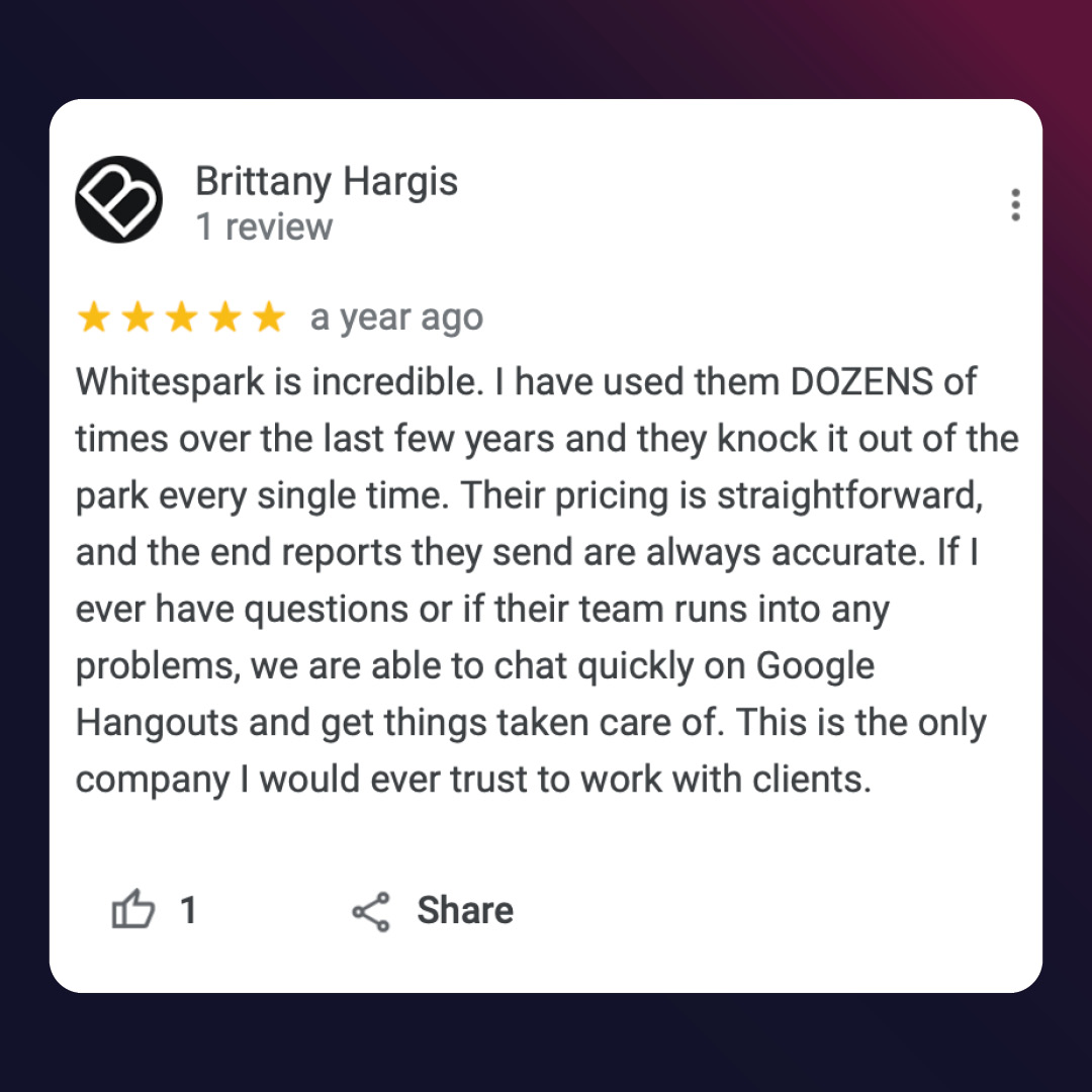
7. Take screenshots of your best reviews and upload them to the Photos section.
This can give visibility to your older glowing reviews, and can keep driving conversions.
This can give visibility to your older glowing reviews, and can keep driving conversions.

What did I miss? What other interesting photo types have you seen businesses add to their Google Business Profile?
• • •
Missing some Tweet in this thread? You can try to
force a refresh


