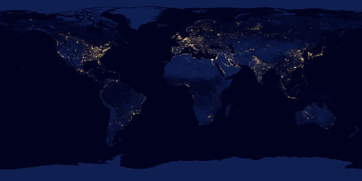
Have LED lights reduced #LightPollution, or have things gotten worse because of blue light emissions? We have the answer, and it's not good news...
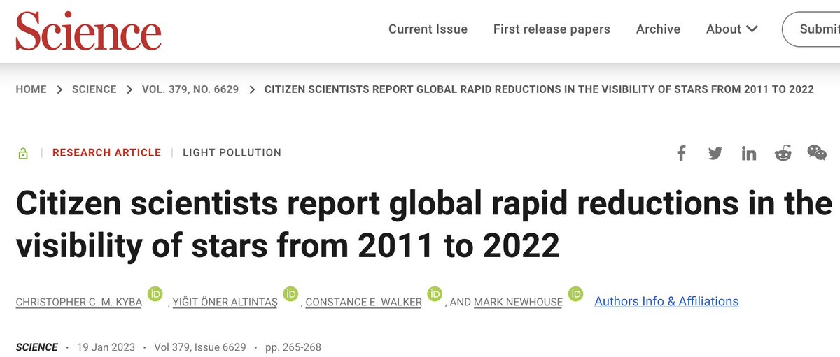
🧵 below, full methodology and results new in @sciencemagazine: science.org/doi/10.1126/sc… #ScienceResearch
(1/)
🧵 below, full methodology and results new in @sciencemagazine: science.org/doi/10.1126/sc… #ScienceResearch
(1/)
Before I tell you what we did, I want you to understand why this is important. Skyglow is a visible symbol of our failure to transition to a sustainable society.
In addition, if skyglow is growing, then all of the ecological impacts of #LightPollution are probably too. (2/)
In addition, if skyglow is growing, then all of the ecological impacts of #LightPollution are probably too. (2/)
So what did we do? It all starts with the #CitizenScience project Globe at Night (GaN), which you've probably seen me boosting before. In GaN, participants select which of a set of star charts most closely matches the sky they see. (3/)

Participants use the GaN webapp (available in dozens of languages!) to also say where they were, the date and time of the observation, and sky conditions. (4/)


The big question - and one of the two reasons it took me ten years to publish this - is what do you do about the fact that the observations aren't in the same place from year to year? Check out ES and PT in different years: (6/)


What I realized is that we could use the World Atlas of @FabioFalchi9 and team as a baseline from which to compare similar places: science.org/doi/10.1126/sc… (7/)

Sure, we might not have observations from the center of Beijing and Paris in every year. But if parts of those places were the same as each other in 2014, then we can test how areas in the same sky brightness "class" are changing. (8/)
Is that really a fair comparison? As it turns out, yes, it is. We've shown in the past that there is a very strong correlation between GaN reports of star visibility and Fabio's map: nature.com/articles/s4155… (9/)

In the graph above, NELM stands for "naked eye limiting magnitude", which is equivalent to a measure of how many stars you can see. Sky brightness here is relative to starlight, so 10 means ten times brighter than starlight. (10/)
Now with the INDIVIDUAL observations it's a different story. There's a wide range of human visual abilities, so not everyone sees the same amount of stars. The key to this working is having A LOT of observations, thanks to regression to the mean. en.wikipedia.org/wiki/Regressio… (11/)
Thankfully, @RLightOrStarlt at @NOIRLabAstro has been attracting citizen scientists to participate around the world, year after year, since 2006 (12/)

That image is from our new Science paper, and shows where and when people have been participating. Europe and North America have well distributed observations in time and space. The rest of the world, unfortunately, has not. (13/)
So what happens if we make a graph like in toot #9 above, but with different years? It looks like this:
(14/)
(14/)

(This is the same as in toot #9, even if the x-axis label looks a bit different. 15/)
What you see is that 2011 and 2021 agree with each other reasonably well when citizen scientists are looking at starlit skies, but they don't agree with each other AT ALL in places that have a lot of #LightPollution. (16/)
So we can see that people are reporting fewer stars every year, but how can we go from that to getting an estimate of how the brightness of the night sky is changing? This is where my former student @yigitoa enters the picture. (17/)
Let's say we assume that the whole world is increasing or decreasing in brightness at the same rate. Then we can easily adjust the World Atlas sky brightness (relative to 2015) for the date when a citizen scientist made their Globe at Night observation. (18/)
The problem is then to figure out what the rate of change is. Yigit and I did this using the "maximum likelihood method". (19/)
The basic idea is that we can estimate the probability a person would pick a certain star chart given where they live and how quickly the sky is brightening. (20/)
If you dress up what I just said in an equation, it looks like this. "P" is how likely one given citizen scientist would say "I pick chart 3" and "L" is how likely the whole dataset would look the way it does if the rate of change in skyglow was "r" (21/)


There are a few other parameters in there, like how often citizen scientists make mistakes (like saying they live in the wrong place), what people are likely to report if there is no #LightPollution in the sky, and how variable one person's rating is from another's. (22/)
We searched through all sorts of different combinations of those parameters to find the one that made L (the likelihood) the biggest. The result? The sky brightness where people who participate in Globe at Night live is increasing at about 10% per year. (23/)
10% per year is a lot. Like, a lot a lot.
That means doubling every 7 years or so.
(24/)
That means doubling every 7 years or so.
(24/)
Let's put it this way: If a baby is born today in a place where her parents can see 250 stars, by the time she is 18 she will only be able to see 100.
The stars are like... (25/)
The stars are like... (25/)
(That's assuming these trends continue... More about that later... 26/)
You might now say "hold up a sec Chris! Back in #21 you tried to scare me with a bunch of letters in italics, but I'm not falling for it. How do I know your fancy pants model actually describes the data?" (27/)
Well, I'm happy to answer that. Because (back in 2019) when I first saw the answer was looking like 10% per year, I got worried. Could I have been doing something wrong?
And I HATE it when scientists present a model but don't show it whether it actually matches the data. (28/)
And I HATE it when scientists present a model but don't show it whether it actually matches the data. (28/)
So for several years, @Helsche and I worked with Connie and @IDADarkSky and to try to boost participation back up to Globe at Night's participation to more like it was in the early years, to make sure this wasn't a systematic effect related to a change in participants. (29/)
(Aside: That led to the #LoveTheStars Valentine's day action darksky.org/love-the-stars…
Take your sweetheart out for some romantic #CitizenScience under the stars this Feb 14!)
(30/)
Take your sweetheart out for some romantic #CitizenScience under the stars this Feb 14!)
(30/)

But the other thing I wanted to do was to prove to you that our model agrees with the data. So here's a way to visualize the data and check the model... (31/)
Let's assume that there is no change in sky brightness. Then we can look at how closely the average Globe at Night observation agrees with what our model predicts the person would say. That looks like this: (32/)

The number of stars people say they see was HIGHER before 2014 (the year the model is based on), and LOWER after 2014.
There hasn't been a month where the mean difference relative to the model prediction has been a whole standard deviation above zero since 2019. (33/)
There hasn't been a month where the mean difference relative to the model prediction has been a whole standard deviation above zero since 2019. (33/)
What about if adjust the model by +9.6% every year relative to 2014? Then the monthly differences look like this. The data at the beginning and end of the time series look like each other, and you see values above and below zero in every year. (34/)

The results aren't being driven by one weird month, or the switch from Globe at Night's original focus on only spring observations to year-round measurements. People are simply reporting fewer stars year after year after year. (35/)
So what can we do about it?
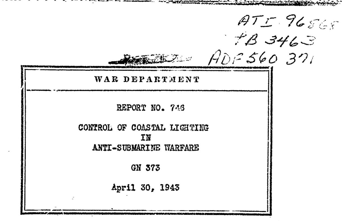
Believe it or not, the US government figured this out already during WWII, when they wanted to stop uboats sinking ships by spotting the dark silhouette of merchant ships against the skyglow of inland cities: apps.dtic.mil/sti/citations/… (36/)
Believe it or not, the US government figured this out already during WWII, when they wanted to stop uboats sinking ships by spotting the dark silhouette of merchant ships against the skyglow of inland cities: apps.dtic.mil/sti/citations/… (36/)
Here are the the 4 simple steps to control #LightPollution.
First: light only WHAT you need.
Don't miss the target and shine light uselessly into the sky.
(or water, or plants, or your neighbor's window, or...). (37/)
First: light only WHAT you need.
Don't miss the target and shine light uselessly into the sky.
(or water, or plants, or your neighbor's window, or...). (37/)

Second, light only WHEN you need.
There's no reason to burn coal to keep your advertising lighting on when all your customers are sleeping.
(Good work @hm, you get a 🌟)
(38/)
There's no reason to burn coal to keep your advertising lighting on when all your customers are sleeping.
(Good work @hm, you get a 🌟)
(38/)

@hm Third, use only the amount of light that's necessary.
If your sign looks like this, you're doing it wrong.
(39/)
If your sign looks like this, you're doing it wrong.
(39/)


@hm Fourth, try to keep the blue content of your light as low as reasonably possible.
Aim for the warm ambiance of candle light, not the sterile cold white of a surgical theater.
(and try to avoid ultraviolet entirely for the 🦋)
(40/)
Aim for the warm ambiance of candle light, not the sterile cold white of a surgical theater.
(and try to avoid ultraviolet entirely for the 🦋)
(40/)


@hm What happens next is up to you. Yes, you.
If we just keep doing what we're doing, things will presumably keep getting worse.
But if we decide "enough is enough", it's possible to turn things around and cut #LightPollution without compromising our quality of life. (41/)
If we just keep doing what we're doing, things will presumably keep getting worse.
But if we decide "enough is enough", it's possible to turn things around and cut #LightPollution without compromising our quality of life. (41/)

@hm If you have a home, make sure your yard lights are well directed and turn off late at night.
If you own a business, make sure your signs and windows are appropriate brightness, and turn them off late at night.
If you see a light that stinks, make a stink about it (42/)
If you own a business, make sure your signs and windows are appropriate brightness, and turn them off late at night.
If you see a light that stinks, make a stink about it (42/)
@hm Don't let your city shine bright blue light into your bedroom window or garden. Call them and get them to install a shield, and complain if you think the lights are too bright. Cities are more responsive to public complaints - at least in the long term - than you might think (43)
I want to wrap up the thread by thanking a few people.
Thanks @GFZ_Potsdam and especially @GuanterLuis for making this all possible with your support. Thanks @helmholtz_en for the ERC Recognition Award. This would not have happened without it. (44/)
Thanks @GFZ_Potsdam and especially @GuanterLuis for making this all possible with your support. Thanks @helmholtz_en for the ERC Recognition Award. This would not have happened without it. (44/)
Thanks @Helsche for your contributions towards this work at various periods over the last 10 years.
Thanks @KlementTockner for your advice over the years, and for your informal peer review of our paper before submission.
(45/)
Thanks @KlementTockner for your advice over the years, and for your informal peer review of our paper before submission.
(45/)
Thanks to a bunch of physicists who commented and criticized parts of this work as it developed over several years. I can't think of everyone, but I can remember talking about it with @andhaenel, @AndreasJechow, @FabioFalchi9, @salvabara, @sjribas, and @costlonne (46/).
Thanks to Anna Wisniewska, who sparked my interest in #CitizenScience during her @EUErasmusPlus visit.
Thanks to @BMBF_Bund, @EU_H2020, and @eraplanetgeo, because parts of this were developed during periods when I was employed thanks to your grants. (47/)
Thanks to @BMBF_Bund, @EU_H2020, and @eraplanetgeo, because parts of this were developed during periods when I was employed thanks to your grants. (47/)
And a final thanks to @RLightOrStarlt for running Globe at Night over all these years, and of course to the tens of thousands of citizen scientists, without whom this publication would never have been possible. (48/)
A last note for the funding agencies who rejected multiple proposals to hire a PhD student to write their thesis on this topic:
I told you it was a good idea...
(49/49)
I told you it was a good idea...
(49/49)


Actually one final, final thank you... Thanks to @DrKeithSmith and the @ScienceMagazine editorial team for your careful editing and criticisms - it was a lot of work to address your points, but it made the paper better, and we appreciate it.
• • •
Missing some Tweet in this thread? You can try to
force a refresh