Real life example of impact from COVID infection and why we need clean air
@ahandvanish taught a grad course on generative music at NYU, works with machine learning, data sonification (auditory equivalent of data visualization), and more ( hannahishere.com/about-me/ ). 🧵1/
@ahandvanish taught a grad course on generative music at NYU, works with machine learning, data sonification (auditory equivalent of data visualization), and more ( hannahishere.com/about-me/ ). 🧵1/

An unrolled one-page web view for this long thread that may be easier to read or share can be found here (
https://twitter.com/jeffgilchrist/status/1617489592642568194). 2/
Hannah Davis was recognized by Time Magazine as one of the 100 rising stars from across industries and around the world for 2022 ( time.com/collection/tim… ). 3.
@ahandvanish was also brave enough to share her real-life experience of COVID infection that drastically impacted her processing speed (
https://twitter.com/ahandvanish/status/1616998955610423296). 4/
She happened to have done some neuro testing just before her COVID infection where she scored being faster than 96% of people. 5/
After her COVID infection, she started having brain issues and decided to redo the test again where she found out her processing speed had dropped from top 96% of people down to only faster than 14% of people. 6/

Hannah explains in her thread how low processing speed affects everything from basic communication with people (talking, texting) not only in how long it takes but how much information you understand about what you are reading/hearing. 7/
This unfortunately makes relationships harder to maintain. She goes on to describe how actions that require you to make fast decisions such as driving are much scarier or often not possible to do at all. 8/
Even common sense decision making is related to processing speed and can be difficult. 9/
Processing speed also impacts memory by limiting how fast you can register memories and emotional awareness in how long it takes to know how you are feeling. Low processing speed ultimately impacts identity in a serious way. 10/
"Processing speed impacts how much you can hold in your head, how you weave the world together and make sense of it, the thoughts that come up when you think about the people, places, ideas that you love. It turns those processes into just a void, a blank wall." 11/
Hannah Davis wants people to understand what can happen after you become infected with COVID and how much #LongCOVID can change you, potentially permanently. This is not just a "mild" virus and should not be treated as such. 12/
Long COVID is not just happening to her or a small number of people, but it is estimated that at least 65 million people worldwide have Long COVID with cases increasing daily. 13/
Hannah Davis and others have put together and published major findings, mechanisms and recommendations on the subject ( nature.com/articles/s4157… ). 14/
This is why it is so important that we improve the infrastructure to provide clean air like we did for water to end the cholera epidemics two centuries ago ( thetyee.ca/Analysis/2023/… ). 15/
Unfortunately we can't easily see how dirty the air is and in many locations including schools and workplaces but if you could see the air in some places, it would look more like the left glass of water compared to the right glass of water (
https://twitter.com/DFisman/status/1616459161931337729). 16/
Would you drink the glass of water on the left? If not, why are you still breathing in dirty air in poorly ventilated indoor spaces? 17/

If spaces are not being regularly tested and monitored, you may have no idea how clean (or not) the air is that you are constantly breathing in or if equipment is actually functioning properly. 18/
For example, look at these two Corsi-Rosenthal (CR) boxes and how dirty the filters got in a school after 7 months despite have windows open 95% of the time and CO2 levels below 1200 ppm (
https://twitter.com/Cyber_Murphy/status/1616481603022163969). 19/

They were still removing that much crap from the air that otherwise would have been breathed in by our children and the teacher. 20/
Do you commute to work using the subway? Check out how dirty the filter on this respirator got (compared to the brand new clean one beside) after a few months taking the subway 2-3 times a week (
https://twitter.com/jasmith_yorku/status/1616814435208761344). 21/

People not wearing a respirator are all breathing this into their lungs every day they commute. 22/
We breathe so much more air (11,000L) than we drink water (4L) or consume food (2L) every day so it is even more important that we ensure we are breathing in clean air ( nasa.gov/mission_pages/… ). 23/
This image really helps you understand the relative difference in the amount (
https://twitter.com/akm5376/status/1616494710784397314). 24/

Did you know if you measure the amount of CO2 in an indoor space you can actually calculate how much of other people's exhaled breath you are breathing in? This handy calculate will help you ( docs.google.com/spreadsheets/d… ). 25/
I have seen some school classrooms measure higher than 3,000 ppm of CO2 which means all of those children are breathing in 28.3 liters of other people's breath every hour! 26/
Can you imagine yourself or your child breathing in the equivalent of 14 bottles of pop full of other people's air backwash every hour? 27/

If you think it too hard to upgrade the infrastructure in current schools and buildings, Engineers are up for the challenge. They raised entire cities (Chicago, Seattle) almost 175 years ago to combat harmful pathogens (
https://twitter.com/jeffgilchrist/status/1607380009760555010). 28/
Would improving ventilation actually help? A study in Italy actually found classrooms equipped with mechanical ventilation systems decreased the relative risk of COVID infection by at least 74% compared to classrooms with only natural ventilation ( frontiersin.org/articles/10.33… ). 29/

For classrooms that were able to obtain higher than ventilation rates greater than 10L per second per student, risk of infection decreased even further to at least 80% lower. 30/
Cleaner air not only reduces the risk from COVID infection but all other viruses that transmit in aerosols through the air like influenza and other respiratory viruses. Click "Show replies" 👇 to continue. 31/
This is important as there have also been links found with other viruses that significantly increased the risk of neurodegenerative disease ( cell.com/neuron/fulltex… ). H/T: @DFisman 32/

Even influenza with pneumonia was significantly associated with five of the six neurodegenerative diseases studied and some exposures were associated with an increased risk of neurodegeneration up to 15 years after infection. 33/
Are you sure you want to keep getting infected by multiple viruses each year if you don't have to? 34/
Remember, as we saw above, clean indoor air isn't just about COVID, but it can help protect against other pathogens and air pollutants linked to various health problems which you can learn more about here (
https://twitter.com/jeffgilchrist/status/1607379781892575234). 35/
Ventilation is also important when cooking as harmful particulate matter (PM) particles can be generated and breathed in so please remember to turn on your kitchen fan when cooking if you have one. 36/
I was able to measure PM2.5 particle levels were 10x higher when I was frying vegetables on my induction stove with the range hood fan turned off using a CO2.click Model E IAQ monitor that was 7.6m (25 feet) away in our family room ( co2.click/ecommerce/en/M… ). 37/

If you don't have a hood fan, a HEPA filter or Corsi-Rosenthal (CR) box may help reduce PM in your kitchen as well. You can learn how to build your own CR box here (
https://twitter.com/jeffgilchrist/status/1607380021143797765). 38/
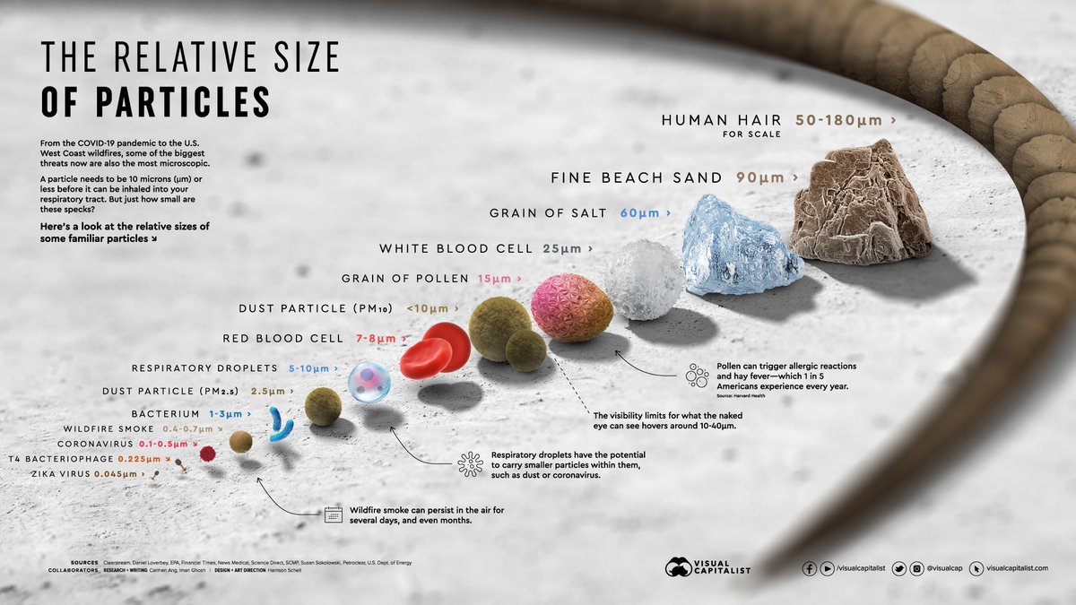
If you aren't sure how the filters in air cleaners or masks actually block viruses and other particles that are much smaller than the sizes of the holes in the filtering material, this thread explains *how* they do that (
https://twitter.com/jeffgilchrist/status/1602994049815908353). 39/
If you want to read about another real-world example of the impact of COVID infection but this time from cardiovascular complications you can find that here (
https://twitter.com/jeffgilchrist/status/1586043132134576128). 40/
The wealthy also believe it is important to clean the air of indoor spaces as they went out of their way to do for the recent WEF conference in Davos, Switzerland. The conference space before was not good enough so they upgraded it to be #DavosSafe (
https://twitter.com/jeffgilchrist/status/1618223851212767232).41/
A real-world example of a young woman 28 years old disabled from the pandemic, infected in March 2020 before the vaccines were available with only a mild illness at first but then she never got better ( thetyee.ca/Analysis/2023/… ). 42/
• • •
Missing some Tweet in this thread? You can try to
force a refresh