
Inspired by the debate between @nfergus and @adam_tooze on the current state of globalisation, I devoted my lecture at Columbia this week to take the pulse on global value chains:
"Global value chains under the shadow of Covid"
bis.org/speeches/sp230…
"Global value chains under the shadow of Covid"
bis.org/speeches/sp230…

First, some background to set the scene
Real exports have grown but so has real GDP; we need to scale trade by the size of the economy, taking account of the different price indices (exports are goods heavy, GDP is services heavy as @BaldwinRE has argued eloquently)
Real exports have grown but so has real GDP; we need to scale trade by the size of the economy, taking account of the different price indices (exports are goods heavy, GDP is services heavy as @BaldwinRE has argued eloquently)

The ratio of global real exports to global real GDP looks like this
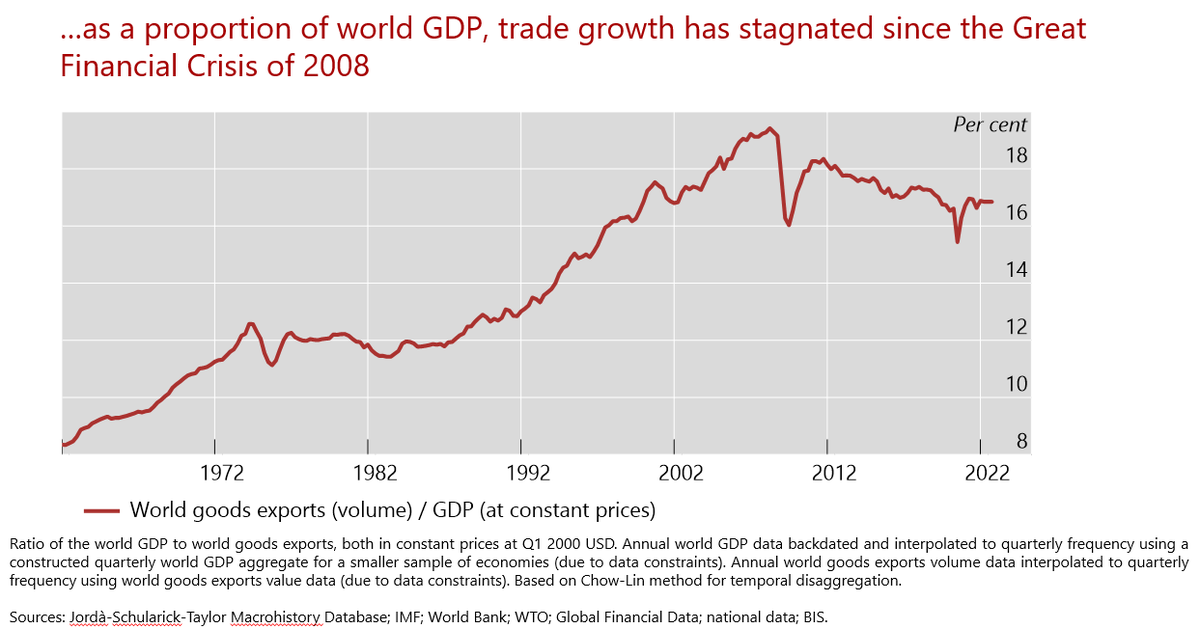
The period of financial exuberance leading up to the GFC also marked peak globalisation of trade; trade is stagnated since
My lecture was about why this is not just a coincidence
My lecture was about why this is not just a coincidence
In fact, the series that most resembles the turning point and stagnation of the exports to GDP series is the BIS global cross-border banking activity chart

Why might this be the case?
The answer lies in the role of global value chains and how they powered the surge in manufactured goods trade; see how everything else pales by comparison
And the surge in manufacturing goods trade peaked just before the GFC
The answer lies in the role of global value chains and how they powered the surge in manufactured goods trade; see how everything else pales by comparison
And the surge in manufacturing goods trade peaked just before the GFC

Supply chains are highly finance-intensive and need working capital to bridge the timing gap between incurring costs and receiving cash flows
A typical manufacturing firm has working capital (inventories and receivables) of 35 - 50% of total assets
A typical manufacturing firm has working capital (inventories and receivables) of 35 - 50% of total assets

Too often, we treat inventories as "buffer stock" to smooth production; the truth is that firms *invest* in inventories to build elaborate supply chains

There is a larger point here that @adam_tooze has done more than most to call out
We are accustomed to viewing the global economy as a collection of islands each representing an economy defined by its GDP area, but this turns out to be highly misleading
adamtooze.com/2018/07/05/fra…
We are accustomed to viewing the global economy as a collection of islands each representing an economy defined by its GDP area, but this turns out to be highly misleading
adamtooze.com/2018/07/05/fra…

But in the age of global value chains (GVCs), it's better to view the world economy as a highly developed network of interconnected balance sheets (each dot below is a firm, each edge is receivable-payable link)
So, GVCs form networks of balance sheets across *countries*, and...
So, GVCs form networks of balance sheets across *countries*, and...

GVCs form networks of interconnected balance sheets across *industries*
The dots below are identical to the ones below, but coloured according to the industry sector of the report firm (you can pick out the large dots by cross-referencing the country and sector)
The dots below are identical to the ones below, but coloured according to the industry sector of the report firm (you can pick out the large dots by cross-referencing the country and sector)

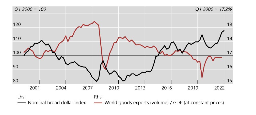
Back to the trade-to-GDP ratio
Zooming into the green rectangle, we can take a closer look at what forces are at play
Zooming into the green rectangle, we can take a closer look at what forces are at play

The broad dollar index turns out to be a good barometer of financial conditions for the fluctuations GVC activity; a strong dollar goes hand-in-hand with tighter financial conditions that dampens supply chain activity
bis.org/publ/work819.h…
bis.org/publ/work819.h…
The timely nature of Korean exports data gives us good insights on the latest state of Korean exports, still feeling the effects of the strong dollar last autumn
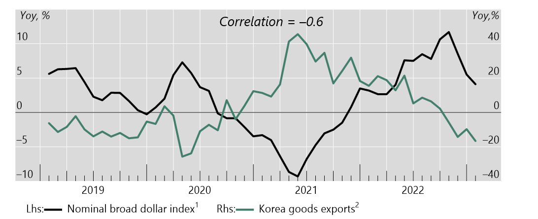
Those accustomed to the "island economy model" will find this chart strange; a weaker currency seems to depress exports
To make sense of it, we need a shift in perspectives to that of the "network of interconnected balance sheets"
If any country fits that model, it's Korea
To make sense of it, we need a shift in perspectives to that of the "network of interconnected balance sheets"
If any country fits that model, it's Korea

Just to reinforce the point, notice how the peak in Korean export growth comes in the summer of 2021
This was when financial conditions were very accommodative, even though supply chain bottlenecks were at their worst; financial conditions won out in that battle
This was when financial conditions were very accommodative, even though supply chain bottlenecks were at their worst; financial conditions won out in that battle

So, what lies ahead?
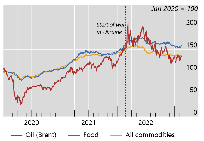
Commodity prices have moderated after spiking in the immediate aftermath of the Russian invasion of Ukraine; this puts fair wind behind further inflation moderation, although it may take some time
Commodity prices have moderated after spiking in the immediate aftermath of the Russian invasion of Ukraine; this puts fair wind behind further inflation moderation, although it may take some time
And notwithstanding the firming of the dollar in the last couple of weeks, it has moderated since last autumn

I talked to @tracyalloway and @TheStalwart on their OddLots podcast about the dollar
bloomberg.com/news/articles/…
bloomberg.com/news/articles/…
Here is the transcript
bis.org/speeches/sp221…
bis.org/speeches/sp221…
Some of your are asking for a written text
This (pre-Covid) piece from 2019 has the key elements; re-reading it, the argument has held up pretty well, even for the Covid period
bis.org/speeches/sp190…
This (pre-Covid) piece from 2019 has the key elements; re-reading it, the argument has held up pretty well, even for the Covid period
bis.org/speeches/sp190…
And this paper with Se-Jik Kim gives a more formal treatment of the subject in the general context of supply chains (whether domestic or global)
bis.org/publ/work1070.…
bis.org/publ/work1070.…

• • •
Missing some Tweet in this thread? You can try to
force a refresh


