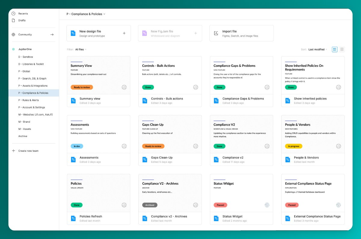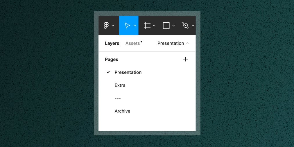
Feeling like your @figma account could use some tidying? I know, I've been there.
Here are the 8 steps I follow to build a file thumbnail component that's minimal, consistent, and scales:
Here are the 8 steps I follow to build a file thumbnail component that's minimal, consistent, and scales:

1. Make a Frame that's the right size (1600x960 suggested)
Name it 'File Thumbnail'
Name it 'File Thumbnail'
2. Match the Frame background color to the theme you prefer
(use color #FFFFFF for light, #2C2C2C for dark)
(use color #FFFFFF for light, #2C2C2C for dark)
4. Add the file name & details (your styles may vary)
<hr> 8px height, brand color fill, border-radius (optional)
<file name> 80px font size
<type of work> 48px, semibold, uppercase
<description> 48px, regular
Wrap in Autolayout Frame, packed, vertical, 40px spacing
<hr> 8px height, brand color fill, border-radius (optional)
<file name> 80px font size
<type of work> 48px, semibold, uppercase
<description> 48px, regular
Wrap in Autolayout Frame, packed, vertical, 40px spacing
If light theme, use dark grey text.
If dark theme, use white text.
The three text layers should 'fill container' horizontally and 'hug' vertically.
If dark theme, use white text.
The three text layers should 'fill container' horizontally and 'hug' vertically.
5. Status & Logo
<status> Use an instance of a separate 'Status' component for design files.
<logo> Your company's logo in a color that's low contrast to the background.
Wrap in Autolayout Frame, space-between, horizontal
<status> Use an instance of a separate 'Status' component for design files.
<logo> Your company's logo in a color that's low contrast to the background.
Wrap in Autolayout Frame, space-between, horizontal
6. Set your two content containers to be the right width (1400px suggested) and center them in the parent Frame
7. Make 'File Thumbnail' a component
Make this a component and publish it from a Library file in your account. Using instances from a library component is key to the long-term consistency and scalability of this pattern.
Make this a component and publish it from a Library file in your account. Using instances from a library component is key to the long-term consistency and scalability of this pattern.
8. Set as thumbnail
Wrap the instance of your File Thumbnail component in a Frame and set that as the thumbnail.
(This is required, you can't set a component instance as a thumbnail, only Frames).
Wrap the instance of your File Thumbnail component in a Frame and set that as the thumbnail.
(This is required, you can't set a component instance as a thumbnail, only Frames).
And voila! Lather, rinse repeat until your files are all looking super sharp, clear, and consistent across the board.
@figma If you got some value from this thread, you might also enjoy Better by Design, which is my newsletter devoted to helping you find the sweet spot between art, commerce, and technology. Come join 1000+ other creative pros working to improve their skills!
betterbydesign.cc
betterbydesign.cc
• • •
Missing some Tweet in this thread? You can try to
force a refresh


