I've been compiling some notes on #StarTrek fonts with an eye to maybe putting together a definitive list on a webpage or something. IDK.
Then I thought, in the meantime why not make it into a thread? So that's the fascinating backstory to this thread! 🧵 [001/???]
Then I thought, in the meantime why not make it into a thread? So that's the fascinating backstory to this thread! 🧵 [001/???]
The classic STAR TREK lettering was designed by the legendary Richard Edlund and was later digitised by Bitstream for a Star Trek font pack released in 1992. Originally the font was simply titled ‘Star Trek’, it has since been renamed to HORIZON. 


REFERENCES: This 2016 Yves Peters article is an essential read on the history of Trek fonts up to DIS S1. I won’t repeat a lot of what is covered there. Also, for this thread I’m only concerning myself with main typefaces.
fontshop.com/content/the-ty…
fontshop.com/content/the-ty…
Another key reference is of course Dave Addey’s ‘Typeset in the Future’ blog (and book) which dive into many of the more obscure typefaces seen onscreen.
typesetinthefuture.com/2020/08/17/sta…
typesetinthefuture.com/2020/08/17/sta…
THE MOTION PICTURE (1979) introduced the next most iconic Star Trek font. Created by Richard A. Foy it was also later digitised as ‘Star Trek Film’ by Bitstream and is now known as GALAXY.


In fact Richard A. Foy was later issued a patent for his ‘calligraphic font design’, one of many granted for designs used in TMP.


This new typeface would be used consistently for the marketing materials and onscreen title cards of all the original series Trek films, with the notable exception of ‘The Wrath of Khan’ which opted for URW CORPORATE for its onscreen title.


In fact, I don’t believe URW Corporate was used again in an official Star Trek show until Lower Decks used it for its ‘Crisis Point 2: Paradoxus’ holodeck episode. Of course, it is currently featuring heavily in Picard season 3.

BTW, corrections are very welcome, especially if you can support them. Any information you don't think I'm likely to be aware of would be appreciated too. It's half the reason I'm making this thread. 👍
The Galaxy font was modelled quite closely on the original TMP lettering, but the lettering used in the films themselves would continue to evolve and be used in various weights. Like the letter 'E' for example.


'The Undiscovered Country' also used ITC BOLT for the subtitle on its poster.


In 1987 ‘The Next Generation’ boldly introduced a new logo. The digital font was published in 1994 by Bitstream as SONIC, but I haven’t been able to find any information on its origins yet. Who designed it and was it based on the TNG logo or vice versa?


The other prominent TNG title font is CRILLEE. I wrote another thread about its (mis)use on Lower Decks…
https://twitter.com/StarfleetDesign/status/1570012592642424835
Deep Space Nine and Voyager made a welcome return to the movie-era style of lettering. I think these remain two of the nicest series logos in the franchise, but I don’t have much else to say about them. 🤷♂️


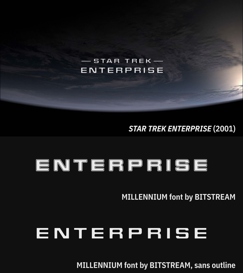
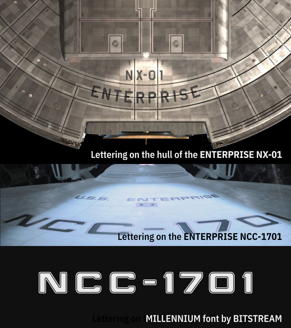
ENTERPRISE opted to modify a font from the Star Trek Font Pack, originally titled 'Starfleet Bold Extended', but later sold as 'MILLENNIUM'.
Somewhat ironically, the Enterprise NX-01 herself did not use the style of lettering that this font was derived from.
Somewhat ironically, the Enterprise NX-01 herself did not use the style of lettering that this font was derived from.
Onto the Next Gen movies and for a while the franchise was in danger of maintaining a consistent - albeit somewhat bland - identity for the films. SERPENTINE and UNIVERS ULTRA CONDENSED were used on the posters while ITC BENGUIAT was appeared onscreen.


Then things rather go from bad to worse over the next two films. I haven't yet identified one of the fonts used in the 'Insurrection' opening title or the 'Nemesis' poster font, but the rest are named in the next tweet…


I believe the font used for the word 'INSURRECTION' in the opening title 👆 might be another variant of Univers Condensed, but I haven't made a 100% match.
And honestly, I just haven't bothered looking for the Nemesis poster font yet. 😄
And honestly, I just haven't bothered looking for the Nemesis poster font yet. 😄


Initial teaser posters for STAR TREK (2009) used a subtly modified version of the classic TOS logotype. Later posters and the film itself used the HORIZON font, entirely unmodified so far as I can tell.


HORIZON would continue to be used for the sequels, with some curious little modifications made to the ‘Into Darkness’ opening title.


In 2017 Star Trek returned to television with ‘Discovery’, which introduced a completely new logo style based on the font REDRAIL SUPERFAST by astroluxtype.


For its third season, Discovery rebranded with an elegant new logotype based on a lightly modified FF QTYPE by FontFont. This font had been seen much earlier in the series however, on the famous DISCO tees the crew can sometimes be seen wearing.


‘Picard’ was next, using DIN CONDENSED for its main logo, with the Starlet delta standing in for the ‘A’.
The classic Star Trek logo was back for marketing materials, but the show would use the Discovery lettering onscreen until season 3.
The classic Star Trek logo was back for marketing materials, but the show would use the Discovery lettering onscreen until season 3.


Oh, I did mean to include 'Short Treks' earlier. Not much to add here; obviously it's using the early Discovery lettering. Modified REDRAIL SUPERFAST.

Both ‘Lower Decks’ and ‘Prodigy’ use custom-made lettering for their logos. The Lower Decks logotype was designed by that show’s animation studio, Titmouse.
The typeface used for the credits in Prodigy is GOOD TIMES by Typodermic.
The typeface used for the credits in Prodigy is GOOD TIMES by Typodermic.


‘Strange New Worlds’ brings us full circle by using HORIZON, modified to be slightly condensed.
In this final graphic I’ve highlighted some of the most prominent differences between the 60s #StarTrek logo and the one currently in use across the franchise.
In this final graphic I’ve highlighted some of the most prominent differences between the 60s #StarTrek logo and the one currently in use across the franchise.


ADDENDA:
I still haven't found the Nemesis poster font. Could be an original creation? Yves Peters suggests it may be heavily modified Handel Gothic. I guess?
I mistakenly identified the Picard end titles font as Corporate. It's clearly not. Maybe a modified Microgramma?
I still haven't found the Nemesis poster font. Could be an original creation? Yves Peters suggests it may be heavily modified Handel Gothic. I guess?
I mistakenly identified the Picard end titles font as Corporate. It's clearly not. Maybe a modified Microgramma?

I also mistakenly named the Generations and First Contact poster fonts by omitting the word 'thin'. They use UNIVERS THIN ULTRA CONDENSED.
It is likely that Insurrection uses UNIVERS ULTRA CONDENSED in its title card, just a different version than mine.
It is likely that Insurrection uses UNIVERS ULTRA CONDENSED in its title card, just a different version than mine.

In summary…

• • •
Missing some Tweet in this thread? You can try to
force a refresh