Hey, so if you're an econ instructor teaching macro this semester, I've got something for you.
I'm sharing an up-to-date slide deck that describes our recent inflationary experience using the conceptual frameworks that we teach our students:
users.nber.org/~jwolfers/teac… #TeachEcon
I'm sharing an up-to-date slide deck that describes our recent inflationary experience using the conceptual frameworks that we teach our students:
users.nber.org/~jwolfers/teac… #TeachEcon
None of us know (yet!) where inflation is going—hence the title: "Is it a spike or is it a surge?"
These slides show students how economists assess things in real time.
And they illustrate there can be (good faith!) debate as our early conclusions are necessarily tentative.
These slides show students how economists assess things in real time.
And they illustrate there can be (good faith!) debate as our early conclusions are necessarily tentative.
The slides aren't designed to only work with the Stevenson and Wolfers textbook -- and I hope others will find them useful. That said, they'll give you a sense of just how much progress a freshman reading our textbook can make, and how prepared they are for big macro debates.
I've designed these slides to be largely self-explanatory, so you might get a sense of where I think inflation is at, what the unknowns are, and some of the contours of the debate if I simply tweet through the slide deck.
So let's start with macro context.
So let's start with macro context.

It's not just headline inflation that has risen: Most measures of inflation tell a similar (albeit less dramatic) story.
[Also, this is a useful moment to remind students why different measures matter, and what they tell us]
[Also, this is a useful moment to remind students why different measures matter, and what they tell us]

Here's a modern Phillips Curve framework -- simplified for Econ 101! -- that we can use to interpret what's happening.
This framework lays out a useful agenda: We'll dig into:
1. Inflation expectations
2. Demand shocks; and
3. Supply shocks.
This framework lays out a useful agenda: We'll dig into:
1. Inflation expectations
2. Demand shocks; and
3. Supply shocks.

Let's start with inflation expectations.
Here's why we care: Inflation expectations can be self-fulfilling. We want the virtuous cycle of low inflation expectations begetting low inflation, rather than the vicious cycle of higher expectations creating inflation (as in the 1970s)
Here's why we care: Inflation expectations can be self-fulfilling. We want the virtuous cycle of low inflation expectations begetting low inflation, rather than the vicious cycle of higher expectations creating inflation (as in the 1970s)

So what do actual data on inflation expectations reveal?
Good news: Inflation expectations haven't risen as much as inflation.
Mixed news: Different measures are more v. less reassuring, and we aren't really sure whose expectations matter, or which horizon to focus on.
Good news: Inflation expectations haven't risen as much as inflation.
Mixed news: Different measures are more v. less reassuring, and we aren't really sure whose expectations matter, or which horizon to focus on.

Perhaps theory can help us figure out what's going on with inflation expectations.
Maybe. Depends a bit on how confident you are in your preferred theory. (I'm not confident.)
Maybe. Depends a bit on how confident you are in your preferred theory. (I'm not confident.)

Okay, this is a whirlwind tour, and we're done with inflation expectations.
Let's turn to demand shocks.
Strap in, there's a lot here, and a lot to debate.
(Trigger warning: Economists aren't sure how much excess capacity the economy has.)
Let's turn to demand shocks.
Strap in, there's a lot here, and a lot to debate.
(Trigger warning: Economists aren't sure how much excess capacity the economy has.)

Here's the theory: It's classic Phillips Curve stuff. If we're producing more than our capacity, inflation will rise, and if we're producing less, it'll fall.
So where's the economy relative to its productive capacity?
Spoiler: It depends on which data you find most compelling.
So where's the economy relative to its productive capacity?
Spoiler: It depends on which data you find most compelling.

If you focus on the output gap, well, the CBO esitmates that actual output is pretty close to potential output. We're neither running too hot, nor too cold. Goldilocks loves this porridge.

But if you focus on unemployment, well, the unemployment is at a fifty year low. And it's well below CBO's estimate of the equilibrium rate.
If you had asked most economists a few years back whether 3.4% would be sustainable, most would have said no, that porridge is too hot.
If you had asked most economists a few years back whether 3.4% would be sustainable, most would have said no, that porridge is too hot.

Remember that we're emerging from a global pandemic. It's taking a while for life to get back to normal.
Maybe we should focus on a measure less distorted by participation decisions. Focus on employment instead. It remains below pre-pandemic trends. That porridge looks too cold
Maybe we should focus on a measure less distorted by participation decisions. Focus on employment instead. It remains below pre-pandemic trends. That porridge looks too cold

Time for your favorite joke about the two-handed economist, but add a third hand, because depending on which indicators you look at, the economy is either too hot, too cold, or just right.
There's a meta lesson here: The actual economy is harder to read than our textbooks let on
There's a meta lesson here: The actual economy is harder to read than our textbooks let on

Our usual Phillips Curve story is about the economy as a whole. But this pandemic presented a new source of bottlenecks: The big pivot from services → goods → services.

The magnitude of this sectoral shock shouldn't be understated. I don't care how old you are, it's the biggest sectoral shock you've seen in your lifetime.
It's worth thinking about the extent to which it's part of the story, and what that means as that shock recedes.
It's worth thinking about the extent to which it's part of the story, and what that means as that shock recedes.

This is the Peloton economy.
Inflation spiked in the goods sector as we all bought Pelotons. Then everyone stopped and the price of Pelotons fell. Now we're returning to the gym, and gyms are getting crowded and prices are rising.
Today the Fed is focused on services inflation.
Inflation spiked in the goods sector as we all bought Pelotons. Then everyone stopped and the price of Pelotons fell. Now we're returning to the gym, and gyms are getting crowded and prices are rising.
Today the Fed is focused on services inflation.

If you think the demand side is murky, just wait. Next stop is the supply side of the economy.
It's clear that supply shocks have raised inflation, but how much of the story do they account for?
It matters, because policy should respond differently to supply than demand shocks.
It's clear that supply shocks have raised inflation, but how much of the story do they account for?
It matters, because policy should respond differently to supply than demand shocks.
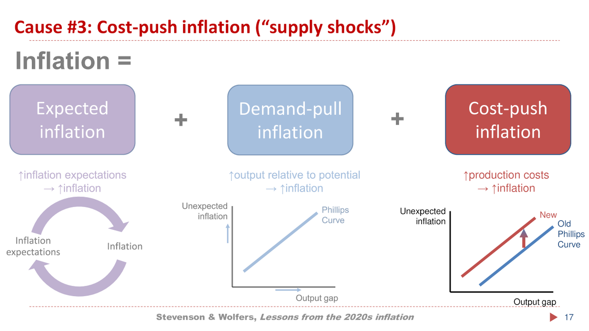
Lemme start with the basic theory: Shocks which raise production costs lead to rising prices, shifting the Phillips Curve up. This is how a shock (like a pandemic, a war, etc) can create both inflation and unemployment.

The shutdowns and mayhem of 2020 didn't cause inflation (or disinflation). Why?
One answer is that it hurt actual (demand) and potential output (supply) in roughly equal measure. The demand shock of no-one visiting stores has little effect when the stores were closed anyway.
One answer is that it hurt actual (demand) and potential output (supply) in roughly equal measure. The demand shock of no-one visiting stores has little effect when the stores were closed anyway.

The next supply shock: Supply chain disruptions caused chaos around the world, as shipping costs soared, chip production disappointed and coordination problems emerged as one never knew which suppliers would lockdown next.
Good news: Those disruptions are dissipating quickly.
Good news: Those disruptions are dissipating quickly.

Next supply shock: Putin. He's an asshole. Invading Ukraine was bad for the world, but also bad for global energy markets.
Fortunately high energy prices have fallen recently. Even if energy remains expensive, if energy prices aren't rising, they're not contributing to inflation
Fortunately high energy prices have fallen recently. Even if energy remains expensive, if energy prices aren't rising, they're not contributing to inflation

Final supply shock: There's a lotta fears of a wage-price spiral. You can see from the 1970s why we worry. You can also see from our recent data that it doesn't look like we're in one yet.
But my friend @jasonfurman rightly warns of wage-price persistence wsj.com/articles/fed-t…
But my friend @jasonfurman rightly warns of wage-price persistence wsj.com/articles/fed-t…

Lemme add one more possibility (tying into all the focus on measurement in Econ 101): The pandemic utterly scrambled economic measurement. Too many numbers can be misinterpreted in a pandemic.
So let's dig into a lesson our students should internalize: Take measurement seriously
So let's dig into a lesson our students should internalize: Take measurement seriously

There are a bunch of biases in how we measure inflation. We teach our students that in normal times this leads the official stats to overstate how fast the cost of living is rising.

But work through the logic of these biases and you'll discover that a sudden shutdown lead these biases to work in the opposite direction.
There were constant stockouts, fewer varieties available, lower quality (remote) services, the cost of switching to delivery, and so on.
There were constant stockouts, fewer varieties available, lower quality (remote) services, the cost of switching to delivery, and so on.

This leads me to tell a different story about this inflationary episode. Perhaps "true" inflation started rising in 2020 but wasn't reflected in the stats. And maybe "true" inflation was overstated through 2021 as these biases unwound.
(This is likely no longer an issue in 2023)
(This is likely no longer an issue in 2023)

Okay, that's the tour of where we've been, using the framework you might learn in my class (or my textbook!)
My goal with these slides is to bring textbook lessons to life, showing students that *THEY* can use these frameworks to interpret the policy debate & forecast inflation.
My goal with these slides is to bring textbook lessons to life, showing students that *THEY* can use these frameworks to interpret the policy debate & forecast inflation.

Importantly these frameworks link very naturally to the ongoing debates that students read about in the media and policymakers continue to debate.
Here's how I would teach Team Transitory v. Team Persistent as reflecting genuine disagreement over the drivers of inflation.
Here's how I would teach Team Transitory v. Team Persistent as reflecting genuine disagreement over the drivers of inflation.

Lemme add a big meta-lesson here: There is respectful and sincere disagreement about what's going on with inflation and how to deal with it. We see that on #EconTwitter all the time. I want to model this for our students: We're sincere nerds, engaged in a search for truth.
So, where are? Let's ask the experts.
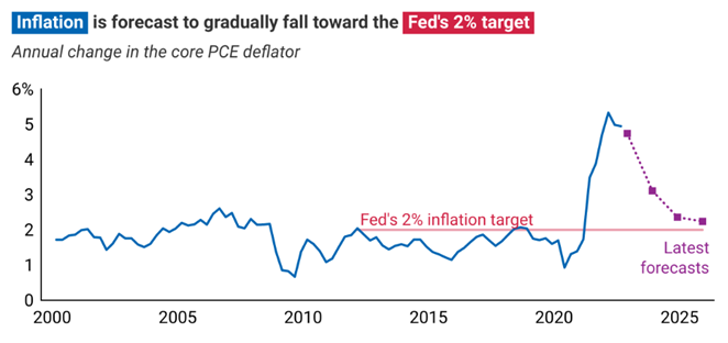
The latest (tho dated) set of Fed projections show inflation returning to 3-point-something soon & then slowly dropping toward its 2% target. Wall Street agrees.
These numbers are more comforting than a lotta hysterical media commentary.
The latest (tho dated) set of Fed projections show inflation returning to 3-point-something soon & then slowly dropping toward its 2% target. Wall Street agrees.
These numbers are more comforting than a lotta hysterical media commentary.

How do we interpret the Fed's optimism that inflation is on the way back down?
Lemme canvas three possibilities.
Possibility #1: The Fed believes the inflationary shock was transitory (though it won't use the 't' word since it became politically toxic).
Lemme canvas three possibilities.
Possibility #1: The Fed believes the inflationary shock was transitory (though it won't use the 't' word since it became politically toxic).
Possibility #2: Inflation will decline not because it was transitory, but because the Fed has raised rates sharply to fight inflation.
Open questions:
- In real terms how much has it raised rates?
- How quickly should this effect become evident?
Open questions:
- In real terms how much has it raised rates?
- How quickly should this effect become evident?

Possibility #3: The Fed has forecast inflation to return to target because that's what it always does. The Fed has been consistently wrong about the future of inflation, and so perhaps we shouldn't feel reassured by the Fed's confidence/hope that inflation is on the way down.

That's all I've got.
I think it's honest to end this by saying no-one has all the answers.
But I hope that I've showed how our frameworks can help you organize your thoughts even if actual economies remain mysterious. Hopefully this empowers your students to join the debate.
I think it's honest to end this by saying no-one has all the answers.
But I hope that I've showed how our frameworks can help you organize your thoughts even if actual economies remain mysterious. Hopefully this empowers your students to join the debate.
I'm sure that I didn't answer all your questions, or address every theory out there (my lefty friends probably want more on corporate profiteering; my more conservative mates want me to talk more about money). Any attempt to distil the key points of an issue must leave stuff out.
• • •
Missing some Tweet in this thread? You can try to
force a refresh