Tweetorial time! We @RecursionPharma mapped consequences of #CRISPR screening of >17K human genes, found a systematic bias confounding all CRISPR screens, traced its molecular cause, and propose a debiasing algorithm. 

“But Imran,” you say, “I’d rather read your thrilling 41-page manuscript than read tweet threads!”
I can’t blame you, it’s great! (I may be a biased source.) Here ya go: biorxiv.org/content/10.110…
I can’t blame you, it’s great! (I may be a biased source.) Here ya go: biorxiv.org/content/10.110…
In this first tweetorial, I’ll share some of the foundations of the similarity-based “maps” we build @RecursionPharma as background for what we found out about CRISPR by building a map over the whole genome.
We use CRISPR to knock out individual genes and measure the consequences by “phenomics”: imaging analysis of cellular morphology and intracellular organization.
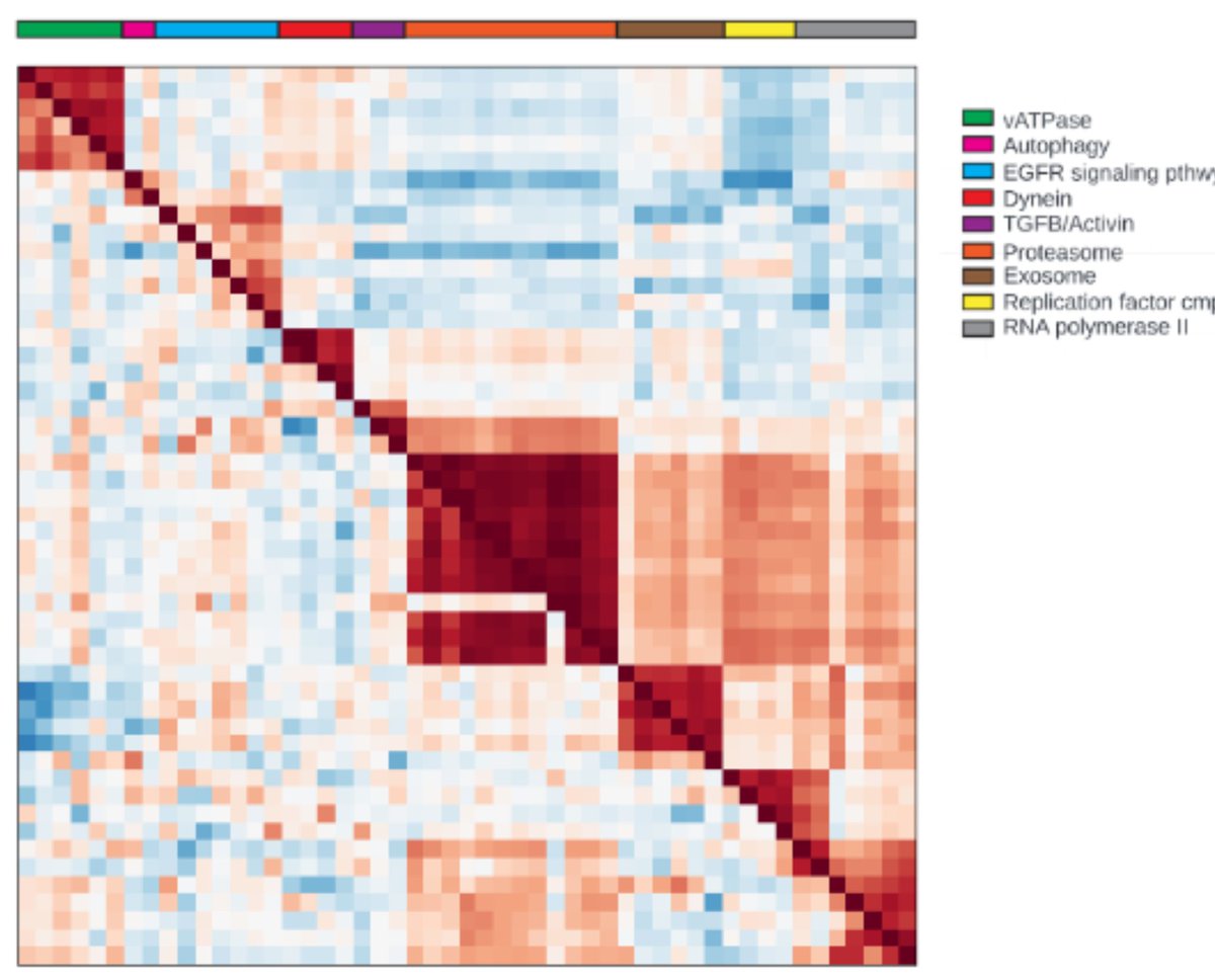
This “maps” biology: knockouts of related genes produce similar phenotypic consequences!
This “maps” biology: knockouts of related genes produce similar phenotypic consequences!
Here you see a similarity map of ~50 KOs of genes in conserved pathways, showing that related genes cluster with each other. This works for a lot of therapeutically interesting pathways, and we can do it not just for KOs but also for chemical treatments for drug discovery. 


To use maps for drug discovery, you may start with a single gene, and then ask the map which other genes (or compounds) look similar to identify interesting starting points or targets. You would like similarities to be biologically meaningful, and that’s what we see above.
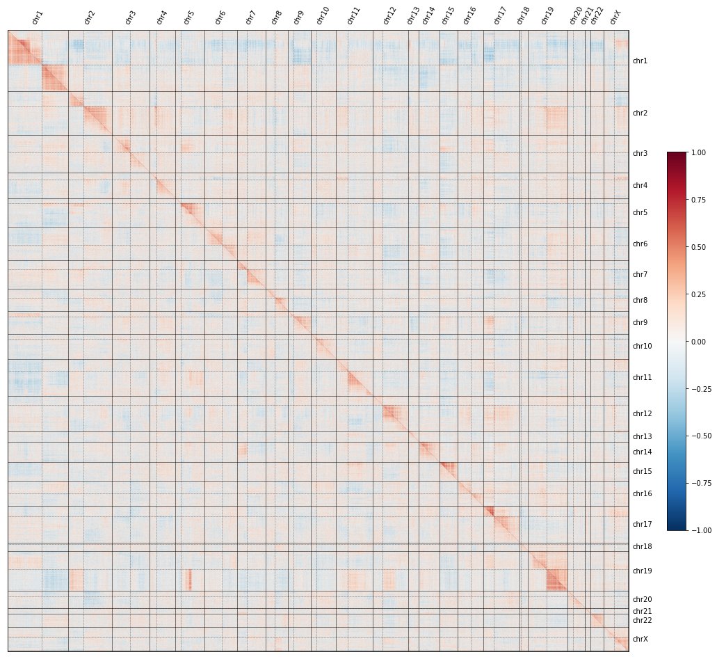
But if we show all the gene knockouts ordered by genomic position, a curious pattern emerges: CRISPR knockouts look more similar to KOs on the same chrom. arm than to KOs on other arms –producing a striking image of a genome-wide CRISPR map in which genome structure is obvious! 

Hmm, you say. That’s weird.
Yes, it is! And tomorrow I’ll dig into what it means.
Yes, it is! And tomorrow I’ll dig into what it means.
This was a big team effort: @nathanlazar, @houndcl, @johnurbanik, @GenRoberts_PhD, @willboneferroni, @RecursionChris, and several folks not on Twitter: Safiye Celik, Marta Fay, Jon Irish, James Jensen, and Conor Tillinghast. Proud to work with this @RecursionPharma team!
Part 2 is now up!
https://twitter.com/ImranSHaque/status/1651261276474208262
• • •
Missing some Tweet in this thread? You can try to
force a refresh

 Read on Twitter


