I used to think tables are boring.
But they can be beautiful & engaging.
Here's a nice example from @infobeautiful.
It uses many eye-catching elements but you don't need them to create a great table.
Just stick to these guidelines 🧵#dataviz
But they can be beautiful & engaging.
Here's a nice example from @infobeautiful.
It uses many eye-catching elements but you don't need them to create a great table.
Just stick to these guidelines 🧵#dataviz

Let's start with a not so great table and improve it.
Here's a table I would have created just a few months ago.
Not so sexy, right? Let's clean that up.
Here's a table I would have created just a few months ago.
Not so sexy, right? Let's clean that up.

1. Avoid vertical lines
The above table uses waaaay to many grid lines.
Without vertical lines, the table will look less cramped.
Have a look for yourself.
The above table uses waaaay to many grid lines.
Without vertical lines, the table will look less cramped.
Have a look for yourself.

2. Texts go left & Numbers go right
Notice that I have switched from all-center-aligned to
1️⃣ right-align numbers
1️⃣ left-align texts.
This improves readability and makes the table more harmonious.
Here's an example: Which column is easier to read?
Notice that I have switched from all-center-aligned to
1️⃣ right-align numbers
1️⃣ left-align texts.
This improves readability and makes the table more harmonious.
Here's an example: Which column is easier to read?

3. Use better column names
Currently, the column names take up too much space.
We can avoid that by combining columns.
This also avoids repeating partial names in multiple columns.
Currently, the column names take up too much space.
We can avoid that by combining columns.
This also avoids repeating partial names in multiple columns.

4. Use groups instead of repetitive columns
The island column is somewhat repetitive.
In cases like these, I'd rather remove the column.
Instead, I would group the table using additional rows.
The island column is somewhat repetitive.
In cases like these, I'd rather remove the column.
Instead, I would group the table using additional rows.

5. Remove missing numbers
Notice that our table has a lot of zeroes in it.
For better readability, let us replace the zeroes with something more lightweight.
Notice that our table has a lot of zeroes in it.
For better readability, let us replace the zeroes with something more lightweight.

6. Add summary lines
Our table already looks much cleaner.
In this format, we could even add MORE information at little cost.
For example, we could add a summary (like counts or means) for each group.
Our table already looks much cleaner.
In this format, we could even add MORE information at little cost.
For example, we could add a summary (like counts or means) for each group.

Short recap:
1. Avoid vertical lines
2. Align columns
3. Better column names
4. Groups instead of repetitive columns
5. Remove missing numbers
6. Add summaries
These tips are dead-simple and use no fancy visuals.
But visuals are great so let me give you a few bonus guidelines.
1. Avoid vertical lines
2. Align columns
3. Better column names
4. Groups instead of repetitive columns
5. Remove missing numbers
6. Add summaries
These tips are dead-simple and use no fancy visuals.
But visuals are great so let me give you a few bonus guidelines.
Visuals can spice up most tables.
Here's another table that we're going to enhance.
Here's another table that we're going to enhance.

7. Transform columns into heatmaps
This table shows that Sierra Leone had the lowest life expectancy in 2007 (among the depicted countries).
We can figure this out by comparing the numbers in the most recent column one-by-one.
Let's make that more obvious with a visual cue.
This table shows that Sierra Leone had the lowest life expectancy in 2007 (among the depicted countries).
We can figure this out by comparing the numbers in the most recent column one-by-one.
Let's make that more obvious with a visual cue.

7b. Use multiple heatmap columns
We could also do the same with the 1957 column.
You could even do that with all columns. But I am not sure whether that's a good idea here.
After all, we do not want to overload our table with colors.
We could also do the same with the 1957 column.
You could even do that with all columns. But I am not sure whether that's a good idea here.
After all, we do not want to overload our table with colors.

8. Add sparklines
Did you notice that each depicted country increased its life expectancy in each year.
Sure, you may have an idea that this is the case.
But to be sure, you will have to compare each cell of each row.
Let's make that easier with so-called sparklines.
Did you notice that each depicted country increased its life expectancy in each year.
Sure, you may have an idea that this is the case.
But to be sure, you will have to compare each cell of each row.
Let's make that easier with so-called sparklines.

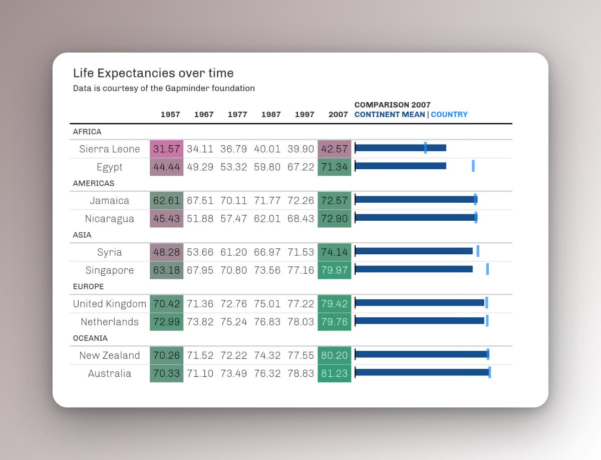
9. Add bullet charts
The data set that was used to create this table contains many more countries.
But showing all of that information would make the table HUUUGE.
Nevertheless, we can use all the data to put the depicted data into context, e.g. with a so-called bullet-chart.
The data set that was used to create this table contains many more countries.
But showing all of that information would make the table HUUUGE.
Nevertheless, we can use all the data to put the depicted data into context, e.g. with a so-called bullet-chart.
10. Add intervals/ranges
You can put means or medians into context using confidence intervals or quantile ranges.
Here's an example of that.
Beware though that I have erroneously labeled the intervals as confidence intervals instead of quantile ranges.
You can put means or medians into context using confidence intervals or quantile ranges.
Here's an example of that.
Beware though that I have erroneously labeled the intervals as confidence intervals instead of quantile ranges.
https://twitter.com/rappa753/status/1446201829168193536
That's a wrap. 🥳
Now you're equipped with guidelines to polish your next table.
Let me know if you've enjoyed this thread by liking the start of this thread below. ☺️
And for more content like this, you can follow @rappa753.
See you next time! 👋
Now you're equipped with guidelines to polish your next table.
Let me know if you've enjoyed this thread by liking the start of this thread below. ☺️
And for more content like this, you can follow @rappa753.
See you next time! 👋
https://twitter.com/rappa753/status/1654486191079665665
• • •
Missing some Tweet in this thread? You can try to
force a refresh