The best way to learn data analysis is to actually practice it.
Each week, the #tidyTuesday challenge gives you plenty of opportunity for this.
Don't know how to get started with the challenge? In case you missed it, I've put together an #rstats guide in January.
Each week, the #tidyTuesday challenge gives you plenty of opportunity for this.
Don't know how to get started with the challenge? In case you missed it, I've put together an #rstats guide in January.
First, get the data.
Head over to the tidyTuesday's GitHub repo at github.com/rfordatascienc…
Just copy the code from the "Get the data" section.
Head over to the tidyTuesday's GitHub repo at github.com/rfordatascienc…
Just copy the code from the "Get the data" section.

Next, I suggest that you use the clean_names() function from the {janitor} package.
This will format the column names of your data set so that it's easier to work with.
Huge time saver!
This will format the column names of your data set so that it's easier to work with.
Huge time saver!

Now, take a look at the column names of your cleaned data set.
Together with the data dictionary from the GitHub repo, you can find out what the data means.
Together with the data dictionary from the GitHub repo, you can find out what the data means.

It looks like there are many 'fed_in' variable names in the 'site_data' data set.
Let's take a look at all of them.
select() + Tidyselect helpers will target the right columns
Let's take a look at all of them.
select() + Tidyselect helpers will target the right columns
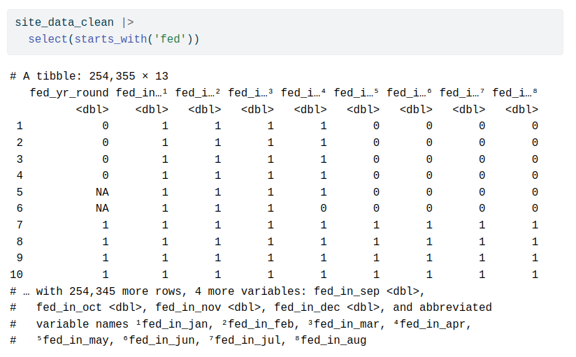
This looks weird.
It's only zeroes, ones and NAs.
Probably a true/false kind of thing.
Let's bring more columns into this.
There's `loc_id` and `proj_period_id` as well.
It's only zeroes, ones and NAs.
Probably a true/false kind of thing.
Let's bring more columns into this.
There's `loc_id` and `proj_period_id` as well.

This is starting to make sense.
Each feeding site has a unique location and a project id that contains what looks like a year.
Let's check how many project IDs there are.
Each feeding site has a unique location and a project id that contains what looks like a year.
Let's check how many project IDs there are.
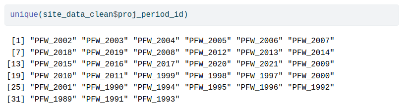
All project IDs contain the same prefix.
Let's remove it and transform the character vector into an actual numeric vector.
`parse_number()` can take care of that.
Let's remove it and transform the character vector into an actual numeric vector.
`parse_number()` can take care of that.

Next, we're going to take care of missing values.
Let's have a look how many missing values there are.
Here are two ways to do that:
1️⃣ summarise() + across()
2️⃣ for-loop
Let's have a look how many missing values there are.
Here are two ways to do that:
1️⃣ summarise() + across()
2️⃣ for-loop


There is missing data. Let’s filter those that have missing data in any of the month columns.
The `fed_yr_round` column can be filled by us later on.
Once again, here are two possible ways:
1️⃣ pmap() from {purrr}
2️⃣ rowSums() (treating TRUE as 1)
The `fed_yr_round` column can be filled by us later on.
Once again, here are two possible ways:
1️⃣ pmap() from {purrr}
2️⃣ rowSums() (treating TRUE as 1)


Now, let us bring our data into a tidy format.
That’s what `pivot_longer()` will do for us.
That’s what `pivot_longer()` will do for us.

Next, we’re able to do a little bit of counting.
This is always an easy but valuable thing to do. Just throw count() at the data to see what's (and how much) is in it.
This is always an easy but valuable thing to do. Just throw count() at the data to see what's (and how much) is in it.

Using these counts we can check how many sites there are in each year.
Looks like overall the number of sites increased over the years.
This plot was just something we did for ourselves. No need to customize it further.
Looks like overall the number of sites increased over the years.
This plot was just something we did for ourselves. No need to customize it further.


Finally, let’s have a look at how many feeding sites feed all-year.
Maybe over time more or maybe less bird sites are active every month.
As it happens, it looks like there is a trend that more and more bird sites are active every month. Let’s make this viz a bit prettier.
Maybe over time more or maybe less bird sites are active every month.
As it happens, it looks like there is a trend that more and more bird sites are active every month. Let’s make this viz a bit prettier.


First, let’s apply `theme_minimal()` and make the bars wider. Also, black borders for the bars could be nice.


Second, add labels. Add a descriptive title and don’t forget to put your Twitter handle into the caption.


Third, let us format the y-axis as percent.


Fourth, pick better colors manually.


Fifth, get rid of the extra spacing surrounding the bars.


Finally, move the legend and title.


There’s lots more one can do with the data or the plot. But this is probably okay as a start.
At this point, you can share your plot on Twitter using the #tidyTuesday hashtag.
At this point, you can share your plot on Twitter using the #tidyTuesday hashtag.
If you share your plot, think about sharing your code as well.
Common practices for sharing the code:
- A dedicated tidyTuesday repo on Github.
OR
- Upload the code at gist.github.com.
This thread's code is available at github.com/AlbertRapp/Pub…
Common practices for sharing the code:
- A dedicated tidyTuesday repo on Github.
OR
- Upload the code at gist.github.com.
This thread's code is available at github.com/AlbertRapp/Pub…
I hope this helps you to get started with the tidyTuesday challenge.
If you want more help, check out the R screencasts rscreencasts.com.
They're a great resource on learning data wrangling using tidyTuesday data sets.
If you want more help, check out the R screencasts rscreencasts.com.
They're a great resource on learning data wrangling using tidyTuesday data sets.
That's a wrap. I hope you've enjoyed this thread.
If you want to see more content like this, follow @rappa753.
See you next time 👋
If you want to see more content like this, follow @rappa753.
See you next time 👋
https://twitter.com/rappa753/status/1657022848530108426
• • •
Missing some Tweet in this thread? You can try to
force a refresh