
Utopian end-game to create an haven for tweets with fact-based analysis of the pandemic and its consequences that is free of bias

 2/10 Introducing a new diagram to provide the full picture of cumulative deaths. Now that all individual weeks in 2020 no longer rank as the least deadly, it would otherwise become restrictively difficult to compare overall mortality for each season as we add more weeks.


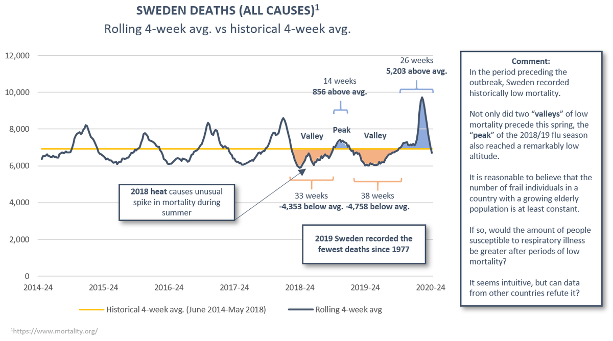
 1/17 When cases began to climb a few weeks ago it was a textbook exhibit of respiratory illness seasonality. I was surprised that many acted as if this was surprising. Others seemed a bit too eager at the prospects of redeeming their outsized mortality forecasts from spring.
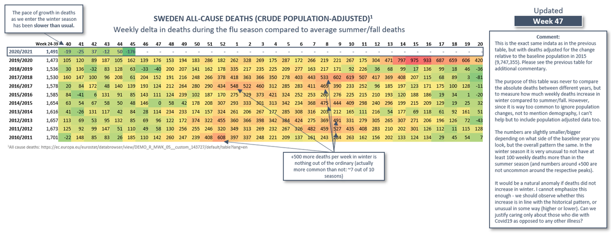
 2/21 Crude pop. adj. deaths this season never caught up with 2016/17 levels. It did so only briefly compared to 2017/18 (week 21) but returned to a deficiency by week 36. By week 41 cumulative deaths 2019/20 were approximately 500 and 1,500 below the previous seasons.


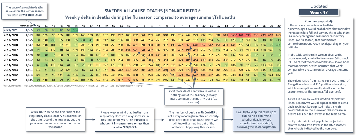
 2/10 Sweden. Firstly, 20 weeks have passed since the 1st surge in cases with no subsequent increase in deaths. There was a smaller bump in cases 11 weeks ago, no increase in deaths. Cases have increases for 6 weeks straight with no noticeable effect on deaths – how can this be?
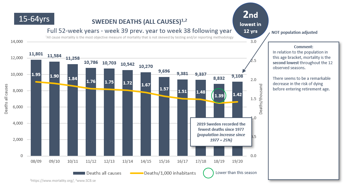
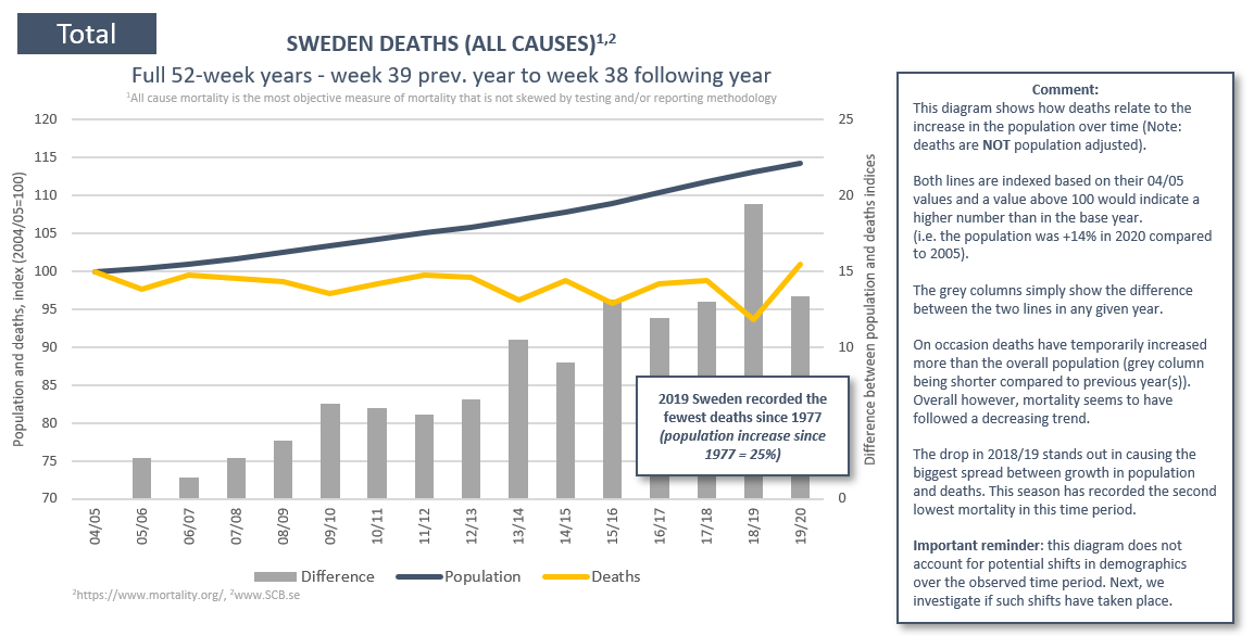
 (2/19) We will explore two types of diagrams for each age bracket. The first type is straightforward. In the second one you would expect the yellow lines to follow the blue lines if mortality in that age bracket remained constant (and the grey columns to remain close to 0).
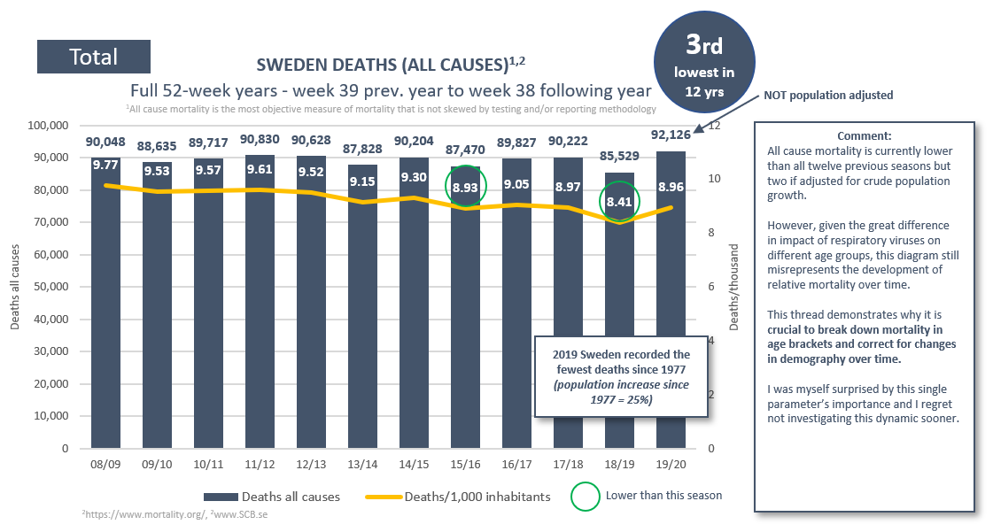
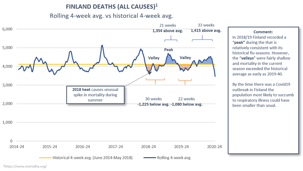
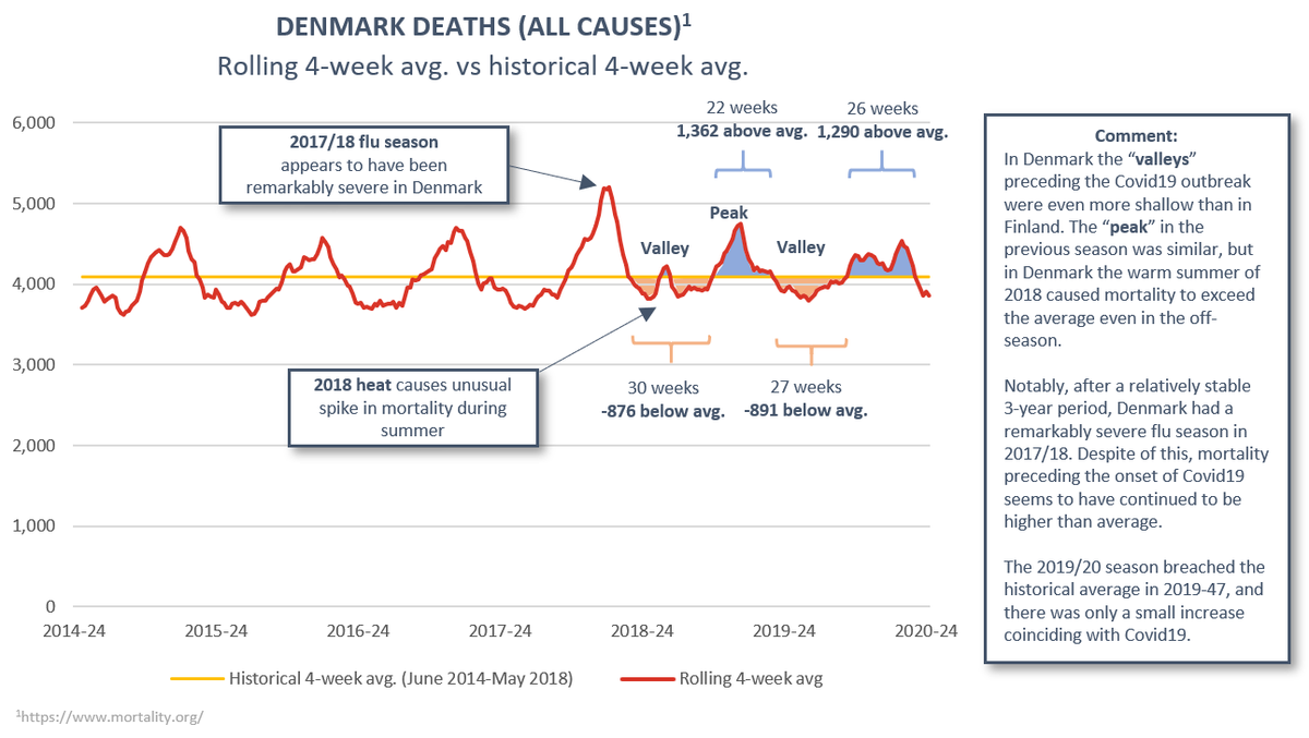
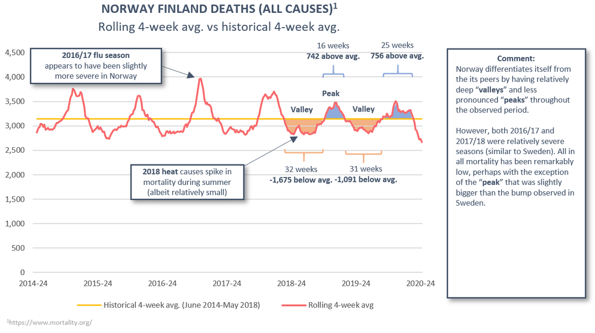 (2/12) I provide comments in the pictures to keep the thread manageable. The diagrams are organized by country. Although I generally advise against inter-country comparison, in this case I would suggest looking at the same diagrams for different countries side by side too.

