James Tozer Profile picture
Co-founder of Prospect, a sports analytics company. Ex-data journalist for @TheEconomist. Views my own.
Stepan Spinka Profile picture Polipolio Profile picture 2 subscribed
Oct 29, 2020 9 tweets 5 min read
EXCLUSIVE: @TheEconomist has obtained data implying that parts of northern Italy have gained enough immunity to substantially slow down the spread of covid-19. (1/9) economist.com/graphic-detail… Using data from @istat_it, we calculated how many excess deaths occurred in 7,300+ Italian municipalities between March 1st and June 30th. This remarkable map is by @_rospearce. (2/9)
May 16, 2020 5 tweets 3 min read
NEW, FREE DATA: We have just published the code and data behind our excess mortality tracker on Github. We believe this is the first public resource to provide this information, and we hope academics and journalists can use it for their research. (1/5) github.com/TheEconomist/c… For several weeks @martgnz and myself have been cleaning, analysing and presenting this data on our tracking page @TheEconomist, which provides interactive charts and is free to read. (2/5) economist.com/graphic-detail…
Apr 28, 2020 12 tweets 6 min read
NEW: we have updated our excess-mortality tracker with the latest data for several countries (the page is free to read). In some places, the overall number of deaths now seem to be falling. (1/11) 
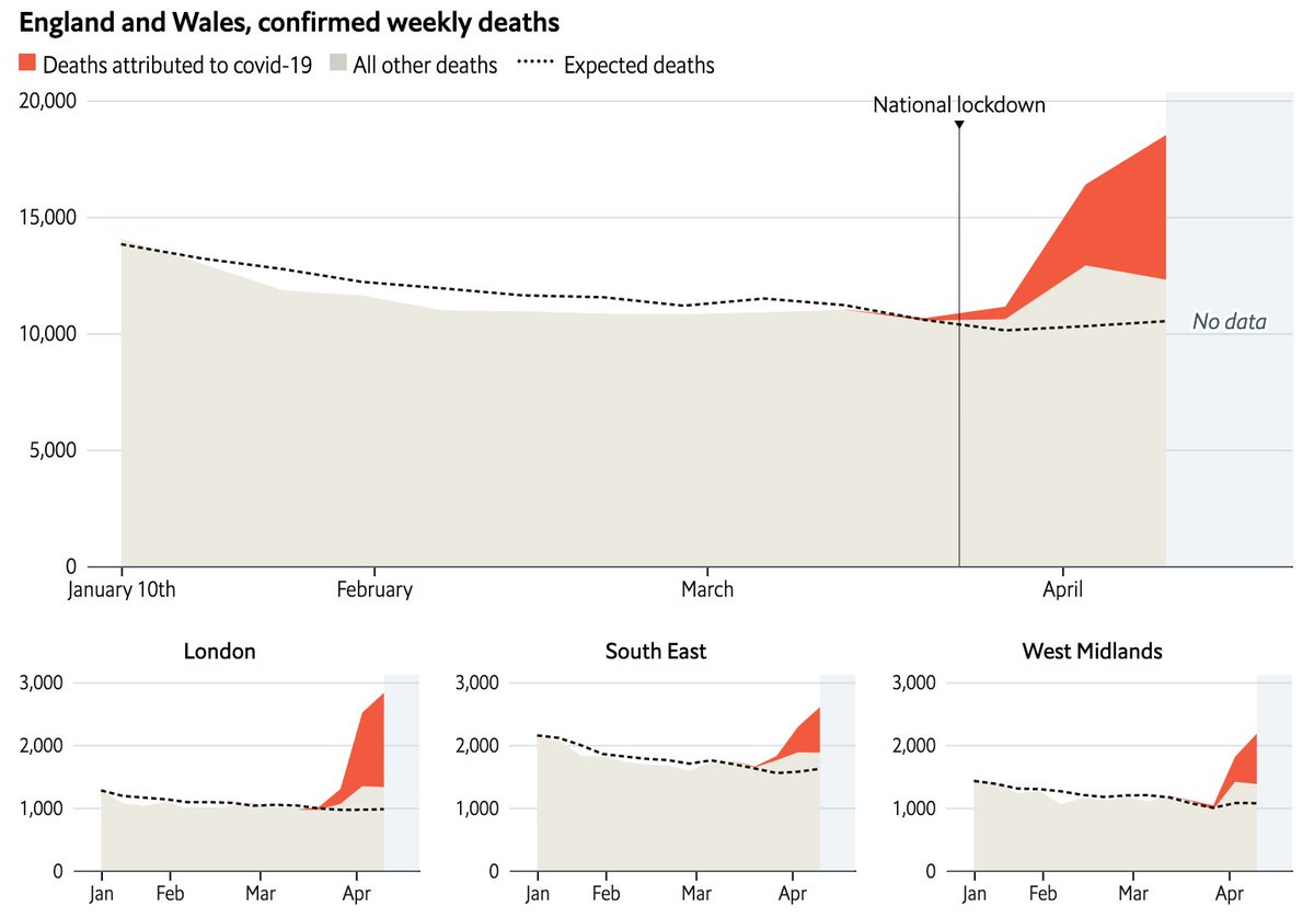
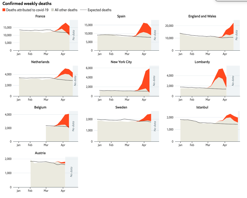
Our interactive charts allow you to inspect the data in each region, for any given week. Note that figures on total mortality include delays, so they may reflect deaths that happened several days beforehand. (2/11) economist.com/graphic-detail…
Apr 21, 2020 13 tweets 8 min read
NEW: @ONS has just released data about total deaths and covid deaths up to April 10th. These show another big increase that week. Total recorded excess since March 20th is 15,200. Registered covid deaths (via death certificates) is 10,300. (1/12) Myself and @martgnz are collecting this data on excess mortality across countries. Yesterday we published figures for Indonesia. Later today we will add Sweden, Belgium, Austria and Turkey. (2/12)
economist.com/graphic-detail…
Apr 20, 2020 11 tweets 6 min read
UPDATE: Today @martgnz and I are publishing an update to @TheEconomist excess mortality tracker. We have new / revised data for all the countries, plus we are adding Indonesia, our first location outside of the West. (1/11)
economist.com/graphic-detail… There are some faint optimistic hints in the data: Italy, Spain, and the Netherlands all show signs of a plateau. But interpret that with caution. Many countries are retrospectively revising their numbers of all deaths upwards. (2/11)
Apr 16, 2020 14 tweets 8 min read
THREAD: From today onwards, @TheEconomist will be tracking excess mortality from covid-19 in as many countries as possible. We have published interactive charts for six countries that have released this data. (1/14) economist.com/graphic-detail… In most countries, the official death toll from covid-19 is a reasonable indicator of whether it is “flattening the curve”. @jburnmurdoch has produced some fantastic charts, tracking these statistics in scores of countries and regions. (2/14)
Apr 2, 2020 10 tweets 5 min read
THREAD: Might the death toll from covid-19 be higher than the official fatalities attributed to it so far? Data emerging from the worst-hit places in Europe suggest so. (1/9) 
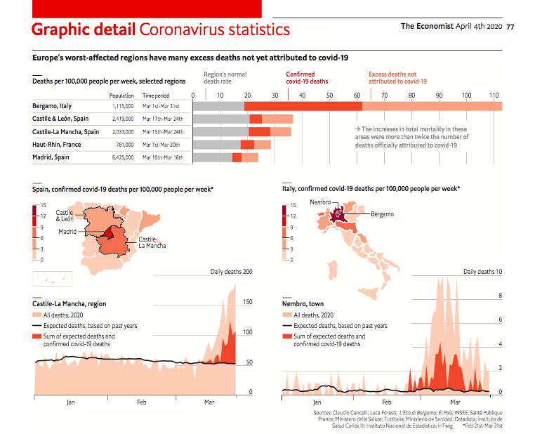
A common way to quantify deaths in a severe health crisis is to look at “excess mortality”: the total number of people who have passed away in an area, compared to usual. Journalists in Italy, Spain and France have started doing this. (2/9) economist.com/graphic-detail…
Jan 27, 2020 8 tweets 5 min read
Today is the 75th anniversary of the liberation of #Auschwitz, the most deadly camp run by the Nazis during the Holocaust. In this week's @TheEconomist, we used some remarkable datasets to depict the horrific scale of the murders committed there. (1/8) economist.com/graphic-detail… The geographic range of people killed at Auschwitz is hard to comprehend. On the map below, we plotted the place of birth or residence of all Jewish victims identified by @yadvashem. They came from as far away as Finland and Morocco. Some were even born in South America. (2/8)
Jun 7, 2019 25 tweets 12 min read
THREAD: After months of data scraping and number crunching, this week we’ve published an analysis of whether @Google's news algorithm displays political bias. (1/25) economist.com/graphic-detail… .@realDonaldTrump has often claimed that the search engine discriminates against right-leaning publications, because so many of the results for searches about "Trump" come from @nytimes and @CNN. (2/25)