
Rotating curators talking about science and humanities, academia, and society. Tuesdays to Sundays. Contact @SciForProgress to sign up!
How to get URL link on X (Twitter) App


https://twitter.com/SfPRocur/status/1156126932607672321


 In order to become insightful, we must help our audience. We need: 1. some explanatory TEXT, 2. an explanation of all COLORS used, and 3. a suitable layout that makes reading the visualization effective.
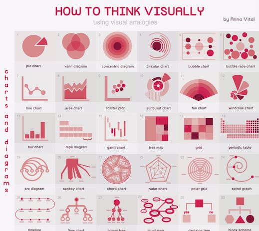
 We encode counts of categories (or %) by area. Easiest to read are horizontal or vertical bar charts. Less intuitive are circle plots (quantity must be AREA not RADIUS!!!). Other charts are pie's for % (hard with many categories), tree maps (always hard to read), and radar charts
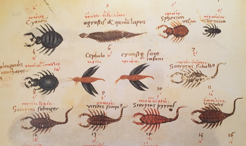
 While drawings have a long history, scientific schematics and charts are more recent. Maybe this one from Aristotle (300BC) could be considered a kind of early diagram. It is scribbled on the right of the text.

 We also get that for charging our laptop we find a socket under the seat. Even when we are in Czech trains and have no command of Czech


https://twitter.com/daniellecrobins/status/1072936157493649408


https://twitter.com/Sainsha/status/1040751037957767168This is such an important discussion to have openly. Not having clear standards for publishability in any field has created myriad problems, from contributing to a knowledge base of grossly inconsistent quality to researcher anxiety resulting from uncertainty.