
Seismologist, volcanologist, professor, and hazards junkie. Soapbox stander. Opinions are my own but I'm happy to share. She/her.


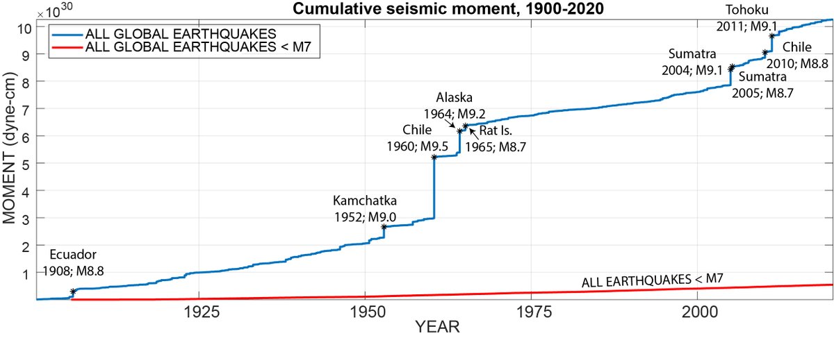 The blue line in this figure shows the total amount of energy (well, seismic moment, but these are similar so we're going with it), released by earthquakes between 1900 and 2020. The figure shows cumulative energy--total released over time--which is why it constantly increases.


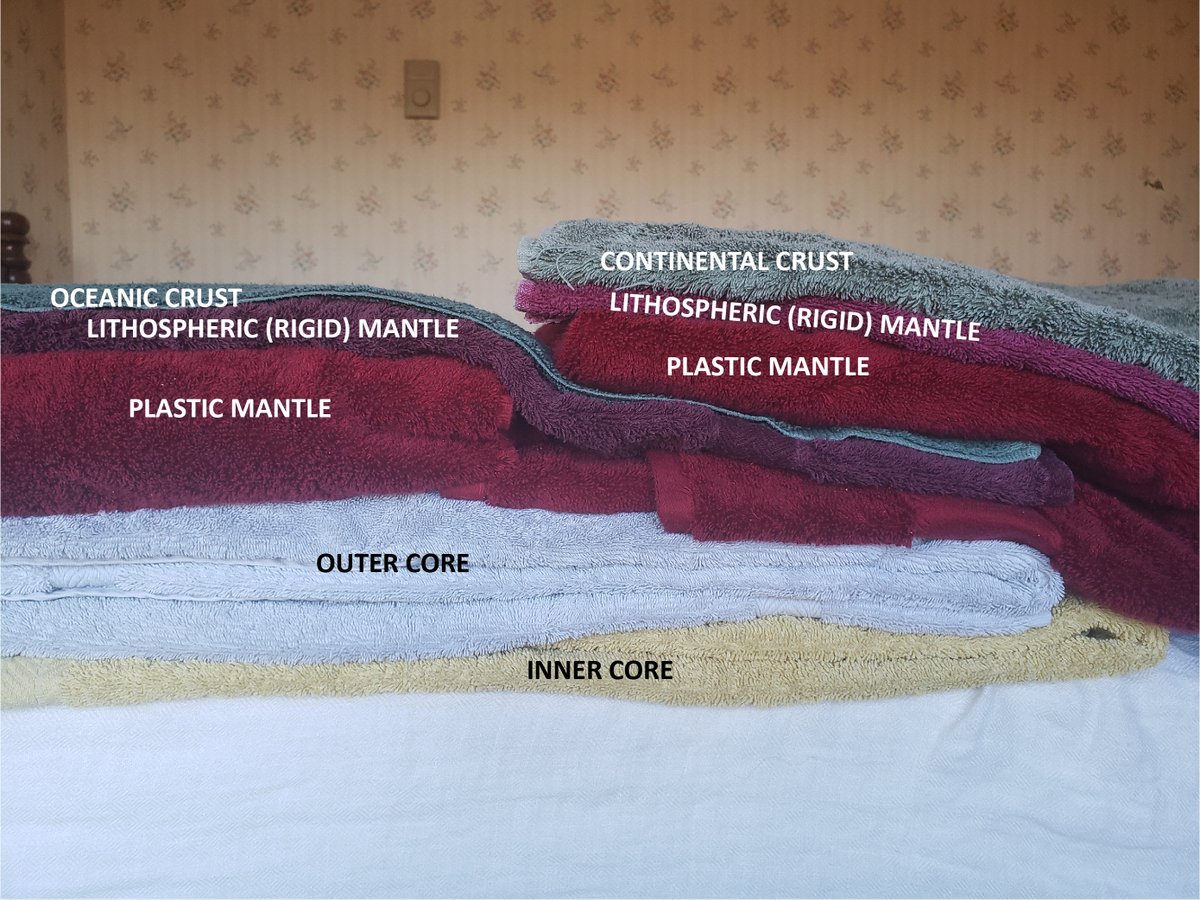 The key issue that is different between the two versions is the common misconception that tectonic plates are made of crust. The original figure shows oceanic crust (blue) subducting into mantle (grey).


 In the past couple of weeks we’ve discussed body waves (P and S waves, which move through the body of the Earth) and surface waves (Love and Rayleigh which, unsurprisingly, only travel across Earth’s surface).
 Today, we have show shaking caused by the M9.0 Tohoku earthquake on March 11, 2011. This figure shows shaking at a station in North Dakota (caused by a quake in Japan!).
 First, a seismogram literally shows us how the ground shook when seismic waves reached the seismometer. The vertical axis is a proxy for this (I'll explain the units later).