jhey ʕ•ᴥ•ʔ Profile picture
⚡️ You bring ideas, I show you how 👨‍🍳 Staff Design + Code @ 🤫 (ex @google, @vercel) 📚 Making UI course: https://t.co/DtDQ0KAxsi 📰 Blog: https://t.co/0uyUvnUidf
Sep 13, 2023 5 tweets 3 min read
Future CSS Tip! 🍏

You could create those Apple-style dynamic CTA reveals with container style queries and scroll-driven animations with zero JavaScript 👀 (Sticking to the #AppleEvent theme)

.cta {
animation: activate both, activate reverse;
animation-timeline: --section, view();
animation-range: entry, cover 50%;
}

keyframes activate {
0% { --active: 0; }
100% { --active: 1; }
}

@ container style(--active: 1) {
.cta__bloom {
scale: 0.99;
transition: scale 0.5s var(--back); /* 👈 linear() */
}
.cta a {
scale: 1;
grid-template-columns: var(--content-size, auto) 36px;
transition: scale 0.2s 0s, grid-template-columns 0.5s 0.6s var(--elastic);
}
}

There's a fair bit of code here 🤯

But, the idea is this...

1. Use a scroll-driven animation scoped to each section for each CTA to change a custom property value (--activate) between 1 and 0.
2. Use a container style query to dictate the transition sequence for each moving part making use of transition-delay.
3. Make use of linear() easing to get the right effect ⚡️

It's wild to put all these APIs together and see what's possible. There are likely some spots to tidy this up 💯 These are powerful combinations for sure though! 💪

@CodePen link below! 👇
Here's that @CodePen link! 🚀

You'll need to be in Chrome 115+ to see everything working as it should 🤞

We're combining:
– Scroll-driven animation
– linear() easing
– Container style queries

codepen.io/jh3y/pen/zYyzY…
Aug 23, 2023 4 tweets 2 min read
CSS Tip! ✨

You can create icon sprite animations using the steps() animation-timing function 🤙

You could use this to create little icon button animations, etc. 😎

But how do you do it? Like this 👇

button img {
object-fit: cover;
object-position: 0 0;
}

The image is a sprite strip of the frames in the animation. To animate the frames, you do something like this:

[aria-pressed=true] img {
animation: play 0.5s steps(20) forwards;
}

@ keyframes play {
to {
object-position: 100% 0;
}
}

We are toggling aria-pressed in our scripts to show a pressed state and we can then fire the animation to play our sprite 🎉

Check out the video that breaks things down a little bit

@CodePen link blow! 👇

Here's that @CodePen link! 🚀

This was a bunch of fun to make. In fact, the hardest part was making the sprite 😂

codepen.io/jh3y/pen/KKbpe…
Feb 28, 2023 4 tweets 3 min read
Have you tried out the View Transitions API? ✨

Been playing have a play with it this evening 👀

A bit of JavaScript Web Animations API usage for those rainbow lines but sets me up for another demo idea! 💡

Repo && deets 👇 The View Transitions API is gonna be a game-changer for the flexible ways in which you can use it with UI 💯

For a guide to the API, @jaffathecake has you covered 👇

developer.chrome.com/docs/web-platf…
Nov 11, 2022 5 tweets 3 min read
CSS Tip! 🚀

Use custom properties to power parallax effects 😎

Use JavaScript to pass the pointer position to CSS. Let CSS handle the rest, moving things at different rates 💪

card:hover{
rotate: calc(var(--ratio-y) * 50deg);
}

Play with card effects ✨

Demo link below! 👇 Here's that @CodePen link! ⚡️

It's kinda hard to explain everything going on here in one tweet 😅

The magic part is how you can use JS to work out something for you and then let CSS do the rest, you're decoupling them in a way.

Let's go over it 👇

codepen.io/jh3y/pen/wvXvE…
Oct 6, 2022 4 tweets 3 min read
CSS Tip! ✨

You could use :has() combined with sibling combinators and other things to build a working 3D CSS Connect 4 🤓

.col:has([row=p-1]:checked) +
...
.col:has([row=p-1]:checked) ~ .result {
--win: 1; --winner: var(--p);
}

Demo link below! 👇 Here's that @CodePen link! 🚀

The performance of CSS :has() is pretty incredible. There's another demo I'll share where it does some pretty "extra" stuff and it handles it like a champ 💪

codepen.io/jh3y/pen/Jjvap…
Oct 5, 2022 5 tweets 3 min read
Wild to think how close we are to almost being able to build this with CSS alone 🤯

This is a version I built with JavaScript using GSAP ✨

It does have perks like infinite smooth scroll 👀

But, think I'll try building a CSS version without 🤓

Demo link for this one below! 👇 Here's that @CodePen link! 🚀

You can spin that mouse wheel to your heart's content on this and it'll keep going 😅

codepen.io/jh3y/pen/WNRvq…
Sep 13, 2022 6 tweets 2 min read
Future CSS Tip! 🔮

Use animation-timeline to create scroll-linked animations 🤯

li { view-timeline-name:in; }
img { animation-name:reveal; animation-timeline:in; }

Animation is bound to the li position in the viewport ✨

Check these image reveals 😎

Demo link/info below! 👇 Here's that @CodePen link! 🚀

And this should work in your browser today 🙌 That's because it's using a polyfill that's currently under development as scroll linked animations are experimented with 😎

codepen.io/jh3y/pen/RwyGB…
Sep 10, 2022 4 tweets 2 min read
This one was born out of the number of skeleton loaders I saw whilst in the US 😅 (My cell reception was "weak")

Amazed how many of them were quite jarring though 👀

Using this one as a stepping stone to get back on the video editing wagon. Also made captions for this one 🙌 Sometimes you get in a rut and you just need to "Make a thing!" to get yourself going again.

It's been like that with these. I'm still trying to find that "Sweet process". But, the more of them I make, the better I get at it. And that's the same with anything.
Aug 26, 2022 4 tweets 2 min read
Future CSS Tip 🔮

The Anchoring API lets you anchor an element to another without JS ⚓️

Don't need to be siblings/nested + you can define positions when things get clipped 🤯

.anchor{anchor-name:--a;}
.boat{position-fallback:--backup;}

Check this video and demo link below! 👇 Here's that @CodePen link! 🚀

You'll need @chromecanary with the "Experimental Web Platform Features" flag set ⛳️

This is super early stages ⚠️

But if you play, try resizing the container and see how the boat moves when it gets clipped 🔥

codepen.io/jh3y/pen/WNzBX…
Aug 26, 2022 5 tweets 3 min read
To think, this UI pattern will be possible without any JavaScript using the Pop-Up API and CSS Anchoring 🤯

<button popuptoggletarget="products">Products</button>
<div popup id="products">
<a autofocus>HTML</a>
</div>

"autofocus" enables keyboard nav 🔥

Demo link below 😎 Here's the @CodePen link! 🚀

This is currently only in @chromecanary behind the "Experimental Web Platform Features" flag ⛳️

I'm also "mocking" the anchoring here with a smidge of JavaScript 🤏

Actual CSS-only anchoring is on the way though! 👇

codepen.io/jh3y/pen/YzabB…
Aug 24, 2022 10 tweets 5 min read
CSS Tip! 🚀

You can select the previous siblings of an element with :has() to create cool hover effects like this OS dock🔥 No JS 😎

:root{--lerp-1:0.525;}
a:has(+a:hover){
--lerp:var(--lerp-1);
translate: 0 calc(var(--lerp) * -75%);
}

Demo link and explanation below! 👇 First, here's that @CodePen link! 🚀

You'll need to be in Safari, Chrome BETA, or you can use Chrome/Firefox with flags enabled ⛳️

Try not only :hovering the items, but also tabbing through them too ✨

codepen.io/jh3y/pen/mdxgg…
Aug 23, 2022 5 tweets 3 min read
CSS Tip! 📢

You could use CSS :has() to make a CSS-only dark mode toggle with a checkbox 🧐

:root:has(:checked) {--dark:1;}

If you can, use a button and [aria-pressed] 🙏
(Toggle via JS ✨)

:root:has([aria-pressed=true]) {--dark:1;}

It powers this demo 😎 Link below! 👇 Here's that @CodePen link! 🚀

codepen.io/jh3y/pen/poLBv…
Aug 6, 2022 5 tweets 2 min read
Lil CSS Tip 🤏

Forgot to post the vertical version of this curved scroller 💈

Want that overscroll bounce? Add a padding element and remove the scroll snap alignment ⚡️

.track:last-child { scroll-snap-align: none; }

s/o @argyleink for this "trick" 🤙

Demo link below! 👇 Here's that @CodePen link! 🚀

codepen.io/jh3y/pen/KKoRX…
Aug 6, 2022 5 tweets 3 min read
Wanna play a game? 🚀

How quickly can you wake up Stan? Beat my score? 🦖

This game is built with CSS using :has() && Houdini

No JavaScript necessary! 🤯

Amazing what you can do with CSS alone ✨

Demo link and articles below 👇 Here's the @CodePen link! 🚀

You'll need a browser that supports :has() && Houdini for the best experience 🙏

👉 codepen.io/jh3y/details/W… via @CodePen
Aug 5, 2022 4 tweets 2 min read
Future CSS Tip! 🔮

You can use CSS :has() to select a previous sibling based on a condition ⚡️

This animated form requires no JavaScript 😎

If a group is focused, hide the previous one! 👀

.group:has( ~ .group:focus-within) {
--show: 0;
--offset: -1;
}

Demo link below 👇 Here's that @CodePen link! 🚀

codepen.io/jh3y/pen/abYBK…
Jul 18, 2022 6 tweets 3 min read
Future CSS Tip! 🔮

Use :has() to power <form> micro-interactions and theme 😎 No JavaScript. Animations powered by <input> state 🚀

.group:has(:invalid) {
animation: shake 0.5s;
}

form:has(.email:valid):has(.password:valid) .submit {
--color: green;
}

Demo link below 👇 Here's that @CodePen link! ✨

🔎 :has is landing in Chrome 105 and is already in Safari as of version 15.4 🙌

Have you tried CSS :has() yet? What could you use it for?

👉 codepen.io/jh3y/pen/yLKMO… via @CodePen
Jul 18, 2022 7 tweets 4 min read
More than 74 billion people use CSS daily

But, so many don't know how to center a <div>

Here are 4 ways to do it so you can show off to your friends in <style> 👇🧵 Let's assume we have a container element and a child element. We want to center both horizontally and vertically.

We could use "display: grid" and "place-content: center"

That's a good start! ✨

👉 codepen.io/jh3y/pen/MWVJP… via @CodePen /*   Given:     <div class="container">       <div
Jun 1, 2022 7 tweets 3 min read
Oh, this? 👀

Jus' a pure CSS image zoom using CSS primitives 🔥

– :has()
– object-view-box
– Houdini @ property

Code 👇

img {
object-view-box: inset(var(--top) ...);
}

:root:has(#car:checked) {
--top: 61%;
...
}

Amazing 🥲

👉 codepen.io/jh3y/pen/QWQrV… via @CodePen Let's break down what's going on here 😎

I will not call this a thread...

The first property "object-view-box" allows us to apply an SVG like viewBox to an element such as an <img>. In this demo, I map the different "viewBox" to the different "Zoom" spots. img {   object-view-box: inset(     				var(--inset-top)
May 31, 2022 4 tweets 2 min read
Pure CSS && SVG Tic Tac Toe! ⚡️

You can build this without any JavaScript at all 🫵😎

Went for a CyberPunk theme here, how would you style it? 🎨

Wanna learn how to make it? Course link is below! 👇

👉 codepen.io/jh3y/pen/KKNwp… via @CodePen Learning with the "Impractically practical" ✨

You'll pick up a bunch of CSS techniques you can use elsewhere 💪

Check out the "FREE" @eggheadio course ⭐️

– Layout techniques
– Animating SVG
– "that" frosted effect
– And more!

egghead.io/courses/tic-ta…
Jan 14, 2021 6 tweets 4 min read
Did you see @CodePen's "Most Hearted of 2020"? 💕

Many awesome things on there! 💯

Honored to have not one, but four of my pens featured 🎉 To see one of my whimsical creations in the top 5 is amazing 🤯

Pens down below 👍

👉 codepen.io/2020/popular/p… Big shout out to @CodePen 🙏 It's a wonderful platform for sharing creative things and it's opened up a bunch of doors for me already.
Oct 11, 2020 18 tweets 7 min read
How to make single div(any element) CSS art - A mini thread 🧵

Spoiler: No magic 🪄 All that's required is patience and knowing your way around some properties 👍

Let's gooo! 👇

Starting with this timelapse ⏳ 
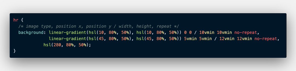
The "Big" trick? Layered background images 😮

With CSS you can give many backgrounds to an element. Comma separate background images and you're golden ✨🏆

What would this give for a 60px square? 🤔

👉 codepen.io/jh3y/pen/eYzNG…