Teodora Profile picture
UX & Mobile Games & Sales | Bootstrapping side projects & sharing it
Nov 21, 2020 14 tweets 6 min read
Today I’m launching threadok.com 🧵

I found this idea while struggling finding great Twitter threads to learn from.

A thread (what else could it be) 👇 Sharing a sad link on Twitter no longer works.

Twitter threads had become the perfect way to tell a story.

Just watch the results of this experiment by @alfred_lua via @buffer Image
Oct 4, 2020 22 tweets 8 min read
Standing out on Twitter can be hard for newcomers.

You can get better results by only choosing a color for your entire content.

I analyzed +200 Twitter profiles to find what color performs better.

What color should you choose? A thread. 👇
#TwitterInColors According to my research, this is the portcetange of usage:

- Yellow: 25.92% |||||
- Black: 22.22% ||||
- Blue: 14.81% |||
- White: 11.11% ||
- Green: 9.25% ||
- Purple: 7.40% ||
- Orange: 5.55% |
- Red: 3.74% |
Oct 4, 2020 14 tweets 7 min read
⚫ Team Black (22.22%)

#TwitterInColors

Works well for brands wishing to promote power, formality, profession, etc and used to hide feelings, intimidate, radiate authority. People wearing a black t-shirt.

People with black backgrounds.

People with both!

Good for light mode, bad for dark mode.
Oct 4, 2020 5 tweets 3 min read
🟢 Team Green (9.25%)

#TwitterInColors

It can have a balancing and harmonizing effect and it’s used for relaxation, revitalization and encouragement.

Not many people use green for his profiles.

So maybe you can find some eye-catching green tone and use it like me. 🟢 @nelio_leone his profile pic isn’t green at all, but the green outline stroke helps his pic to stand out. Uses the same color on his cover pic to present his slogan.
Oct 4, 2020 11 tweets 6 min read
🔵 Team Blue (14.81%)

#TwitterInColors

Is the most popular color in terms of brand creation, basically because it reduces stress, relax, secure and it brings order. I thought I would find more blue color profiles, as there are many studies that say that it’s the color that people like the most.

But probably, since blue is everywhere, it is not the best to attract attention.
Oct 4, 2020 5 tweets 3 min read
🔴 Team Red (3.70%)

#TwitterInColors

Attracts the most attention and is associated with strong emotions like excitement, love, romance, style.

I didn’t find any red personal profile and I was shocked because with red you can capture attention very easily. 
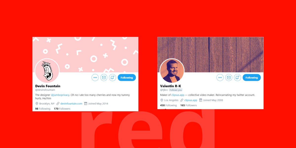
It can draw negative emotions so be careful with red.

Red is usually used to draw attention, if you use another less attractive color and add a single dot of red, everyone will focus on that point.
Oct 4, 2020 17 tweets 9 min read
🟡 Team Yellow (25.92%)

#TwitterInColors

Its brightness is particularly useful in catching the consumer's eyes and it’s used to simulate relax, awake awareness.

Lots of profiles are using yellow as their main color, probably because it’s very cheerful. It works because it pushes you to press the profile picture.

But if a lot of people use it, it stops drawing attention.

So probably not the best choice right now if you want to stand out.
Oct 4, 2020 6 tweets 3 min read
🟣 Team Purple (7.40%)

#TwitterInColors

Inspires reflection and self-awareness and uses for royalty, luxury, dignity, etc.

There aren’t many profiles using purple as their main color, so can be another good option to choose. 
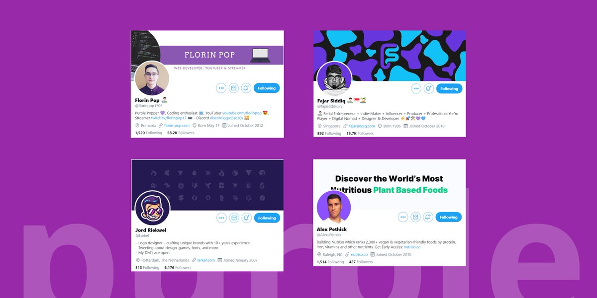
🟣 @florinpop1705 great use of purple in many of his content, he and his personal brand are related with this color. Purple color instantly drives to his profile, this is a great example of color related to a person.
Oct 4, 2020 8 tweets 4 min read
⚪ Team White (11.11%)

#TwitterInColors

White is widely used in websites because it’s easy to make contrast with all colors tones. Also gives a sense of cleanliness.

White has the same problem as black.

Bad for light mode, good for dark mode. @jamesone_ is in white t-shirt team, funny face plus a cap makes the difference in this case. Also his cover pic is very uncommon and original and can be considered as his brand.
Oct 4, 2020 5 tweets 3 min read
🟠 Team Orange (5.55%)

#TwitterInColors

A color of joy used for optimism, impulse, freedom, creation, communication and fun. Orange is king to draw attention.

No wonder why Amazon uses it on their buy button.

Few profiles are using orange! 🟠 @JamieHoward profile is simple and clean. The orange on the can works wonders with his profile pic background.
Sep 22, 2020 7 tweets 5 min read
I'm polishing techniques to become a producer on Twitter.

I spent more than 10 hours a week scrolling down my feed on Twitter without any profit, so I decided to fix it.

This is a “living” thread, so I’ll be updating it.

The pre-order has started!

gum.co/hkVRI 1/ Setting up @gumroad page:

- Choosing between 17 titles and subtitles I've written down.
- Rewriting 3 times the description for @gumroad page.
- Creating a clear cover using @figmadesign.

Any feedback is welcome.

gum.co/hkVRI
Sep 21, 2020 15 tweets 8 min read
Today I'm sharing some stats about some experiments that increase my Twitter follow count.

I ended up with +50% more followers with:

- 20 minutes of daily work.
- 3 weeks.

So here are the actions (and failures) I did. I call it “net fishing” 🎣 👇 Image 
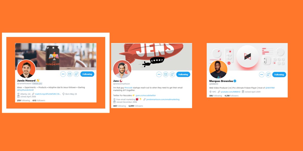
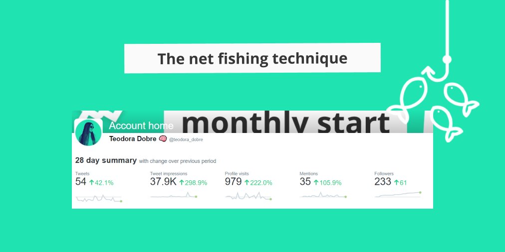
1/ Net fishing is all about:

- Keeping your feed clean.
- Focus on accounts with the same followers you want.

I'll explain later why get rid of everyone that is not talking about similar topics you write.
Sep 4, 2020 4 tweets 1 min read
This is definitely not UX, by making a "beautiful" element you will not improve the user's experience.

What is going on here?

Thread 👇 Image The user experience only can be improved by analyzing the data we have about how the user uses our software.

It also can be improved without even seeing the visual part of the software.
May 20, 2020 4 tweets 2 min read
🔥This was my proposal for the #design of the official folder for my university🎓

🧐My main objective was to make a design that at a first look already expresses that is the 10th anniversary of the institution🎉

👇Explanation below👇 Image ✅Use of only one color, yellow, the official university color, to quicky associate the color with
✅Big font for "10 ANYS" ("10 YEARS"), to make clear what is the purpose of the folder 👇