Matt Godden Profile picture
May 10, 2019 15 tweets 8 min read Read on X
what’s wrong with #iTunes has nothing whatsoever to do with it’s “complexity”, and everything to do with incompetent #UI design at Apple.

iTunes doesn’t need features removed, it needs designers removed, and replaced with people who aren’t #Bozos
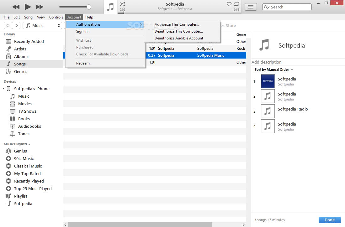
For example the breaking of the disclosure-triangle list on the left. Previously the conceptual heart of navigation, where everything could be found (even downloads), its mutated into this confusing combination where the first level of the app is modal to the media kind. ImageImageImage
Another offender - the downloads / activity window is now a separate entity, that loses its download history on quit, and has no place in the structural order of the app, even though downloading media is one of the primary things #iTunes does. Image
Then there’s #Podcasts - I know the #CupertinoLizardPeople live in this fantasyland where bandwidth is free and unlimited, but for a lot of the world it isn’t. The idea of downloading a podcast onto multiple devices directly is obscenely wasteful.
#iTunes used to be a beautiful podcatcher, up until version 10, when a whole bunch of stupid changes came in.

Firstly, the notion of “saved episodes”, which was a counter feature to default auto-deleting.
Auto-delete meant that unless you told #iTunes to “keep” all episodes of a show, it would wipe them from disk once you’d listened to them. If you set it to keep “all” episodes, iTunes will download every episode in a feed, every time the feed changes.
So, podcast moves to a new host, and keep “All” is on, there’s the whole back catalogue downloaded again. Host changes the naming structure, all of them downloaded again etc.
So to get around this, you only “keep” the most recent couple, but now you have to manually save every freaking episode in #iTunes to protect against the auto-delete setting, which protects you from having your bandwidth chewed up on downloading multiple copies of the same show.
The #iOS inspired List view in #iTunes #Podcast display - displays a separate entry for a podcast each time its host changes, or something about the episode is different, you get double or triple entries (worse on iOS) that only show as a single in the old “classic list” view. Image
and yes, that was a super-nerd slice through my #iTunes subscriptions. Not all of them are active, because iTunes used to also be about #Archiving things - your collection, and I treat most #Podcasts like #Comics collections.
Spending a bit of time again in #iTunes, and really struck by the fact that what was wrong with it, had nothing to do with the number of tasks it was expected to fulfil. Nor did it have anything to do with an excess in the breadth or depth of its features.
#iTunes was never a large, or complex program by any reasonable metric.

What killed iTunes, was that it was Cronenberged by a bunch of incompetent UI & UX “designers”, who in Apple’s major trend, removed the connection between UI structure, and task structure.
The primary target of this #iTunes ruination of the UI, was a company-wide obsession with destroying the hierarchical relationships, indicated by the turndown disclosure triangle, so instead of a single sidebar, where each media kind was a turndown, revealing all the items with…
…we get #iTunes made modal for each media kind. We get the stupid button for a device when it’s plugged in, that switches the whole app another modal view, instead of just being another sidebar item, as in earlier, better versions.
…and we lose the sidebar item for downloads, replaced with a separate floating window, that takes up screen real estate *for no benefit*.

Apple has forgotten more good UI since 2007, than they invented since, as evidenced by the gesture-commandline clusterfuck iOS has become.

• • •

Missing some Tweet in this thread? You can try to force a refresh
 

Keep Current with Matt Godden

Matt Godden Profile picture

Stay in touch and get notified when new unrolls are available from this author!

Read all threads

This Thread may be Removed Anytime!

PDF

Twitter may remove this content at anytime! Save it as PDF for later use!

Try unrolling a thread yourself!

how to unroll video
  1. Follow @ThreadReaderApp to mention us!

  2. From a Twitter thread mention us with a keyword "unroll"
@threadreaderapp unroll

Practice here first or read more on our help page!

More from @metaning

Sep 23, 2020
28 years ago, I graduated from #ShoreSchool - a fact I, frankly, don’t like to admit do. From the first day term 2 year 9, until I had a mental breakdown and tried to quit 2 weeks before my trial HSC, I was subjected to (multiple) daily verbal abuse and physical assault…
…constantly hunted in corridors, and grabbed by the hair, and hurled around, and against walls, labelled a “faggot”, for the crime of a *haircut*.

Yes, apparently, there are “gay” haircuts.

#ShoreSchool
That school was expensive, even then, and two generations of my family had all pooled resources to cover the fees - I was a third generation student.

It wasn’t until my (separated parents) father, having finally found out, after I told him I was “quitting”…

#ShoreSchool
Read 41 tweets
Sep 20, 2020
Gave the 2009 #MacPro cheesegrater a pre-summer service. Pulled every major component & blasted with the air-compressor. Re-greased the northbridge and processors (x-pattern).

Back together, temps are down about 5-8c, & ready for another year’s work.
Chassis & motherboards from 2009, processors & RAM from ~2011, Wifi from ~2014, spinning storage from 2009-2020, SSDs from 2018-2020, Graphics from 2019.

By a large margin, the most stable #Mac I’ve ever owned.

The sealed & non-upgradable = stability hypothesis is horseshit.
What makes these old #Cheesegrater #MacPro stable in a way the 2013 wasn’t & the 2019 isn’t (go look it up, the 2019 is a crapfest of wake from sleep issues), is that these machines are standard Intel reference designs - they’ve got the least #Apple, of any #Mac, in them.
Read 5 tweets
Sep 18, 2020
Hey @Pinterest, I follow boards for metal fabrication, architecture, workshop tools and custom vehicle modifications… so why’s my pinterest feed filled with 4th-rate wannabe anime art? Image
@Pinterest And another one… Image
@Pinterest And Again… Image
Read 5 tweets
Mar 8, 2020
Been doing #DTP for 26-odd years. Started with Quark Xpress 3.32 (AU$1900), and Photoshop 3.01 (AU$1200), bought Adobe GoLive 4 (~AU$4-500) & PS 6. CS1, & CS2. CS3 was the ruination of CS, with Dreamweaver & Fireworks clumsily replacing GoLive & Imageready, + Flash infection.
Nowdays, I’ve replaced InDesign, Photoshop and IIlustrator with @affinitybyserif Publisher, Photo and Designer, each for about AU$79.

Best description of Publisher, is “Frictionless”. You can be as rigidly process-oriented as you like, or you can also work quickly and loosely.
There a little relearning along the way, but even when you get the natural frustration at things being different, once you get the new methods, they’re just such comfortable apps to use.
Read 7 tweets
Mar 3, 2020
so one of the great #Mac news websites #Macsurfer has closed down. It’s a real shame, BUT it was inevitable when they revealed their pricing.

Every time I see a website / podcast network membership pricing scheme, it’s always nuts, by a whole digit.

#Subscriptions
My whole email, web hosting, domain rego etc, works out at about AU$10/month. That’s my entire online infrastructure - a single news website suggests it should be worth AU$4/month to me?

#Subscriptions
Netflix, with all of its content, much of which they actually produce is AU$9/month.

Is *one* #Mac specific website worth half as much as *netflix*?

This is what constantly bugs me about subscription services / apps etc - they all seem to be in this bubble…

#Subscriptions
Read 9 tweets
Sep 25, 2019
So, the workflow: you’ve got dozens, if not hundreds of images to check. You have a finder window on one screen, you Quicklook an image onto a second screen, drag it larger, then go full screen. Every image you click now displays scaled to full screen size. #macOS #Mojave
You can do this one at a time, or as a slideshow - it’s an incredibly powerful workflow for dealing with lots of images. No having to bust out a DAM app, or open them all into Preview, just click and it’s there, you can even apply labels etc as you go. #macOS #Mojave
Well @Apple screwed this up in #macOS #Mojave as QuickLook will only honour an up-scale for the first image. From then on, any image that’s smaller than the pixel dimensions of your display will be at its native size. So the app-less fullscreen slideshow workflow is gone.
Read 4 tweets

Did Thread Reader help you today?

Support us! We are indie developers!


This site is made by just two indie developers on a laptop doing marketing, support and development! Read more about the story.

Become a Premium Member ($3/month or $30/year) and get exclusive features!

Become Premium

Don't want to be a Premium member but still want to support us?

Make a small donation by buying us coffee ($5) or help with server cost ($10)

Donate via Paypal

Or Donate anonymously using crypto!

Ethereum

0xfe58350B80634f60Fa6Dc149a72b4DFbc17D341E copy

Bitcoin

3ATGMxNzCUFzxpMCHL5sWSt4DVtS8UqXpi copy

Thank you for your support!

Follow Us!

:(