My Authors
Read all threads
Bold Prediction: By 2022, Climate Change will be the only thing discussed at the #G20Summit

Within 3 years, we'll realize the goals of the #ParisAccords were like putting a Band-Aid on an amputation.

Here's why:
The whole concept of limiting Global Warming to 2°C by 2100 is predicated on a graph looking something like this:

images.app.goo.gl/U5JK9oBnHjf65c…
It uses a long-term moving average (in this case, 10yr) line to try and project where we are heading. The red line 'points to' somewhere around 2° by 2100.

The thing is, moving averages... move.
From year to year, the rate of warming varies, which is why they use moving averages-- it smooths out short-term fluctuations. And generally, the longer the time span, the better.

As a result, it takes time to 'nudge' the moving average significantly in either direction.
It's pretty commonly reported that the last four years have been the hottest on record.

m.phys.org/news/2019-02-y…
Now think of this in terms of our original graph. It appears to be a year old, as it's missing the latest dot.

What happens to that trend line-- the 'moving average' - when more and more dots appear above projections?
This is where the data for the next 2 or 3 years will be crucial.

The data from 2017 and 2018 was a bit 'fuzzy' - while still two of the four hottest on record, they were much closer to the 2° by 2100 projection.
If '19 and '20 are hotter than the last two- even if not approaching the 2016 record- then our moving average projections rise quickly.

patricktbrown.files.wordpress.com/2018/01/brown_…
And the longer we go remaining above this line, the more clear it is we are hurtling towards an extinction level crisis.
This is not hyperbole. This is not 'in future generations'.

4°C means 200 foot rise in water level. In our children's lifetime.

businessinsider.com/hothouse-earth…
FYI, where has data thus far in 2019 pointed? (numbers are + or - 13month moving average.)
Link to above data;

UAH Global Temperature Update for May, 2019: +0.32 deg. C - drroyspencer.com/2019/06/uah-gl…
An update to the original graph. I added the green dots for 2018, and first half of 2019.

*note: you'll notice this projection shows us hitting 2° by around 2063 (not 2100- we'd have to curb emissions to hit that target).

We could hit 2°in 20 or 30 years.
Missing some Tweet in this thread? You can try to force a refresh.

Enjoying this thread?

Keep Current with Sean Charles

Profile picture

Stay in touch and get notified when new unrolls are available from this author!

Read all threads

This Thread may be Removed Anytime!

Twitter may remove this content at anytime, convert it as a PDF, save and print for later use!

Try unrolling a thread yourself!

how to unroll video

1) Follow Thread Reader App on Twitter so you can easily mention us!

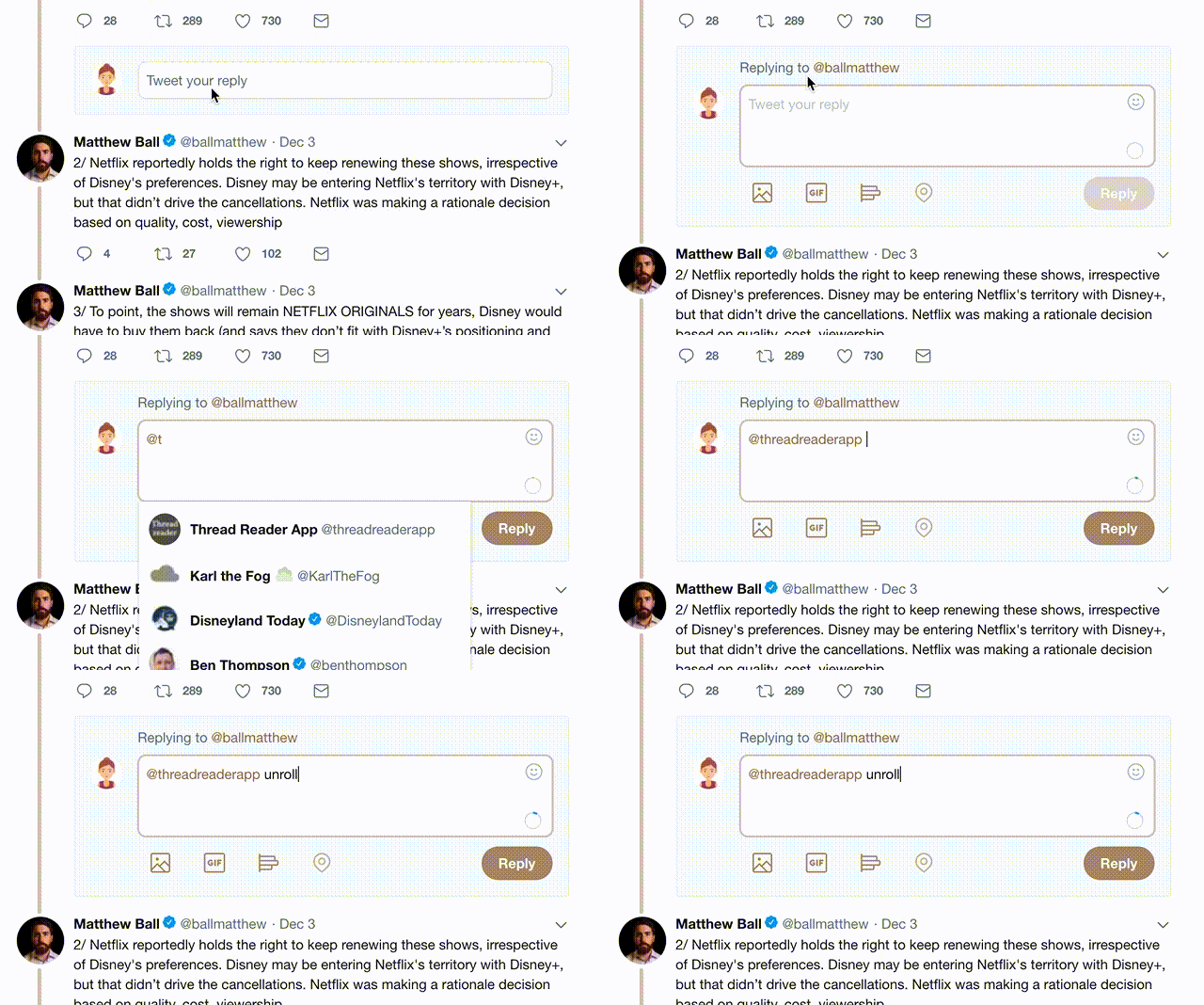
2) Go to a Twitter thread (series of Tweets by the same owner) and mention us with a keyword "unroll" @threadreaderapp unroll

You can practice here first or read more on our help page!

Follow Us on Twitter!

Did Thread Reader help you today?

Support us! We are indie developers!


This site is made by just two indie developers on a laptop doing marketing, support and development! Read more about the story.

Become a Premium Member ($3.00/month or $30.00/year) and get exclusive features!

Become Premium

Too expensive? Make a small donation by buying us coffee ($5) or help with server cost ($10)

Donate via Paypal Become our Patreon

Thank you for your support!