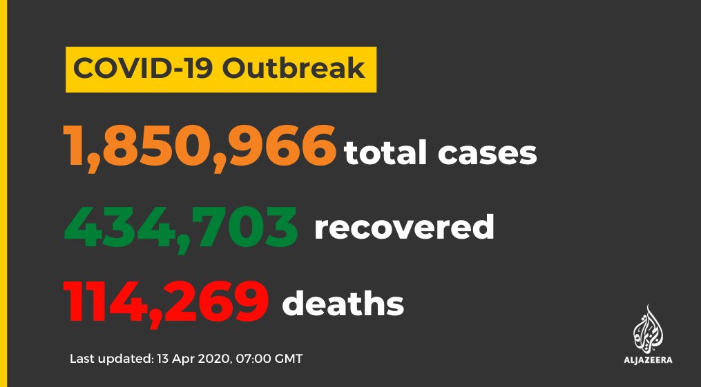
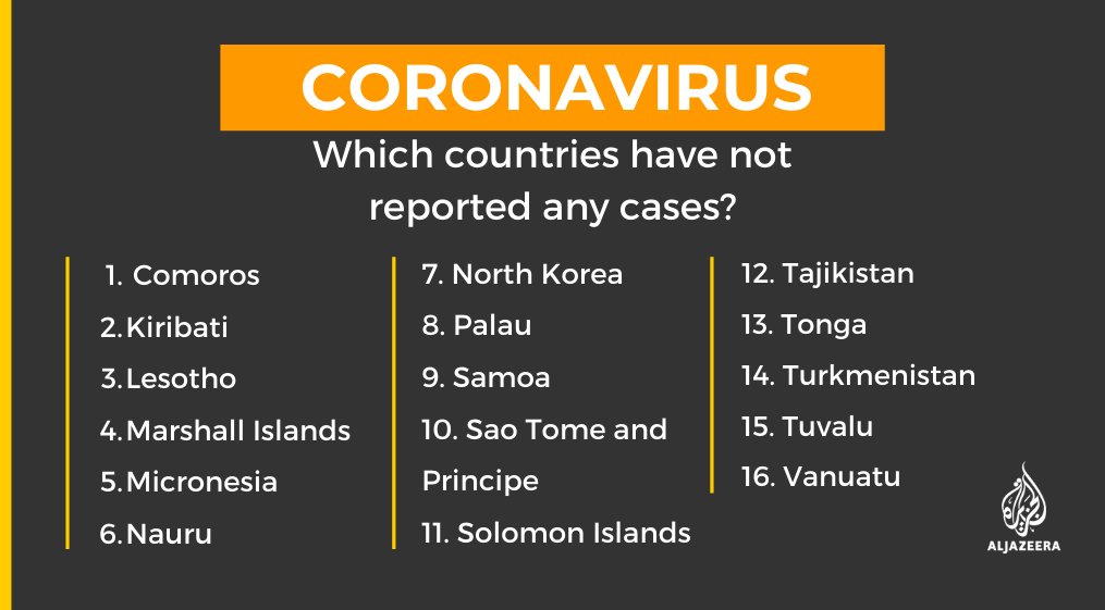
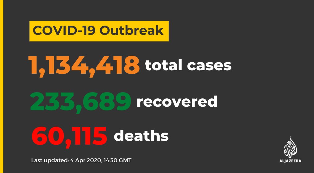
Are you trying to make sense of all the #coronavirus numbers?
We help you filter through the headlines and charts behind the #COVID19 pandemic.
The coronavirus numbers being reported are not facts - but they’re the best we’ve got aje.io/7nduk
And what we observe today is a result of actions taken a few weeks ago aje.io/rcgz4
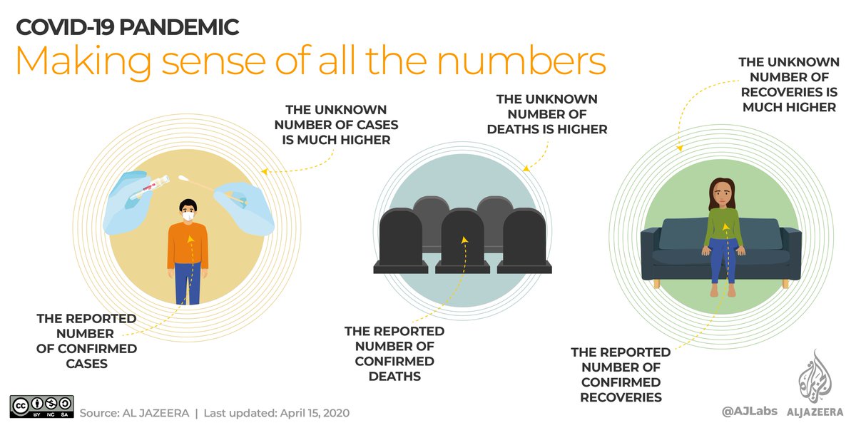
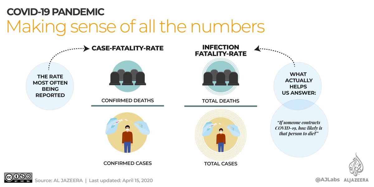
The infection-fatality-rate (IFR) is the proportion of people who die out of the actual number of people who were infected - which is what actually helps us calculate the risk of death aje.io/rcgz4
No single chart can communicate everything about how #COVID19 behaves.
Generally speaking, maps can tell you what is happening around the world right now, while charts tell you what has happened over time aje.io/rcgz4
The first reported case was in China's Hubei province on November 17, 2019.
The virus quickly spread, and the US currently has the highest number of confirmed cases worldwide aje.io/rcgz4
One way is to compare the weekly rolling averages.
This allows you to see if the number of new #coronavirus infections this week was higher or lower than last week aje.io/rcgz4


