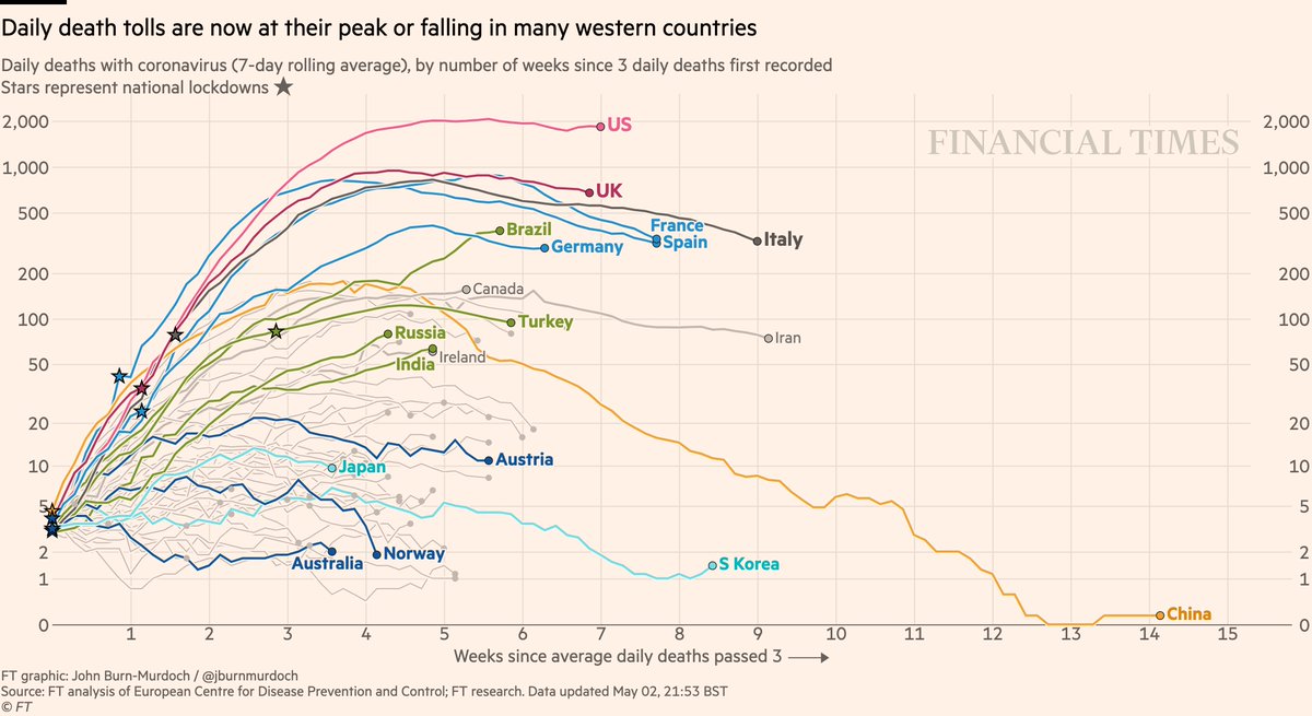
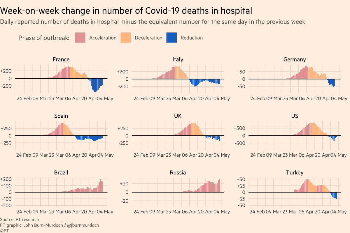
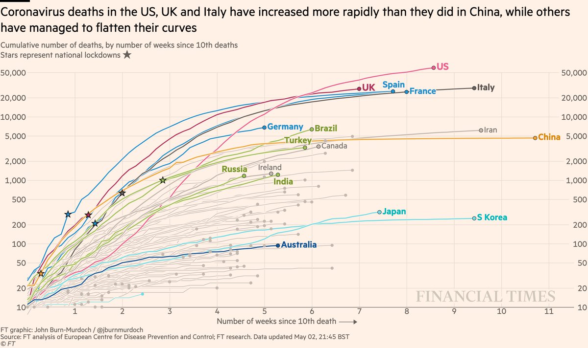
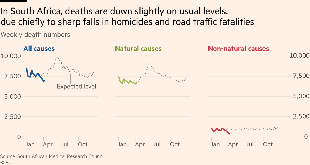
Story by me, @ChrisGiles_ & @valentinaromei (free to read): ft.com/content/6bd88b…

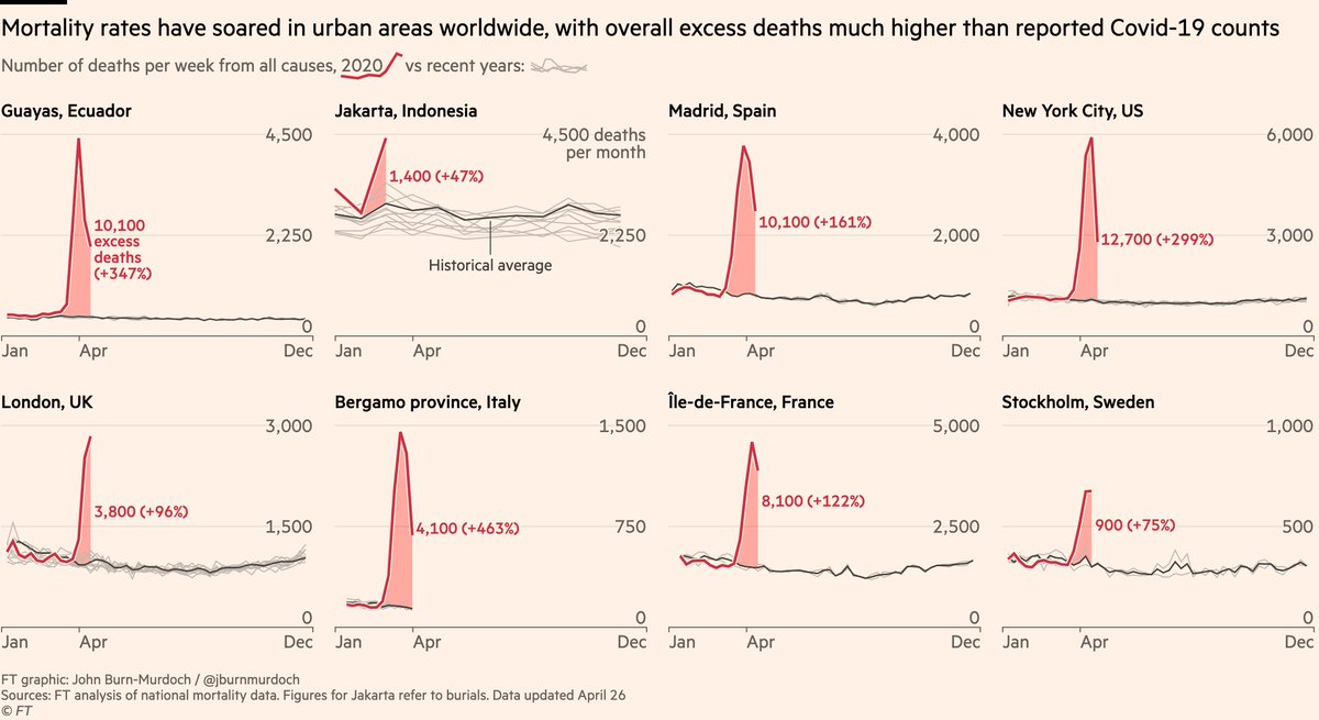
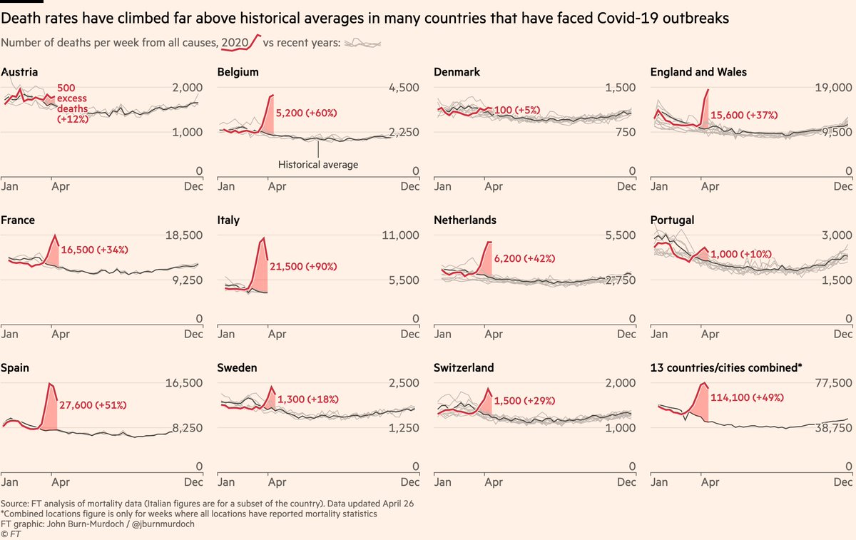
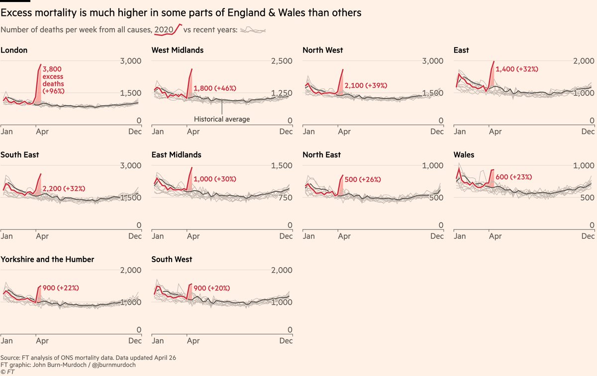
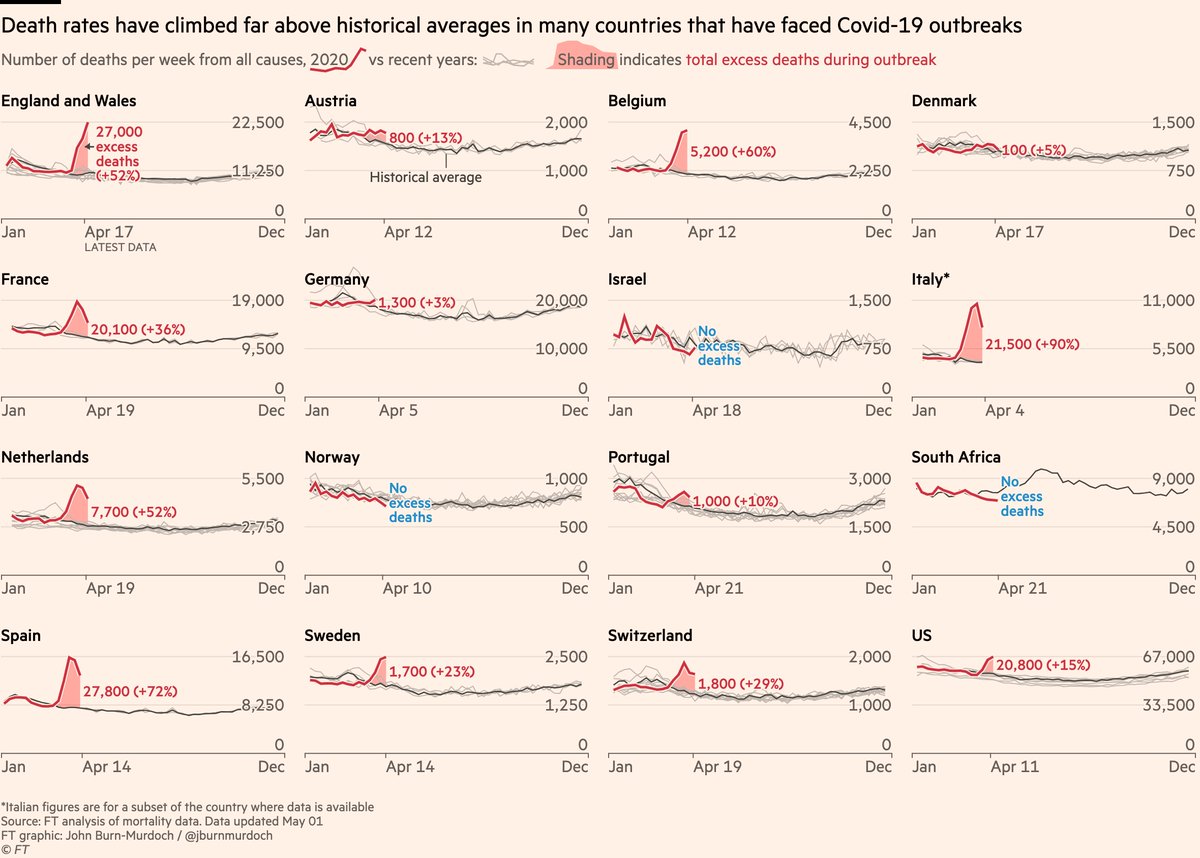
You can clearly see that in almost every country, spikes in mortality are *far* higher than what we see from flu etc (grey lines are historical death numbers) ft.com/content/6bd88b…

Excess all-cause mortality is the best way to get around this data quality issue and reveal what’s really happening.
We’ll be updating our excess mortality numbers for our current set of 14 countries, and expanding that list.
• In each case we establish a historical baseline using deaths in the same country/city for the same weeks in 2015-2019
• Our excess deaths are the 2020 number minus that average
• This means our excess mort numbers may rise *for the weeks we’re already showing here* as well as over future weeks.
I’ve been looking for all-cause mortality in Ecuador for about a month now, and made a breakthrough last week when I stumbled upon this 2019 study of Ecuador’s mortality registry pophealthmetrics.biomedcentral.com/articles/10.11…
Ecuador has chosen to be transparent, even though it paints a dreadful picture.
• Germany: as Chris explains, German data will be out this week
• The US: we show NYC in the charts here and will be adding US states in coming days & weeks

