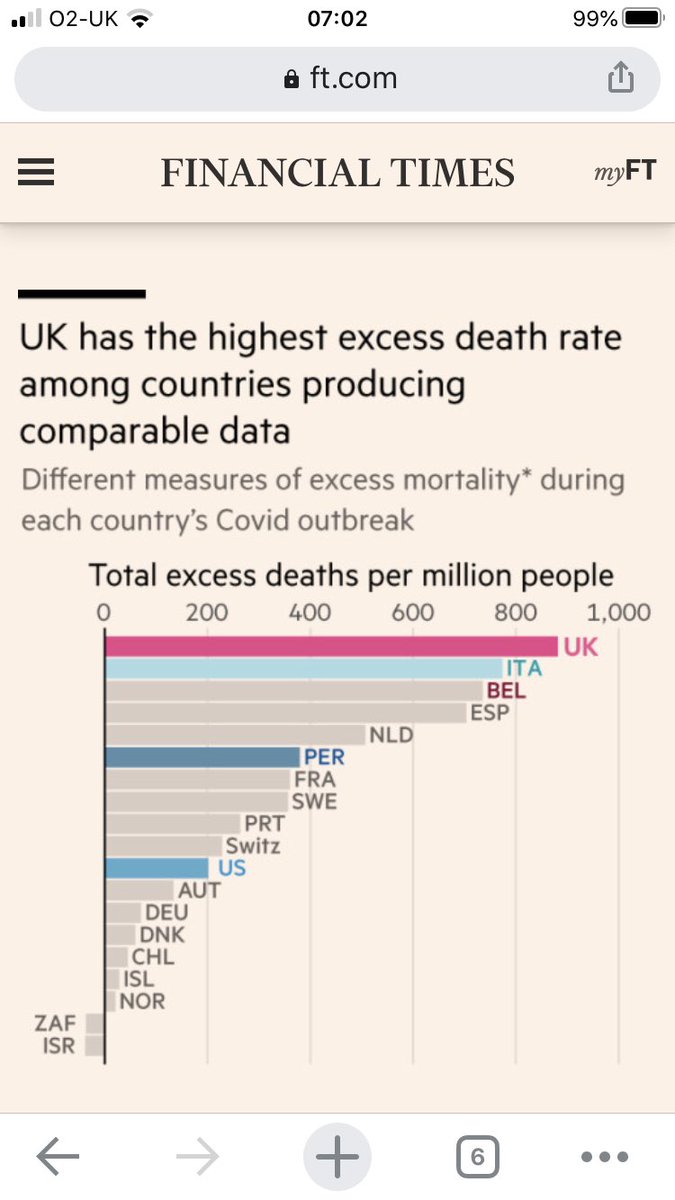
Sufficient data worldwide now exists to conclude that, to date, the UK has the highest rate of excess deaths in the Coronavirus pandemic in the world
Free to read article with @jburnmurdoch
1/
ft.com/content/6b4c78…
Free to read article with @jburnmurdoch
1/
ft.com/content/6b4c78…
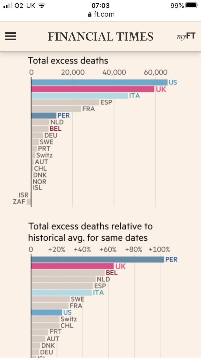
The UK has suffered 60,000 excess deaths, directly or indirectly linked to Coronavirus, according to official figures.
Only the much larger US has had more.
UK has had the highest global excess death rate (per million)
And only Peru has had a higher increase in deaths
2/

Only the much larger US has had more.
UK has had the highest global excess death rate (per million)
And only Peru has had a higher increase in deaths
2/
We can say this now because there are few new excess deaths across Europe and high quality data has now been published.
The US will have a much higher absolute number but its per capita rate is far lower.
Peru has had dengue fever this year and is earlier in its outbreak
3/
The US will have a much higher absolute number but its per capita rate is far lower.
Peru has had dengue fever this year and is earlier in its outbreak
3/
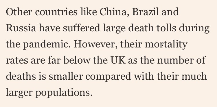
There are some other countries with little data published - Brazil, Russia, China - these have large populations and unlikely to have death rates per million close to the UK
4/
4/
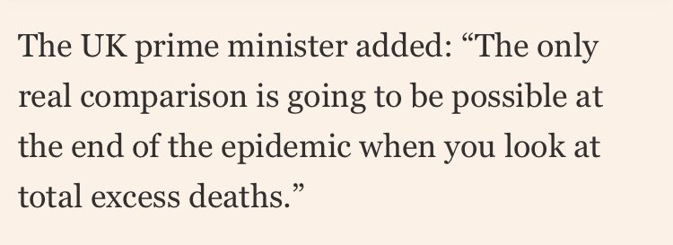
Excess deaths is the measure Boris Johnson and Chris Whitty have championed for comparison
Correctly, they say it is not subject to the measurement and testing problems of other comparisons
UK rate is highest for pensioners and non pensioners. Age adjustment is a red herring
5
Correctly, they say it is not subject to the measurement and testing problems of other comparisons
UK rate is highest for pensioners and non pensioners. Age adjustment is a red herring
5
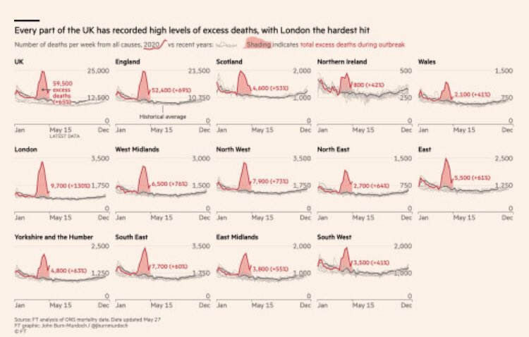
The reason for the UK being at the bottom of the table appears to be twofold.
First, the epidemic spread across all nations and regions of the UK with excess deaths everywhere
7/
First, the epidemic spread across all nations and regions of the UK with excess deaths everywhere
7/
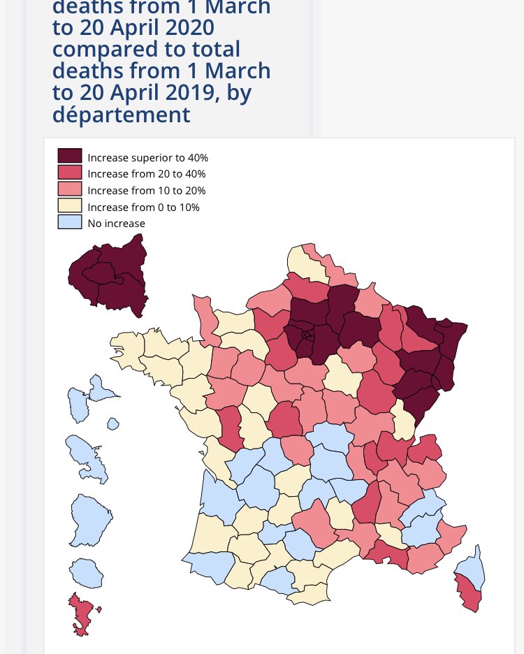
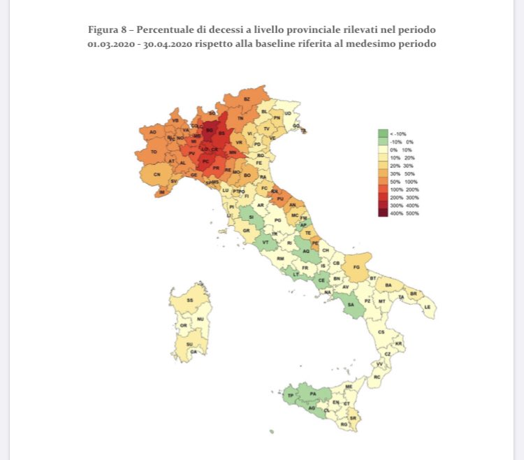
This is not true in Italy and France, for example, where there were definitive hotspots of public health systems being overwhelmed and other areas with lower than normal death rates.
8/

8/
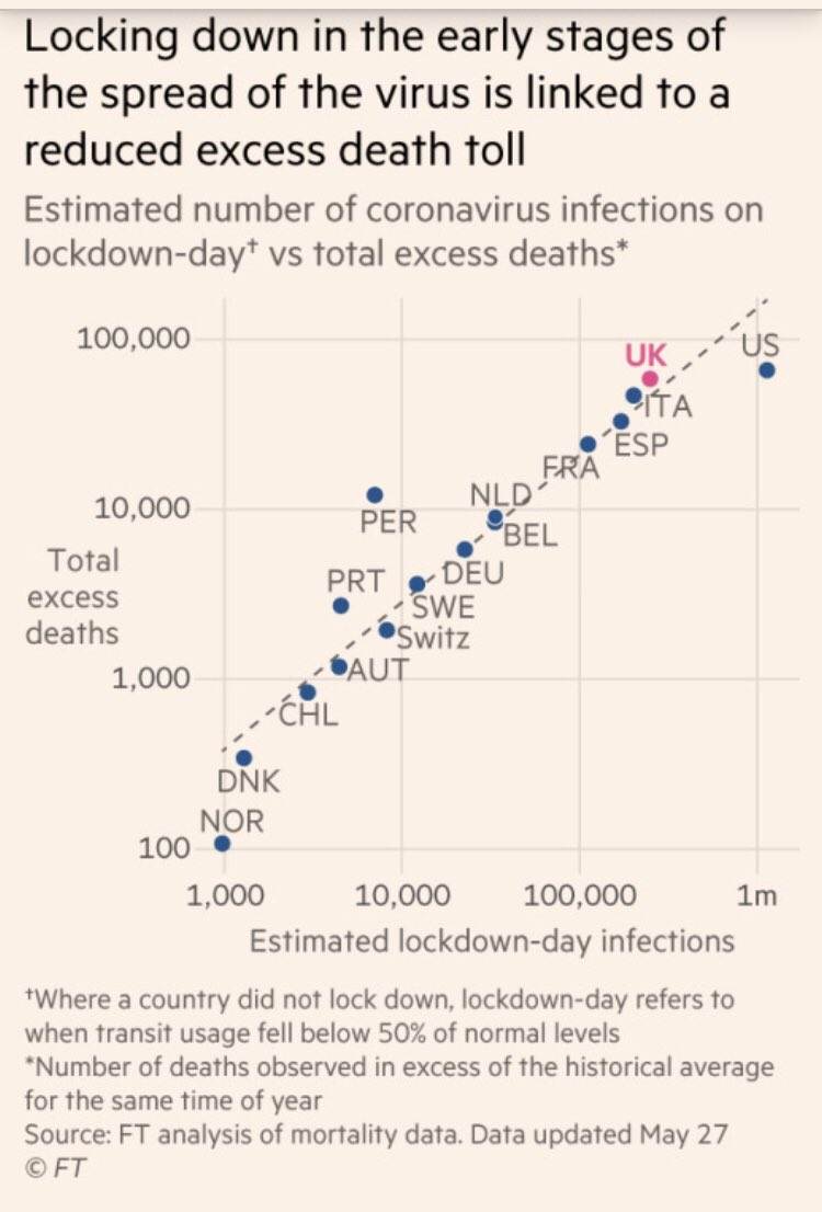
Second, the point of lockdown appears strongly linked to eventual excess deaths.
Here, we show the relationship between an estimate of infections on lockdown day and eventual excess deaths
9/
Here, we show the relationship between an estimate of infections on lockdown day and eventual excess deaths
9/
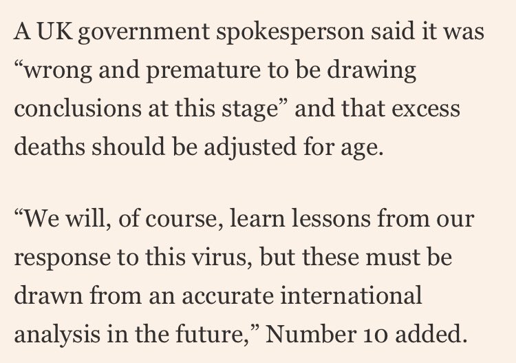
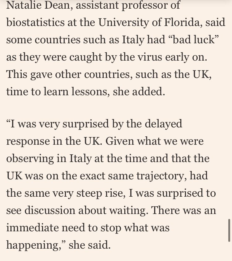
Number 10 has complained that we are jumping the gun with this international comparison and it should determine timing.
One statistician who was sympathetic @d_spiegel to the problems of comparisons says this after seeing the FT analysis
ENDS
One statistician who was sympathetic @d_spiegel to the problems of comparisons says this after seeing the FT analysis
ENDS
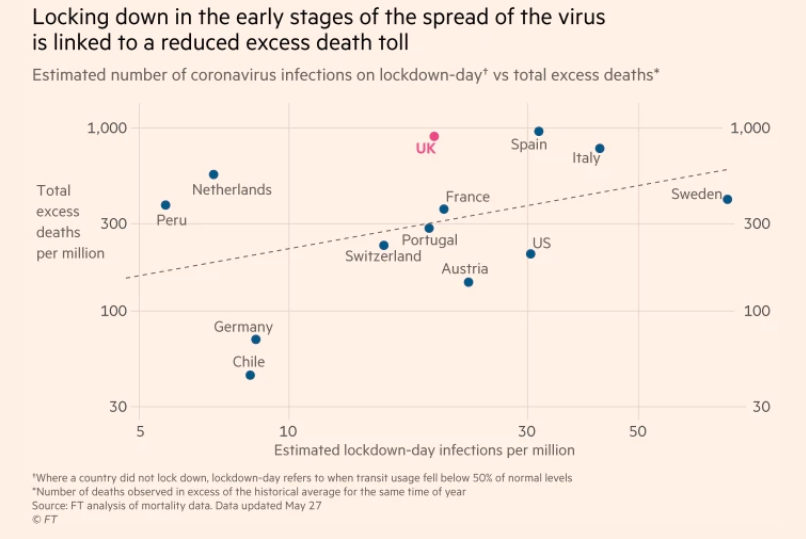
@d_spiegel Following helpful suggestions here on Twitter and elsewhere, we have changed our correlation chart to report on a per capita basis.
This removes an element of tautology in the original version, which we regret. It does not change the story.
This removes an element of tautology in the original version, which we regret. It does not change the story.
• • •
Missing some Tweet in this thread? You can try to
force a refresh

