
QGIS Learning Thread Below! Are you interested in learning how to map? I’m going to go step by step to produce a Texas Map. Follow along and you will be able to try it yourself. #ElectionTwitter
Step 1: You want to download a shapefile that properly fits your data. In this case we are testing a Texas VTD file. This is trial and error, but it is important to have a shapefile that matches. In your downloads, drag and drop the .shx file onto the QGIS Canvas and it will show 

Step 2: Next you have to find your data. In this case we are using the full 2018 General Election Returns. Load your CSV file into excel and save it as a Workbook. Make sure to always save your file on QGIS and Excel in case it crashes.

Step 3: To isolate the data for the specific race you want to map, click on "Filter" in the top-right corner. This will add filters to each column on your spreadsheet.

Step 4: Now you want to isolate your data. We are mapping the 2018 US House election in Texas-7. Simply de-select your options, click on 7 only, and hit okay. This will give you the data you want.

Step 5: Now you simply Copy each required Column of data into a new sheet. (You can make it by hitting the plus sign on the bottom) Your data is ready to go into QGIS, so save it and drag it onto the canvas from your downloads folder.

Step 6: When you drag your data onto the canvas, you have to make sure you select the correct sheet to upload data from in your workbook. Make sure to upload the smaller second sheet with data from TX-7. If you mistakenly add all the TX data QGIS will explode and crash.

Step 7: Next you select your color scheme for your shapefile. If you want the 25 Styles Color Scheme, or the Miles Wincode, I can send you them. Just DM. I usually use 3 PCT, but you can select what you want. The shapefile will disappear after this.

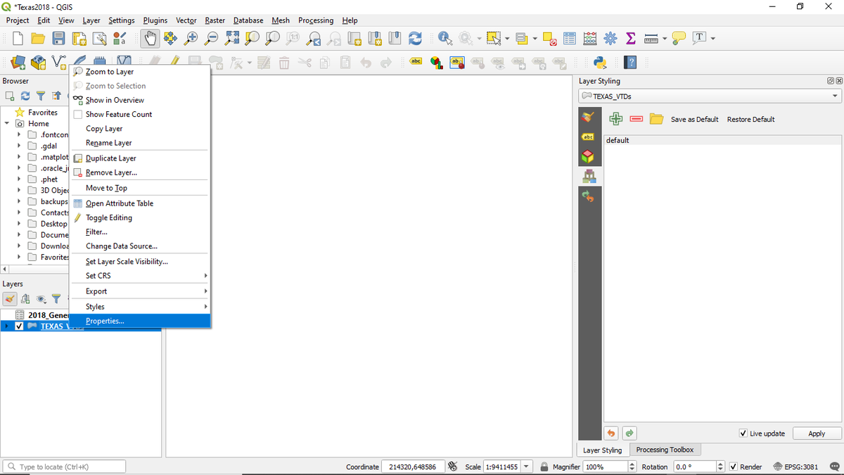
Step 8: Next you right-click your shapefile and select properties. This is how you get to your layer styling options.
Step 9: Once you open your layer styling panel, click "Joins" and hit the plus sign on the bottom left to open your panel. This is how you join your data to the shapefile.

Two tips! 1) Use County VTDs instead of VTD so Numbers don’t duplicate. 2) Check for Divide by 0 errors otherwise your margin column won’t appear in QGIS
Step 10: Join the like fields. (In this case County VTD to County VTD) and create an optional custom field name. Next hit ok and then hit apply to confirm your changes.

Step 11: Go to symbology and select your margin column (The difference between the DEM and GOP totals - in this case TX-7R-D) and then hit apply.

Then you get a map! I will post it in full soon.


