Prize for the first person to spot what went wrong here.
(First author is an old friend so I am sure she won't mind me pointing it out. Great study! All publicity is good publicity Valentina!)
(First author is an old friend so I am sure she won't mind me pointing it out. Great study! All publicity is good publicity Valentina!)

Bit tricky on that, so let me make it easier:

Answer in the morning from @drgrahamcole who pointed it out to me.
OK I see some initial answers that are aimed at pretty high-brow analysis.
You can ask F2 harrell about all that kind of fancy stuff.
I am just looking at this.
You can ask F2 harrell about all that kind of fancy stuff.
I am just looking at this.
Hmmm... maybe people are finding this harder than I expected.
A further hint here.
A further hint here.

Why can we be *confident* that
(a) what was described in the methods, was not was actually done
and
(b) that in one case, even what was done, was done incorrectly.
(a) what was described in the methods, was not was actually done
and
(b) that in one case, even what was done, was done incorrectly.

Lots of sophisticated answers overnight! But we are looking for something simple.
Kishore is the closest to what Graham and I had in mind.
Is that a good enough hint?
Kishore is the closest to what Graham and I had in mind.
Is that a good enough hint?

Step 1. Read this.

Step 2.
Look at the top two rows of data and the bottom row.
Look at the top two rows of data and the bottom row.

Now what jumps out and slaps you in the face?
Remember that we said Kishore was close to the idea we are after.
Remember that we said Kishore was close to the idea we are after.
Any doctor who has seen BNPs or CRPs or troponins should start laughing now.
Hint. What do those three variables share, in your experience?
Hint. What do those three variables share, in your experience?
Excellent suggestion!
Not the answer I was looking for, but getting at exactly the right issue.
Not the answer I was looking for, but getting at exactly the right issue.
Why do we sometimes report "median and interquartile range" rather than "mean and SD"?
The *two* leading answers are correct.
Let's remind ourselves about Parametric and Non-parametric STATISTICAL TESTS.
(@alexnowbar please make a note of this as a topic to cover specifically as people do find it a bit puzzling sometimes)
Let's remind ourselves about Parametric and Non-parametric STATISTICAL TESTS.
(@alexnowbar please make a note of this as a topic to cover specifically as people do find it a bit puzzling sometimes)
Suppose I want to describe to you the positions of ALL of the light blue pixels on this graph.

It's easy. I would say:
"Go to point (2, -1). Every pixel that is within 3 pixels of that point, is in my region of interest. Everything outside is not."
How many numerical parameters do I need to describe the position of the light blue region?
"Go to point (2, -1). Every pixel that is within 3 pixels of that point, is in my region of interest. Everything outside is not."
How many numerical parameters do I need to describe the position of the light blue region?
Hmmm... the answer "two" seems to be inexplicably popular, winning half the votes at the 6-vote stage.
I can see how Donald Trump became president.
I can see how Donald Trump became president.
Here are the numbers I used.
X coordinate of centre of circle, i.e. 2
Y coordinate of centre of circle, i.e. -1
Radius of circle, i.e. 3.
How many numbers is that?
X coordinate of centre of circle, i.e. 2
Y coordinate of centre of circle, i.e. -1
Radius of circle, i.e. 3.
How many numbers is that?
It occurs to me that some people were counting (2, -1) as a single numerical parameter.
Anyway I am considering 2 and -1 to be separate numbers.
(I can't believe I'm having to point this out)
Anyway I am considering 2 and -1 to be separate numbers.
(I can't believe I'm having to point this out)
Now look at this triangle.
Think of all the ways you could describe the points of its interior.
What is the smallest number of numerical parameters you can use?
Think of all the ways you could describe the points of its interior.
What is the smallest number of numerical parameters you can use?

The picture itself uses 6 parameters.
With those 6 parameters, 2 coordinates for each of the 3 corners, the triangle is described unambiguously, and uniquely - that is, only that exact triangle has those particular 6 values.
With those 6 parameters, 2 coordinates for each of the 3 corners, the triangle is described unambiguously, and uniquely - that is, only that exact triangle has those particular 6 values.
You could try a different combination, to try to cut down the wasteful usage of parameters. (Save the planet, etc)
For example, how about:
X and Y coords of point B, and then
Orientation of one side (0 to 360 degrees)
Orientation of other side (0 to 360 degrees)
Seems to be 4?
For example, how about:
X and Y coords of point B, and then
Orientation of one side (0 to 360 degrees)
Orientation of other side (0 to 360 degrees)
Seems to be 4?
But no, if you only know the orientations, you don't know how far along the lines to put the points A and C.
So you need
X and Y coords of B, plus
Orientation AND LENGTH of one side
Orientation AND LENGTH of other side
So that's 6 again.
It turns out 6 is the minimum needed.
So you need
X and Y coords of B, plus
Orientation AND LENGTH of one side
Orientation AND LENGTH of other side
So that's 6 again.
It turns out 6 is the minimum needed.
Now, how many numerical parameters would you need to correctly describe all the points inside this shape?

Options
That's the problem we face in stats. The question we are asking in hypothesis testing is typically of this form:
"These two groups of numbers, heights of men and heights of women. Could they easily be explained as one big group, with man versus woman being unrelated to height?"
"These two groups of numbers, heights of men and heights of women. Could they easily be explained as one big group, with man versus woman being unrelated to height?"
The statistical hypotheis test, aka the P value, is telling us:
"If in reality gender has no effect on height, how likely is it that when you measure heights of men and women, you would get a result as different as this between groups?"
"If in reality gender has no effect on height, how likely is it that when you measure heights of men and women, you would get a result as different as this between groups?"
To give you a P value, the stats test has to have a description of the data. It is really, really convenient if we can tell the stats test a simple description of the data.
So suppose we have loads of data points:
So suppose we have loads of data points:

Instead of feeding into the statistical test all the INDIVIDUAL data points, we just give it a SUMMARY of the distribution of the men, and of the women.
The most convenient summary is when the data look reasonably "Normal" (Gaussian) in distribution.
The most convenient summary is when the data look reasonably "Normal" (Gaussian) in distribution.
Because then we can just say "In my sample, the men have height distributed with mean 70 inches, and standard deviation 5 inches. And the women have mean 65 inches, and standard deviation 5 inches."
How many numerical PARAMETERS have we reduced our detailed graph to?
How many numerical PARAMETERS have we reduced our detailed graph to?
So when you do a two sample t test, e.g. "are men taller than women, on average?" you are actually
Starting with the raw data
Computing 4 parameters (mean & sd of one group, mean and sd of other group)
THROWING AWAY THE RAW DATA
and then feeding the 4 parameters into the stats.
Starting with the raw data
Computing 4 parameters (mean & sd of one group, mean and sd of other group)
THROWING AWAY THE RAW DATA
and then feeding the 4 parameters into the stats.
Did you know that from knowing the two means and two SDs, you can calculate the unpaired t-test P value directly, without having access to the raw data?
Hopefully you answered Yes.
Even if you didn't, you NOW know, don't you?
The unpaired t-test does not need the RAW data of all your million people or whatever.
Just the 4 *PARAMETERS*.
You know what's coming, don't you?
Even if you didn't, you NOW know, don't you?
The unpaired t-test does not need the RAW data of all your million people or whatever.
Just the 4 *PARAMETERS*.
You know what's coming, don't you?
"That's why the unpaired t-test is called a Parametric test.
It tests the PARAMETERS, not the raw data."
D Francis
J Blindingly Obvious, 2020
It tests the PARAMETERS, not the raw data."
D Francis
J Blindingly Obvious, 2020
Now suppose your data was distributed like this. You want to know if these three samples show significantly different values.

It's hard to feed in a summary into a statistical test. You can summarise the right hand distribution with mean and SD, and be confident you are describing the data right to the stats program
But what about the left? The program will have a very different impression from reality
But what about the left? The program will have a very different impression from reality
In the general case of funny-shaped distributions, there are no useful PARAMETERS that describe the distributions well enough for the stats program to understand what you mean.
So you end up having to feed in ALL THE RAW DATA.
Not just the parameters.
So you end up having to feed in ALL THE RAW DATA.
Not just the parameters.
And the STATISTICAL TESTS have to process all the raw data.
Not the parameters.
So these statistical tests (not your data!) are called
Not the parameters.
So these statistical tests (not your data!) are called
Nothing stopping you calculating your data's mean and SD. So your DATA does have parameters.
It's just that the parameters aren't very helpful in describing the situation.
It's just that the parameters aren't very helpful in describing the situation.
Like the mean wealth of people in your house, when Bill Gates drops round for tea.
Your wealth distribution does have parameters such as mean (many billions!) and SD (also many billions), but that doesn't really give a useful picture of the situation.
Your wealth distribution does have parameters such as mean (many billions!) and SD (also many billions), but that doesn't really give a useful picture of the situation.
So when we are studying CRP, BNP or Troponin, you know how patients freak out when their number goes up, seemingly a lot?
"Doctor, doctor, I must be dying! My BNP has doubled since last time!"
"Doctor, doctor, I must be dying! My BNP has doubled since last time!"
The reason that happens is that they are thinking of it like weight. If your weight doubles between visits, that's really really bad (if you are an adult).
But your BNP can easily double, and halve between visits, just on a whim.
It has a large positive tail.
But your BNP can easily double, and halve between visits, just on a whim.
It has a large positive tail.
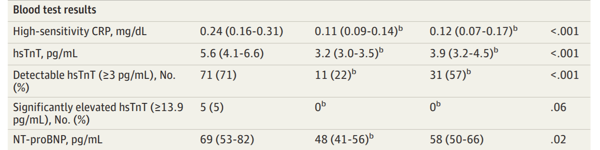
In fact here is an example from a Circ paper where the authors have shown the distribution and correctly given the MEDIAN and INTERQUARTILE RANGE to describe the distribution.

Oddly they have also drawn a Normal distribution on the data, presumably for comedy value?
You can see that almost half of the Normal distribution is dangling into the negative territory.
You can see that almost half of the Normal distribution is dangling into the negative territory.
Notice how the lower quartile is much closer to the median, than the upper quartile is?
Figuratively:
22 .. 110 ........................... 342
Figuratively:
22 .. 110 ........................... 342

That always happens in these very skewed distributions:
BNP
CRP
Troponin
Income of people in a whole country
Simply ask yourself "Is it possible to have a value 3 times that of the mean?"
If the answer is "sure, yes!" then the distribution is 100% definitely skewed.
BNP
CRP
Troponin
Income of people in a whole country
Simply ask yourself "Is it possible to have a value 3 times that of the mean?"
If the answer is "sure, yes!" then the distribution is 100% definitely skewed.
OK I forgot what the original question was.
Back to the paper.
Back to the paper.

How are numerical data described?
Hint.

Where is the supposed median, in relation to the supposed IQR, of this variable in 100 patients?

Options
It might happen in 10 patients, but if you extract 100 CRP values from the hospital computer in front of you, will they be distributed like that, with the median potentially at the midpoint of IQR?
Answer is no. CRP is strongly positively skewed.
In a 100 patients, selected on any non-CRP criterion, I guarantee that you will find the upper quartile much, much further away than the lower quartile, from the median.
Go and check, if you don't believe me.
In a 100 patients, selected on any non-CRP criterion, I guarantee that you will find the upper quartile much, much further away than the lower quartile, from the median.
Go and check, if you don't believe me.
(unless they are all "0" or "undetectable" of course)
So what happened?
There several possibilities, in general, that people could accidentally write, instead of median and IQR.
Which one of the following is NOT a possibility.
Which one of the following is NOT a possibility.
Will Parsonage has actually answered our original question in a brilliant one-liner!

Wtf above! There is no such thing as "intermode". I made it up.
Why is that not instantly winning, due to not even existing?
Why is that not instantly winning, due to not even existing?
Anyway here is Will's brilliant insight.
And Brent's and Nathan's observations. All 3 together pincer in on the conclusion.

If the median number of insane things Donald Trump says per day is 10, what do we know about the PROPORTION OF DAYS on which he says 7 or more insane things?
Good. And if the median troponin is 3.2, what proportion of people must have troponins greater than or equal to 3?
Discuss:

So now we have our answer, working backwards.
Those are NOT medians.
They are means.
A mean can be 3.2, with less than half of the cases being 3 or more, because a few high values are lifting up the mean a lot.
Those are NOT medians.
They are means.
A mean can be 3.2, with less than half of the cases being 3 or more, because a few high values are lifting up the mean a lot.
Only slightly more tricky to see, is the lower quartile issue.
If the lower quartile is 4.1, what percentage of the patients do we know MUST have values of 3 or above?
And similarly in the third column.
Now, looking back, you can see why all these supposed median-and-IQRs look funny.
They are not median and IQR, they are mean and something symmetrical.
In all of these cases, the middle value is at the exact midpoint (+/- 1 in last digit due to rounding) of the other 2 values.
They are not median and IQR, they are mean and something symmetrical.
In all of these cases, the middle value is at the exact midpoint (+/- 1 in last digit due to rounding) of the other 2 values.
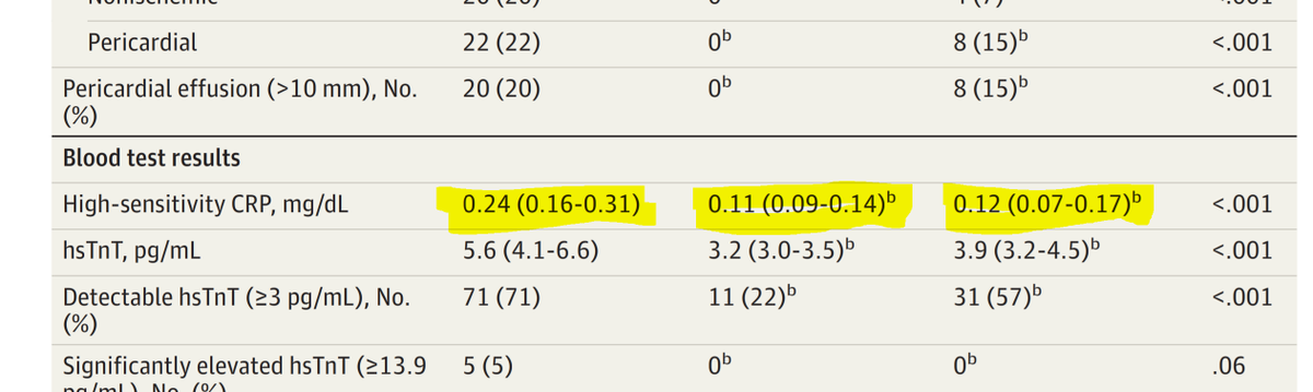
And these too. All are mean and something symmetrical, not median and IQR.
Nicely central.
Nicely central.

That was what I was hoping would jump out at you like it did at Graham and me.
And for the bonus question, "In which one did the authors not quite manage to do what even they were trying to do", is the remaining unhighlighted one.
And for the bonus question, "In which one did the authors not quite manage to do what even they were trying to do", is the remaining unhighlighted one.

This is a strange one, because it is indeed skewed, but ...
Yes.
4.1 ...................... 5.6 ........ 6.6
The skew is the wrong way round.
In a 100-patient group, that never happens. So I am sure it is a typo.
4.1 ...................... 5.6 ........ 6.6
The skew is the wrong way round.
In a 100-patient group, that never happens. So I am sure it is a typo.
And Michael Mielewczik has also pointed out that 31/57 is not 57%.

So far, we know these parts aren't quite right.

Unfortunately, now that our eyes are sensitised, we can see that quite a few other entries are also not quite right, in the same way. They are all mean and something-other-than-IQR, not median and IQR.

I have highlighted two things that seem to have a curious downward skew.
Anyway, aside from those red underlined ones, the rest are all consistent with being EITHER mean and SE
OR mean and 95% CI limits of mean
They can't be SD, because they are two narrow.
The two underlined ones are presumably typos.
OR mean and 95% CI limits of mean
They can't be SD, because they are two narrow.
The two underlined ones are presumably typos.
I'm sorry I got into all of this now!
I promise I had no intention. All I was doing with my original tweet is drawing attention to what I believed to be an error on the ABSTRACT!
I promise I had no intention. All I was doing with my original tweet is drawing attention to what I believed to be an error on the ABSTRACT!

What jumped out to @drgrahamcole and me was that this was describing two distributions, whose medians and interquartile ranges looked like this:
13 22 32
31 43 56
Can you visualise it?
13 22 32
31 43 56
Can you visualise it?
Imagine it was two histograms, one above the other.
The "32" is the upper quartile of the first one, and
the "31" is the lower quartile of the second.
If I draw a vertical line at around 31-or-32,
ROUGHLY how many of the first histogram's area is to the LEFT of it?
The "32" is the upper quartile of the first one, and
the "31" is the lower quartile of the second.
If I draw a vertical line at around 31-or-32,
ROUGHLY how many of the first histogram's area is to the LEFT of it?
And roughly how much of the SECOND histogram's area is to the RIGHT of it?
In my head when Graham and I saw those numbers we were seeing this.
The lower quartile of one distribution is roughly where the upper quartile of the other is.
The lower quartile of one distribution is roughly where the upper quartile of the other is.

If you have a hundred people in your study, and you have THAT enormous a difference between them, you will absolutely NEVER get a P value of 0.02.
It will be <0.001.
Parametric or non-parametric, there is no way P is 0.02.
That is what I wanted to say originally.
It will be <0.001.
Parametric or non-parametric, there is no way P is 0.02.
That is what I wanted to say originally.
That's how I knew from the abstract, that some of the medians and IQRs are means +/- SEs or 95% CIs.
The abstract is odd in another regard too.
I doubt that the age distribution is really as narrow as shown. Probably again the same issue, mean and something, not IQR.
The abstract is odd in another regard too.
I doubt that the age distribution is really as narrow as shown. Probably again the same issue, mean and something, not IQR.
HOWEVER the time-to-scan does seem to be a median and IQR. At least it is asymmetrical, and (at long last) skewed in the correct direction, namely upper quartile further from median than lower quartile is.

However, being forced to think it out step by step, for Twitter, has illuminated something else, though.
I skipped over the primary endpoint of the paper, which is T1 and T2 times, because I have no idea about what I am talking about on this subject.
I wouldn't know a T1 or 2 time if it bit me on the nose.
I wouldn't know a T1 or 2 time if it bit me on the nose.
BUT.
Remember we concluded that these can't be IQRs, because the P value is too weak for such massively different distributions, considering their narrow widths?
Remember we concluded that these can't be IQRs, because the P value is too weak for such massively different distributions, considering their narrow widths?

I don't know what the typical SD of a T1 or T2 is.
Never met one in my normal life, doing humble echo etc.
Does anyone have experience? Graham has his head in his hands and all I can get out of him is "dont' go there".
Never met one in my normal life, doing humble echo etc.
Does anyone have experience? Graham has his head in his hands and all I can get out of him is "dont' go there".
While you are thinking about it, I have this other problem.
If, as I thought I was extremely confident of, those are not IQRs but a confidence interval of the mean, then it should be mean +/- 2 SEs, i.e. for 100 patients
mean +/- 2*SD/sqrt(100)
mean +/- SD/5
If, as I thought I was extremely confident of, those are not IQRs but a confidence interval of the mean, then it should be mean +/- 2 SEs, i.e. for 100 patients
mean +/- 2*SD/sqrt(100)
mean +/- SD/5
This makes SD/5 to be about 10ms (since the limits in the Abstract are about 10ms away from the middle values)
So SD of T1 is about 50ms.
In that case, how to explain this?
So SD of T1 is about 50ms.
In that case, how to explain this?

Now I am questioning my sanity.
I can't work out how the values in the abstract, the P values, and the graphs, can all coexist.
The problem is that all 3 seem to be mutually incompatible.
I think no single one of the 3 can be fixed, to make a compatible set.
Open to ideas?
I can't work out how the values in the abstract, the P values, and the graphs, can all coexist.
The problem is that all 3 seem to be mutually incompatible.
I think no single one of the 3 can be fixed, to make a compatible set.
Open to ideas?