
Recently i have started to learn #color theory.
What color schemes should pick for the next website? This is a frequent question that a lot of people are asking me so i will start to post some advice here on Twitter.I hope that this may help you! A thread🧵
#100DaysOfColour #web
What color schemes should pick for the next website? This is a frequent question that a lot of people are asking me so i will start to post some advice here on Twitter.I hope that this may help you! A thread🧵
#100DaysOfColour #web
Tip no 1:
Picking the right #Colors for your website is very important.
Your colors must reflect your design’s goal and brand’s personality. You should create a positive psychological impact on users. So, you should determine how the color temperature reflects your message.1/2
Picking the right #Colors for your website is very important.
Your colors must reflect your design’s goal and brand’s personality. You should create a positive psychological impact on users. So, you should determine how the color temperature reflects your message.1/2
Picking the right color is related with the purpose of your website. For example if you want to sell a product the right color is blue because it represents trust and strength. Make a colour scheme with blue in it and that's it( not100% blue maybe light blue)
Tip no 2:
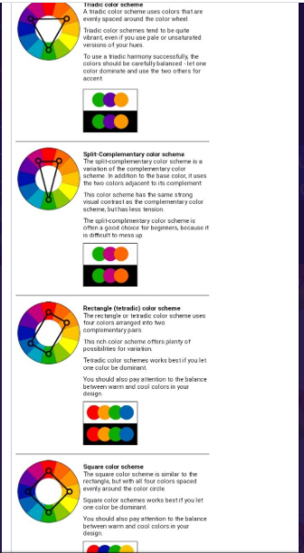
To pick a #colour combination you can use color wheel. Down below are shown the basic color chords based on the color wheel.
#design #Website
To pick a #colour combination you can use color wheel. Down below are shown the basic color chords based on the color wheel.
#design #Website

Some secrets for colour inspiration:Artist palette
canva.com/learn/color-ti…
canva.com/learn/color-ti…
Tip no 3:
Understand how color affects emotion!
The first thing I recommend is familiarizing yourself with how color affects humans on an emotional level.
Here’s a breakdown of how various button colors affect shoppers .
Understand how color affects emotion!
The first thing I recommend is familiarizing yourself with how color affects humans on an emotional level.
Here’s a breakdown of how various button colors affect shoppers .

Tip no 4
Take “the color quiz”.
If you need a little help deciding on a primary color, you may want to take this quiz.
grasshopper.com/resources/tool…
It’s quick and easy (seven questions) but can point you in the right direction if you’re confused about which direction to take
Take “the color quiz”.
If you need a little help deciding on a primary color, you may want to take this quiz.
grasshopper.com/resources/tool…
It’s quick and easy (seven questions) but can point you in the right direction if you’re confused about which direction to take
Tip no 5:
Decide on how many #colors to use.
So you should have a primary color in mind.Then it’s time to figure out how many colors you want to use in total.While there’s no one-size-fits-all formula for this,I would like to point out something that’s called "60-30-10 rule".1/2
Decide on how many #colors to use.
So you should have a primary color in mind.Then it’s time to figure out how many colors you want to use in total.While there’s no one-size-fits-all formula for this,I would like to point out something that’s called "60-30-10 rule".1/2
Here’s how it breaks down
60% of a dominant color
30 % of a secondary color.
10 %of an accent color.
This means that the primary color will account for 60 % of the space on your website, the secondary color will account for 30% and the accent color will account for 10%.
60% of a dominant color
30 % of a secondary color.
10 %of an accent color.
This means that the primary color will account for 60 % of the space on your website, the secondary color will account for 30% and the accent color will account for 10%.
Tip no 6:Use tools for help.
colorspire.com
It gives you a quick&easy way to test out different color combinations to give you a better idea of how they would look on your website. Also check this list of tools for choosing a website color scheme.
mayvendev.com/blog/25-awesom…
colorspire.com
It gives you a quick&easy way to test out different color combinations to give you a better idea of how they would look on your website. Also check this list of tools for choosing a website color scheme.
mayvendev.com/blog/25-awesom…
Tip no 7. Compare a few different color schemes
You don’t need to commit to the first color scheme you come up with.
What I suggest is coming up with three or four different color schemes and compare each one side-by-side,then choose the best
#colours #Website
#100daysOfColour
You don’t need to commit to the first color scheme you come up with.
What I suggest is coming up with three or four different color schemes and compare each one side-by-side,then choose the best
#colours #Website
#100daysOfColour
Tip no 8: Simplicity.
It is usually better to use one color that is offset by a neutral color like white, gray, or black. Using too many colors, may end up conveying too many messages at once that will confuse the person viewing your design.
#100DaysOfColour 🎨
It is usually better to use one color that is offset by a neutral color like white, gray, or black. Using too many colors, may end up conveying too many messages at once that will confuse the person viewing your design.
#100DaysOfColour 🎨
Tip no 10:Contrast
For the most part, dark colors are strong complements to bright colors. That is why most books are designed using white backgrounds and black text. Each color has a contrast value (white is the lightest and black is the darkest).
#100DaysOfColour
For the most part, dark colors are strong complements to bright colors. That is why most books are designed using white backgrounds and black text. Each color has a contrast value (white is the lightest and black is the darkest).
#100DaysOfColour
Tip11.Accessibility
As you’re designing your website, keep in mind that your audiences perceive the world differently.The W3CWebAccessibility has put together a list of resources to ensure that their websites are accessible to people with disabilities.
w3.org/WAI/test-evalu…
As you’re designing your website, keep in mind that your audiences perceive the world differently.The W3CWebAccessibility has put together a list of resources to ensure that their websites are accessible to people with disabilities.
w3.org/WAI/test-evalu…
Tip 12:🎨#100DaysOfColour
Brightness is defined asthe intensity of light illuminating an object. It canbe calculated as the arithmetic mean of the red, green, and blue color coordinates. Howto determine color brightness
BRIGHTNESS=((RED X 299)+ (GREEN X 587)+(BLUE X 114))/1000
Brightness is defined asthe intensity of light illuminating an object. It canbe calculated as the arithmetic mean of the red, green, and blue color coordinates. Howto determine color brightness
BRIGHTNESS=((RED X 299)+ (GREEN X 587)+(BLUE X 114))/1000
20 Awesome Tools for Choosing a Website Color Scheme...really helpful
#100DaysOfColour 🌈🎨
mayvendev.com/blog/25-awesom…
#100DaysOfColour 🌈🎨
mayvendev.com/blog/25-awesom…
Tip 12
To make sure that your website is accessible, follow these tips:
Use font sizes that are large enough to read. While this tip isn't related to color, it's important to keep in mind.Color isn't a standalone concept — it works together with other elements of your website.👇
To make sure that your website is accessible, follow these tips:
Use font sizes that are large enough to read. While this tip isn't related to color, it's important to keep in mind.Color isn't a standalone concept — it works together with other elements of your website.👇
Keep paragraphs short so the information is easy to digest (and readers don’t feel like they’re looking a giant block of color).
Use complimentary but contrasting colors between your background and foreground. You can use a color wheel to figure out which colors will work well
Use complimentary but contrasting colors between your background and foreground. You can use a color wheel to figure out which colors will work well
Tip 13**🤦♀️
Color is something that we could seriously talk about forever, but there are more topics.
~Pure colors, tints, and shades are some of the most basic color variations that you’ll be working with. Know the moods and feelings that your color choices are likely to evoke.🧵#colours
~Pure colors, tints, and shades are some of the most basic color variations that you’ll be working with. Know the moods and feelings that your color choices are likely to evoke.🧵#colours
~Colors come with social and cultural connotations. Remember your frame of reference when you think about how your color choices will affect your audience.
~Remember that people are reading your content from different perspectives. Eyeballs were not created differently. Some of us have perfect vision while others strain to read text on a screen. Make sure that your text is easy to read by using contrasting colors.
Red and green are the colors most affected by vision deficiency, especially among men. Be careful when you’re working with these colors.
~ When creating your website, pick colors that contrast dramatically from the rest of your color scheme. Remember, people on the Internet have limited attention spans and are flaky. The more that you can capture their attention, the easier time you’ll have engaging them.
...👇
...👇
• • •
Missing some Tweet in this thread? You can try to
force a refresh


