
[1/X] Attempt to explain Orderflow basics. It will be a long thread but will try to make the content worth the read.
Below is a Depth of Market (DOM). The
Blue ones = Bid Limit orders
Red ones = Ask Limit orders
So what happens to these orders in the trade cycle
#Basics
Below is a Depth of Market (DOM). The
Blue ones = Bid Limit orders
Red ones = Ask Limit orders
So what happens to these orders in the trade cycle
#Basics

[2/X] Such limit orders are invariable absorbed by the Market Orders.
It is the Market Orders that drive the markets up and down.
Lesson # 1: Every auction starts with a Bid and an Ask
Lesson # 2: Market orders move the price
It is the Market Orders that drive the markets up and down.
Lesson # 1: Every auction starts with a Bid and an Ask
Lesson # 2: Market orders move the price
[3/X] So how do we track these market orders. We track them on the Footprint aka Cluster charts
GREEN = Buy Market Orders
RED = SELL Market Orders
Market Orders indicate Aggresiveness
GREEN = Buy Market Orders
RED = SELL Market Orders
Market Orders indicate Aggresiveness

[4/X] So what you see on the Foorpint aka Cluster chart is Market Orders and what you see on DOM are the Limit Orders i.e., orders waiting to be executed.
Lesson # 3: A Market Order buys/sells a Limit Order
PS: Exceptions to every rule exist
Lesson # 3: A Market Order buys/sells a Limit Order
PS: Exceptions to every rule exist
[5/X] When the buyers are aggressive, they will take out all the Limit Orders on the Ask side.
Similarly when sellers are aggressive, they will take out all the Limit Orders on the Bid side
This can clearly be seen on the Footprint Chart
Similarly when sellers are aggressive, they will take out all the Limit Orders on the Bid side
This can clearly be seen on the Footprint Chart
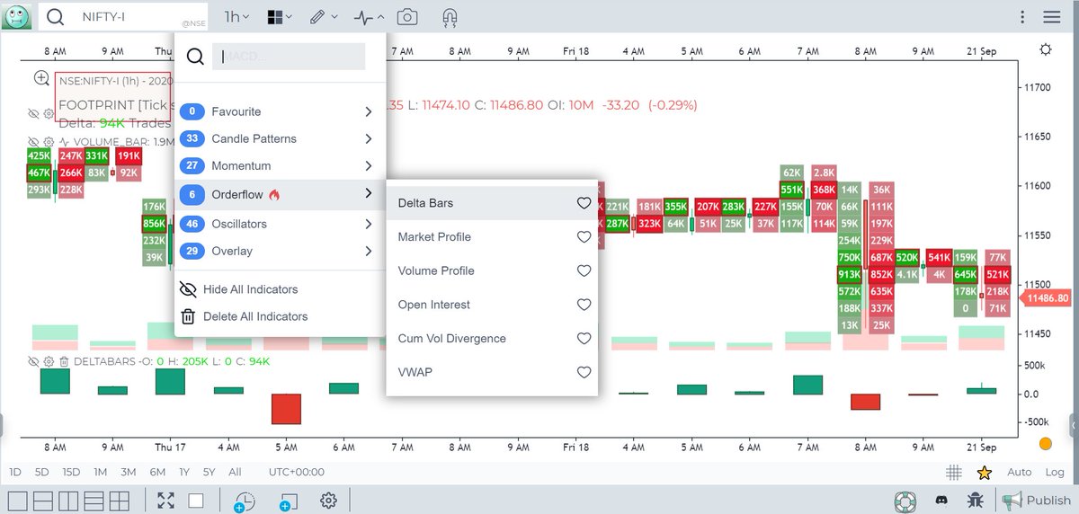
To activate the Footprint, choose the chart type = Cluster from the Chart dropdown on the top bar

The volume is now split between the Buy trades and the Sell trades
Total Volume = Buy Trades + Sell Trades
Total Volume = Buy Trades + Sell Trades

[8/X] Now lets understand the concept of Delta
Delta = Buy Volume - Sell Volume
in a footprint chart
Delta = Buy Volume - Sell Volume
in a footprint chart

[9/X]
Delta = Positive => Aggressiveness on the Buy side
Delta = Negative => Aggressiveness on the Sell side
Generally you would expect Price to move 🆙 when Delta is positive and Price to move 🔽 when Delta is negative
True....but there is a catch...called Divergence
Delta = Positive => Aggressiveness on the Buy side
Delta = Negative => Aggressiveness on the Sell side
Generally you would expect Price to move 🆙 when Delta is positive and Price to move 🔽 when Delta is negative
True....but there is a catch...called Divergence
[10/X] So what is Divergence?
Any two parameters that should be in sync (Price and Delta in this case) towards supporting a particular move (Up or Down) but are in reality not (in sync) form a Divergence
Divergence is best shown by the Orderflow Indicator called Delta Bars
Any two parameters that should be in sync (Price and Delta in this case) towards supporting a particular move (Up or Down) but are in reality not (in sync) form a Divergence
Divergence is best shown by the Orderflow Indicator called Delta Bars

[11/X] Taking a small detour to explain Delta Bars.
Delta Bars are a candle stick chart on Delta. We measure the delta at the open of the candle (always 0) and close of the candle along with Delta Max and Delta Min
What is this Delta Max and Delta Min?
Delta Bars are a candle stick chart on Delta. We measure the delta at the open of the candle (always 0) and close of the candle along with Delta Max and Delta Min
What is this Delta Max and Delta Min?
[12/X] Delta Max is the maximum diff between Buy and Sell Volume at any point in time during the Candle formation.
Delta Min is the minimum diff between Buy and Sell
Now plot a candlestick using Delta Max and Delta Min as High and Low of the Delta Candle and you have Delta Bar
Delta Min is the minimum diff between Buy and Sell
Now plot a candlestick using Delta Max and Delta Min as High and Low of the Delta Candle and you have Delta Bar
[13/X] To activate Delta Bars, choose from the Indicators menu under Orderflow category
These bars also come in the Cumulative format called Cumulative Delta Bars
These bars also come in the Cumulative format called Cumulative Delta Bars
[14/X] So the green and red bands are zones of divergence - meaning price and delta are out of sync

[15/X] So how does this Divergence take place?
Say, Delta = Positive but Price does not move 🆙
So more aggressive Buy market orders than Sell market orders and yet price does not move up
Why?
Say, Delta = Positive but Price does not move 🆙
So more aggressive Buy market orders than Sell market orders and yet price does not move up
Why?
[16/X] This is so because some institution (FII/DII/Whale) is simply absorbing all the <arket buy orders with Limit orders, which is happening without you coming to know of it..
[17/X] When the institution deems all the market buy orders are absorbed, they start selling with Market orders..
This last bit can be seen with the help of delta divergence
This last bit can be seen with the help of delta divergence
[18/X] We have now scratched the surface of Orderflow....barely
Opening this thread to anyone who wants to build on this content to help everyone
#Knowledge #Sharing #Orderflow #basics
Opening this thread to anyone who wants to build on this content to help everyone
#Knowledge #Sharing #Orderflow #basics

• • •
Missing some Tweet in this thread? You can try to
force a refresh


