🟑 Team Yellow (25.92%)

#TwitterInColors

Its brightness is particularly useful in catching the consumer's eyes and it’s used to simulate relax, awake awareness.

Lots of profiles are using yellow as their main color, probably because it’s very cheerful.
It works because it pushes you to press the profile picture.

But if a lot of people use it, it stops drawing attention.

So probably not the best choice right now if you want to stand out.
🟑 @hellojerryalex uses a light tinted yellow on his profile pic, but the drawing in it make it unique! Also, emphasizes his profile choosing a yellow flat cover pic.
🟑 @zhenpixels has a cool face sketch, that makes the difference. In this case, he also chooses a yellow flat cover pic, so the main focus is in his sketch face.
🟑 @wes_kao stands out for the clarity and contrast of her photo with the yellow background. Also, she uses the yellow flat cover pic team, simplicity is cool!
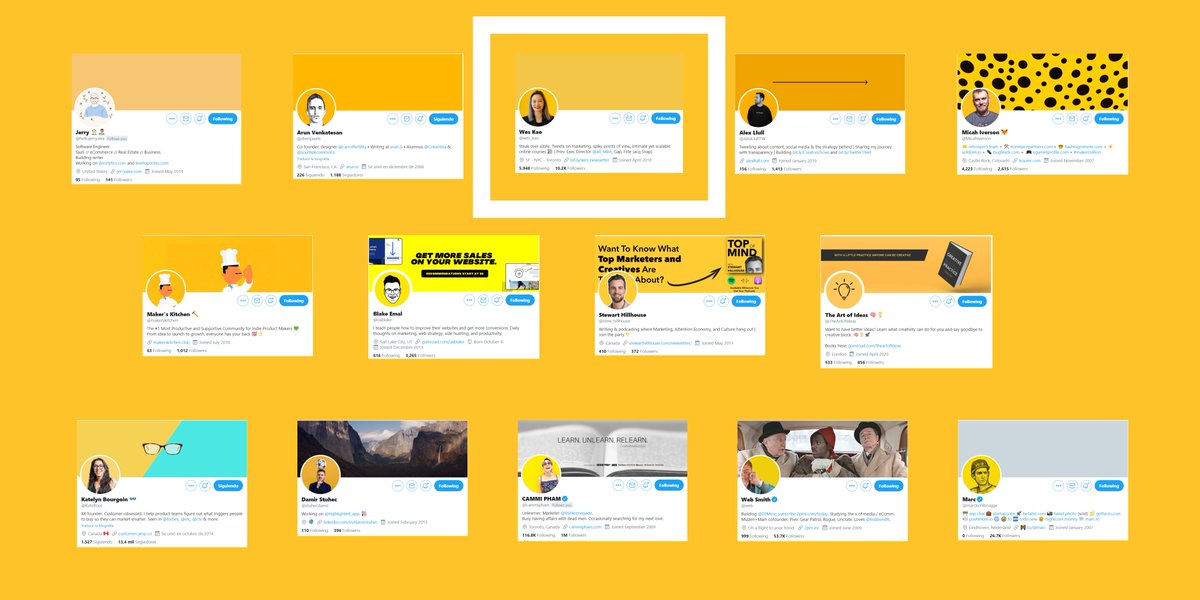
🟑 @AlexLlullTW has a black & white filter on his photo, which contrasts more with the yellow background. The black arrow on his cover pic adds personality to his profile, simple and effective.
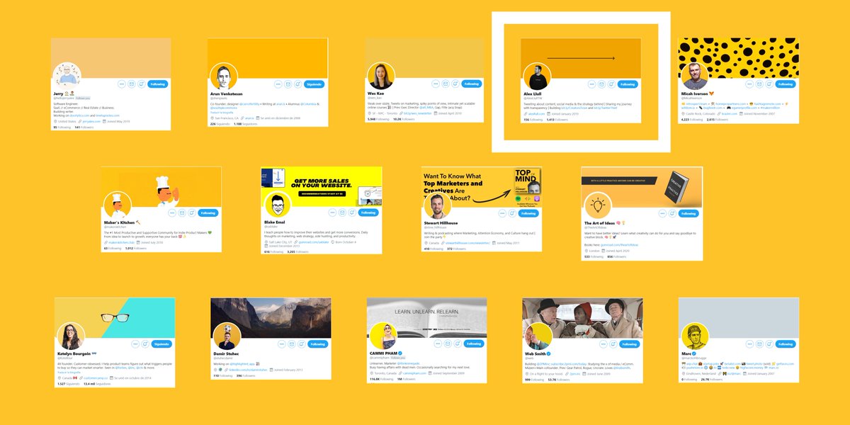
🟑 @MicahIverson uses black circles on his cover pic that reminds me to a cheetah, has a lot of personality and only with a few circles!
🟑 @makerskitchen profile stand out because they mix the illustration of a chef with the community of makers and uses the same illustrator for their cover pic, a good choice to define the brand.
🟑 @uxblake has a nice black and whote illustrator of his face making a perfect contrast with the yellow background and very easy to recognize. He takes advantage of his cover pic to explain what his product is about.
🟑 @stew_hillhouse has a nice white stroke around his head and it gives him a nice personal touch. On his cover pic he is promoting his podcast, sad that a piece of text is covered by his profile pic.
🟑 @TheArtOfIdeas a light bulb black icon reinforce the purpose of the account. On the cover pic shows a book available to buy with a great slogan. Yellow can also be related to light, so it makes sense.
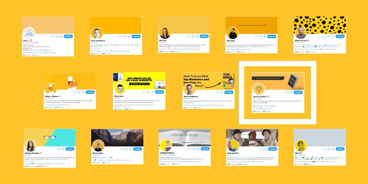
🟑 @KateBour her glasses add personality. She uses a lighter yellow tone but the glasses and the contrast with blue on her cover pic makes his profile always recognizable.
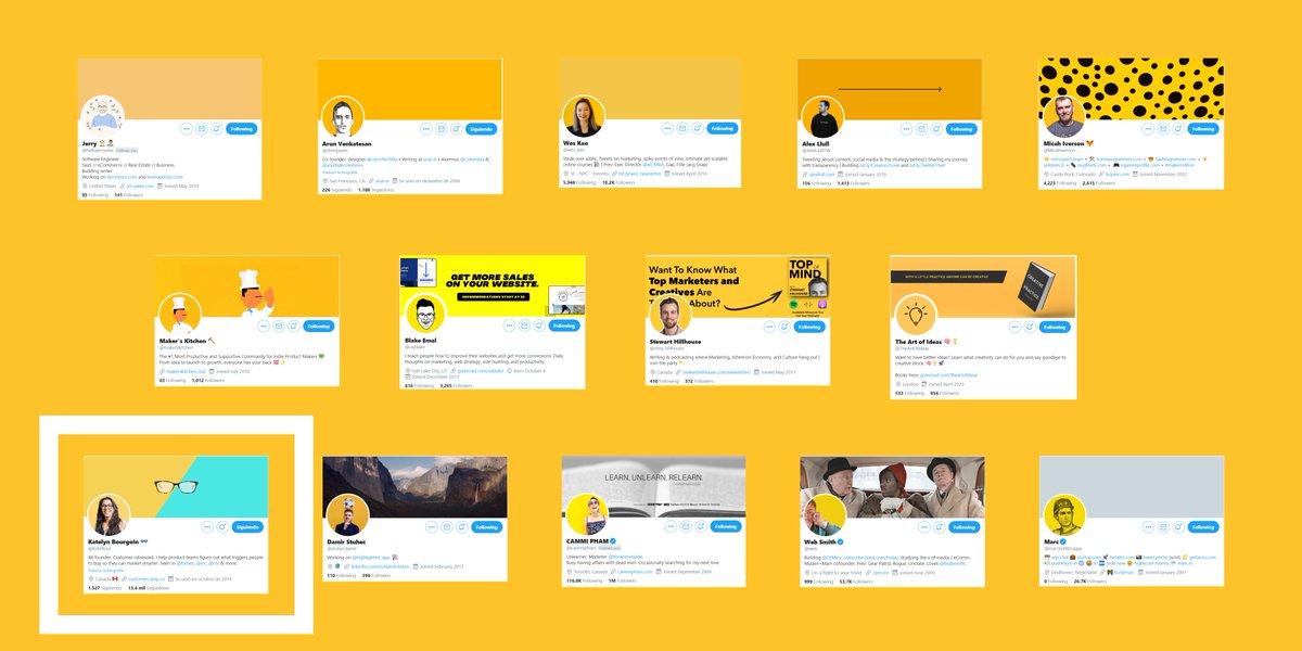
🟑 @stuhecdamir profile pic stand out because of yellow but most importantly, the soccer ball on his head! As his app is about highlighting, yellow is the best choice.
🟑 @cammipham yellow takes almost half part of her profile pic and makes sense because she looks very happy. Yellow evokes happiness, so is a nice choice!
🟑 @web yellow takes almost all of your profile picture, that's why it stands out. He looks happy too, so yellow is a good choice because it also represents positivity.
🟑 @marckohlbrugge the facial expression of the black sketch and the yellow background makes it stand out a lot, the cap is also an identifying element. All this gives a great personality to the profile pic.
Check out the complete analysis about colors and profiles here πŸ‘‡

β€’ β€’ β€’

Missing some Tweet in this thread? You can try to force a refresh
γ€€

Keep Current with Teodora Dobre 🧠

Teodora Dobre 🧠 Profile picture

Stay in touch and get notified when new unrolls are available from this author!

Read all threads

This Thread may be Removed Anytime!

PDF

Twitter may remove this content at anytime! Save it as PDF for later use!

Try unrolling a thread yourself!

how to unroll video
  1. Follow @ThreadReaderApp to mention us!

  2. From a Twitter thread mention us with a keyword "unroll"
@threadreaderapp unroll

Practice here first or read more on our help page!

More from @teodora_dobre

4 Oct
Standing out on Twitter can be hard for newcomers.

You can get better results by only choosing a color for your entire content.

I analyzed +200 Twitter profiles to find what color performs better.

What color should you choose? A thread. πŸ‘‡
#TwitterInColors
According to my research, this is the portcetange of usage:

- Yellow: 25.92% |||||
- Black: 22.22% ||||
- Blue: 14.81% |||
- White: 11.11% ||
- Green: 9.25% ||
- Purple: 7.40% ||
- Orange: 5.55% |
- Red: 3.74% |
Why is it important to have a brand color?

When someone likes a tweet they go to visit your profile account, then they see:

- Your header image.
- Your profile image.
- Your fixed tweet.
- Bio description.
Read 22 tweets
4 Oct
⚫ Team Black (22.22%)

#TwitterInColors

Works well for brands wishing to promote power, formality, profession, etc and used to hide feelings, intimidate, radiate authority.
People wearing a black t-shirt.

People with black backgrounds.

People with both!

Good for light mode, bad for dark mode.
⚫ @traf profile pic is a nice example of blending yourself with the background, in this case he achieves it by wearing a black t-shirt and adding black shadows.
Read 14 tweets
4 Oct
🟒 Team Green (9.25%)

#TwitterInColors

It can have a balancing and harmonizing effect and it’s used for relaxation, revitalization and encouragement.

Not many people use green for his profiles.

So maybe you can find some eye-catching green tone and use it like me.
🟒 @nelio_leone his profile pic isn’t green at all, but the green outline stroke helps his pic to stand out. Uses the same color on his cover pic to present his slogan.
🟒 @GetMakerlog is a about shipping products in public, so the green color on their profile pic represents positivity and the icon is easy to recognize. The word β€œship” on the cover pic makes clear their purpose.
Read 5 tweets
4 Oct
πŸ”΅ Team Blue (14.81%)

#TwitterInColors

Is the most popular color in terms of brand creation, basically because it reduces stress, relax, secure and it brings order.
I thought I would find more blue color profiles, as there are many studies that say that it’s the color that people like the most.

But probably, since blue is everywhere, it is not the best to attract attention.
πŸ”΅ @rylandking uses literally a profile pic, this pose is not common and neither is the turquoise background color! His profile is aesthetically pleasing, his header pic contains a wave with a little surfboard that works well with the blue-ish color.
Read 11 tweets
4 Oct
πŸ”΄ Team Red (3.70%)

#TwitterInColors

Attracts the most attention and is associated with strong emotions like excitement, love, romance, style.

I didn’t find any red personal profile and I was shocked because with red you can capture attention very easily.
It can draw negative emotions so be careful with red.

Red is usually used to draw attention, if you use another less attractive color and add a single dot of red, everyone will focus on that point.
πŸ”΄ @devinsfountain profile uses a rare pinkish color. I have classified it as red because pink can be considered as light red. His illustration helps him to stand out plus his cover pic has patterns that are easy to remember, patterns are powerful tools, so use them.
Read 5 tweets
4 Oct
🟣 Team Purple (7.40%)

#TwitterInColors

Inspires reflection and self-awareness and uses for royalty, luxury, dignity, etc.

There aren’t many profiles using purple as their main color, so can be another good option to choose.
🟣 @florinpop1705 great use of purple in many of his content, he and his personal brand are related with this color. Purple color instantly drives to his profile, this is a great example of color related to a person.
🟣 @fajarsiddiqFS is a perfect example of a well branded profile. His balance between blue and purple is easy to recognize, reinforced by a personalized sketch.
Read 6 tweets

Did Thread Reader help you today?

Support us! We are indie developers!


This site is made by just two indie developers on a laptop doing marketing, support and development! Read more about the story.

Become a Premium Member ($3/month or $30/year) and get exclusive features!

Become Premium

Too expensive? Make a small donation by buying us coffee ($5) or help with server cost ($10)

Donate via Paypal Become our Patreon

Thank you for your support!

Follow Us on Twitter!