Is the most popular color in terms of brand creation, basically because it reduces stress, relax, secure and it brings order.
I thought I would find more blue color profiles, as there are many studies that say that itβs the color that people like the most.
But probably, since blue is everywhere, it is not the best to attract attention.
π΅ @rylandking uses literally a profile pic, this pose is not common and neither is the turquoise background color! His profile is aesthetically pleasing, his header pic contains a wave with a little surfboard that works well with the blue-ish color.
π΅ @AlexAndBooks_ is all about blue, he uses blue on his website as well creating a link between the web and Twitter. Also, he uses a stroke on his pic to highlight himself.
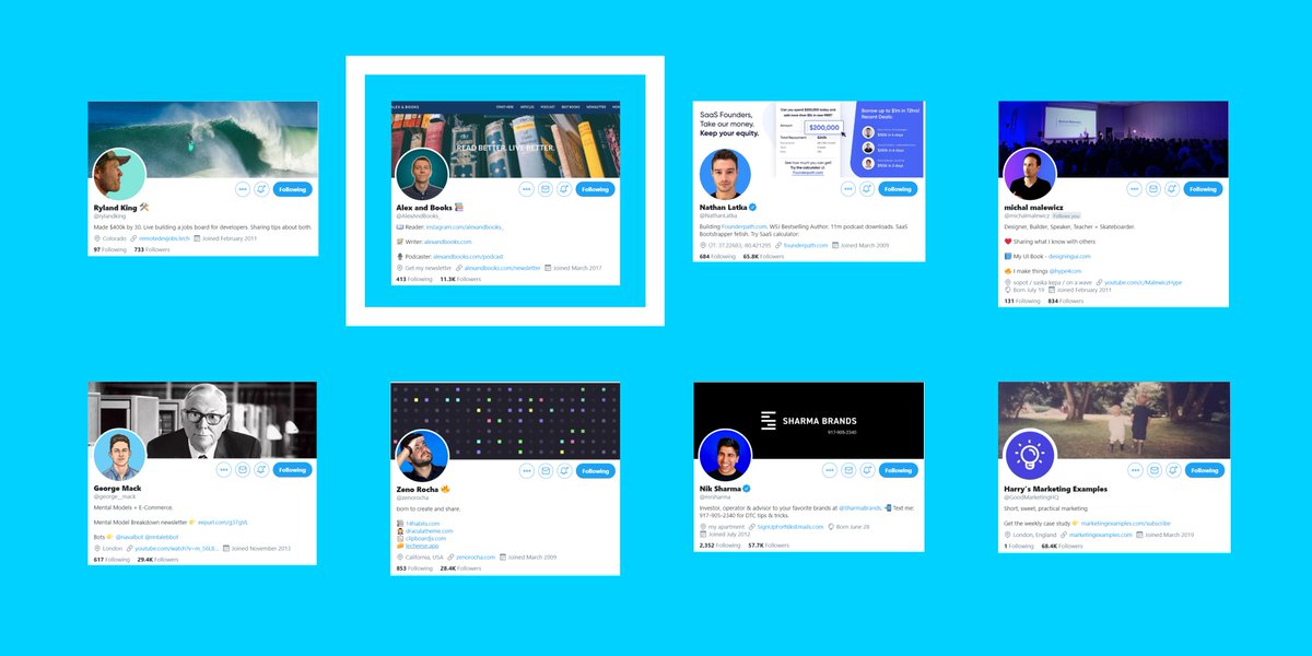
π΅ @NathanLatka has a site where blue is the main color, so choosing it for his profile pic is a good move. He also uses his profile pic to show his product, highlighting the important part in blue.
π΅ @michalmalewicz use a gradient between blue and purple, to be honest I didn't see almost anyone using a gradient for their profile pic, so it can be a good way to stand out! Also, notice how the lights on his cover pic match the background gradient of his profile.
π΅ @george__mack the particular illustration of himself and the celestial background are what make his profile easy to remember.
π΅ @zenorocha uses a particular pose to stand out and the blue background reinforces it. As I said before, a genuine pose and a background color can make the difference.
π΅ @mrsharma has a happy face and an electric blue background, a profile pic that sends good vibes is always a good choice!
π΅ @GoodMarketingHQ profile is very easy to recognize. He changed his profile pic some time ago and he had to put the bulb logo back again, because people were confused and they didn't recognize the brand.
Check out the complete analysis about colors and profiles here π
Works well for brands wishing to promote power, formality, profession, etc and used to hide feelings, intimidate, radiate authority.
People wearing a black t-shirt.
People with black backgrounds.
People with both!
Good for light mode, bad for dark mode.
β« @traf profile pic is a nice example of blending yourself with the background, in this case he achieves it by wearing a black t-shirt and adding black shadows.
It can have a balancing and harmonizing effect and itβs used for relaxation, revitalization and encouragement.
Not many people use green for his profiles.
So maybe you can find some eye-catching green tone and use it like me.
π’ @nelio_leone his profile pic isnβt green at all, but the green outline stroke helps his pic to stand out. Uses the same color on his cover pic to present his slogan.
π’ @GetMakerlog is a about shipping products in public, so the green color on their profile pic represents positivity and the icon is easy to recognize. The word βshipβ on the cover pic makes clear their purpose.
Attracts the most attention and is associated with strong emotions like excitement, love, romance, style.
I didnβt find any red personal profile and I was shocked because with red you can capture attention very easily.
It can draw negative emotions so be careful with red.
Red is usually used to draw attention, if you use another less attractive color and add a single dot of red, everyone will focus on that point.
π΄ @devinsfountain profile uses a rare pinkish color. I have classified it as red because pink can be considered as light red. His illustration helps him to stand out plus his cover pic has patterns that are easy to remember, patterns are powerful tools, so use them.
Its brightness is particularly useful in catching the consumer's eyes and itβs used to simulate relax, awake awareness.
Lots of profiles are using yellow as their main color, probably because itβs very cheerful.
It works because it pushes you to press the profile picture.
But if a lot of people use it, it stops drawing attention.
So probably not the best choice right now if you want to stand out.
π‘ @hellojerryalex uses a light tinted yellow on his profile pic, but the drawing in it make it unique! Also, emphasizes his profile choosing a yellow flat cover pic.
Inspires reflection and self-awareness and uses for royalty, luxury, dignity, etc.
There arenβt many profiles using purple as their main color, so can be another good option to choose.
π£ @florinpop1705 great use of purple in many of his content, he and his personal brand are related with this color. Purple color instantly drives to his profile, this is a great example of color related to a person.
π£ @fajarsiddiqFS is a perfect example of a well branded profile. His balance between blue and purple is easy to recognize, reinforced by a personalized sketch.