AUTUMN 2020 CORONAVIRUS GROWTH
IN UK, FRANCE, ITALY & SPAIN
APPEARS TO BE MUCH MILDER THAN SPRING
An analysis:
[14 Oct 2020 v1]
[Notes added to charts in grey bubbles are my own.]
[Analysis, opinions & errors my own.]
IN UK, FRANCE, ITALY & SPAIN
APPEARS TO BE MUCH MILDER THAN SPRING
An analysis:
[14 Oct 2020 v1]
[Notes added to charts in grey bubbles are my own.]
[Analysis, opinions & errors my own.]


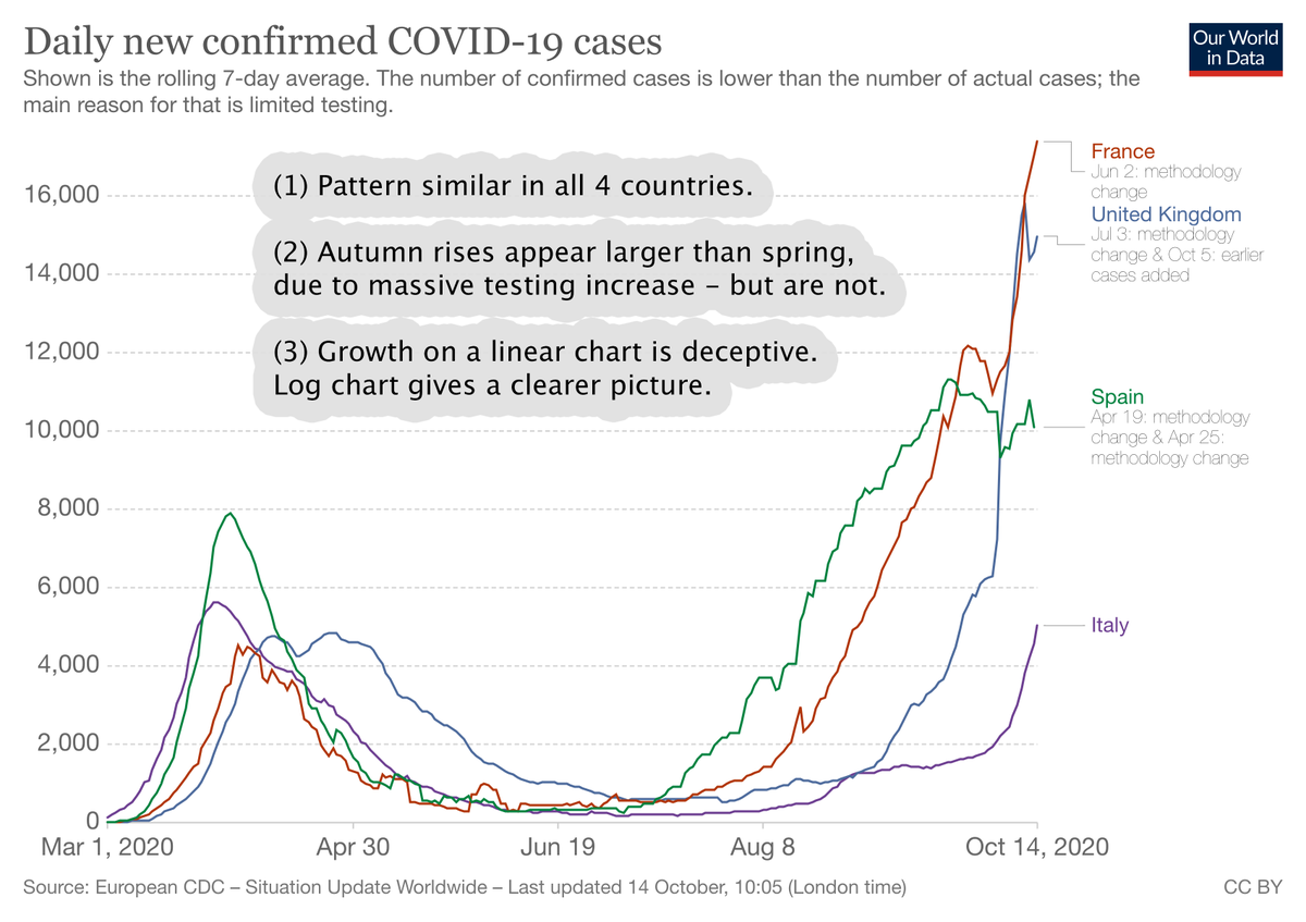

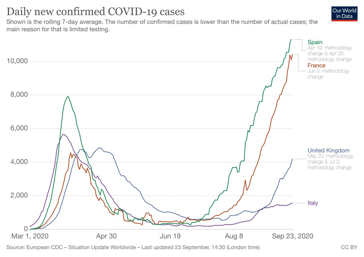
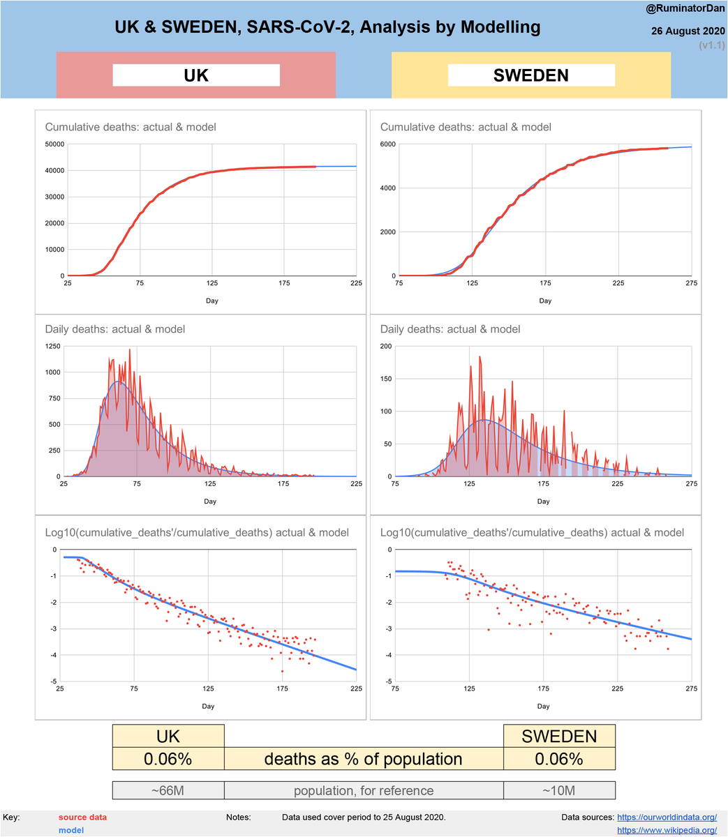
Several countries that experienced relatively high fatalities in the spring have seen an autumn increase. The patterns are similar.
Comparing the recent increases to the spring suggests that the underlying situation might be significantly less severe than generally believed.
Comparing the recent increases to the spring suggests that the underlying situation might be significantly less severe than generally believed.
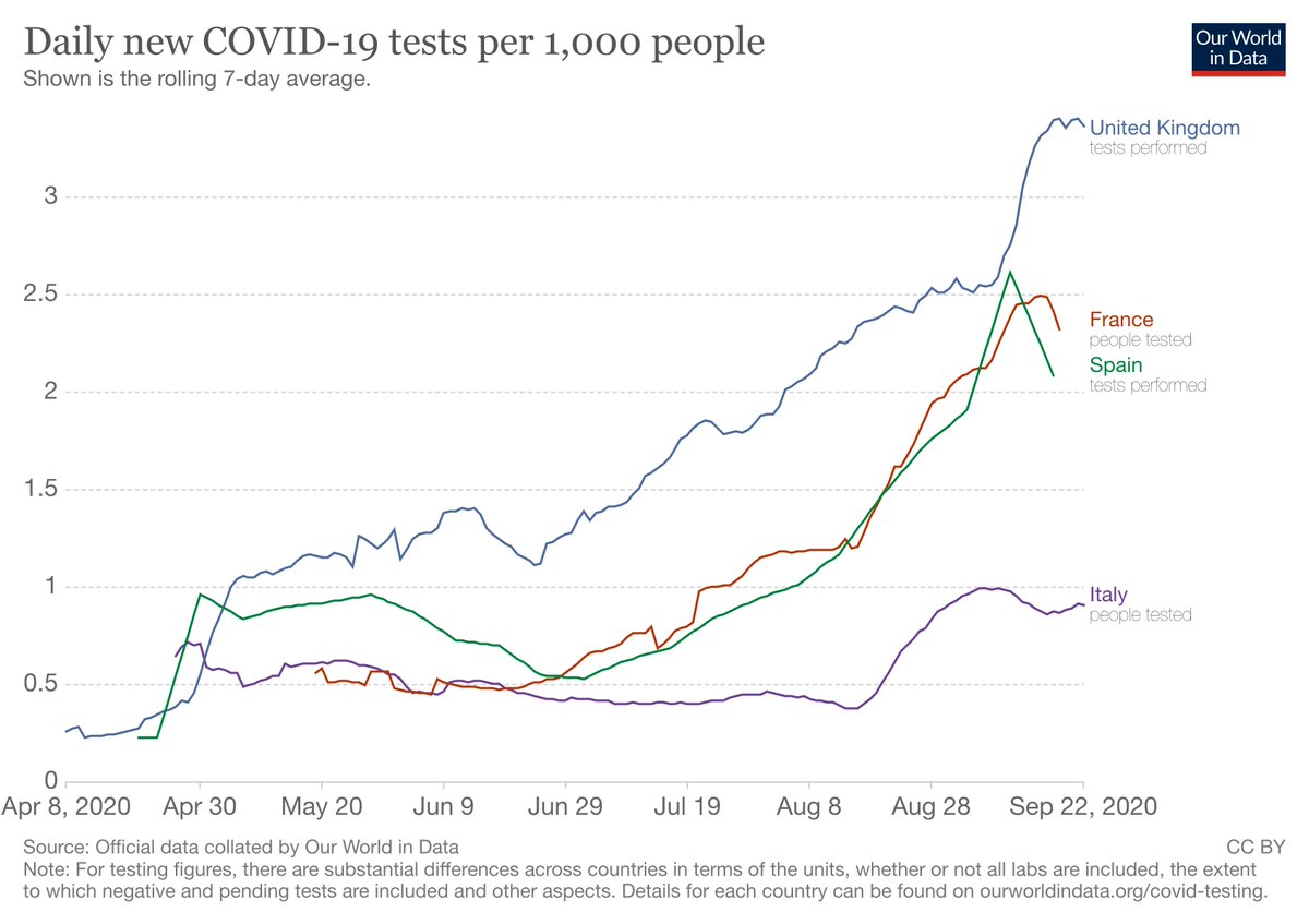
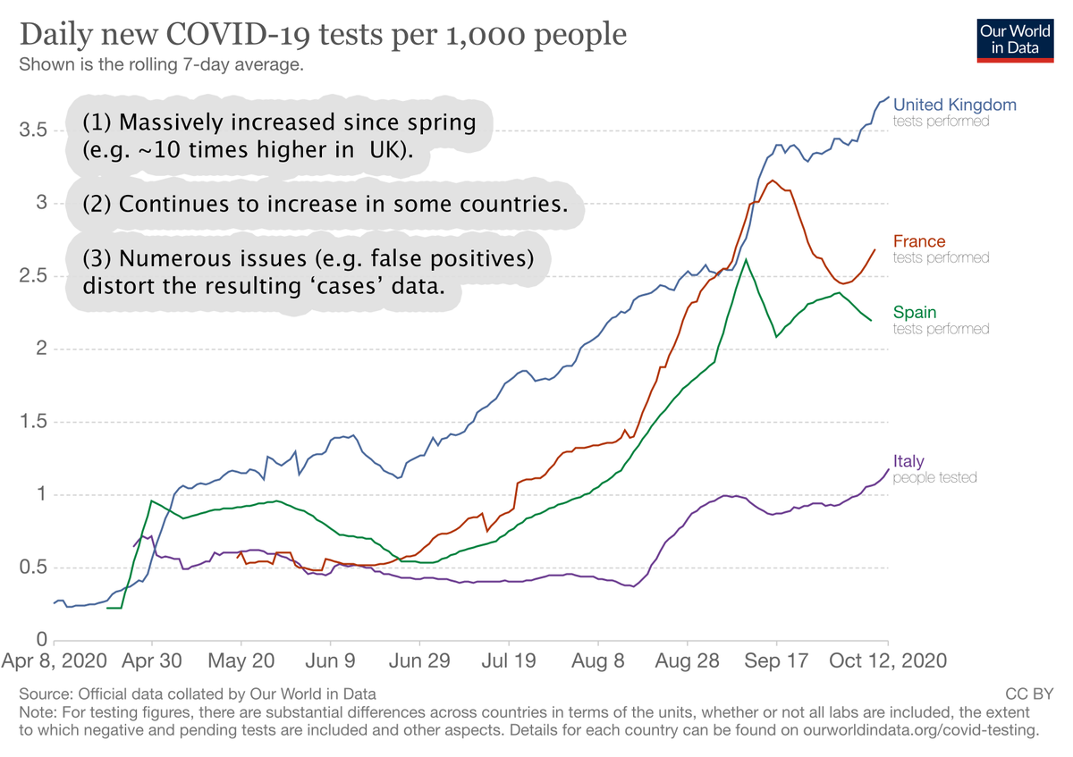
TESTING: See notes on chart.
Despite numerous issues relating to testing, we will treat the data as accurate here so as to err on the side of caution & good faith. This should give us a worst case picture, with the reality being likely somewhat milder.
Despite numerous issues relating to testing, we will treat the data as accurate here so as to err on the side of caution & good faith. This should give us a worst case picture, with the reality being likely somewhat milder.
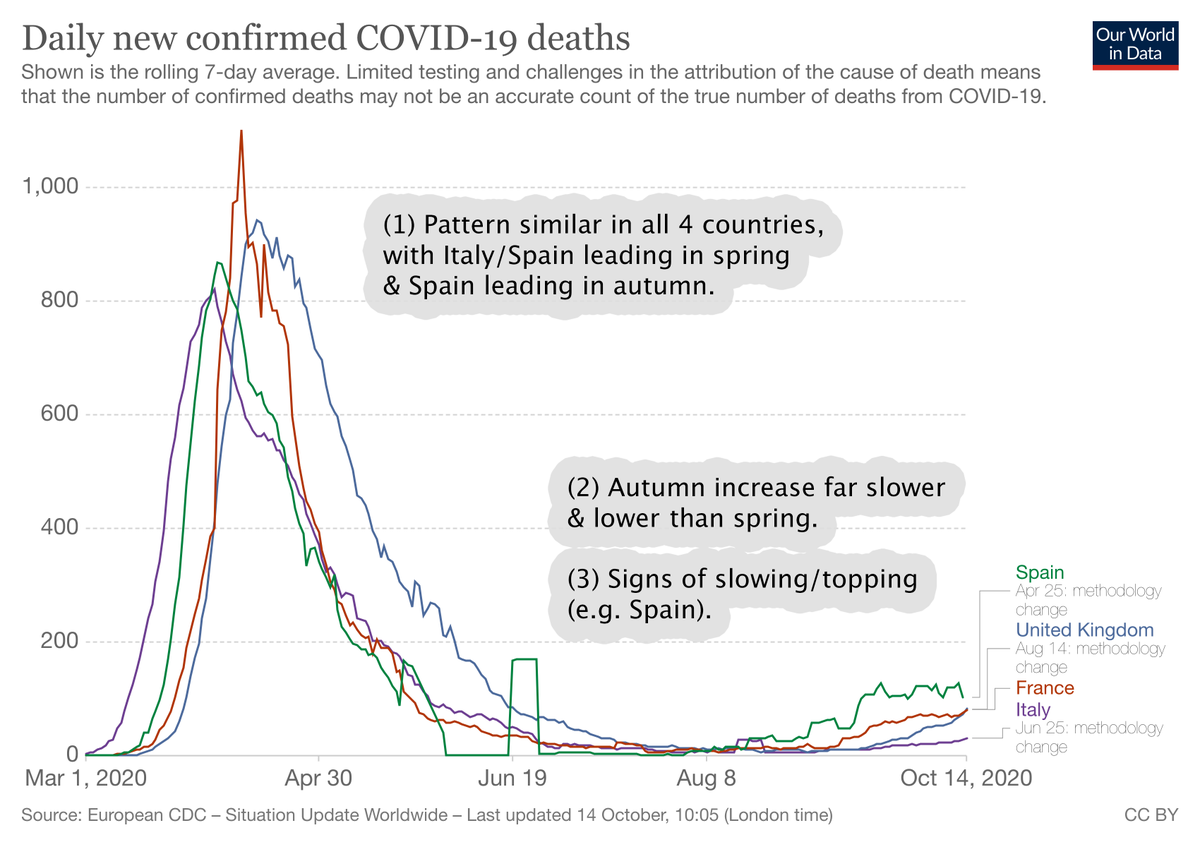
DEATHS: See notes on charts. Deaths, whilst not unaffected by testing & other issues, are the most robust data available with which to track the virus (& deduce the pattern of underlying infections).
Viewed using deaths, it is clear that spring was far larger than current rises.
Viewed using deaths, it is clear that spring was far larger than current rises.

A log chart is used in addition to a regular one to enable better analysis of growth. Constant exponential growth on a log chart appears as a straight, diagonal line, with a steeper slope representing faster growth.
As can be seen, recent growth is much milder than spring.
As can be seen, recent growth is much milder than spring.


CASES: Despite the upward distortion caused by testing, cases data are still very revealing & show very similar information to the deaths charts: slower, lower growth & signs of topping.


For cases, a log chart is even more useful, since growth on a linear chart can appear deceptive. Also, due to testing, the recent figures appear higher than the spring. It is, however, the speed & character of growth that interest us and a log chart shows them clearly.


SUMMARY AND CONCLUSION
The autumn increases appear to be far slower (growth rate) & lower (peaks) than the spring.
Most importantly, deaths, while sadly increased, remain lower & slower than spring.
(This is all visible despite likely upward data distortion due to testing.)
The autumn increases appear to be far slower (growth rate) & lower (peaks) than the spring.
Most importantly, deaths, while sadly increased, remain lower & slower than spring.
(This is all visible despite likely upward data distortion due to testing.)


Assuming that the virus & environment are not greatly different from spring, a possible explanation for the slower & lower growth might be that the virus is having a harder time finding & infecting a diminishing supply of susceptible people, implying that more people are immune.
@threadreaderapp unroll
• • •
Missing some Tweet in this thread? You can try to
force a refresh