I think the below modelling output provides a useful illustration of how to evaluate forecasts. A short thread... 1/
First, let's be clear about difference between a 'scenario' and 'forecast'. Scenarios explore specific 'what if' questions, e.g. 'What if we don't introduce any control measures?' - Below are some examples from the March Imperial UK modelling report (imperial.ac.uk/mrc-global-inf…). 2/
In contrast, epidemic forecasts provide an answer to the question 'What do we think is most likely to happen?' More on scenarios vs forecasts here: washingtonpost.com/outlook/2020/0… 3/
The authors of the above '24-37 deaths at peak' model have previous referred to it having predictive accuracy (blogs.bmj.com/bmj/2020/09/24…), so I think it's fair to judge it accordingly. There are three main metrics we can use to do so... 4/
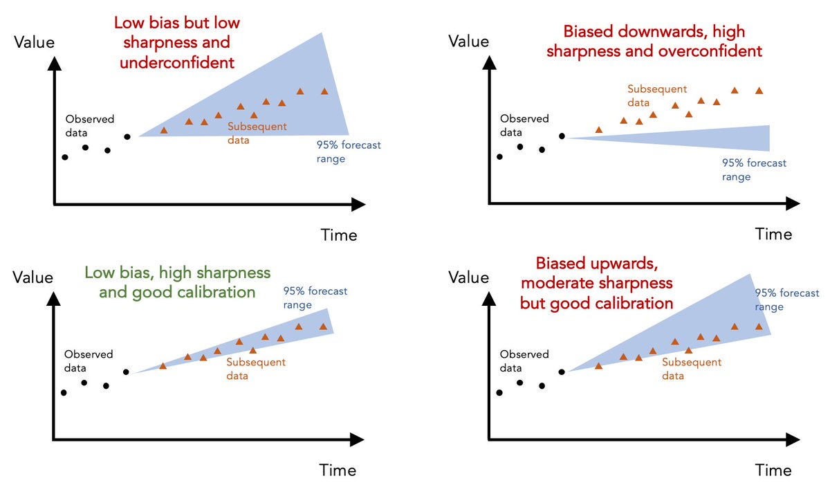
First, 'calibration' measures ability of model to correctly identify its own uncertainty in making predictions. Basically, is it under- or overconfident? E.g. if model says particular range of values is '95% likely', we'd expect 95% of subsequent data to fall within this range 5/
Given 7 day average for daily deaths in UK has fallen outside above model's 95% prediction range of 24-37 for several weeks, it's clear that the above model was overconfident in its predictions... 6/
The second metric is 'sharpness', i.e. the ability of model to generate predictions within narrow range of possible outcomes. Basically, a model that says 'value will be between 0 and 10000' isn't as useful as a well-calibrated model that can generate more precise predictions. 7/
The above model makes 'sharp' predictions (i.e. within a narrow range) but the lack of calibration suggests this sharpness is coming at the expense of insufficient uncertainty. 8/
The third metric is 'bias' - is the model systematically over- or underpredicting the true values? In this case, above model seems biased downwards, generating predictions that routinely fall below the subsequent data. 9/
Although I've used above model as an illustrative example, the same ideas can be applied to any epidemic forecast. Here are some examples of different hypothetical forecasts and how they perform on these different metrics... 10/
If you're interested in reading more about forecast evaluation, here's a paper we published on these issues last year: journals.plos.org/ploscompbiol/a…. And a nice review with more technical details: annualreviews.org/doi/10.1146/an… 11/11

• • •

Missing some Tweet in this thread? You can try to force a refresh
 

Keep Current with Adam Kucharski

Adam Kucharski Profile picture

Stay in touch and get notified when new unrolls are available from this author!

Read all threads

This Thread may be Removed Anytime!

PDF

Twitter may remove this content at anytime! Save it as PDF for later use!

Try unrolling a thread yourself!

how to unroll video
  1. Follow @ThreadReaderApp to mention us!

  2. From a Twitter thread mention us with a keyword "unroll"
@threadreaderapp unroll

Practice here first or read more on our help page!

More from @AdamJKucharski

21 Oct
The COVID-19 pandemic has shown power of open data and analytics in research, but these activities often aren't recognised in traditional academic metrics. New perspective piece with @rozeggo & @sbfnk: journals.plos.org/plosbiology/ar…. I'd also like to highlight some examples... 1/
- Curation of open data sources, such as line list data by @MOUGK @davidmpigott et al (github.com/beoutbreakprep…), case tracking by @TexasDownUnder et al (coronavirus.jhu.edu/map.html), testing from @OurWorldInData (ourworldindata.org/coronavirus-te…)... 2/
Read 9 tweets
19 Oct
A short thread about a dead salmon and implausible claims based on epidemic curves... 1/
A few years ago, some researchers famously put an Atlantic salmon in an fMRI machine and showed it some photographs. When they analysed the raw data, it looked like there was evidence of brain activity... wired.com/2009/09/fmrisa… 2/
Now of course there wasn’t really any activity. It was a dead salmon. But it showed that analysing the data with simplistic methods could flag up an effect that wasn’t really there. Which leads us to COVID-19... 3/
Read 9 tweets
14 Oct
'Herd immunity' has been reached during previous epidemics of influenza, measles and seasonal coronaviruses. But it's subsequently been lost (and then regained). What are some of the reasons for this? 1/
Here we're using technical definition of 'herd immunity', i.e. sufficient immunity within a population to push R below 1 in absence of other control measures. But reaching this point doesn't mean R will stay below 1 forever. Here four things to be aware of... 2/
A: Population turnover. Over time, new births mean an increase in % of population susceptible. This will eventually lead to R>1 and new (but smaller) outbreaks - the more transmissible the infection, the sooner this recurrence will happen. More: 3/
Read 8 tweets
7 Oct
How would a 'protect the vulnerable and let everyone else go back to normal' approach to COVID play out? I see three main scenarios, each with important consequences to consider... 1/
Scenario A: Let's suppose it's possible to identify who's at high risk of acute/chronic COVID-19. Then somehow find way to isolate these people away from rest of society for period it would take to build immunity in low risk groups and get R below 1 & infections low... 2/
This would mean isolating at least 20% of UK population (if use over 65 as age cutoff) and this period of isolation could be several months (or longer if rest of population continues to be cautious, reducing the overall rate of infection and hence accumulation of immunity). 3/
Read 6 tweets
6 Oct
If COVID cases/hospitalisations/deaths are rising - as they are in many European countries - there are only two ways the trend will reverse.... 1/
A. Enough change in control measures and/or behaviour to push R below 1. The extent of restrictions required will depend on population structure/household composition etc. But given existing measures are disruptive and R is above 1, could take a lot of effort to get R down. 2/
B. Accumulation of sufficient immunity to push R below 1. However, evidence from Spain (e.g. bbc.co.uk/news/world-eur…) suggests ICUs will start hitting capacity before this point, so to avoid them being overwhelmed, would likely end up cycling between epidemics and (A) above. 3/3
Read 4 tweets
4 Oct
I often see the misconception that control measures directly scale COVID case numbers (e.g. “hospitalisations are low so measures should be relaxed”). But in reality, measures scale *transmission* and transmission in turn influences cases. Why is this distinction important? 1/
If discussions are framed around the assumption of a simple inverse relationship between control and cases, it can lead to erroneous claims that if cases/hospitalisations are low, control measures can be relaxed and case counts will simply plateau at some higher level. 2/
But of course, this isn’t how infectious diseases work. If control measures are relaxed so that R is above 1, we’d expect cases - and hospitalisations - to continue to grow and grow until something changes (e.g. control reintroduced, behaviour shifts, immunity accumulated). 3/
Read 6 tweets

Did Thread Reader help you today?

Support us! We are indie developers!


This site is made by just two indie developers on a laptop doing marketing, support and development! Read more about the story.

Become a Premium Member ($3/month or $30/year) and get exclusive features!

Become Premium

Too expensive? Make a small donation by buying us coffee ($5) or help with server cost ($10)

Donate via Paypal Become our Patreon

Thank you for your support!

Follow Us on Twitter!