The Secret to Visual Branding
[ THREAD ]
Let's go 👇
[ THREAD ]
Let's go 👇

The big trap people fall into with branding?
Making their brand like every other brand.
Inexperienced marketers look at the style of a company like Apple...
Making their brand like every other brand.
Inexperienced marketers look at the style of a company like Apple...
They love the minimal aesthetic. The bold typography. The vivid colors.
Then they appropriate that style for a completely different purpose.
And it's a disaster.
Here's what they don't realize...
Then they appropriate that style for a completely different purpose.
And it's a disaster.
Here's what they don't realize...
When it comes to visual style, no style is *inherently* better than any other style.
ANY style can look good.
The thing that matters? The style you choose must be a good expression of the thing it's trying to be.
To see what this means, let's look at architecture...
ANY style can look good.
The thing that matters? The style you choose must be a good expression of the thing it's trying to be.
To see what this means, let's look at architecture...
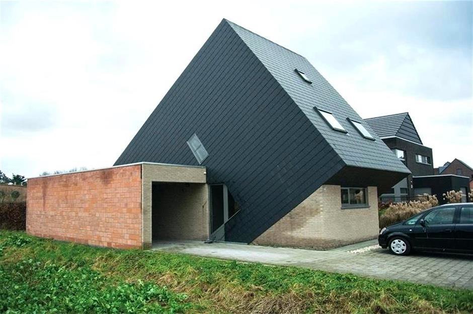
In the 1980s, a new bastardized form of colonial architecture became popular in American suburbia.

For most people, this (bad) expression of the style is what they associate with colonial architecture.
And, without thinking much about it, they conclude that colonial architecture sucks.
But...
And, without thinking much about it, they conclude that colonial architecture sucks.
But...
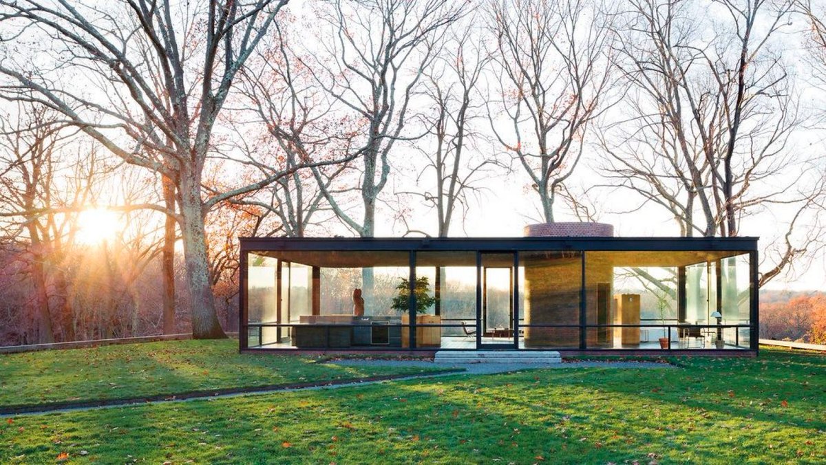
When these same people see a great expression of the colonial style...
They realize it's quite sublime
They realize it's quite sublime

Both of these homes are "colonial"
But the first one is a bad expression of the style. The second is a good expression of it.
How *well* the style is expressed makes all the difference.
But the first one is a bad expression of the style. The second is a good expression of it.
How *well* the style is expressed makes all the difference.
This phenomenon applies across the aesthetic spectrum.
Some people hate modern homes because there are so many poor expressions of modernism.
But modern homes, well-expressed, are rightfully admired.
Some people hate modern homes because there are so many poor expressions of modernism.
But modern homes, well-expressed, are rightfully admired.
Now, back to branding...
When choosing a visual style
Unsophisticated minds will fall into a trap...
They'll think that some styles are inherently better than others
When choosing a visual style
Unsophisticated minds will fall into a trap...
They'll think that some styles are inherently better than others
They'll think that minimalist design is the "ultimate" form of design — the best style for any brand emerging in 2020
But, like architecture, it's not about WHICH style you choose.
It's about whether the style is a good expression of the thing it intends to be
It's about whether the style is a good expression of the thing it intends to be
Before we wrap up
Let's look at two examples of radically different styles that are perfectly suited to their brands...
Let's look at two examples of radically different styles that are perfectly suited to their brands...
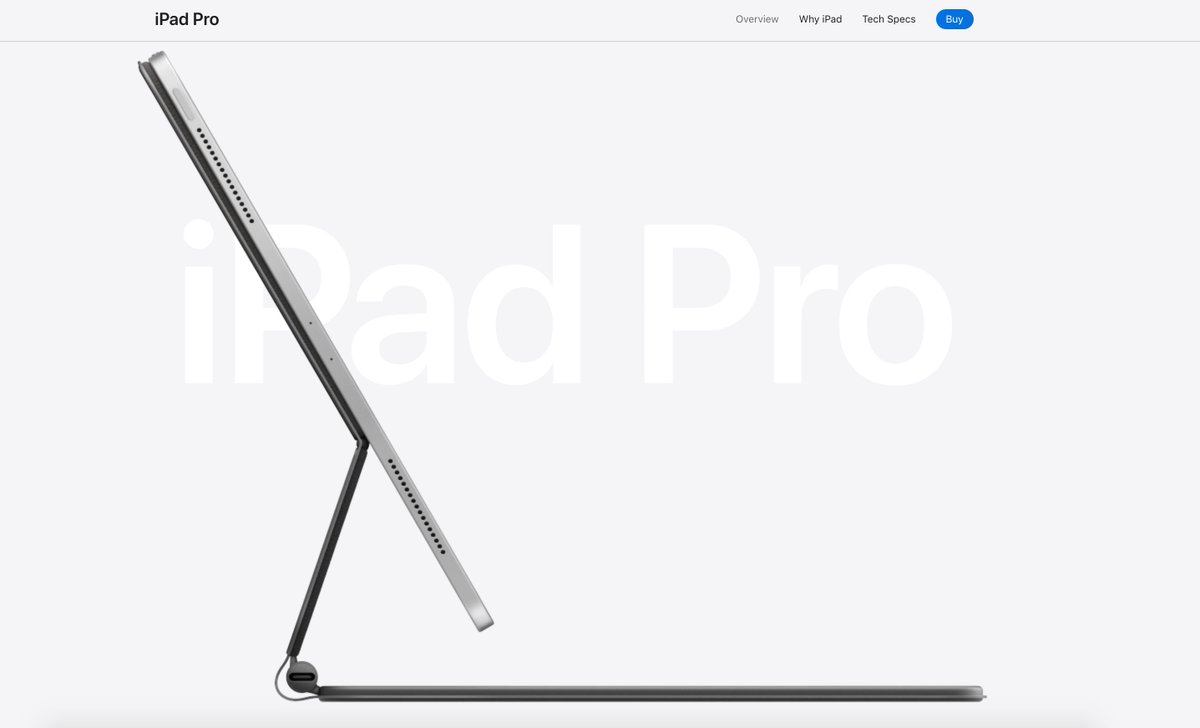
Apple's brand is world famous — and for good reason.
It is the perfect embodiment of minimalism.
Lots of white space. Emphasis on bold, sans serif type. And high-contrast photography.
It 100% works for Apple's message of democratized creative technology.
It is the perfect embodiment of minimalism.
Lots of white space. Emphasis on bold, sans serif type. And high-contrast photography.
It 100% works for Apple's message of democratized creative technology.
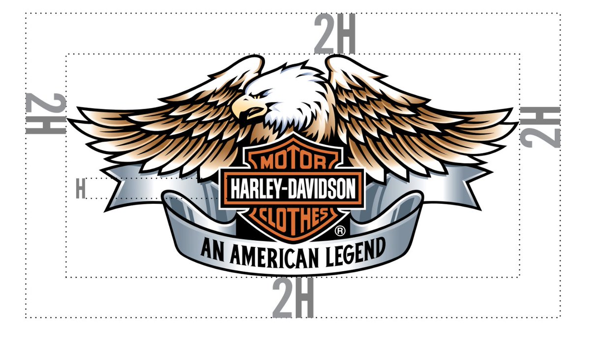
Now consider another cult brand: Harley Davidson.
Compared to Apple, its brand identity is maximalist.
Its logo incorporates more realism, color, and even shades and gradients.
The aesthetic is rugged, fierce, and rebellious.
Compared to Apple, its brand identity is maximalist.
Its logo incorporates more realism, color, and even shades and gradients.
The aesthetic is rugged, fierce, and rebellious.
BOTH brands are iconic.
Apple's aesthetic would be a terrible choice for Harley Davidson. And vice versa.
But that's fine — because both styles are brilliant expressions of what they're trying to be.
Apple's aesthetic would be a terrible choice for Harley Davidson. And vice versa.
But that's fine — because both styles are brilliant expressions of what they're trying to be.
Conclusion:
1. No visual aesthetic is inherently superior to others
2. The bad expression of a great style is bad
3. The good expression of a great style is sublime
4. The most important thing is that the style is well-expressed and matches the brand mission
1. No visual aesthetic is inherently superior to others
2. The bad expression of a great style is bad
3. The good expression of a great style is sublime
4. The most important thing is that the style is well-expressed and matches the brand mission
That's all friends!
If you found this valuable, please RT the top tweet:
If you found this valuable, please RT the top tweet:
https://twitter.com/LifeHornsWay/status/1320862804639797249?s=20
• • •
Missing some Tweet in this thread? You can try to
force a refresh