James Tozer Profile picture
29 Oct, 9 tweets, 5 min read
EXCLUSIVE: @TheEconomist has obtained data implying that parts of northern Italy have gained enough immunity to substantially slow down the spread of covid-19. (1/9) economist.com/graphic-detail…
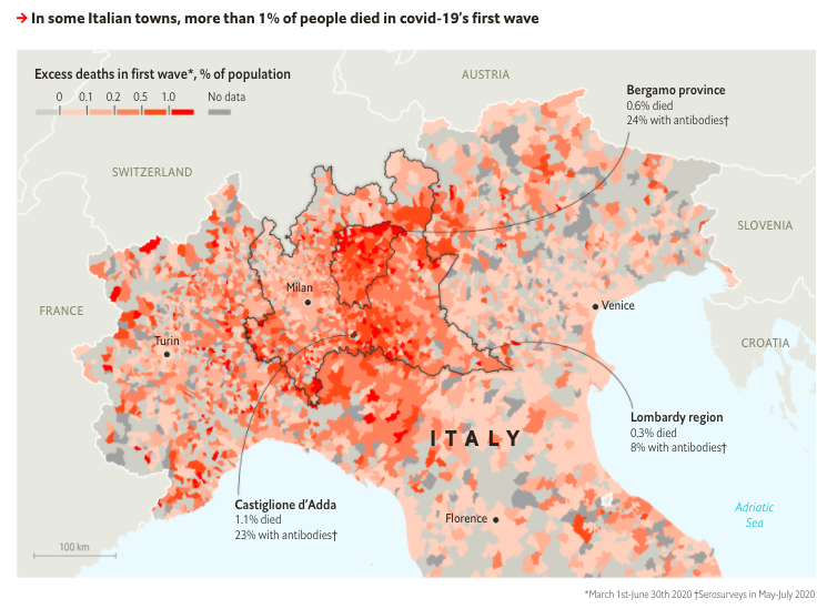
Using data from @istat_it, we calculated how many excess deaths occurred in 7,300+ Italian municipalities between March 1st and June 30th. This remarkable map is by @_rospearce. (2/9)
For each of Lombardy’s 1,300+ municipalities, we calculated how many new cases they have recorded since September 1st. The regional government tracks these numbers internally, and @EasyInve helped us acquire them. (3/9)
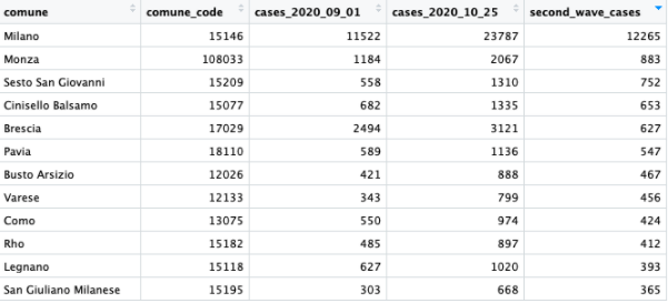
When we compared these second-wave cases to first-wave deaths, we found a clear pattern: the municipalities that suffered the most deaths in the spring are recording the fewest new infections in autumn. (4/9)
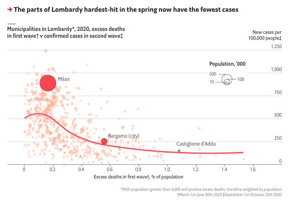
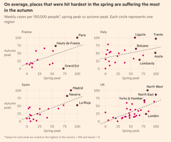
These towns may be the first pockets of Europe with enough immunity to restrain covid-19. Unfortunately, the regions and cities hit hardest in spring are generally recording the most cases now, according to @ftdata. (5/9)
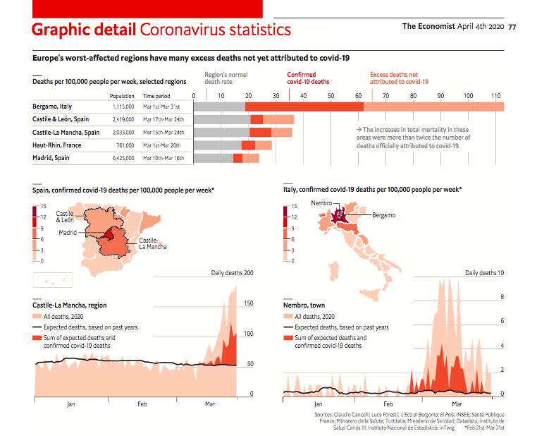
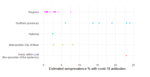
This is supported by serosurveys, which @Sondreus has analysed. 24% of Bergamasques had detectable antibodies in July. By contrast, no European country has a nationwide seroprevalence above 7%. (6/9)
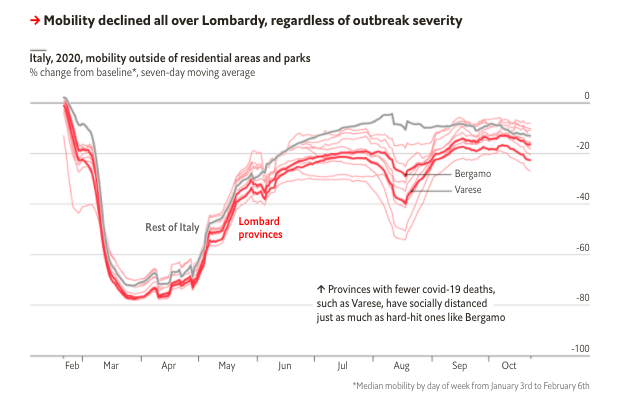
Social distancing has helped in Lombardy, which has the lowest Google mobility levels of any Italian region. But as @DanRosenheck spotted, that decline is similar across the region, suggesting that immunity played a bigger role in the worst-hit municipalities. (7/9)
All this implies that >25% antibodies + social distancing might slow down covid-19 - but the world is still far from that goal. Bergamo’s worst-hit towns lost >1% of residents before restraining the virus. Hopefully, other places can gain that benefit at a less awful cost. (8/9)
We have published all the data and R scripts that we used for this analysis on GitHub, in case you want to inspect or reproduce it. (9/9) github.com/TheEconomist/c…

• • •

Missing some Tweet in this thread? You can try to force a refresh
 

Keep Current with James Tozer

James Tozer Profile picture

Stay in touch and get notified when new unrolls are available from this author!

Read all threads

This Thread may be Removed Anytime!

PDF

Twitter may remove this content at anytime! Save it as PDF for later use!

Try unrolling a thread yourself!

how to unroll video
  1. Follow @ThreadReaderApp to mention us!

  2. From a Twitter thread mention us with a keyword "unroll"
@threadreaderapp unroll

Practice here first or read more on our help page!

More from @J_CD_T

16 May
NEW, FREE DATA: We have just published the code and data behind our excess mortality tracker on Github. We believe this is the first public resource to provide this information, and we hope academics and journalists can use it for their research. (1/5) github.com/TheEconomist/c…
For several weeks @martgnz and myself have been cleaning, analysing and presenting this data on our tracking page @TheEconomist, which provides interactive charts and is free to read. (2/5) economist.com/graphic-detail…
Excess deaths are now being widely used to analyse the covid-19 pandemic, as the most comparable measure across countries. But as @MaxCRoser pointed out yesterday, none of this data has been turned into a public resource yet. (3/5)
Read 5 tweets
28 Apr
NEW: we have updated our excess-mortality tracker with the latest data for several countries (the page is free to read). In some places, the overall number of deaths now seem to be falling. (1/11)
Our interactive charts allow you to inspect the data in each region, for any given week. Note that figures on total mortality include delays, so they may reflect deaths that happened several days beforehand. (2/11) economist.com/graphic-detail…
Unfortunately, in Britain the latest data from @ONS show that fatalities were still rising quickly in the week to April 17th, with nearly 2x as usual. Excess deaths registered by then were 27,000. Covid deaths were 19,100, based on an analysis of death certificates. (3/11)
Read 12 tweets
21 Apr
NEW: @ONS has just released data about total deaths and covid deaths up to April 10th. These show another big increase that week. Total recorded excess since March 20th is 15,200. Registered covid deaths (via death certificates) is 10,300. (1/12)
Myself and @martgnz are collecting this data on excess mortality across countries. Yesterday we published figures for Indonesia. Later today we will add Sweden, Belgium, Austria and Turkey. (2/12)
economist.com/graphic-detail…
First, a summary of what we have found in our sample of countries so far, based on a previous thread. (Remember to interpret these charts with caution – many places are revising their total deaths and covid deaths retrospectively.) (3/12)
Read 13 tweets
20 Apr
UPDATE: Today @martgnz and I are publishing an update to @TheEconomist excess mortality tracker. We have new / revised data for all the countries, plus we are adding Indonesia, our first location outside of the West. (1/11)
economist.com/graphic-detail…
There are some faint optimistic hints in the data: Italy, Spain, and the Netherlands all show signs of a plateau. But interpret that with caution. Many countries are retrospectively revising their numbers of all deaths upwards. (2/11)
Starting with Italy: by April 4th there was a big drop in excess deaths in the Lombard municipality figures published by @istat_it. There may be some incomplete data there, but probably a real decline in deaths too. (3/11)
Read 11 tweets
16 Apr
THREAD: From today onwards, @TheEconomist will be tracking excess mortality from covid-19 in as many countries as possible. We have published interactive charts for six countries that have released this data. (1/14) economist.com/graphic-detail…
In most countries, the official death toll from covid-19 is a reasonable indicator of whether it is “flattening the curve”. @jburnmurdoch has produced some fantastic charts, tracking these statistics in scores of countries and regions. (2/14)
But official daily death tolls, produced by national health ministries, understate the true number of people killed by the virus at that point. As @OurWorldInData and @MaxCRoser have explained, establishing the cause of death can take several days. (3/14)
ourworldindata.org/coronavirus#re…
Read 14 tweets
2 Apr
THREAD: Might the death toll from covid-19 be higher than the official fatalities attributed to it so far? Data emerging from the worst-hit places in Europe suggest so. (1/9)
A common way to quantify deaths in a severe health crisis is to look at “excess mortality”: the total number of people who have passed away in an area, compared to usual. Journalists in Italy, Spain and France have started doing this. (2/9) economist.com/graphic-detail…
EuroMOMO, a group of researchers from 24 countries, gives national weekly estimates of all deaths. But, for various reasons, that data cannot yet be directly compared to regional covid-19 fatalities. (For Italy, it aggregates a selection of cities.) (3/9) euromomo.eu
Read 10 tweets

Did Thread Reader help you today?

Support us! We are indie developers!


This site is made by just two indie developers on a laptop doing marketing, support and development! Read more about the story.

Become a Premium Member ($3/month or $30/year) and get exclusive features!

Become Premium

Too expensive? Make a small donation by buying us coffee ($5) or help with server cost ($10)

Donate via Paypal Become our Patreon

Thank you for your support!

Follow Us on Twitter!