
THREAD: Might the death toll from covid-19 be higher than the official fatalities attributed to it so far? Data emerging from the worst-hit places in Europe suggest so. (1/9) 
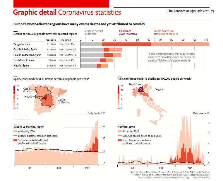
A common way to quantify deaths in a severe health crisis is to look at “excess mortality”: the total number of people who have passed away in an area, compared to usual. Journalists in Italy, Spain and France have started doing this. (2/9) economist.com/graphic-detail…
EuroMOMO, a group of researchers from 24 countries, gives national weekly estimates of all deaths. But, for various reasons, that data cannot yet be directly compared to regional covid-19 fatalities. (For Italy, it aggregates a selection of cities.) (3/9) euromomo.eu
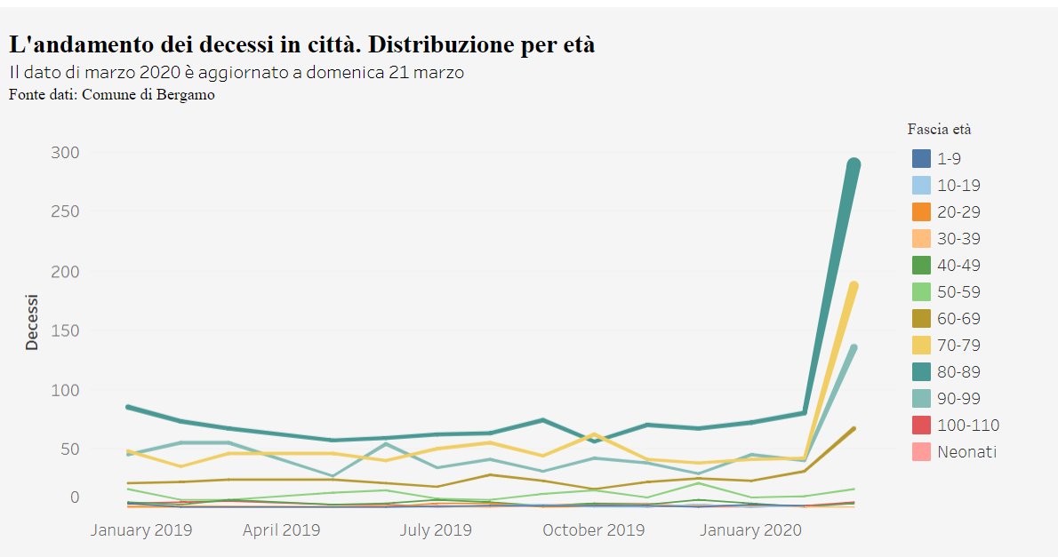
So local researchers and reporters are gathering data. In Italy @lforesti and @EasyInve have worked with mayors of small comunes in Bergamo province. They have found that, so far, “excess mortality” is double the official covid-19 death toll. (4/9) public.tableau.com/profile/isaia.…
An article in El País showed a similar discrepancy in total deaths and covid-19 deaths for several regions in Spain, based on figures from the government’s health research centre. (5/9) elpais.com/sociedad/2020-…
And in France @manhack has noticed that the covid-19 death toll in Haut-Rhin, the most affected department, is growing less quickly than the number of obituaries published in local newspapers. (6/9) nextinpact.com/news/108832-co…
There are many reasons why these discrepancies could exist. Data on total deaths and covid-19 deaths often come from different sources. Sometimes it takes a few days to establish the cause of death. (See this from @OurWorldInData.) (7/9)
ourworldindata.org/coronavirus#re…
ourworldindata.org/coronavirus#re…
But the gap between official covid-19 deaths and total deaths could also represent people who died outside of hospitals (as seems likely in Bergamo), or who were killed by other diseases that might normally have been treated. (8/9) ecodibergamo.it/stories/bergam…
It may take several months before we know what explains this pattern. But at the very least, it seems like the grim death tolls we receive each day understate the damage that has already occurred. (9/9)
One more thing - thanks to @MatterofMatt for the great charts, @martgnz for crunching the numbers, and @DanRosenheck for the edit. And the many reporters and researchers who helped with the data. (10/9)


![Screenshot of a news headline: “[Op-ed] Why Vietnam has been the world’s number 1 country in dealing with coronavirus<br />
<br />
While other countries have dithered, Vietnam’s response to Covid-19 has been swift, sharp and effective”](https://pbs.twimg.com/media/ESjvKWiUUAEGprI.jpg)


