NEW: I have seen internal NHS data which reveals that the number of #COVID19 cases in care homes in Leeds has now exceeded the peak it hit in the spring.
It’s the first solid evidence that the disease is again spreading rapidly into the care sector.
news.sky.com/story/coronavi…
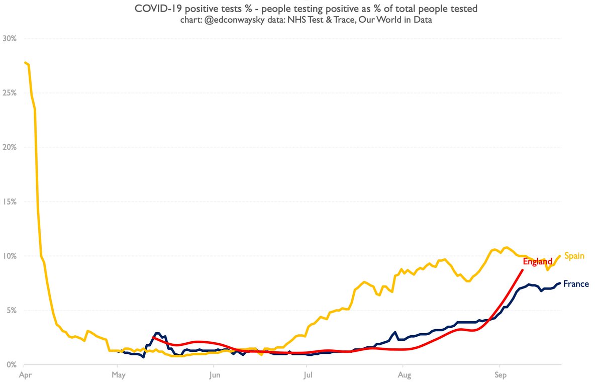
I’ve tweeted many depressing charts in this pandemic but this is among the worst.
I’ve obtained unpublished NHS data showing that the number of care home #COVID19 cases in Leeds has leapt so dramatically in the past week that they have exceeded the levels during the first wave.
My TV live on this story.
Hopeful interpretation is this rise is partly explained by more testing and that many of the cases are among younger care workers or asymptomatic residents.
Scary interpretation is that efforts to shield the elderly from this second wave are now failing
Local MP @FabianLeedsNE reacts to our story about a sharp increase in care home #COVID19 cases in the Leeds area:
This was in May: yorkshireeveningpost.co.uk/news/politics/…
In the past week and a half the number of care homes in Leeds facing outbreaks more than doubled, from 14 to 34.
More on this in the thread above. The numbers are from an internal NHS database.

• • •

Missing some Tweet in this thread? You can try to force a refresh
 

Keep Current with Ed Conway

Ed Conway Profile picture

Stay in touch and get notified when new unrolls are available from this author!

Read all threads

This Thread may be Removed Anytime!

PDF

Twitter may remove this content at anytime! Save it as PDF for later use!

Try unrolling a thread yourself!

how to unroll video
  1. Follow @ThreadReaderApp to mention us!

  2. From a Twitter thread mention us with a keyword "unroll"
@threadreaderapp unroll

Practice here first or read more on our help page!

More from @EdConwaySky

30 Oct
How does one reconcile this with the fact that case growth was actually SLOWER than in that "worst case scenario" (on basis of pretty much every measure inc @ONS survey)?
As @JeremyFarrar admits, communication of this stuff hasn't been great.
Lots of questions still unanswered.
Here's that famous illustration from Sep.
The black & grey lines show you what actually transpired.
I’ve included @ONS cases growth for comparison, mapped onto the baseline @uksciencechief used.
How, on the basis of actual case data, can one claim that trajectory was surpassed? Image
The point is not to dispute the substance of @JeremyFarrar’s thread. And yes I’m being somewhat pedantic. But these details matter.
What is the point of publishing a “worst-case scenario” and then claiming it’s been surpassed when the numbers show it hasn’t?
Genuine question…
Read 9 tweets
28 Oct
The green line on this chart might help explain why Germany is imposing a #COVID19 lockdown.
Unlike in the first wave of the disease, its case trajectory is steeper than in countries like France, Spain, UK etc.
However, it’s locking down comparatively earlier than some others
If you want a sense of what many European leaders hope for from these short term #COVID lockdowns, look at the light blue line here - Israel.
Cases were rising fast there. A month-long lockdown was imposed and new case growth dropped. The lockdown is now being eased.
For those who like to keep tabs on Sweden and its #COVID19 situation (I’ve heard that’s a “thing”), here it is. In the same pack as most other countries. Denmark there too.
BUT NB: Norway’s caseload is so low it currently doesn’t even make it above the line in this chart
Read 4 tweets
16 Oct
NEW:
IMF boss tells Rishi Sunak: "now is not yet the time to balance the books"
She warns of "massive bankruptcies and unemployment" if govts around the world withdraw economic support amid #COVID19's second surge.
Exclusive interview with @KGeorgieva on @skynews imminently
IMF head @KGeorgieva tells me there is still time to salvage a Brexit deal - even tho No10 says talks are over. “These are the last few weeks of negotiations; there is still a possibility to continue to work towards that agreement
“The clock is ticking but it’s not yet midnight.”
When considering the IMF MD's comments to @skynews tonight, perhaps worth reflecting that less than a fortnight ago @RishiSunak gave his first Tory conference speech. His standout message?
"We will always balance the books".
Read 4 tweets
16 Oct
Your weekly reminder to be a bit cautious comparing last week’s headline fig from the @ONS survey to this week’s
Last week @ONS reported 17.2k new daily cases.
This week 27.9k new cases.
V big increase; doubling every 8-9 days! BUT...
As we've covered before, those two numbers (17.2k and 27.9k aren't really directly comparable). Because this week more data has come in and the @ONS has remodelled its epidemiological curve. So it has revised where it thinks we were last week up to 19.5k.
The implication is #COVID19 is doubling every 13 days or so. Still not "good" news. Still higher than anyone would like. But not quite as scary as you might have thought if you're bluntly comparing those two numbers.
Read 6 tweets
16 Oct
You know the theory that the public is turning against vaccines, egged on by anti-vaccination conspiracy theorists on social media? What if that theory itself turned out to be a conspiracy theory?
A thread, based on my @thetimes column today: thetimes.co.uk/article/dd5181…
Lemme be clear: I'm not going to make a point abt the efficacy/safety of vaccines; I'll leave that to others. I'm questioning whether public opinion is indeed swinging towards vax scepticism. Plenty suspect it is (sorry @daaronovitch I know you don’t write the headlines but:)
Vaccine scepticism catastrophism (sorry for double -ism) has gone into overdrive since #COVID19 for understandable reasons. Epidemiologists reckon even a 100% effective vaccine (& the initial ones are likely be less than that) wld need 60-70% take-up for it to be truly effective)
Read 14 tweets
15 Oct
Q: How do you make your #COVID19 situation look less scary, without actually combating the disease?
A: Fiddle with the data.
That's what's just happened here in England. Test & Trace have quietly changed their data, suddenly changing our picture of the severity of the disease 🧵
The starting point is to note that perhaps the best measure (admittedly of a bad bunch) when it comes to overall case data, is to work out the number of positive cases as a percentage of tests taken. Here is how that chart looked for England as of last week. Scary, right?
Given cases are rising pretty quickly, it looked v much as if by this week England's positivity rate would have been above France/Spain. So here's what the statisticians have done: changed their definition for the total number of tests. Footnote here: gov.uk/government/pub…
Read 6 tweets

Did Thread Reader help you today?

Support us! We are indie developers!


This site is made by just two indie developers on a laptop doing marketing, support and development! Read more about the story.

Become a Premium Member ($3/month or $30/year) and get exclusive features!

Become Premium

Too expensive? Make a small donation by buying us coffee ($5) or help with server cost ($10)

Donate via Paypal Become our Patreon

Thank you for your support!

Follow Us on Twitter!