I’ve said it before, I hear every day that masks aren’t working cause people aren’t wearing them…so I wanted to do a thread to show all the states where people aren’t wearing masks
Here we go!
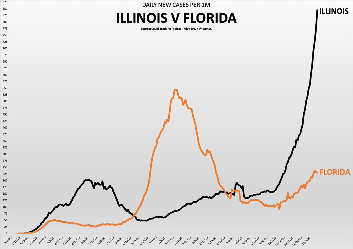
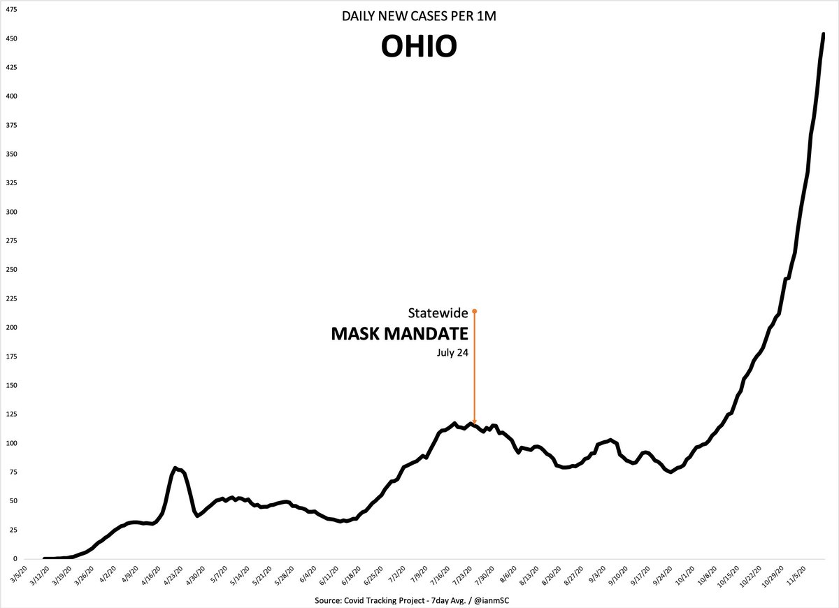
First up is Ohio! No one is wearing masks in Ohio
No one is wearing masks in Michigan either
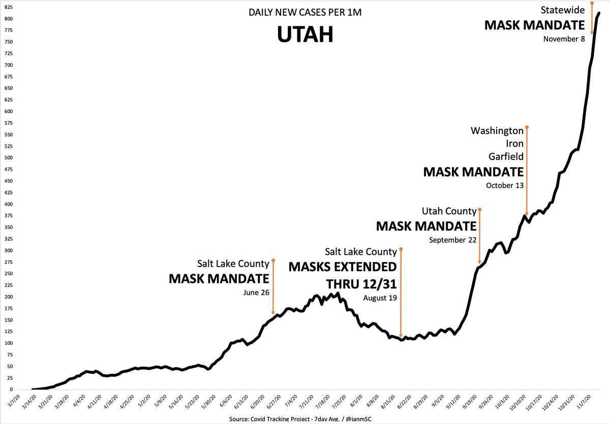
Let’s look at Utah…yup, no one wearing masks here either
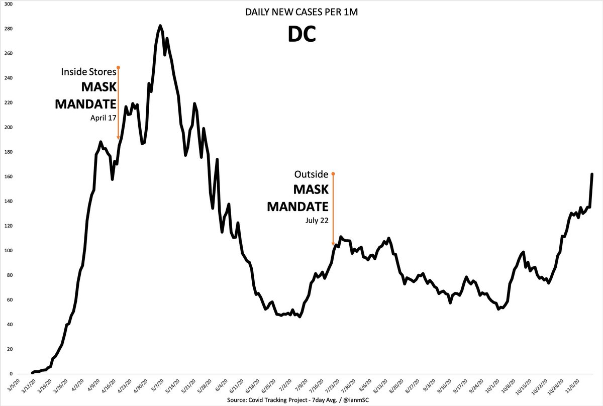
DC has seen a big increase recently…no one wearing them
Illinois…nope. No masks here.
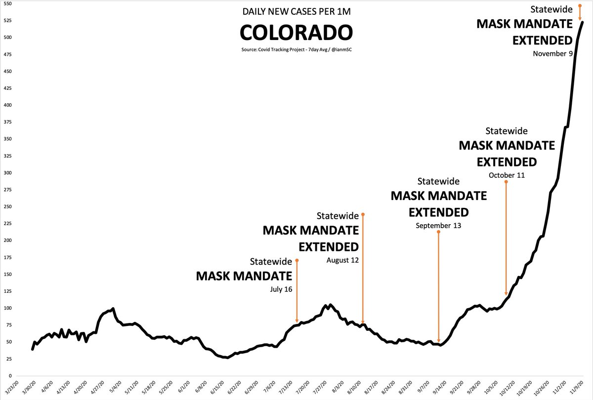
Colorado! Beautiful state. No masks.
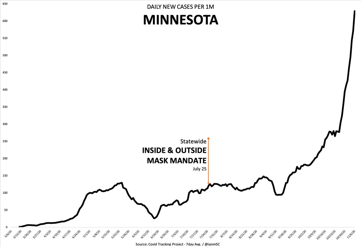
It’s sure cold in Minnesota, so you’d think people would wear masks there, just to get some warmth…but no. No masks.
I live in LA County and people here wear masks walking their dogs alone at night at 11pm. But I guess I’m wrong, because masks work, science says, and yet cases went up anyway. So yeah, no masks here.
Montana has a mask mandate, but no one’s using them there either
Wisconsin! Lots of cheese. But no masks.
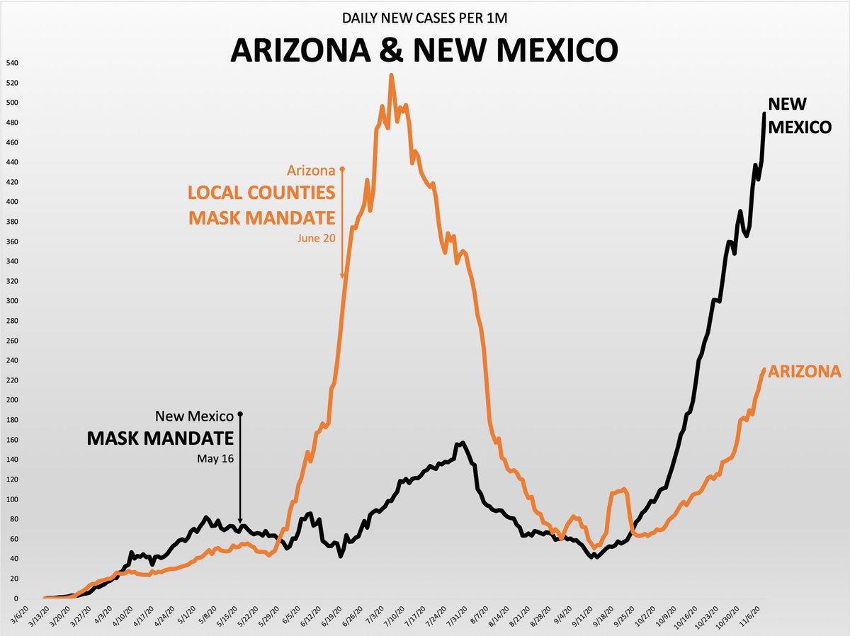
New Mexico has seen a massive increase in cases. Must be because no one is wearing masks
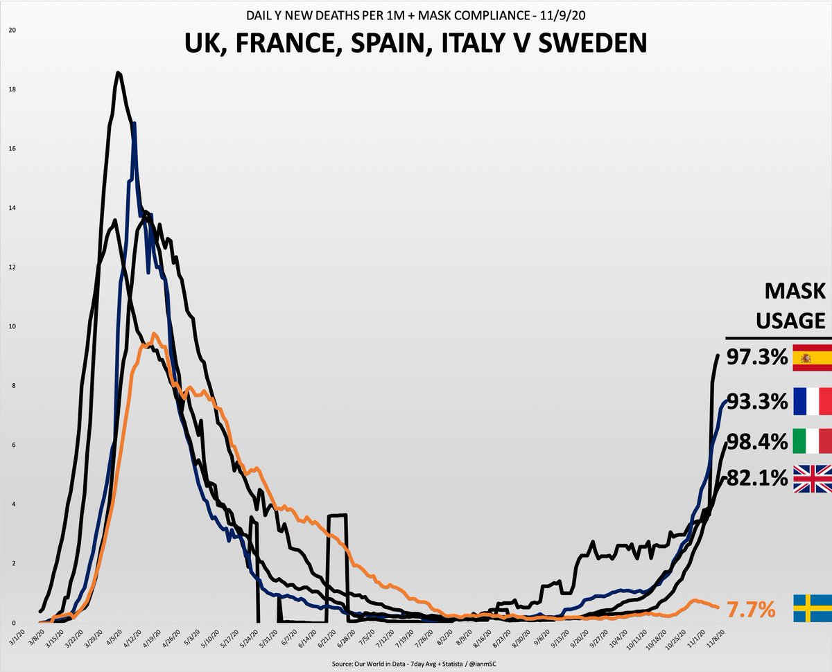
Sure, all of these European countries are reporting huge mask compliance numbers, but that can’t be accurate, cause the numbers are still bad. So nope, no one is wearing masks in Spain, Italy, France or the UK.
But they are in Sweden, apparently?
So there you have it, all those people you see walking around with masks? Optical illusion. Even in Europe! Totally fake
Because the experts say they work, and experts are NEVER wrong
So your eyes, the data…it’s all lying to you. But you know who isn’t lying? Fauci & the CDC
• • •
Missing some Tweet in this thread? You can try to
force a refresh
Ok so this is a thread, but I wanted to come up with a visual way to see the difference between April in NY & NJ and today in the southern "hotspot states"
So I looked at CDC Provisional Death Counts in those areas. These will change (gray area the most), but it's still useful
I made the Y-Axis values go to the same level (8000) so you can see what happened in the Northeast vs. the south.
While there are population differences, the expected level of deaths in some of the areas are not actually that different from NYC & NJ
So with that said, here's NYC & NJ vs. Florida, which has been "the next NY" seemingly forever.
So Penn State does a study showing 8.7 million infections in March, which means lockdowns were months too late to matter.
CDC says cases 10x higher than reported, so ~24 million
Which means ~15.3M infections after lockdowns were in place. So uh, they don’t work.
The CDC’s 10x estimate puts iFR at ~0.5%, which is likely still way too high given their estimate is likely low given that it’s based on antibody surveys mostly conducted months ago. Not to mention T-cell immunity.
So yeah, seems like iFR is in the 0.26% range, if not lower
Which also ignores the gigantic age stratification. Wonder why this isn’t front page news!
The CDC seems to be about 2 months behind reality, so maybe there’s some hope that by August they’ll pull the placebo requirement
@AZDHS@AlexBerenson Can you also explain how you repeatedly report more cases than tests in multiple areas?
Can you also explain how none of your positive test percentages make sense or add up?
It’s going to be super fun when you’ve reported 9-10 million cases of Covid with a population of 6.8M
@AZDHS@AlexBerenson It’ll be great, you’ll have 15,000 Covid hospitalizations with 7,800 hospital beds, hospitalization use will be at 85% and none if it will make any sense. Which is consistent with every single act of data of reporting you’ve done so far.
@AZDHS@AlexBerenson You could also explain how your antibody test percentage is 3% when you’ve already reported cases for ~1% of the total state population.
That means you’ve only missed ~2% of the cases in the state, which is literally impossible.