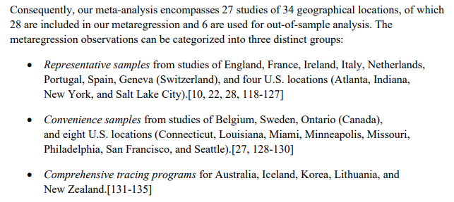
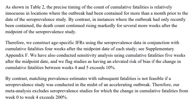
They also attend properly to the effects of reporting lags in death:
This leaves them with the following sample:
And they find the following:
In graphical form that looks like this:
Or on a non-log plot. Look how all three sources of data align- no obvious difference between the PCR based tracing and the Representative anti-body samples.
Using data from the ec datasets: ec.europa.eu/eurostat/datab… we can easily compute what the expected population IFR should be for European countries, under the assumption of uniform spread in all age groups.
I find the following results:
Note how the population demographics actually make expected IFR for Italy, Germany and Spain, markedly higher than the countries of Netherlands, Austria, and UK.
Elsewhere they apply this to Manaus in Brazil:
In Figure six they compare actual and predicted IFR estimates - however, I think this is a bit misleading, as I believe that they have used the age-specific infection rates in the data, rather than using the age-specific death rates on population demographics.
In England, this has resulted in a predicted IFR which is around 40% lower than the assumption of uniform spread as per my estimates above. My guess is they have used ONS age specific infection rates which under states the spread in older groups due to excluding nursing homes.
You will note here that the uniform spread prediction (1.5%) is exactly the observed "actual IFR" and is consistent with the findings of similar prevalence in all age groups in wave one.
(Also, if you think England has more favourable demographics for covid than New York City... I have a bridge to sell you). :)
Putting that aside, its clear that the age structure of populations accounts for an extremely large part of the difference in observed cross country IFRs.
We should also note, that in general if you are below the line, then you did well in shielding your elderly (they had lower prevalence), if you are above the line, you had excess spread in elderly demographics.
These are the best estimates for IFRs in developed countries. The science is done, the results are in: IFR is >1.5% in most rich nations. Covid really is a bad disease, and all the charlatans claiming its much less than 1% are no more worth your time than climate change deniers.
These estimates, from a high quality meta study and analysis, are the best estimates science can offer. A gold standard of data analysis. Always remember:

• • •

Missing some Tweet in this thread? You can try to force a refresh
 

Keep Current with Iron Economist

Iron Economist Profile picture

Stay in touch and get notified when new unrolls are available from this author!

Read all threads

This Thread may be Removed Anytime!

PDF

Twitter may remove this content at anytime! Save it as PDF for later use!

Try unrolling a thread yourself!

how to unroll video
  1. Follow @ThreadReaderApp to mention us!

  2. From a Twitter thread mention us with a keyword "unroll"
@threadreaderapp unroll

Practice here first or read more on our help page!

More from @IronEconomist

3 Sep
So there seems to be a myth taking hold among the twitter commentariat that a lot of housing economists think that the rise in house prices in the UK is well explained by interest rates alone. This.... is not the expert consensus. Here is a thread of papers (in no partic order).
Nice recent paper using a planning dataset from the uk:
cpb.nl/sites/default/…
Starts with a nice little literature review:
Read 18 tweets
12 May
ONS now recorded 46380 excess deaths by May first. Deaths are coming off but there are still going to have been many thousands since May first, we are certainly over 50k already, and it seems doubtful death rates will fully normalise before we reach 60k.
60000 deaths is 0.1% of the population. This means a sero-prevalence at 10% would lead to an IFR of 1%. In the last ten days we have had three pieces of information that make it likely the total attack rate closer to 5% than 10% in the UK, and consequently an IFR near 2%.
Firstly Patrick Vallence gave a preview of the UK ongoing serology study (due May 14th I believe): parliamentlive.tv/Event/Index/78… look around 10:20-10:20. 10% in London 3-4% UK wide.
Read 7 tweets
24 Apr
So I was reading this excellent analysis of how GRR Martin's books differ from the medieval world, and it brought together a few thoughts I have been having for a while: acoup.blog/2019/06/12/new…
One of the reasons I find history so fascinating, is that it somehow reveals how our modern world is anomalous, and I think one way in which our world is particularly unusual, is the lack of real constraints on elite behaviour.
And by elite here I do not just mean billionaires, I mean university professors, and small bushiness owners and journalists. The top 10% on some ranking of financial power and prestige.
Read 21 tweets
25 Mar
Absolutely mad to me how many people are credulously reporting the FT headline that ‘up to half of U.K. may have been infected’ when the paper plots a variety of results and to get that one you have to assume an IFR 100x smaller than consensus.
No wonder the researchers ‘weren’t keen to criticise the government’. They probably know perfectly well the IFR is likely around 1%.
Their paper points out the path of deaths can be consistent with higher prevalence/lower severity. But people have been estimating those numbers and despite uncertainty exactly no one thinks it’s a tenth as deadly as the common flu. Which is what is needed for 50% exposure.
Read 4 tweets
24 Mar
So on the oxford paper, the two main findings are this graph, where rho characterises the percentage of severe cases. (0.01 = 1%). Image
But the key is to characterise rho in terms of the more common IFR - the death rate among all infections, we see from the rhs here that deaths are only 0.12-0.016 of rho. Image
This means that rho=0.001, generating the FT headlines, corresponds to a true IFR aroudn 0.00014, or 0.014%, which is deeply implausible. Using the same IFR as the imperial paper (1%), rho would be 0.06, and only a small fraction are infected. Hard to read but maybe 10%.
Read 5 tweets
8 Jun 19
Saw a new paper on the lead-crime hypothesis, and it is pretty much the perfect randomised intervention. Notes to follow.

aeaweb.org/articles?id=10…
In this paper they explicitly measured he blood lead levels of children, and then took a group of hose with the highest lead exposure and intervened to lower the blood lead level of some of those with the highest lead levels.
If lead in the blood stream causally causes crime then you would expect that crime rates should be correlated with measured lead except for the intervention group who should have lower crime than their high lead comparators.
Read 7 tweets

Did Thread Reader help you today?

Support us! We are indie developers!


This site is made by just two indie developers on a laptop doing marketing, support and development! Read more about the story.

Become a Premium Member ($3/month or $30/year) and get exclusive features!

Become Premium

Too expensive? Make a small donation by buying us coffee ($5) or help with server cost ($10)

Donate via Paypal Become our Patreon

Thank you for your support!

Follow Us on Twitter!