
1/ After a few months of building, it's time for us to reveal the first version of the Terminal:
terminal.tokenterminal.com
A thread 👇
terminal.tokenterminal.com
A thread 👇
2/ Our long-term goal is to work together with our users – the project teams and communities, investors, analysts, and other stakeholders – to build out the most robust and useful investment analysis toolkit for the crypto markets.
3/ "Launched in 1982, long before PCs and the Internet became ubiquitous, the Bloomberg Terminal brought transparency to financial markets. It connected market participants to groundbreaking data, analytics, and information-delivery service and revolutionized an industry."
4/ Now, some forty years later, it feels like the Internet-native capital markets are on the verge of their Bloomberg moment.
In a nascent market like crypto, the lack of standards makes it hard to conduct relative analysis on the performance of crypto projects.
In a nascent market like crypto, the lack of standards makes it hard to conduct relative analysis on the performance of crypto projects.
5/ With the Terminal, we want to provide tools for investors and analysts alike to tackle this issue.
Below is a walkthrough of the layout for the dashboards that can be found in the Terminal.
We hope to engage the community to help improve this initial framework.
Below is a walkthrough of the layout for the dashboards that can be found in the Terminal.
We hope to engage the community to help improve this initial framework.
6/ P.S. Even if crypto is still largely associated with cryptocurrencies and Bitcoin, we hope that the Terminal sheds light on the promise of Internet-native financial markets, especially for those who still believe currency to be the only viable use case for cryptoassets.
7/ Metrics initially available in the Terminal:
Market cap - what is a project valued at? Calculated based on a project's fully-diluted token supply.
Market cap - what is a project valued at? Calculated based on a project's fully-diluted token supply.

8/ Price to sales ratio (P/S) - how is a project valued in relation to its revenues? Calculated as a project's market cap divided by its annualized revenue.
Annualized revenue is a forward-looking revenue estimate that is calculated based on a simple 30-day moving average.
Annualized revenue is a forward-looking revenue estimate that is calculated based on a simple 30-day moving average.

9/ Token trading volume to market cap ratio (VOL/MC) - how efficient is the price discovery for a project’s native token?
Calculated as the daily trading volume for the project's native token divided by its market cap.
Calculated as the daily trading volume for the project's native token divided by its market cap.

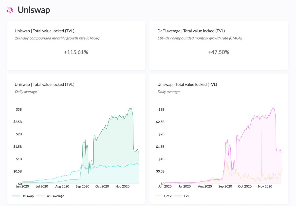
10/ Total value locked (TVL) - how much money has been deposited into a project’s smart contracts?
Calculated as the liquidity deposited to a project's smart contracts (exchange) or as the difference between the assets deposited and borrowed (lending).
Calculated as the liquidity deposited to a project's smart contracts (exchange) or as the difference between the assets deposited and borrowed (lending).
11/ Gross merchandise volume (GMV) - what is the demand for a project’s service?
Calculated as the project's transaction (blockchain), trading (exchange), or borrowing (lending) volume.
Calculated as the project's transaction (blockchain), trading (exchange), or borrowing (lending) volume.

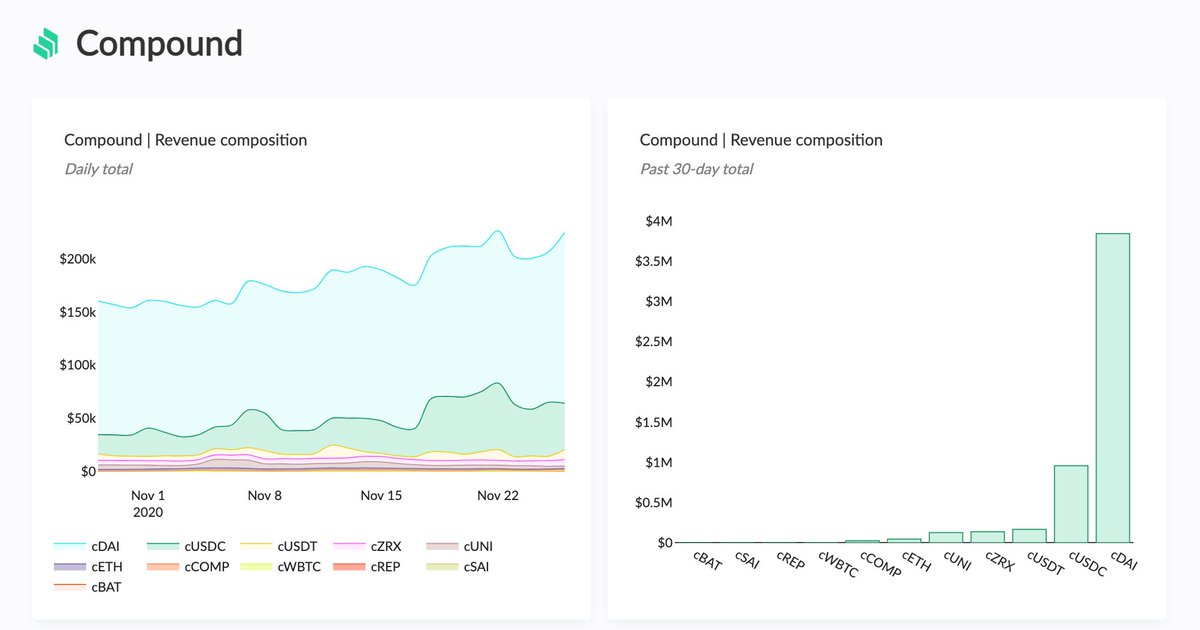
12/ Revenue - how much are users paying to use a project’s service? Calculated as GMV*Take rate.
For now, revenue refers to total fees paid by the project's users.
Where available, we’ve included data on the revenue share % between supply-side participants & tokenholders.
For now, revenue refers to total fees paid by the project's users.
Where available, we’ve included data on the revenue share % between supply-side participants & tokenholders.

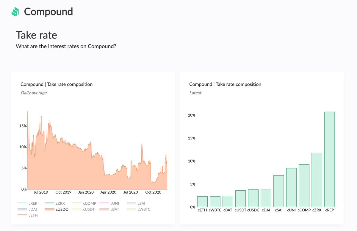
13/ Take rate - what does it cost to use a project’s service?
Refers to the fee charged on the GMV, either in the form of a trading fee (exchange) or an interest rate (lending).
Refers to the fee charged on the GMV, either in the form of a trading fee (exchange) or an interest rate (lending).
14/ How to get the most out of the charts:
When going through a project's dashboard, it's useful to write down the dates for:
- the launch of the project's native token
- potential token incentive distributions
- inclusion of new assets (trading pools/lending markets)
When going through a project's dashboard, it's useful to write down the dates for:
- the launch of the project's native token
- potential token incentive distributions
- inclusion of new assets (trading pools/lending markets)

15/ These events are usually clearly visible in the GMV and revenue composition charts.
For example, the launch of token incentives can temporarily increase the demand for the project's service (increase its GMV).
tokenterminal.substack.com/p/biweekly-new…
For example, the launch of token incentives can temporarily increase the demand for the project's service (increase its GMV).
tokenterminal.substack.com/p/biweekly-new…
16/ Counter charts: the counter charts focus on current values, benchmarked against the project's peer group (currently other DeFi projects listed on Token Terminal).
They also include month over month changes and compounded monthly growth rates (CMGR) for longer time periods.
They also include month over month changes and compounded monthly growth rates (CMGR) for longer time periods.

17/ When looking at the counter charts, it is useful to think about what could explain the upward or downward movement month over month? Is the movement inline or in contrast with the project's peer group, why?
18/ Historical charts: the historical charts provide deeper insight into a project's development over time. Here it's useful to look for patterns (stable, volatile, one-off spikes or drops, correlation with the peer group, etc.) and the underlying events that could explain them.

19/ Composition charts: the composition charts tell us more about the project's business:
- GMV: which trading pools (TP)/lending markets (LM) are most used?
- Take rate: which TPs/LMs charge the highest/lowest fees?
- Revenue: which TPs/LMs generate the most fees?
- GMV: which trading pools (TP)/lending markets (LM) are most used?
- Take rate: which TPs/LMs charge the highest/lowest fees?
- Revenue: which TPs/LMs generate the most fees?
20/ Normalized charts: the normalized versions of composition charts show how the relationships between the different trading pools or lending markets have evolved over time.
The toggle feature enables the user to focus the view on specific trading pools or lending markets.
The toggle feature enables the user to focus the view on specific trading pools or lending markets.

21/ Charts with multiple trading pools or lending markets:
for projects that have multiple different GMV & revenue components, we've visualized the nine components with the most GMV & revenue during the relevant time period (30-days, 180-days, since launch) + an "Other" category.
for projects that have multiple different GMV & revenue components, we've visualized the nine components with the most GMV & revenue during the relevant time period (30-days, 180-days, since launch) + an "Other" category.

22/ A large "Other" category would indicate that the long-tail of trading pools or lending markets generate significant GMV or revenue and vice versa.
The toggle feature enables the user to focus the view on specific trading pools or lending markets.
The toggle feature enables the user to focus the view on specific trading pools or lending markets.
fin/ If you can imagine spending your days creating and analyzing charts similar to those in the Terminal, shoot us a DM on Twitter or email people@tokenterminal.xyz, and let's figure out a way to work together!
tokenterminal.substack.com/p/launching-th…
tokenterminal.substack.com/p/launching-th…
• • •
Missing some Tweet in this thread? You can try to
force a refresh


