THREAD: New Toy
1/x Just finished building a new toy in python, gotta share. How it works: you type in a stock, group of stocks, index, sector, industry, factor, WHATEVER, plus date range. It then goes into OSAM research database & builds massive graphical report, 130 chart pdf.
1/x Just finished building a new toy in python, gotta share. How it works: you type in a stock, group of stocks, index, sector, industry, factor, WHATEVER, plus date range. It then goes into OSAM research database & builds massive graphical report, 130 chart pdf.
Here's an example of the code run on the S&P 500 (OSAM US Large Stock universe).
Link: philosophicaleconomics.com/wp-content/upl…
PDF is ~55MB so may not open immediately.
Link: philosophicaleconomics.com/wp-content/upl…
PDF is ~55MB so may not open immediately.
In addition to doing dispersion work on individual stock returns, valuations, profitability, etc., etc. code aggregates income statements, balance sheets, & cash flow statements of companies in the index (which user defines) and presents those as graphics. Example: 
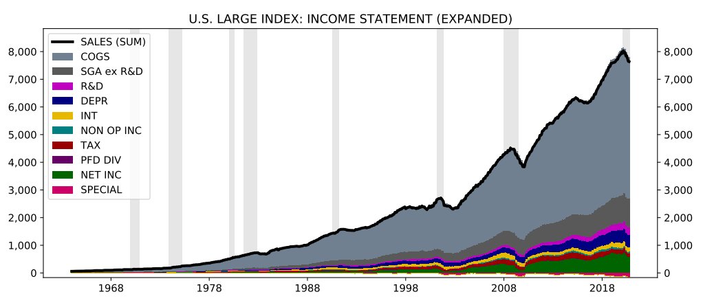
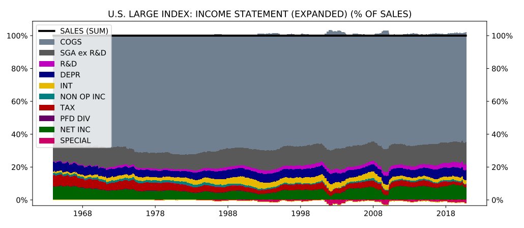
The above tweet is the "income statement" of the S&P 500 from 1963 to 2020. Here's everything expressed as % of sales, with special items and non-operating income included in the graphic: 
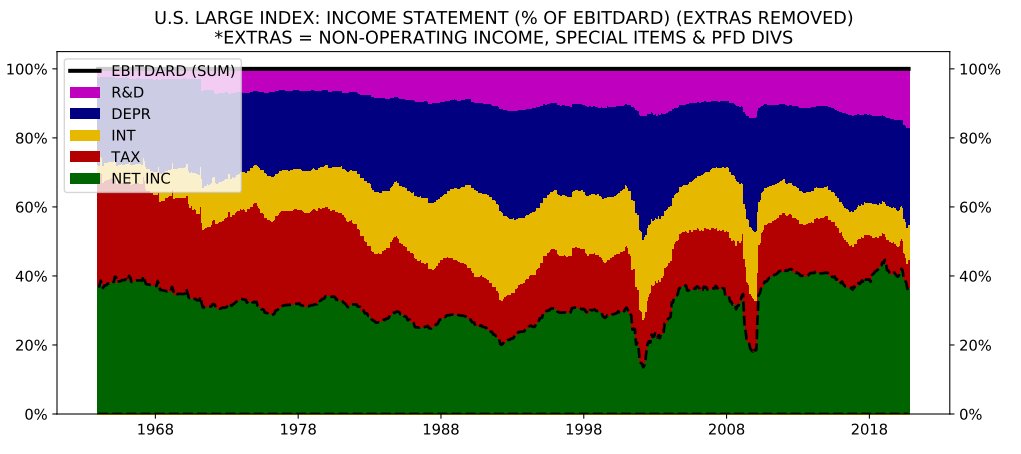
Here's bottom line portion of SPX income statement expressed as a % of EBITDARD. (New term--EBITDA w/ R&D treated as if it were CAPEX. Incoherent to exclude CAPEX depreciation expense from an earnings measure but then allow R&D expense to be included. Should be expensed alike) 
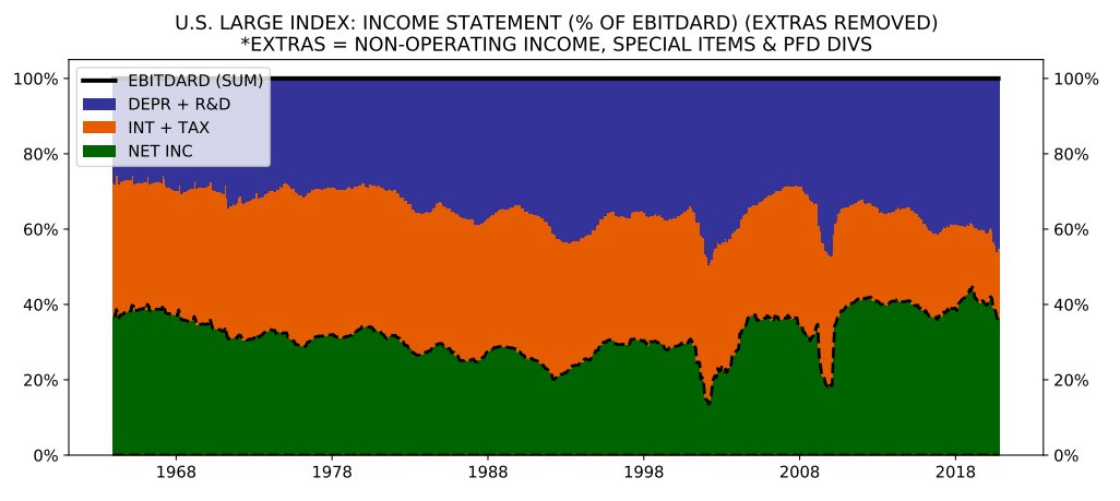
One thing that stands out is role of declining interest & tax expense in SPX margin increase from early 1990s to present. In chart below, interest & taxes (orange) and depreciation & R&D expense are grouped (purple). You can see the massively shrinking orange, while purple grows. 

Not the theme of the thread, but that point was important to the profit margin mean reversion debates that took place several years ago. Chart helps put a picture on it. 
Anyways, there's way too much in the pdf to discuss here, so you can just go through the charts. Basically everything you ever wanted to know about that index and probably much more than anyone needs to know.
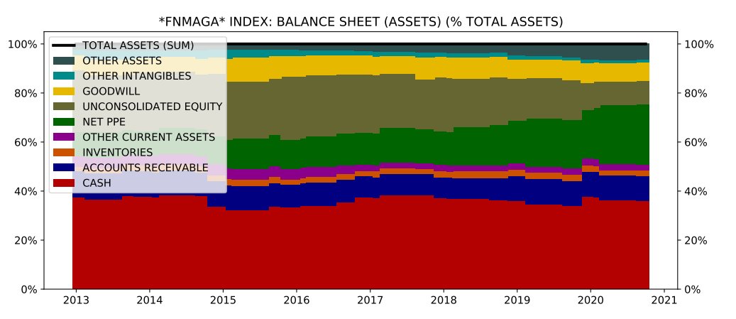
The cool thing I want to highlight is how the code can be run on any stocks you pick. So, let's just make one up, $FNMAGA = $FB, $NFLX, $MSFT, $AMZN, $GOOG, $AAPL. Date range: Dec 2012 to Sep 2020. Here's the result: philosophicaleconomics.com/wp-content/upl…
Interestingly, as a group, $FNMAGA profit margins really haven't grown that much. From 2012 to present, it's more of a sales growth and multiple expansion story. Here's the income statement as % of sales. 
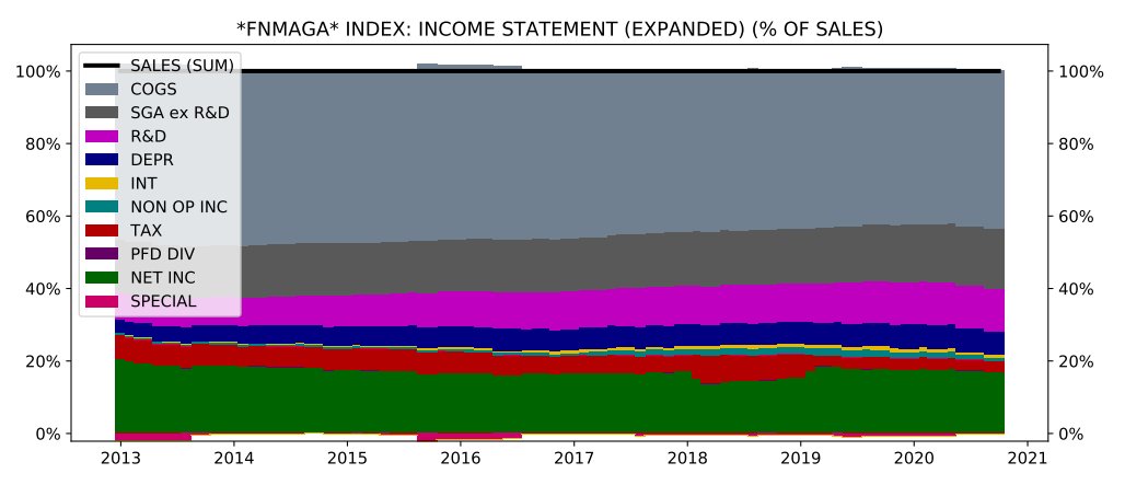
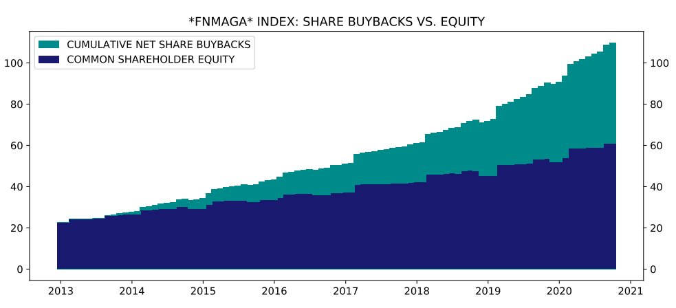
Uses of Capital. Obviously huge R&D spend, and also big buyback increase starting several years ago from $AAPL. 
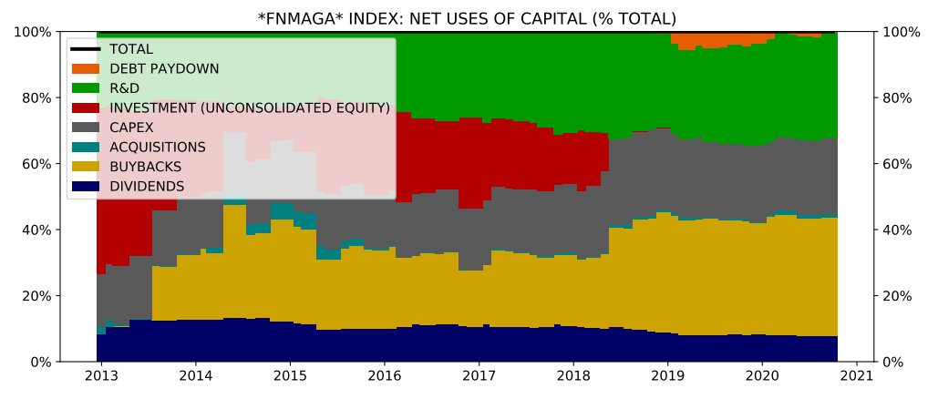
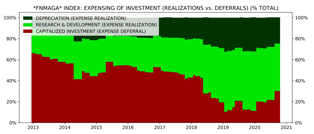
The companies have high FCF to Earnings because they expense their investments up front via R&D more than they defer them via capitalization. Relative to the rest of the market, their reported earnings power is likely understated. 
OFC, as we know, they're also priced very expensively relative to those earnings, particularly as large, mature companies. Huge multiple expansion over the period: 

Finally, can run code on individual stocks. Example: $MSFT starting Dec 1989. philosophicaleconomics.com/wp-content/upl… Raw numbers for MSFT "index" are different from actual $MSFT numbers b/c scaled to starting 1989 price of 100, w/ all divs converted into share BB. But information preserved.
• • •
Missing some Tweet in this thread? You can try to
force a refresh
