Now, some will inevitably say "but that’s just showing Covid spreading among people who were already in hospital for other reasons", but that is wrong.

Of the 17,900 new Covid cases in English hospitals since Christmas day, 15,072 were new admissions from the community, i.e 84%.
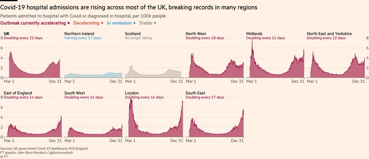
Here are hospital admissions for all UK regions (excl Wales where this data is not readily available).

Far from being only a London problem, new Covid admissions are now doubling in less than 2 weeks across 5 English regions.
And here’s what that means for Covid hospital occupancy:

Now increasing in every English region + Wales, and no longer falling in Scotland or Northern Ireland.
We can also see how the new B.1.1.7 variant is playing a key role.

Latest data from @covidgenomicsuk show that even in 5 days from Dec 17 to Dec 22, the share of sequenced samples that found the new variant was growing well beyond the south east, with hotspots in the north too.
Edit to third tweet: we can also look at data not only on how many Covid patients are in hospital, but what share they make up of *all* available beds.

Covid patients now occupy more than half of all beds in many areas (and rising fast), including 63% in North Middlesex.
For those interested, the hospital bed breakdown data shown in these charts come from the weekly NHS hospital activity data here (specifically the last three sheets of the Excel workbook) england.nhs.uk/statistics/sta…

• • •

Missing some Tweet in this thread? You can try to force a refresh
 

Keep Current with John Burn-Murdoch

John Burn-Murdoch Profile picture

Stay in touch and get notified when new unrolls are available from this author!

Read all threads

This Thread may be Removed Anytime!

PDF

Twitter may remove this content at anytime! Save it as PDF for later use!

Try unrolling a thread yourself!

how to unroll video
  1. Follow @ThreadReaderApp to mention us!

  2. From a Twitter thread mention us with a keyword "unroll"
@threadreaderapp unroll

Practice here first or read more on our help page!

More from @jburnmurdoch

2 Jan
NEW: Saturday update of latest UK Covid data

The trend in test positivity since Christmas is genuinely scary, with lines climbing almost vertically in all English regions.

On Christmas eve 17% of tests in London came back positive. Four days later that was 24% and accelerating Image
There are now 5,861 Covid patients in London’s hospitals, almost 700 more than at the worst point in April.

There has also been a clear inflection point in deaths, which have climbed to almost 100 per day (last seen in April). Image
We can also look at data not only on how many Covid patients are in hospital, but what share they make up of *all* available beds.

This makes for grim reading: Covid patients now occupy more than half of all beds in many areas (and rising fast), including 63% in North Middlesex. Image
Read 7 tweets
31 Dec 20
NEW chart thread:

The latest UK Covid data paints a dire picture, with London and much of the south now in a worse position than they were at the spring peak, and hospitals struggling to cope

18% of tests in London now come back positive, and rates are climbing everywhere.
The surge in infections is putting hospitals under immense pressure. London now has 5,524 Covid patients in hospital beds, surpassing its April peak.

There were 739 new Covid admissions or diagnoses on Monday, up 50% on the previous week. The steepness of these climbs is scary.
London’s numbers are the most grim, but the same pattern is visible across most of England, with new hospital admissions and diagnoses now doubling every ~2 weeks in several regions.
Read 7 tweets
24 Dec 20
NEW: Christmas eve update on key Covid metrics in the UK and beyond

Cases and positivity rates are still rocketing in London and surrounding areas, the regions where the new B.1.1.7 variant is known to be most prevalent.

15% of tests in London now positive.
If we group by restriction tier instead of region, we can see the justification for the additions to Tier 4 on Saturday.

Case rates and positivity in these areas were the lowest in the country a couple of weeks ago, but have since shot up, growing faster than any other areas.
Here’s the same thing in map form:

Every London borough now has case rates above 400 per 100k, and almost the whole of the south/east is a deep shade of red.

Growth rates are very high right across to the south west and down to the Isle of Wight.
Read 9 tweets
22 Dec 20
NEW: long overdue, I’ve updated our excess deaths data, expanding the list of countries to 30

We have tracked 1.5 million excess deaths so far, considerably more than the 960k attributed to Covid-19 in the same countries over same period.

Free to read: ft.com/coronavirus-la…
Here’s a summary of the different ways of tallying excess deaths:

Whatever metric you choose, Latin America has been hit extremely hard. Europe next hardest-hit, though with very different outcomes from place to place.
First, top-level patterns:

In the English-speaking world we often focus on situation in Europe & US, but large parts of Latin America have endured a brutal year.

Mexico, Ecuador & especially Peru have seen deaths soar far above expected levels. Brazil & Chile have also suffered
Read 17 tweets
19 Dec 20
NEW: quick chart showing key context for today’s news of a Tier 4 Christmas

Cases are soaring in areas set to go into T4, with rate of increase extremely worrying. Testing has increased lately too, but even if we look at positivity, the rate of increase is very steep.
Story here from @PickardJE ft.com/content/3484bb…

And we’ll have more later on what we know about the new strain
And here’s weekly change in positivity for all English local authorities:

Increasing almost everywhere, and doubling every 10 days in almost 50 local authorities.
Read 5 tweets
17 Dec 20
NEW with @JasmineCC_95 & @ChrisGiles_

38.5m people (68% of England’s population) will be in the tightest restrictions from Saturday.

Story: ft.com/content/e4eea7…

Two charts show that most moves into T3 were really no-brainers:

1) Case rates in these areas are high
And 2) in all-but-one area moved into T3, cases are also rising, in some cases very rapidly.

The exception is Runnymede in Surrey, where cases are elevated but trending downwards.
And here’s all of the above in map form.

Tier 3 maps very neatly onto areas whose case rates are currently elevated.

Rate of change (right) is a less neat fit; some areas in T3 are trending downwards, and most in T2 are trending sharply up.
Read 4 tweets

Did Thread Reader help you today?

Support us! We are indie developers!


This site is made by just two indie developers on a laptop doing marketing, support and development! Read more about the story.

Become a Premium Member ($3/month or $30/year) and get exclusive features!

Become Premium

Too expensive? Make a small donation by buying us coffee ($5) or help with server cost ($10)

Donate via Paypal Become our Patreon

Thank you for your support!

Follow Us on Twitter!