NEW: long overdue, I’ve updated our excess deaths data, expanding the list of countries to 30
We have tracked 1.5 million excess deaths so far, considerably more than the 960k attributed to Covid-19 in the same countries over same period.
Free to read: ft.com/coronavirus-la…
We have tracked 1.5 million excess deaths so far, considerably more than the 960k attributed to Covid-19 in the same countries over same period.
Free to read: ft.com/coronavirus-la…
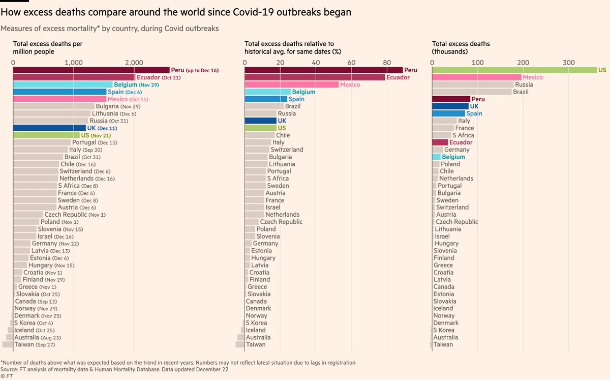
Here’s a summary of the different ways of tallying excess deaths:
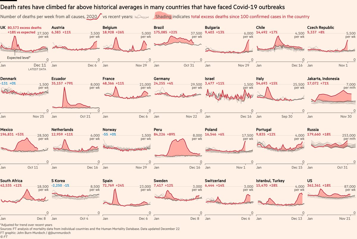
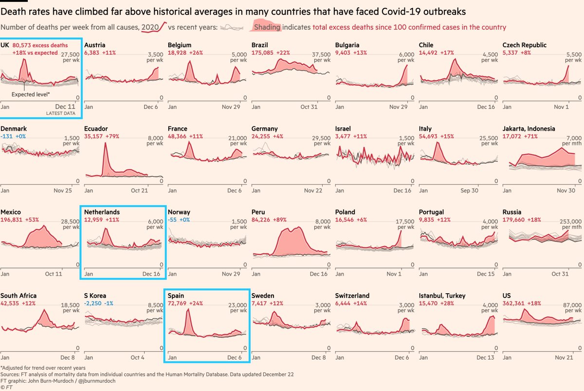
Whatever metric you choose, Latin America has been hit extremely hard. Europe next hardest-hit, though with very different outcomes from place to place.
Whatever metric you choose, Latin America has been hit extremely hard. Europe next hardest-hit, though with very different outcomes from place to place.
First, top-level patterns:
In the English-speaking world we often focus on situation in Europe & US, but large parts of Latin America have endured a brutal year.
Mexico, Ecuador & especially Peru have seen deaths soar far above expected levels. Brazil & Chile have also suffered
In the English-speaking world we often focus on situation in Europe & US, but large parts of Latin America have endured a brutal year.
Mexico, Ecuador & especially Peru have seen deaths soar far above expected levels. Brazil & Chile have also suffered
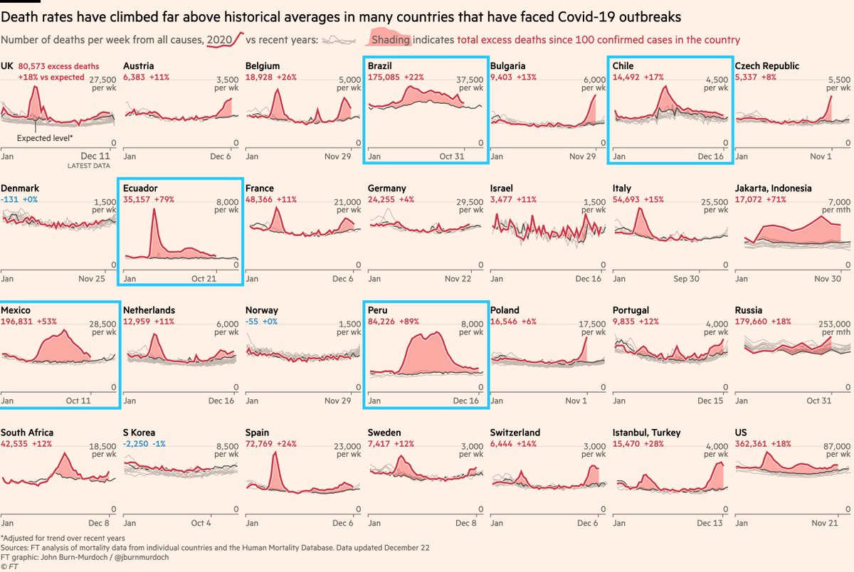
Another notable pattern emerging is that in many cases, countries that suffered particularly grim peaks in the spring have seen a more muted excess in autumn/winter.
Those winter tolls will rise, but in UK, Spain, Netherlands in particular winter is very different to spring.
Those winter tolls will rise, but in UK, Spain, Netherlands in particular winter is very different to spring.
There will be a few things at play here:
1) Outbreaks in spring were much more severe. No social distancing. Vast majority of infections were not caught. People who needed hospital may not have got there. Care home outbreaks picked off thousands of the most vulnerable.
1) Outbreaks in spring were much more severe. No social distancing. Vast majority of infections were not caught. People who needed hospital may not have got there. Care home outbreaks picked off thousands of the most vulnerable.
2) Flu has ~disappeared due to social distancing. That saves a lot of lives, lowering the baseline of non-Covid deaths such that excess deaths now actually *undercount* Covid deaths in countries like these during winter.
@ChrisGiles_ has more on that here
@ChrisGiles_ has more on that here
https://twitter.com/ChrisGiles_/status/1341364088824340485
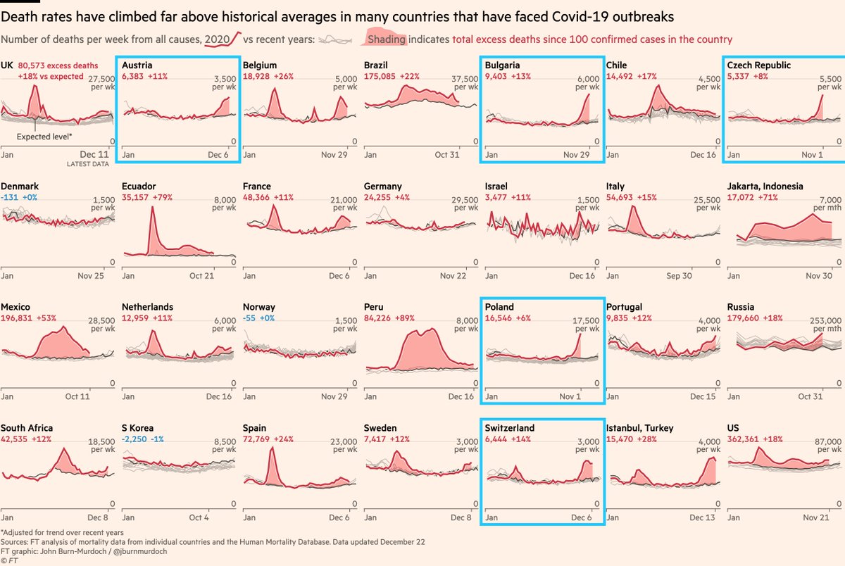
Other patterns:
Many Euro countries avoided bad outbreaks earlier in year, but now have steep peaks much like e.g UK in spring.
One possibility is a country’s first bad outbreak will tend to be more lethal than any that follow.
Then again, Switzerland. And to an extent Belgium
Many Euro countries avoided bad outbreaks earlier in year, but now have steep peaks much like e.g UK in spring.
One possibility is a country’s first bad outbreak will tend to be more lethal than any that follow.
Then again, Switzerland. And to an extent Belgium
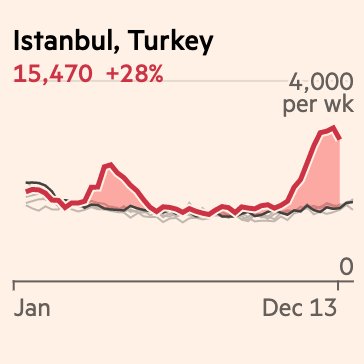
Another example of this is Istanbul.
We don’t have deaths data for all of Turkey, but fortunately @mesuturkiye has been tracking the numbers for its capital mesuturkey.wordpress.com/2020/05/25/exc…
A grim toll in the spring has been followed by an even bigger toll in autumn/winter.
We don’t have deaths data for all of Turkey, but fortunately @mesuturkiye has been tracking the numbers for its capital mesuturkey.wordpress.com/2020/05/25/exc…
A grim toll in the spring has been followed by an even bigger toll in autumn/winter.
Staying on the theme of people doing brilliant work to track excess deaths where that need is not met by official sources, I’m also hugely indebted to @thomasfujiwara and co for their efforts in Brazil conass.org.br/indicadores-de…
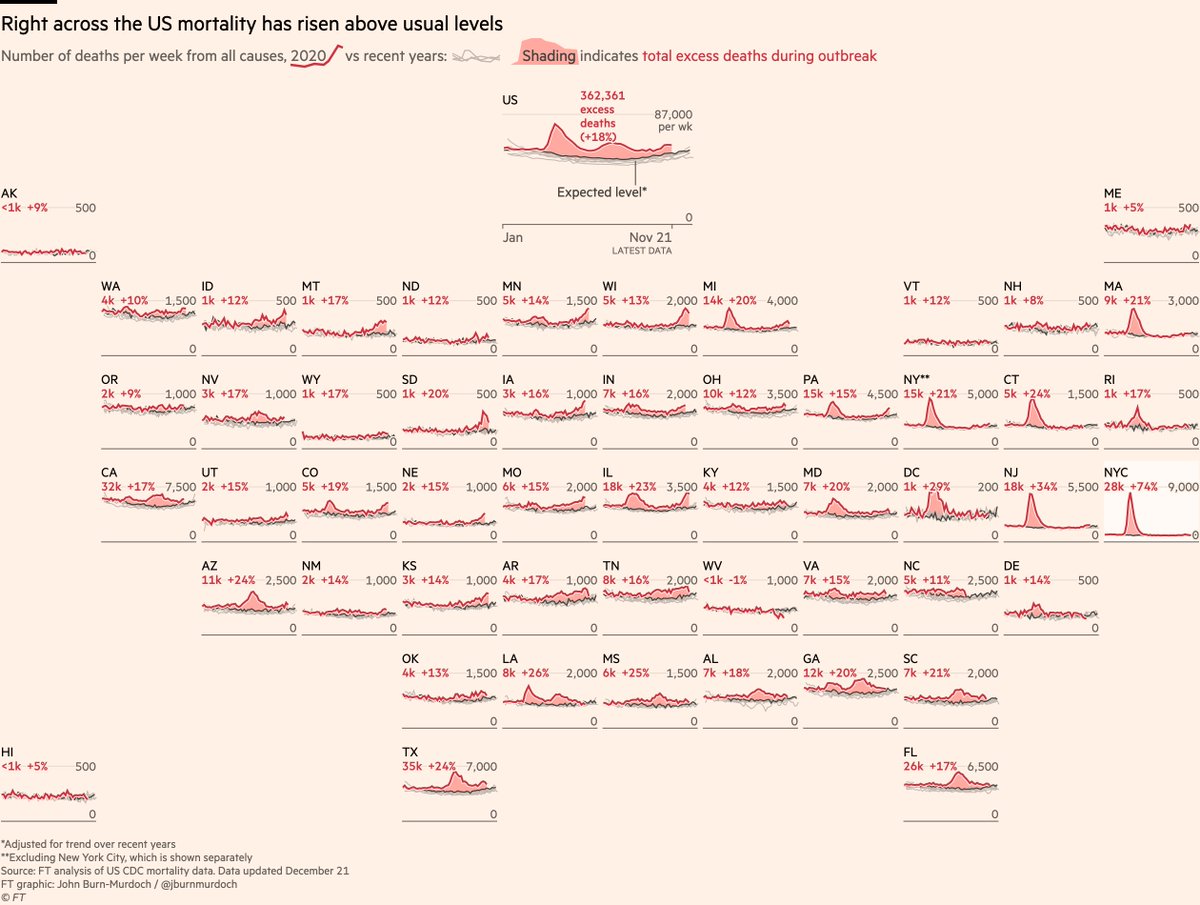
At this point let’s visit the US, where the excess toll stands at 362,000 vs an official toll of 246,000 at the same stage.
Notably, while the urban north east saw brutal outbreaks in the spring, excess rates have since exceeded 20% (very high) in parts of the south & west.
Notably, while the urban north east saw brutal outbreaks in the spring, excess rates have since exceeded 20% (very high) in parts of the south & west.
Now onto some nerdier stuff:
Lots of people have said excess deaths need to take account of population growth. This is half right, but only half.
The logic is that as population grows, we’d expect deaths to grow proportionally. But it’s not that simple...
Let’s use an example
Lots of people have said excess deaths need to take account of population growth. This is half right, but only half.
The logic is that as population grows, we’d expect deaths to grow proportionally. But it’s not that simple...
Let’s use an example
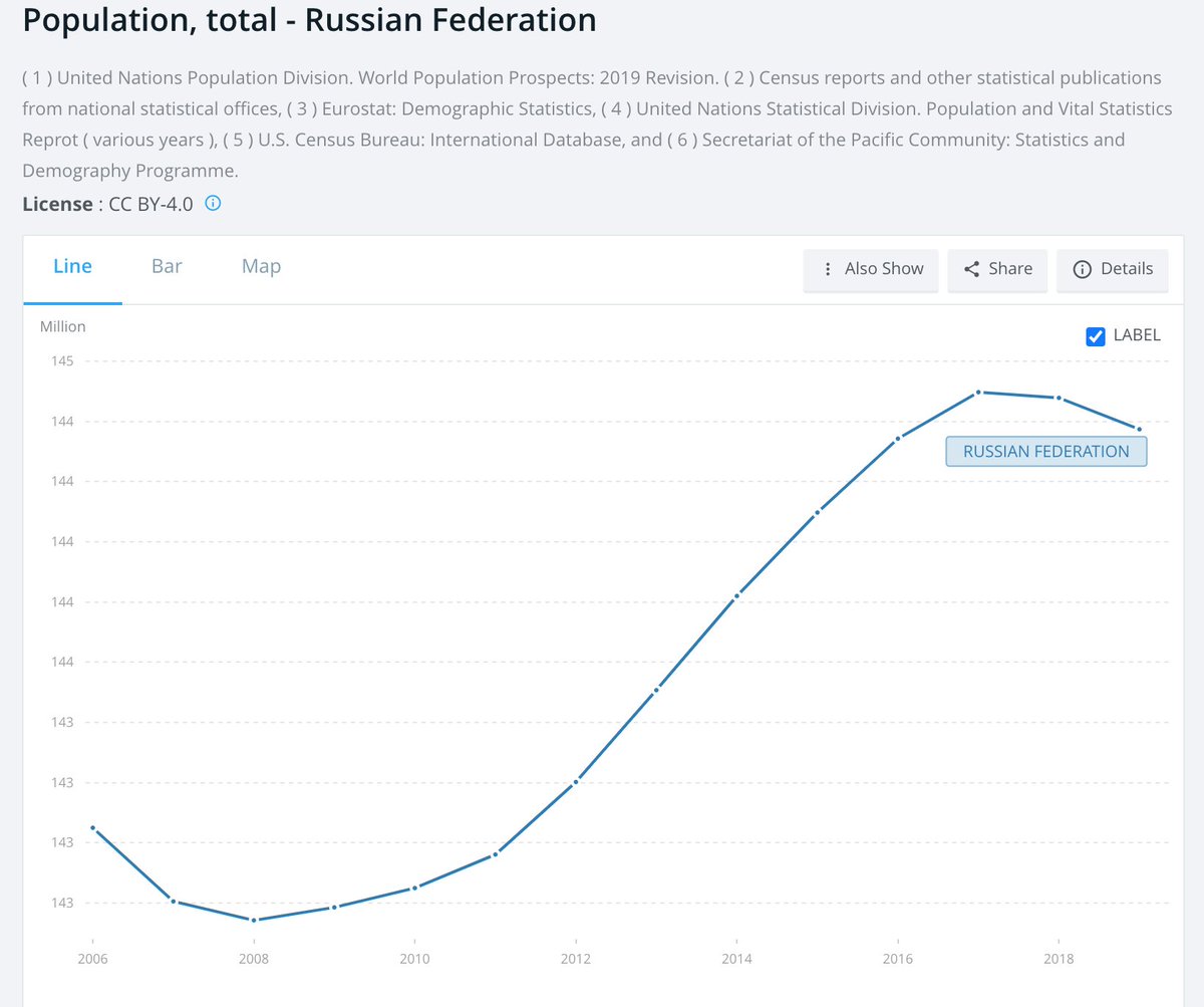
Here’s Russia’s total population since 2006. Steady upward trend.
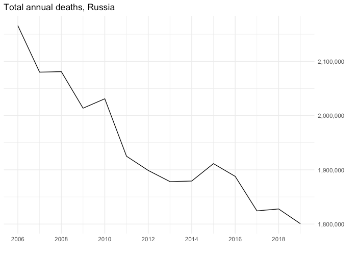
Deaths? Not so much.
So if we want to calculate an "expected deaths" baseline, it makes much more sense to model this by adjusting not for recent trend in population, but in *deaths*
If deaths are 📉, it’s usually more about structural changes than population. Improvements in health & healthcare etc
If deaths are 📉, it’s usually more about structural changes than population. Improvements in health & healthcare etc
Here’s what that looks like for Russia.
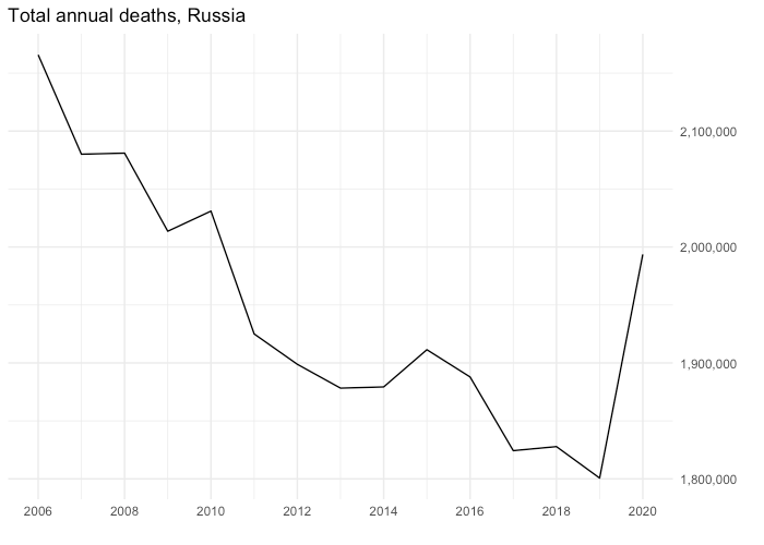
Deaths have been trending consistently downwards, so we’d have expected 2020 to follow that trend. It would have been a record low number for total deaths this century.
Instead deaths have gone upwards by 180k, i.e backwards by a decade.
Deaths have been trending consistently downwards, so we’d have expected 2020 to follow that trend. It would have been a record low number for total deaths this century.
Instead deaths have gone upwards by 180k, i.e backwards by a decade.
So to account for the trend in deaths, the full method we’re now using is:
- Forecast total deaths for 2020 based on the trend from 2015 to 2019
– Distribute forecast 2020 total across weeks or months of the year based on the share of the total each period typically accounts for
- Forecast total deaths for 2020 based on the trend from 2015 to 2019
– Distribute forecast 2020 total across weeks or months of the year based on the share of the total each period typically accounts for
Lots to take in there, so feel free to leave questions and comments :-)
• • •
Missing some Tweet in this thread? You can try to
force a refresh