NEW: quick chart showing key context for today’s news of a Tier 4 Christmas

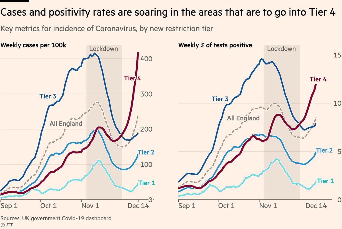
Cases are soaring in areas set to go into T4, with rate of increase extremely worrying. Testing has increased lately too, but even if we look at positivity, the rate of increase is very steep.
Story here from @PickardJE ft.com/content/3484bb…

And we’ll have more later on what we know about the new strain
And here’s weekly change in positivity for all English local authorities:

Increasing almost everywhere, and doubling every 10 days in almost 50 local authorities.
Finally, the most infuriating response to the latest data is "they’re just cases, nobody is actually ill. what about hospital data?"

Well, since you asked so nicely:

Hospital occupancy is rising extremely rapidly in London, SE, E & Wales, and climbing across the UK in aggregate
Note that the colours for outbreaks that are decelerating or in remission are not applicable to a single UK region.

Hospitals are either filling with more Covid patients, or holding steady at their already high levels (and likely to rise again imminently).

• • •

Missing some Tweet in this thread? You can try to force a refresh
 

Keep Current with John Burn-Murdoch

John Burn-Murdoch Profile picture

Stay in touch and get notified when new unrolls are available from this author!

Read all threads

This Thread may be Removed Anytime!

PDF

Twitter may remove this content at anytime! Save it as PDF for later use!

Try unrolling a thread yourself!

how to unroll video
  1. Follow @ThreadReaderApp to mention us!

  2. From a Twitter thread mention us with a keyword "unroll"
@threadreaderapp unroll

Practice here first or read more on our help page!

More from @jburnmurdoch

17 Dec
NEW with @JasmineCC_95 & @ChrisGiles_

38.5m people (68% of England’s population) will be in the tightest restrictions from Saturday.

Story: ft.com/content/e4eea7…

Two charts show that most moves into T3 were really no-brainers:

1) Case rates in these areas are high
And 2) in all-but-one area moved into T3, cases are also rising, in some cases very rapidly.

The exception is Runnymede in Surrey, where cases are elevated but trending downwards.
And here’s all of the above in map form.

Tier 3 maps very neatly onto areas whose case rates are currently elevated.

Rate of change (right) is a less neat fit; some areas in T3 are trending downwards, and most in T2 are trending sharply up.
Read 4 tweets
15 Dec
Genuinely amazed that we aren’t able to get data on the number of people who have been vaccinated.

Such a huge own goal.

Not only is it really important to know this for public health reasons, it would also be a "good news" number to track, and may show the UK in a good light.
I suspect (and certainly hope) we will start getting this data in the near future, but that it wasn’t planned for and published from the outset suggests that once again this stuff is being made up as we go along.
It also sows distrust at a time when this could not be more crucial.

Distrust fuels vaccine hesitancy, and people project their distrust from one domain onto vaccine safety.

Hailing vaccination successes while unable to point to any evidence is a complete shambles.
Read 4 tweets
14 Dec
NEW: the latest UK data is out, and it’s not good.

London is into Tier 3, but that’s only a small part of the wider story of UK’s looming Covid winter.

Case rates rising fast in London, SE & E, but also now rising in Midlands, NW and SW, and decline has halted in NE.
Regrettably, it’s also clear only tough restrictions suppress transmission.

During national lockdown, case rates either went from rising to falling, or from falling slowly to fast, in all English regions.

Since restrictions eased, all declines have either flattened or reversed.
The picture in Wales is even more stark:

During the 17 days of their "fire-break" lockdown, the weekly case rate fell from 295 per 100k to 184. In the first 17 days after restrictions eased, it rebounded to 301.

In the 6 days since then, the rate has increased by 45% to 440.
Read 15 tweets
10 Dec
NEW: it’s expected (but not yet confirmed) London will go into Tier 3 when England’s Covid restrictions are reassessed next week, so what do the data show?

Let’s dig into all 6 metrics the govt is using.

First, new case rates:
• High in much of London, well into old T3 levels Image
But with cases, *growth rate* is also a key consideration, and this could be the big one for London.

Rates are rising in the vast majority of London boroughs, increasing by 50% per week in many places, and rising faster than almost all current Tier 3 areas. Image
Sticking to cases, government is also looking at rates specifically among those aged 60 and over.

As with the pattern in the general population, London boroughs send that Tier 2 slope steeply upwards on the left, with case rates among the 60+ well into former Tier 3 territory. Image
Read 8 tweets
9 Dec
NEW: could London be set for Tier 3?

@JasmineCC_95 has the story, and I’ve had a look at the latest data ft.com/content/34fda7…

The picture isn’t as clear-cut as one might think, so here’s a short thread on the key details:
At first glance, it seems pretty clear that London should go into T3. Overall, London case rates are currently roughly at the T3 average, with several boroughs showing rates that would be high even in the top tier.

but ... Image
... the question is not necessarily how case rates compare between the tiers *now*, but how current rates compare to *when tiers were introduced*

On that basis, London as a whole is still at very low end of T3 when it came in (grey circles), and most boroughs exceptionally low Image
Read 6 tweets
9 Dec
NEW: quick chart & thread to clear up some confusion following @Peston’s digging into ONS modelled estimates:

It’s true that ONS modelled incidence series has issues, and the revisions can provoke doubts.

BUT that doesn’t mean gov was flying blind when it announced 2nd lockdown
Let’s set aside that ONS series, and instead look at:
• Imperial REACT study
• Covid symptom tracker
• ONS’s model-free weighted estimates (not subject to revisions)
• The dashboard
Each as it stood when lockdown was announced.

All pointed to rapidly increasing infections
tl;dr

The way ONS models incidence can a) give a misleading shape to recent days of the outbreak, and b) cause confusion where estimated prevalence is retrospectively altered.

But there’s no doubt the virus was spreading rapidly in late October when lockdown was announced
Read 6 tweets

Did Thread Reader help you today?

Support us! We are indie developers!


This site is made by just two indie developers on a laptop doing marketing, support and development! Read more about the story.

Become a Premium Member ($3/month or $30/year) and get exclusive features!

Become Premium

Too expensive? Make a small donation by buying us coffee ($5) or help with server cost ($10)

Donate via Paypal Become our Patreon

Thank you for your support!

Follow Us on Twitter!