Are high levels of existing COVID-19 population immunity in US counties associated with a lower infection rate in this current wave?
This thread contains my latest findings to this question.
Initial conclusion: No, there is practically no correlation.
This thread contains my latest findings to this question.
Initial conclusion: No, there is practically no correlation.
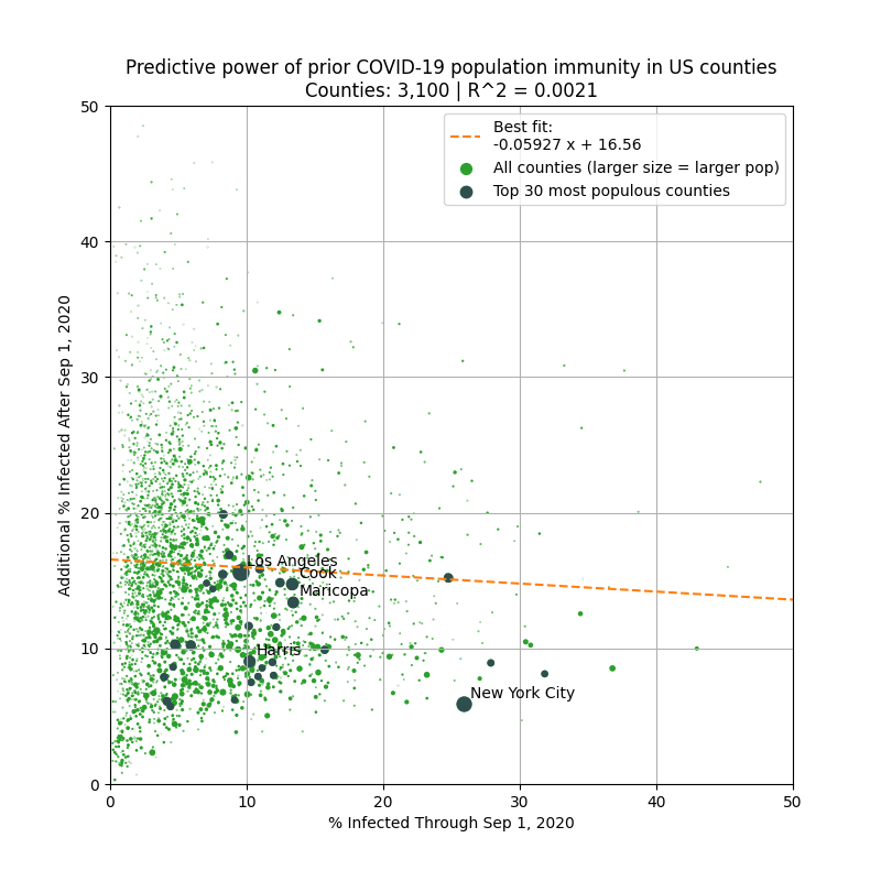
The plot above shows the the percentage of the population infected before Sep 1 & after Sep 1 in each county (based on covid19-projections.com estimates).
The question is: can knowing the % infected before Sep 1 in a county predict the relative severity of this current wave?
The question is: can knowing the % infected before Sep 1 in a county predict the relative severity of this current wave?
When looking at all 3,000+ counties, the answer is no. There is practically no correlation (R^2 = 0.002) between the % infected before Sep 1 and after Sep 1.
So given a county, the COVID-19 prevalence before Sep 1 has no predictive value in determining the severity since Sep 1.
So given a county, the COVID-19 prevalence before Sep 1 has no predictive value in determining the severity since Sep 1.
Perhaps there are small counties that may be outliers, so let's remove those.
Even if you ignore counties with less than 50,000 residents, the pattern is consistent. There is virtually no correlation.
The pattern seem to hold no matter what population thresholds you set.
Even if you ignore counties with less than 50,000 residents, the pattern is consistent. There is virtually no correlation.
The pattern seem to hold no matter what population thresholds you set.

In fact, in the plot above, the slope of the best fit line is positive, meaning that a higher prevalence in a county is correlated with an even more severe fall outbreak.
But of course, the correlation is very weak, so I would not focus on the slope too much.
But of course, the correlation is very weak, so I would not focus on the slope too much.
The correlation improves marginally when you break it down by state. But the slope actually tends to be more positive, rather than negative.
Meaning higher prevalence before Sep 1 -> worse outbreak after Sep 1.
37 / 50 states have a + slope (plots of CA, TX, FL & NY below).
Meaning higher prevalence before Sep 1 -> worse outbreak after Sep 1.
37 / 50 states have a + slope (plots of CA, TX, FL & NY below).


This suggests that within an individual state, counties that have low prevalence before Sep 2020 will continue to have relatively lower prevalence after Sep.
Ofc, there are many other factors at play that can explain this. But population immunity doesn't seem to be one of them.
Ofc, there are many other factors at play that can explain this. But population immunity doesn't seem to be one of them.
Before doing this analysis, I would have expected a weak negative correlation between high existing COVID-19 prevalence and the severity of the current wave.
But the data does not support this hypothesis, and hence I must revise my prior and beliefs.
But the data does not support this hypothesis, and hence I must revise my prior and beliefs.
I urge others who still believe in the strategy of using natural herd immunity to control future outbreaks to look at the data and see for themselves. Current evidence does not support this strategy.
The raw data is available on GitHub: github.com/youyanggu/covi…
The raw data is available on GitHub: github.com/youyanggu/covi…
We see people cite Florida and California as two counterexamples, but they are outliers.
We should also look at Tennessee & Arizona, who are currently experiencing large outbreaks despite large summer waves. Or, Oregon & Vermont, where spread has consistently been contained.
We should also look at Tennessee & Arizona, who are currently experiencing large outbreaks despite large summer waves. Or, Oregon & Vermont, where spread has consistently been contained.

That said, it is still important to do case studies on California and Florida so that we can better understand why Florida was seemingly able to "flatten the curve" for this current wave, while California was not.
This is despite Florida having significantly fewer restrictions.
This is despite Florida having significantly fewer restrictions.
I also tried using the population as the predictor and computed the correlation.
It seems that more populous counties had marginally smaller outbreaks (in relative terms) than less populous counties.
This also goes against the notion that population centers drive infections.
It seems that more populous counties had marginally smaller outbreaks (in relative terms) than less populous counties.
This also goes against the notion that population centers drive infections.

These are preliminary findings. I am in the process of examining other variables that can better predict the relative severity of the current wave (e.g. income, intervention level, weather, etc).
If you have any other promising variables (for which there are data), let me know.
If you have any other promising variables (for which there are data), let me know.
UPDATE: I'm glad this thread spurred some discussion. Thank you all for responding. I have done some follow-up analysis based on some of the feedback. I am addressing the following:
- Using deaths instead of % infected
- Outliers
- Min threshold for % infected
- Non-linearity
- Using deaths instead of % infected
- Outliers
- Min threshold for % infected
- Non-linearity
1) Deaths instead of % infected
Deaths is not as good of a predictor because it lags by many weeks and small counties do not have many deaths.
If we use deaths for this analysis, we can see that the correlation is still fairly weak (with NYC as an outlier).
Deaths is not as good of a predictor because it lags by many weeks and small counties do not have many deaths.
If we use deaths for this analysis, we can see that the correlation is still fairly weak (with NYC as an outlier).

2) Outliers
Many people tried to refute my conclusion by using NYC as an example that "population immunity works".
But this exact analysis shows that NYC is an outlier, not the norm. We should not make broad generalizations based on outliers. Too many are making this mistake.
Many people tried to refute my conclusion by using NYC as an example that "population immunity works".
But this exact analysis shows that NYC is an outlier, not the norm. We should not make broad generalizations based on outliers. Too many are making this mistake.
I highlighted the four counties in and around NYC in the plot below. They have high prevalence prior to Sep 1 and relatively low transmission since.
They appear to be outliers. Using those data points to support the claim that high prevalence leads to lower infections is flawed.
They appear to be outliers. Using those data points to support the claim that high prevalence leads to lower infections is flawed.

If you look at all US counties with more than 1M in population, you can see that the outliers even more clearly.
Once again, there does not seem to be a correlation between existing prevalence and the severity of the current wave.
Once again, there does not seem to be a correlation between existing prevalence and the severity of the current wave.

Those that only uses NYC as an "example" are ignoring Miami-Dade. 6% of the entire county tested positive by Sep 1 (~25% infected).
One would expect Miami to be able to suppress another wave. But another 6% of the county tested positive since then.
Similar situation in Phoenix.
One would expect Miami to be able to suppress another wave. But another 6% of the county tested positive since then.
Similar situation in Phoenix.


The purpose of this analysis is to look at *all counties*, not just a few cherry-picked ones.
So picking a single data point (like NYC) doesn't refute these findings. In fact, it only highlights the need for more generalizing studies to avoid falling into confirmation bias.
So picking a single data point (like NYC) doesn't refute these findings. In fact, it only highlights the need for more generalizing studies to avoid falling into confirmation bias.
3) Threshold for % infected
Some people suggested added a threshold for % infected before Sep 1, as population immunity effects may not kick in until some sort of minimum is reached.
Below, I re-ran the analysis but only on counties with >20% infected before Sep 1.
Some people suggested added a threshold for % infected before Sep 1, as population immunity effects may not kick in until some sort of minimum is reached.
Below, I re-ran the analysis but only on counties with >20% infected before Sep 1.

It's possible that population immunity does not "kick in" until we get to 30-50%+. But there are simply not enough counties in this category to confirm this hypothesis.
In either case, as experts have been saying all along, the only path to herd immunity is through vaccination.
In either case, as experts have been saying all along, the only path to herd immunity is through vaccination.
4) Non-linearity: Some people mentioned that it's possible that the relationship is not linear. That's true.
But for most practical purposes, if there is little to no linear correlation, it doesn't help much to start considering nonlinear ones, especially for a single variable.
But for most practical purposes, if there is little to no linear correlation, it doesn't help much to start considering nonlinear ones, especially for a single variable.
In any case, here's the residuals for the linear regression. The residuals are fairly normally distributed, which is good.
There is some heteroskedasticity in the data (i.e. the variance is not evenly distributed across x). But that should not affect the bias.
There is some heteroskedasticity in the data (i.e. the variance is not evenly distributed across x). But that should not affect the bias.


You can also take the log of the input data to get a more homoscedastic plot. But as you can see, the correlation remains poor.

That's it for this update. I'm always open to more suggestions.
By the way, if you follow me because I present an unbiased analysis, then please don't be surprised/dismissive if not all my findings agree with your beliefs/priors. Nobody is right all the time, including myself.
By the way, if you follow me because I present an unbiased analysis, then please don't be surprised/dismissive if not all my findings agree with your beliefs/priors. Nobody is right all the time, including myself.
• • •
Missing some Tweet in this thread? You can try to
force a refresh