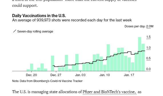
🚨U.S. is now averaging 1.1M doses/day (7-day rolling)
💉VACCINE DATA UPDATE (Jan. 23)💉
🇺🇸US: 21.1M doses admin
➕1.3M doses today; 📈7-day avg=1.1M
🏅3.14M people completed vaccination
🌏63M doses (daily rate ~3.21M⬆️)
⚠️CDC *did* update today
bloomberg.com/graphics/covid…
💉VACCINE DATA UPDATE (Jan. 23)💉
🇺🇸US: 21.1M doses admin
➕1.3M doses today; 📈7-day avg=1.1M
🏅3.14M people completed vaccination
🌏63M doses (daily rate ~3.21M⬆️)
⚠️CDC *did* update today
bloomberg.com/graphics/covid…

Here is out US map of the % of doses that have been delivered than have been used. There are still BIG disparities in this rate. We are investigating why -- especially California -- and hope to have more to share there ASAP.
bloomberg.com/graphics/covid…
bloomberg.com/graphics/covid…

⚠️CDC updated today -- first time on the weekend IIRC -- which is great. It will also reduce Monday lag/bump. (As usual, many states did not -- but we get the CDC number in their place.)
Our U.S. leaders table:
bloomberg.com/graphics/covid…
Our U.S. leaders table:
bloomberg.com/graphics/covid…

As always, you can find out full graphic and global numbers here. Thank you to our weekend data team!
bloomberg.com/graphics/covid…
bloomberg.com/graphics/covid…
• • •
Missing some Tweet in this thread? You can try to
force a refresh