You may be wondering why @bristoliver rather cryptically RT’d a chart that I posted last night. The answer is not just that he loves quadratic fits on log axes, but that this chart may –and I stress may– hint at a vaccine effect amongst the over 80s THREAD
https://twitter.com/JamesWard73/status/1354511535285166081?s=20
WARNING: this is a long thread, and it’s a bit of a roller-coaster. We find some apparently strong patterns in the data, and then start to unpick them a bit. So if you start getting excited half way through you might find you’re less excited at the end. But we’ll see…
First we first have to go back a bit. @bristoliver posted a thread a few days ago explaining why, with a constant vaccination rate, a log plot of cases should show a quadratic form. In other words, it should fit an equation like: a + b.x + c.x^2
I meant to link in the model thread there - here it is
https://twitter.com/BristOliver/status/1353270197935812608?s=20
the quadratic coefficient – the ‘c’ in that equation – gives an estimate of the % of the population who are being newly protected by the vaccine each day. Please note ‘protected by the vaccine’, not ‘vaccinated’ – as we don't expect 100% protection after the first dose
with some prompting from @FLermyte (thank you!), I started last night to look at the over-80s case data from 8-23 Jan, which is the bit to the right of the peak in the graph below (note I’m using a 7-day average, so the raw case data is actually from 2-23 Jan) 
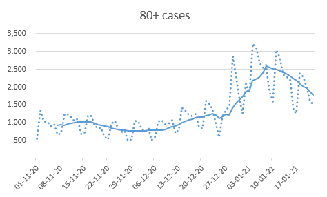
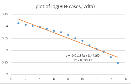
On a log plot, you can see that the line curves down to the right, so a simple linear trend-fit doesn’t work very well. The rate of decline appears to be accelerating over time. 
We get a much better fit if we use a quadratic equation to fit to this. And using @bristoliver’s model, we can use the coefficient of x^2, and multiply this by 10 to give us an estimate of the %ge of people newly protected per day 
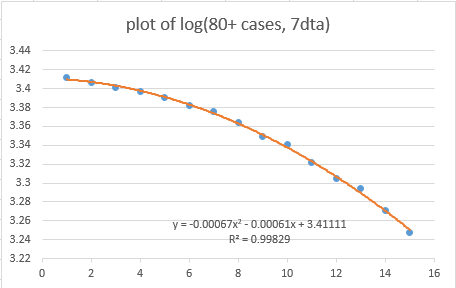
Here the coefficient is 0.00067, so ten times that is 0.0067, which is 0.67%. And we know that there are 2.84m over-80s in England, so that converts to about 19,000 people being newly protected each day.
How does that compare to reality? Well, if we go back into the NHS vaccination data, we can see how many people were being vaccinated in the period 21 Dec – 10 Jan, which is a period roughly 12-13 days prior to the raw case data I am using
Why 12-13 days? Well because we know that’s roughly the time it takes for the vaccines to start having a noticeable impact on the time series of recorded (symptomatic) cases, from the Phase 3 trial data.
FOOTNOTE: I am assuming that this 12-13 day period includes the time taken to develop symptoms and get a test etc. on the basis that the vaccine trials were using symptoms + positive PCR as their 'event' definition. If you have better info, please let me know!
BACK TO MAIN THREAD: So, over that period we had an average of 225000 over-80s given their first dose each week – which works out to about 32000 people per day.
So our log-quadratic fit of the case data implies 19k protected per day, and the NHS vaccine data implies 32k per day. These could be consistent, if the first dose of the vaccine gave c. 60% protection (=19/32) – which is not a million miles away from the emerging Israeli data
FOOTNOTE: Someone is going to ask (rightly) here what ‘protected’ means – is that protection vs infection? Transmission? Symptoms? Serious disease? And the rather messy answer is that I mean ‘protection vs. appearing in the gov.uk dashboard case data’
Since the (Pillar 1 + Pillar 2) case data is a mix of testing based on symptoms (mostly), plus a good chunk of asymptomatic screening (e.g. in care homes, of hospital staff etc.) then our protection measure is also a mix of ‘protection vs infection’ and ‘protection vs symptoms’
BACK TO MAIN THREAD: So that’s quite exciting, our model fits the actual vaccination data for over-80s if we assume the first dose has c. 60% protection.
But we’ve forgotten about the second doses, and there were (on average) 14k of those per day for the over-80s in the period we’re looking at. And we’d expect the second dose to boost protection quite a lot.
So our data would also be consistent with (e.g.) the first dose having 50% protection, and the second dose giving 20-25% boost on top of that (after 12 days or so). There’s a danger of trying to draw too much inference here, there will be a fair bit of noise in the analysis.
The other effect I noted is that the vaccination rate wasn’t really constant over the period we’re looking at – in particular it’s much faster in the final week (running up to 10th Jan) than in the previous two weeks
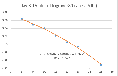
So @bristoliver’s model, which assumes a constant vaccination rate, doesn’t quite match the reality. To explore this I’ve cut the data into two, being 8-15 Jan, and 15-23 Jan (both with trailing averages). Now we can separately fit the data on each half - this is the first week 
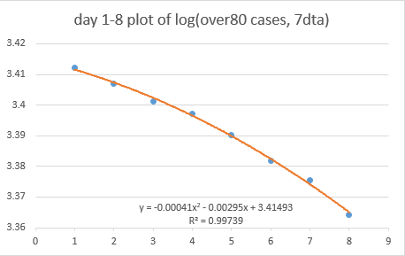
And the two ‘c’ coefficients we get are 0.00041 (first week) and 0.00078 (second week). So the rate of steepening is increasing over our 2-week period
(mathematical observers will note that we are now commenting on the third derivative of a log plot – I knew that A-level maths was going to come in handy at some point!)
Again, does that match reality? Well, yes, if we look at the vaccination data, we can see that the rate of vaccination was much faster in the final week of our period. If I run the data, assuming 50% protection from first dose and +25% from second, the co-efficients...
...that I would *expect* to see in the case data are 0.00037 and 0.00083. So a close match for the observed 0.00041 and 0.00078
very sorry to do this but I need to take a 30-minute break here - back soon. There is more to this story, I promise!
right, back now. hope you enjoyed your drinks at the bar and the queue for the ice cream. the pressure's on as I have another call at 3pm so need to finish by then!
Earlier on this thread: we had just split our case data for the over80s into two weeks, and got a very nice fit to the vaccination data, using @Bristoliver's model, for each week - and matching the faster vaccination rate in the second week
In fact, since we now have two independent sets of data (for the 2 weeks) we can solve to find the values of protection for the first and second doses that best explain the data. This works out to 55% for the first dose, and an extra 10% from the second – BUT
I would caution strongly against relying on this interpretation, there really isn’t much data to go on with the second doses, and they mostly happen quite late in our sample period may not have had long enough to properly take effect in the case data
Still, that’s not a bad result, we’re seeing a quadratic pattern in the case data that very closely matches the actual vaccination data via @bristoliver’s model, both over the period 8-23 Jan, and also when we fit separately to the individual weeks within that period. HOWEVER
Before we all start celebrating and doing the vaccine victory dance, it’s important to think about what else could be causing that pattern. For example it could just be a delayed effect of lockdown, with compliance actually increasing over the period.
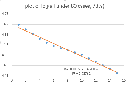
To explore this we can look at the patterns in the other age groups. The model predicts we should see a quadratic pattern in the over80s, who are being vaccinated, but we should not see that pattern in the under80s – the log plot should be linear (absent other effects).
(note there are some vaccinations in the under80s, mostly for care and healthcare workers, but the direct effect of this in a much larger population of under80s will be small, and probably not observable in the data)
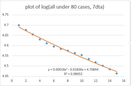
But my brain is hurting trying to interpret that back into the model – I’ll leave the theoretical framework to @Bristoliver here. So instead I’ve gone back to looking at this as a quadratic fit in the two weeks separately: 

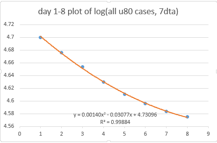
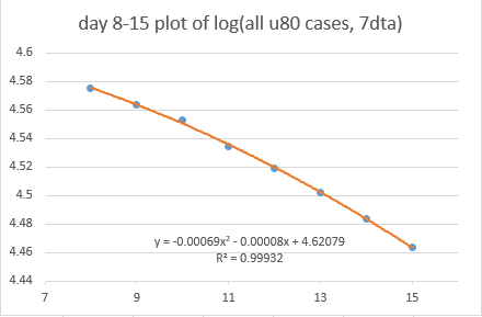
So we can see we have a flattening rate of decline in the first week, and then accelerating decline (with a quadratic coefficient quite similar to the over-80s) in the second week. What to make of this?
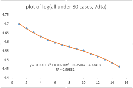
Well, I won’t bore you with all the graphs (available on request), but I have done the fits for more granular age groups, and it is clear that the strongest effect (ie the flattening then steepening) is in the under20s, with progressively weaker effects in the older age groups.
Looking within the under20s, the effect is pretty strong in the 0-4s, 5-9s and 10-14s; less so in the 15-19s. Looking here at the data for the 5-9s, we can see that cubic shape, getting flatter and then steeper again 
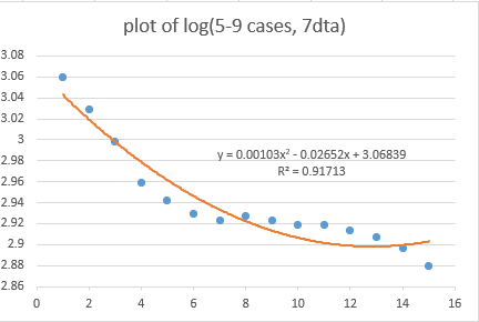
What could be doing this? Well we’re looking for something that caused slower decline in cases (in the under-80s) in the early part of January, and then faster decline as we approached mid/late Jan
I don’t yet have a good answer for this, but I have seen others on here (eg @video4me) suggesting that there was a bit of a blip in the case data potentially caused by mixing in the one day of school that some children had before lockdown on Jan 4th
Would this be enough to cause the effect we’re seeing, when combined with the impact of the 7-day averaging? If not, what else could be doing this? I don’t honestly know, and I need a better time-series model to work it out, so will call on others for ideas at this point.
So to summarise where we are: we have a surprisingly good fit between the case data for over-80s, using a quadratic fit on a log plot, which matches what @bristoliver’s model would predict from the actual vaccination data, if you assume 50-60% protection from the first dose BUT
We’re also seeing some unexplained dynamics in the under-80s (and particularly the under-20s) which can’t be due to vaccination. And if there’s something else going on in those age groups, maybe the data for the over-80s is also being distorted in a similar-but-different way...
...which is what's still holding me back from saying "yes, definitely, this is due to vaccination".
Gut feel, and a big slug of confirmation bias, suggests that what we’re seeing really is a vaccination effect in the over80s – you would certainly hope there would be one at this stage. But I can’t rule out from the data that there could be other effects distorting this.
I’d welcome comments, suggestions etc for further analysis (although no promises on when I can do it – I’ve already spent too long on this when I should be working / supervising homeschool etc.!).
One thought is to do the analysis at regional level, and see how stable the impact of vaccination (if that's what it is) is in the over-80s data. but that’s not a quick task. /end
• • •
Missing some Tweet in this thread? You can try to
force a refresh
