I think about this statistic every morning.
24 MILLION US adults "sometimes" or "often" didn't have enough to eat over the last week.
80% of these report that the reason is that they *couldn't afford to buy more food*
(according to @uscensusbureau Household Pulse Survey)
1/
24 MILLION US adults "sometimes" or "often" didn't have enough to eat over the last week.
80% of these report that the reason is that they *couldn't afford to buy more food*
(according to @uscensusbureau Household Pulse Survey)
1/
More than 1 in 6 Black non-Hispanic adults and Hispanic adults report being in households where there is not enough to eat.
Of all adults in households going hungry, 42% are White non-Hispanic, 28% are Hispanic/Latino, and 20% are Black.
2/

Of all adults in households going hungry, 42% are White non-Hispanic, 28% are Hispanic/Latino, and 20% are Black.
2/


Fully 1 in 5 of adults without a high school degree report being in households where there is not enough to eat.
But hardship is of course not only a function of education. 1/3 of those without enough to eat have some college or an associate's degree; 10% have a BA.
3/

But hardship is of course not only a function of education. 1/3 of those without enough to eat have some college or an associate's degree; 10% have a BA.
3/


1 in 8 adults in households with children report that there was sometimes or often not enough to eat over the last 7 days. **1 in 8!**
This means that about half the adults in households without enough food are in households with children.
4/

This means that about half the adults in households without enough food are in households with children.
4/


16% of adults in households who lost employment income during the pandemic report not having enough to eat.
In all, nearly 80% of the 24 million adults reporting not having enough to eat were in households which have lost employment income since the start of the pandemic.
5/

In all, nearly 80% of the 24 million adults reporting not having enough to eat were in households which have lost employment income since the start of the pandemic.
5/


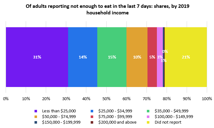
Food insufficiency is by far the worst for households with low household income. 1/3 of households with incomes<$25k - 7.5m adults - report not having enough to eat.
But there are also more than 2m people who earned >$75k household income in 2019 but are lacking food now.
6/

But there are also more than 2m people who earned >$75k household income in 2019 but are lacking food now.
6/


It's important and striking to emphasize: the large majority of households reporting not having enough to eat *do not receive SNAP benefits*.
The vast majority have not received free groceries or meals in the last 7 days either.
7/

The vast majority have not received free groceries or meals in the last 7 days either.
7/


Finally the mental health implications are obviously devastating. Around half of everyone who report not having had enough to eat in the last week report being nervous, anxious, or on edge; not able to stop worrying; and feeling down, depressed, or hopeless.
8/
8/

I hope these stats are etched into all our minds & policymakers' minds over coming weeks and months. This is entirely avoidable in the richest country in the world. 9/
To explore the data, you can access the Household Pulse Survey at census.gov/data/tables/20…
Live tracker of food insufficiency from @dwschanz & @NatalieTomeh is available at:
ipr.northwestern.edu/apps/economici…
/end
Live tracker of food insufficiency from @dwschanz & @NatalieTomeh is available at:
ipr.northwestern.edu/apps/economici…
/end
• • •
Missing some Tweet in this thread? You can try to
force a refresh


