I love seeing journalists do a textbook job of calling bullshit on the misleading use of quantitative data.

Here's a great example. @RonDeSantisFL claimed that despite having schools open, Florida is 34th / 50 states in pediatric covid cases per capita.
nbcmiami.com/news/local/des…
I don't know for certain what set off their bullshit detector, but one rule we stress in our class is that if something seems too good or too bad to be true, it probably is.

DeSantis's claim is a candidate.

Below, a quote from our book. Image
The very next paragraph of the book suggests what to do when this happens: trace back to the source. This is a key lesson in our course as well, and at the heart of the "think more, share less" mantra that we stress. Don't share the implausible online until you've checked it out. Image
So that's what investigative reporter Tony Pipitone @TonyNBC6 from South Florida's @nbc6 did.

He found that the 34th out of 50 claim came from this @AmerAcadPeds report: downloads.aap.org/AAP/PDF/AAP%20… Image
I might have stopped there, and assumed the low rank was due to with testing rates and the fact that children are more often asymptomatic or mildly symptomatic. Tony didn't. He did something else that we also stress in our class: Beware of unfair comparisons. Again from the book: Image
It turns out that Florida does well relative to other states because it reports cases among children as those aged 0-14, instead of 0-17, 0-18, 0-19, or 0-20 as other states do.

A classic unfair comparison.

From the very same @AmerAcadPeds report: Image
The NBC report explains Florida should be 9th, not 34th, in cases among kids.

Because it compares different age groups, the argument that @GovRonDeSantis is making in this tweet is deeply deceptive.

Epidemiologist @JasonSalemi at @USouthFlorida explains in further detail in this short thread.

But seriously, watch the original report. It's a powerful and well-done debunking of data-driven disinformation from @TonyNBC6 at @nbc6.

I'd love to see more of this kind of data journalism.

Again, the link:

nbcmiami.com/news/local/des…

• • •

Missing some Tweet in this thread? You can try to force a refresh
 

Keep Current with Calling Bullshit

Calling Bullshit Profile picture

Stay in touch and get notified when new unrolls are available from this author!

Read all threads

This Thread may be Removed Anytime!

PDF

Twitter may remove this content at anytime! Save it as PDF for later use!

Try unrolling a thread yourself!

how to unroll video
  1. Follow @ThreadReaderApp to mention us!

  2. From a Twitter thread mention us with a keyword "unroll"
@threadreaderapp unroll

Practice here first or read more on our help page!

More from @callin_bull

5 Dec 20
In science, people tend to be most interested in positive results — a manipulation changes what you are measuring, two groups differ in meaningful ways, a drug treatment works, that sort of thing.
Journals preferentially publish positive results that are statistically significant — they would be unlikely to have arisen by chance if there wasn't something going on.

Negative results, meanwhile, are uncommon.
Knowing that journals are unlikely to publish negative results, scientists don't bother to write them up and submit them. Instead they up buried file drawers—or these days, file systems.

This is known as the file drawer effect.

(Here p<0.05 indicates statistical significance.)
Read 23 tweets
3 Dec 20
Jevin West was away today so in lecture I was able to sneak in one my favorite topics, observation selection effects.

Let's start a little puzzle.

In Portugal, 60% of families with kids have only one child. But 60% of kids have a sibling.

How can this be?
People are all over this one! And some are out ahead of me (looking at you, @TimScharks). We'll get there, I promise!

There are fewer big families, but the ones there are account for lots of kids.

If you sampled 20 families in Portugal, you'd see something like this.
@TimScharks Now let's think about class sizes.

Universities boast about their small class sizes, and class sizes play heavily into the all-important US News and World Report college rankings.

For example, @UW has an average class size of 28.

Pretty impressive for a huge state flagship.
Read 15 tweets
20 Sep 20
One of our key pieces of advice is to be careful of confirmation bias.

There's a thread going around about how the crop below is what happens when Twitter's use of eye-tracking technology to crop images is fed with data from a misogynistic society. I almost retweeted it. But…
…that story fits my pre-existing commitments about how machine learning picks up on the worst of societal biases. So I thought it was worth checking out.

Turns out, it's not Twitter at all.

Here's the @techreview tweet itself:
The picture is provides as a "twittercard", and is provided by the publisher, @techreview, as part of the header in the html file for the article.
Read 8 tweets
26 Jul 20
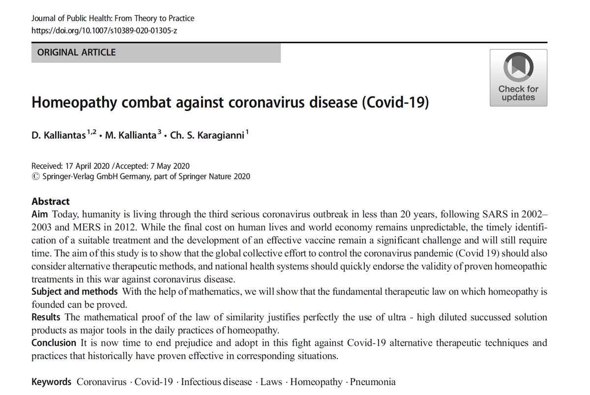
A couple of months ago, an almost unfathomably bad paper was published in the Journal of Public Health: From Theory to Practice.

It purports to prove—mathematically—that homeopathy will provide and effective treatment for COVID-19.

link.springer.com/article/10.100…
While it would be fish in a barrel to drag this paper as a contribution to the pseudoscience of homeopathy, we'll largely pass on that here. More interestingly, this single paper illustrates quite a few of the points that we make in our forthcoming book.
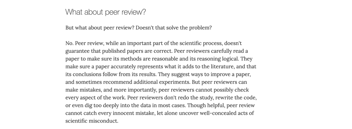
The first of them pertains to the role of peer review as guarantor of scientific accuracy.

In short, it's no guarantee, as we discuss here: callingbullshit.org/tools/tools_le…

This paper shows that all sorts of stuff makes it through peer review.
Read 50 tweets
17 Jul 20
A truly remarkable example of misleading data visualization from the Georgia department of public health.
In our book we suggest that one never assume malice when incompetence is a sufficient explanation, and one never assume incompetence when an understandable mistake could be the cause.

Can we apply that here?
I bet we can.

A lot of cartographic software will choose bins automatically based on ranges. For example, these might be the 0-20%, 20-40%, 40-60%, 60-80%, and 80-100% bins.

As the upper bound changes over time, the scale slides much as we see here.
Read 5 tweets
25 Jun 20
We've written several times about what we describe as Phrenology 2.0 — the attempt to rehabilitate long-discredited pseudoscientific ideas linking physiognomy to moral character — using the trappings of machine learning and artificial intelligence.
For example,, we've put together case studies on a paper about criminal detection from facial photographs...

callingbullshit.org/case_studies/c…
...and on another paper about detection of sexual orientation from facial structure.

(tl;dr — both are total bullshit)

callingbullshit.org/case_studies/c…
Read 11 tweets

Did Thread Reader help you today?

Support us! We are indie developers!


This site is made by just two indie developers on a laptop doing marketing, support and development! Read more about the story.

Become a Premium Member ($3/month or $30/year) and get exclusive features!

Become Premium

Too expensive? Make a small donation by buying us coffee ($5) or help with server cost ($10)

Donate via Paypal Become our Patreon

Thank you for your support!

Follow Us on Twitter!